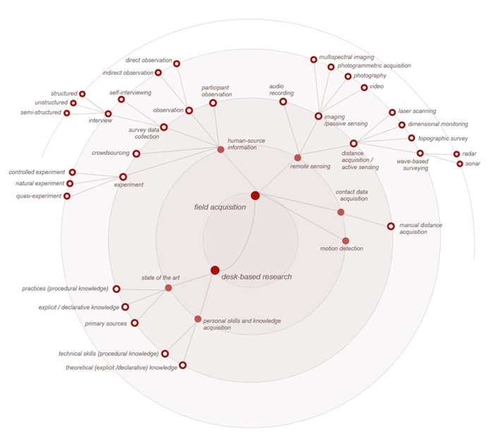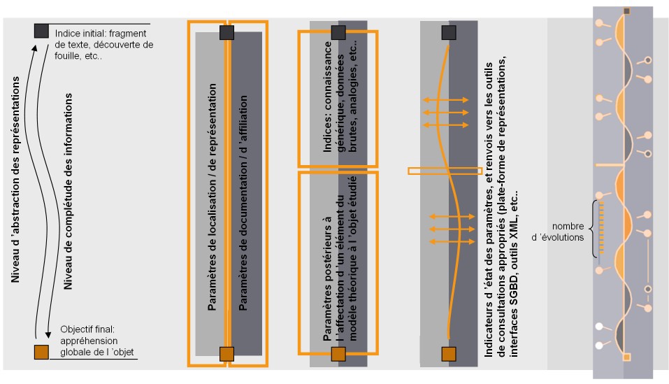
I. Fasse (design, management) E. Laffont (implementation, evaluation), J.Y. Blaise (design contribution), I. Dudek (design contribution)
Participation in the elaboration of a protocol for data collection and exploitation (i.e. elaboration of a protocol for the evaluation and comparison of collected visual and audio data).
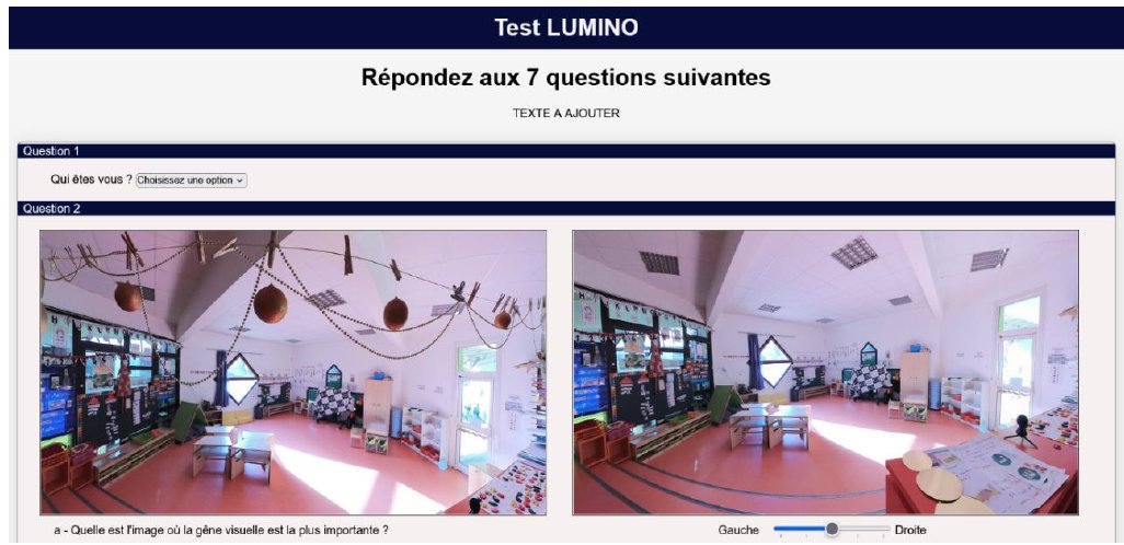
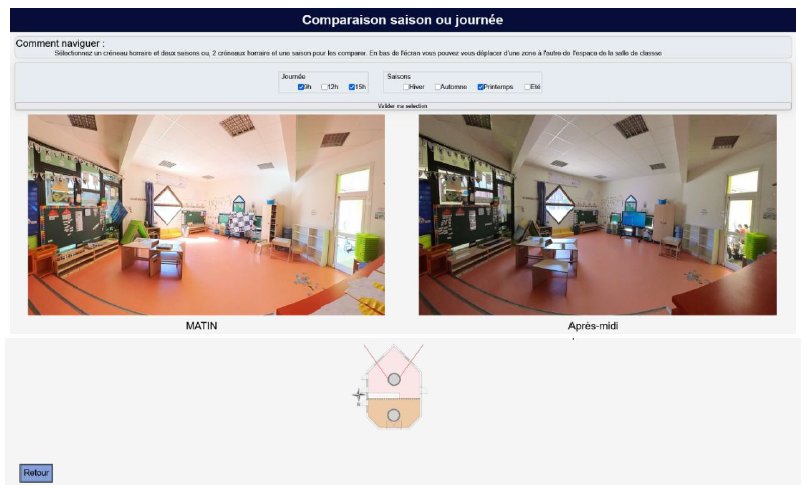
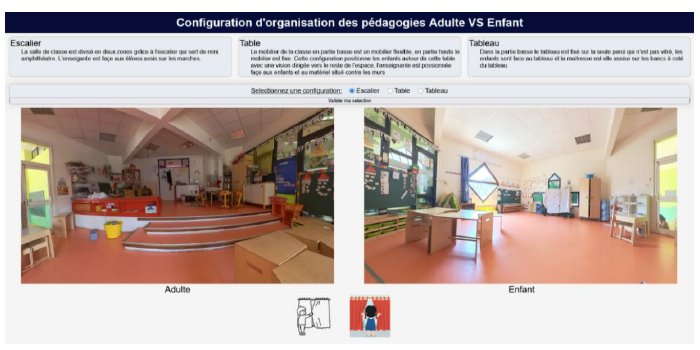
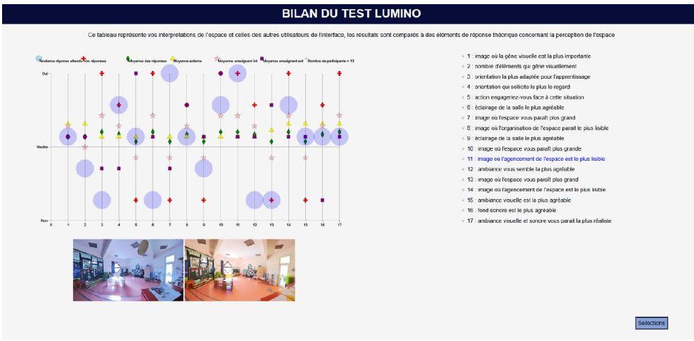
The interface of an exploratory tool called LUMINO - implemented and tested by Emma Laffont - enables a series of perception tests to be carried out on brightness and visual discomfort for pairs of images (e.g. comparisons of two photographs taken at different times of day or different seasons), as well as associations with sound concepts (auditory perception).
I. Dudek (pilotage, conception, vérification), J.Y. Blaise (participation à la conception, alimentation de la BD, vérification), A. Devogelaere (implémentation, debugge)
Implementation of a tool for comparative visual analysis of annotated soundtracks in the “Soundscape typological analysis” prototype, where segments of a soundtrack are associated with different types of sound source. The sound sources are identified and organised according to a typology developed beforehand, differentiating between two major groups: sounds of nature and man-made sounds.
The aim is to provide a visual comparison of the human perception of the acoustic ambience of the sound environment.
The approach is based on a combination of qualitative and quantitative methods. The aim is to verify whether and how a visual comparison of soundscape annotations can help their understanding both for scientists and for the general public, including the hearing impaired people. The research aims to explore of ideas, without first considering that it will lead to a particular application or practical use.
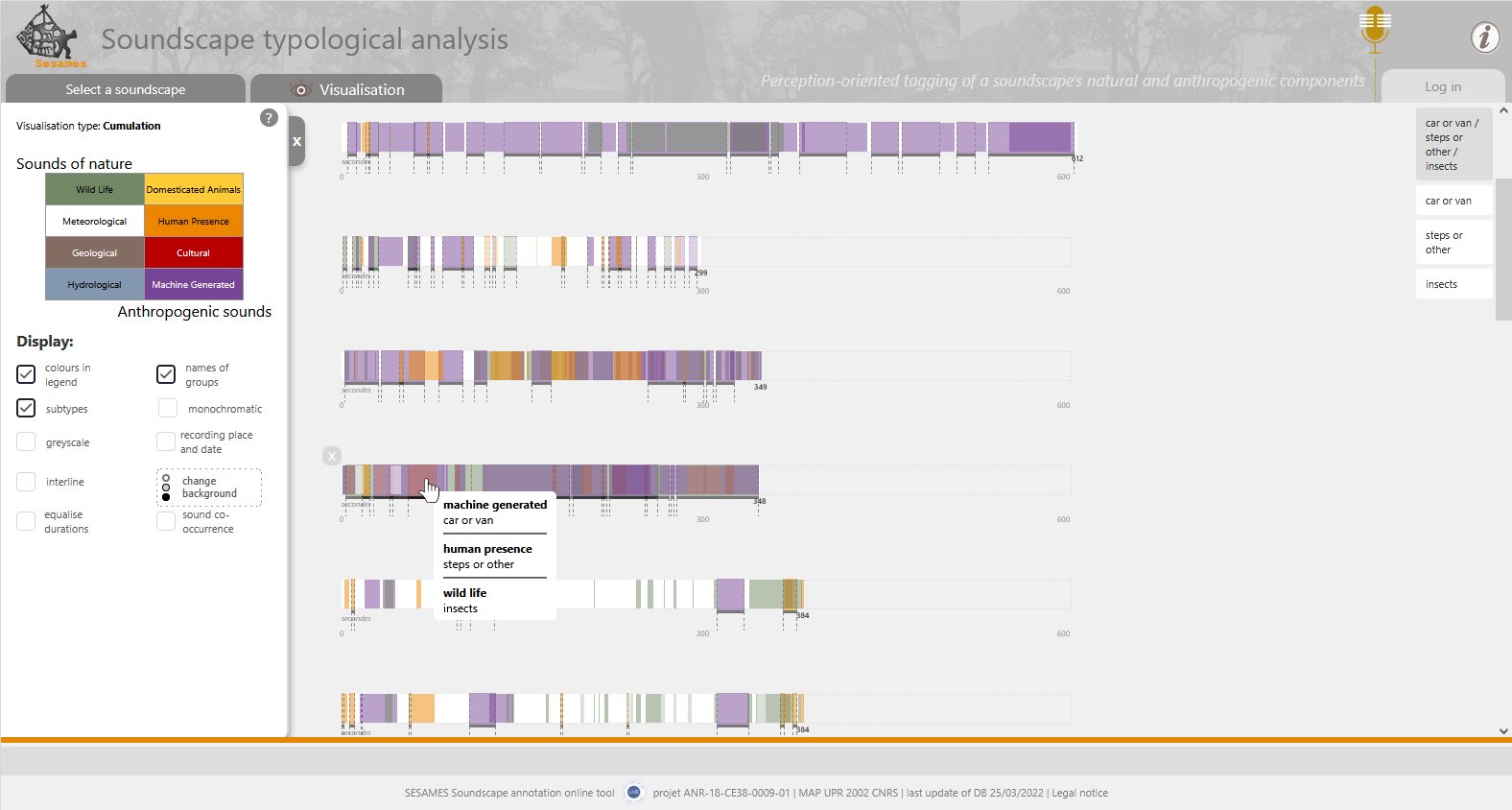
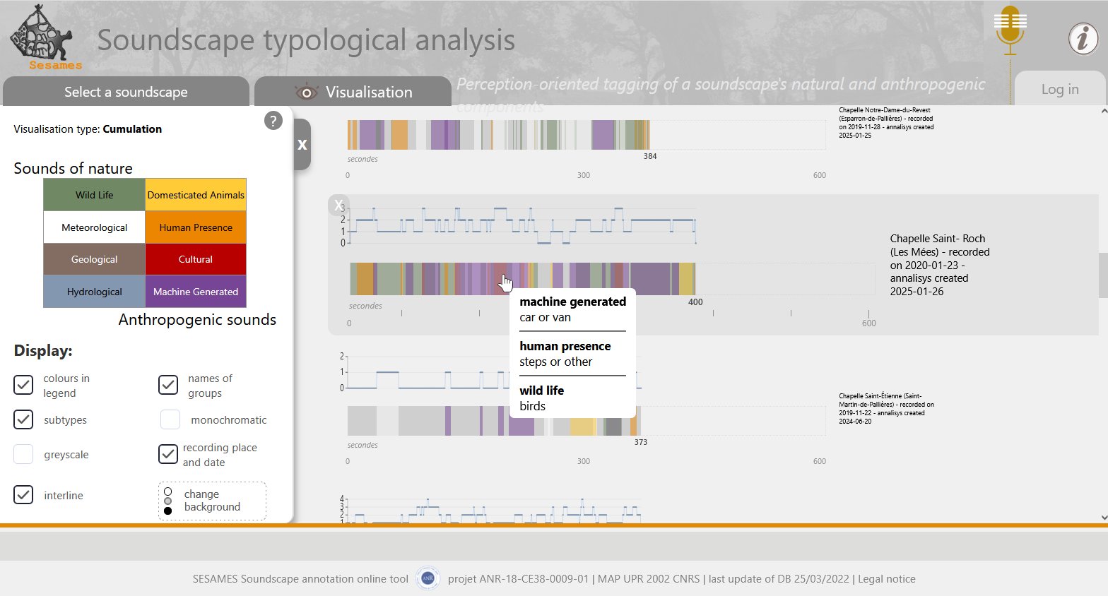
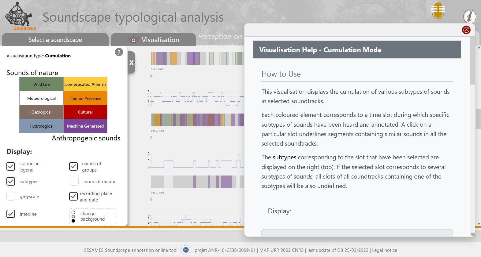
• Cumulation
This visualisation displays the cumulation of various subtypes of sounds in selected soundtracks.
Each coloured element corresponds to a time slot during which specific subtypes of sounds have been heard and annotated. A click on a particular slot underlines segments containing similar sounds in all the selected soundtracks. The subtypes corresponding to the slot that have been selected are displayed on the right (top). If the selected slot corresponds to several subtypes of sounds, all slots of all soundtracks containing one of the subtypes will be also underlined.
I. Dudek (pilotage, conception, vérification), J.Y. Blaise (participation à la conception, alimentation de la BD, vérification), A. Devogelaere (implémentation, debugge)
Implementation of a tool for comparative visual analysis of annotated soundtracks in the “Soundscape typological analysis” prototype, where segments of a soundtrack are associated with different types of sound source. The sound sources are identified and organised according to a typology developed beforehand, differentiating between two major groups: sounds of nature and man-made sounds.
The aim is to provide a visual comparison of the human perception of the acoustic ambience of the sound environment.
The approach is based on a combination of qualitative and quantitative methods. The aim is to verify whether and how a visual comparison of soundscape annotations can help their understanding both for scientists and for the general public, including the hearing impaired people. The research aims to explore of ideas, without first considering that it will lead to a particular application or practical use.
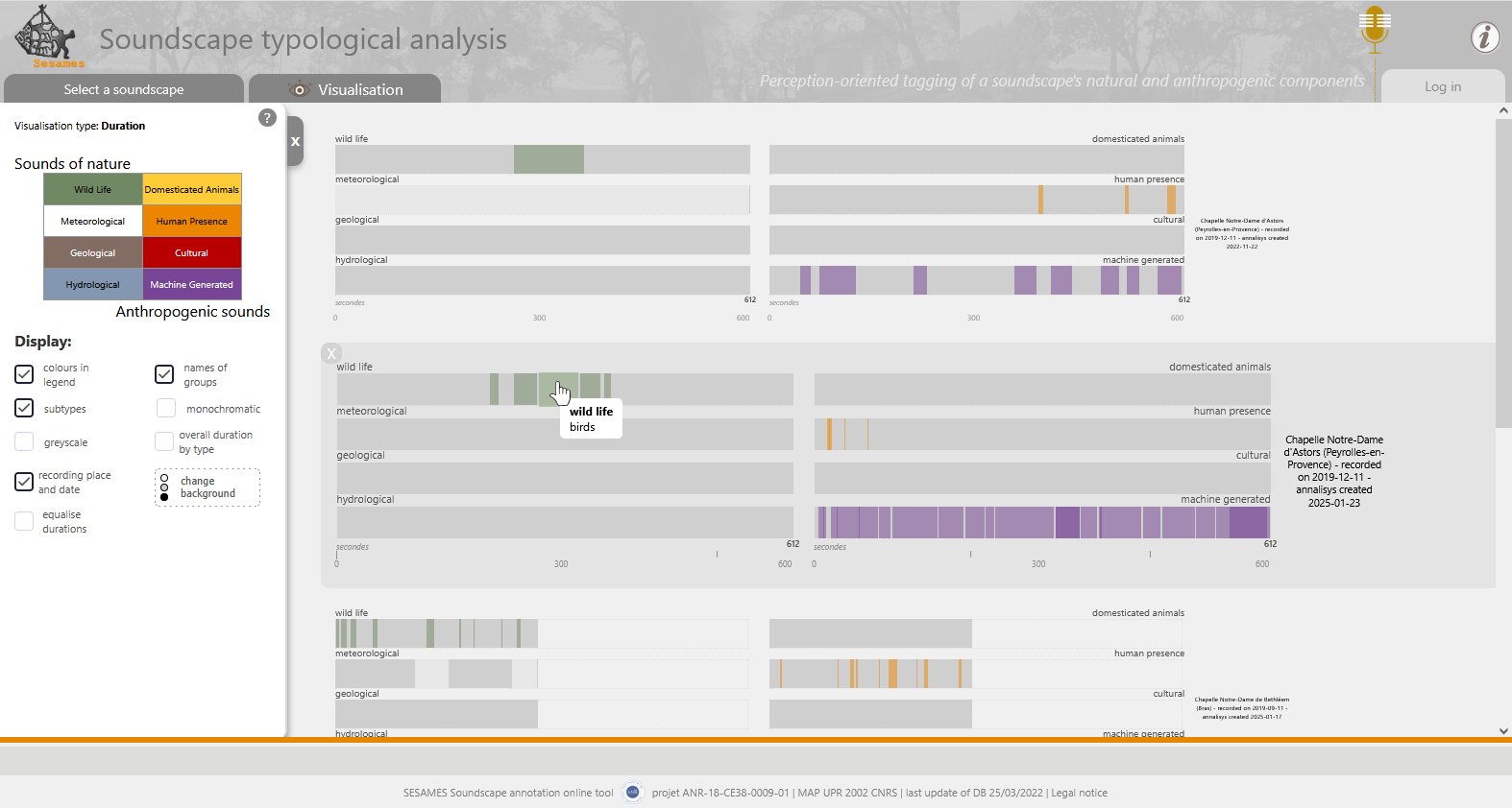
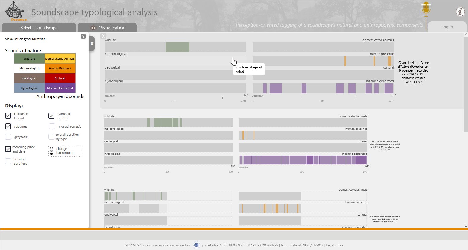
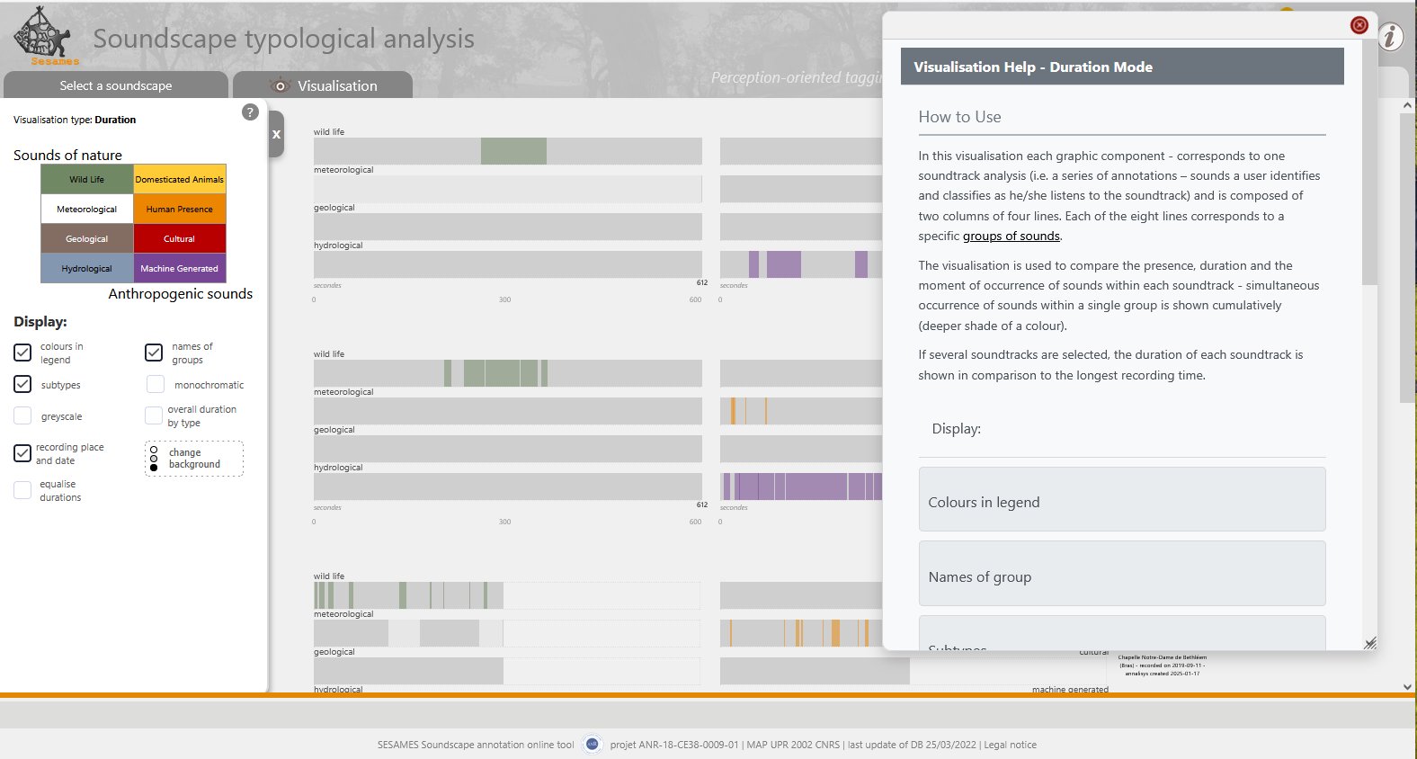
• Duration
The annotated sound track is represented here as a set of two columns containing rows. Each column represents groups of sounds (for example, ‘wild animals’) and each of the eight rows corresponds to a specific type of sound (for example, ‘insects’).
The visualisation is designed to compare the duration and the moment of occurrence of sounds within each soundtrack. The simultaneous appearance of sounds is represented in a cumulative way (shades of colour depth).
I. Dudek (pilotage, conception, vérification), J.Y. Blaise (participation à la conception, alimentation de la BD, vérification), A. Devogelaere (implémentation, debugge)
Implementation of a tool for comparative visual analysis of annotated soundtracks in the “Soundscape typological analysis” prototype, where segments of a soundtrack are associated with different types of sound source. The sound sources are identified and organised according to a typology developed beforehand, differentiating between two major groups: sounds of nature and man-made sounds.
The aim is to provide a visual comparison of the human perception of the acoustic ambience of the sound environment.
The approach is based on a combination of qualitative and quantitative methods. The aim is to verify whether and how a visual comparison of soundscape annotations can help their understanding both for scientists and for the general public, including the hearing impaired people. The research aims to explore of ideas, without first considering that it will lead to a particular application or practical use.
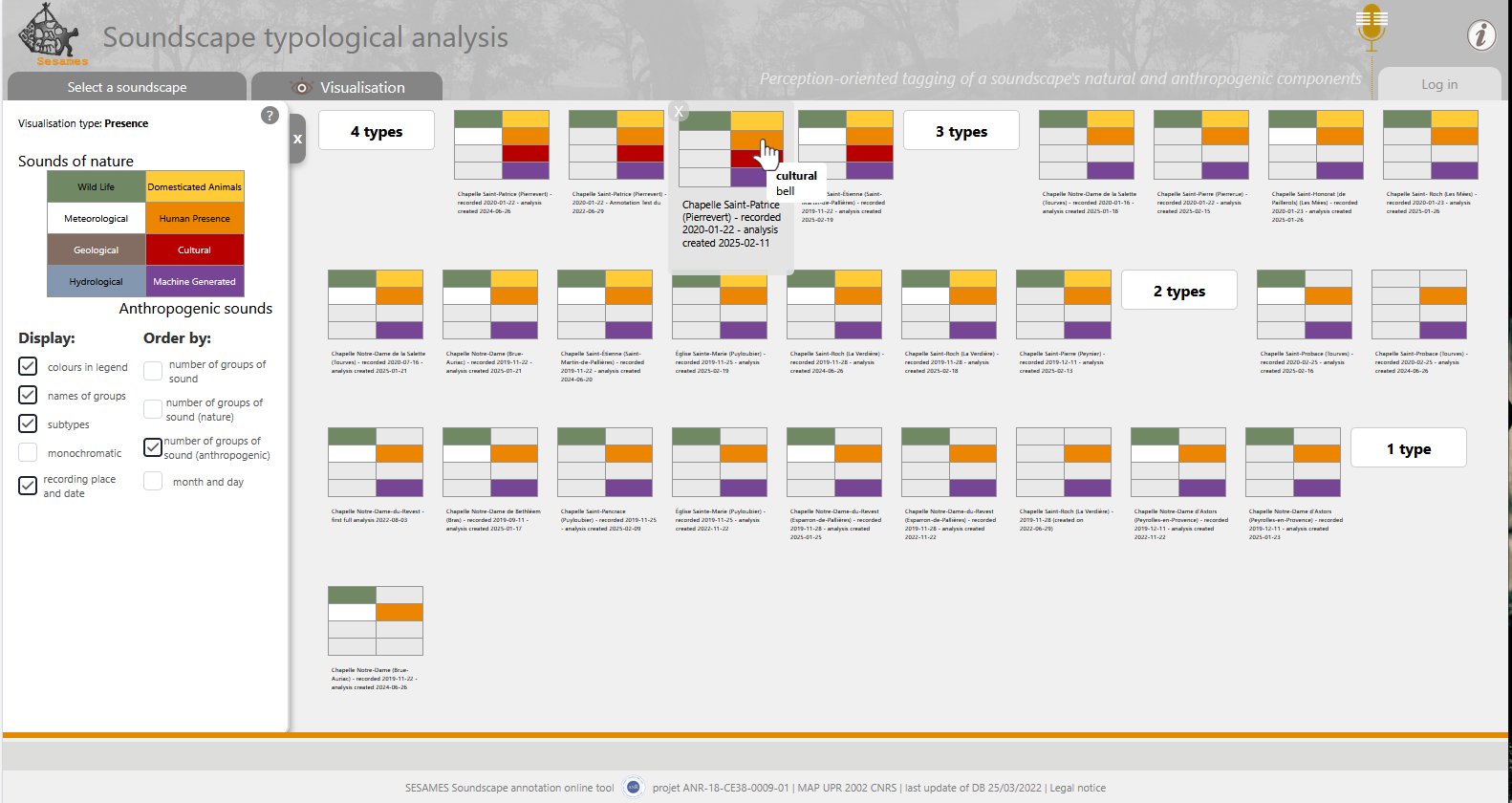
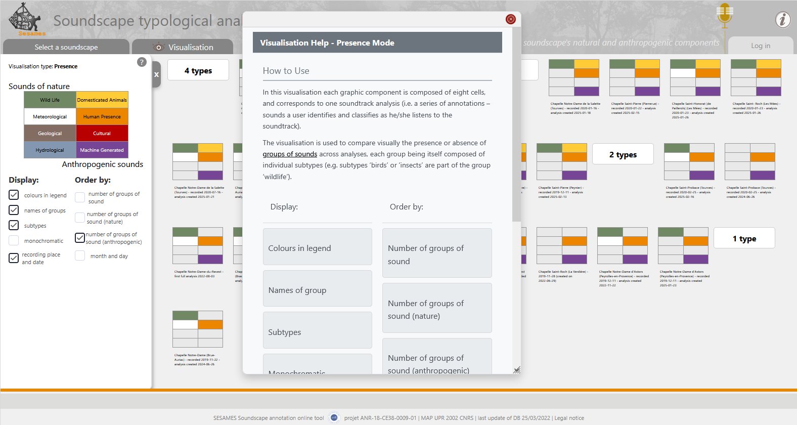
• Presence
In this visualisation each graphic component is composed of eight cells, and corresponds to one soundtrack analysis (i.e. a series of annotations – sounds a user identifies and classifies as he/she listens to the soundtrack). The visualisation is used to compare visually the presence or absence of groups of sounds across analyses, each group being itself composed of individual subtypes (e.g. subtypes ‘birds’ or ‘insects’ are part of the group ‘wildlife’).
I. Dudek, J.Y. Blaise
visualisation of the semantic fields of concepts
I. Dudek (pilotage, conception), J.Y. Blaise (participation à la conception, alimentation de la BD)
Design and implementation of a tool for comparative visual analysis of annotated soundtracks in the “Soundscape typological analysis” prototype, where segments of a soundtrack are associated with different types of sound source. The sound sources are identified and organised according to a typology developed beforehand, differentiating between two major groups: sounds of nature and man-made sounds.
The aim is to provide a visual comparison of the human perception of the acoustic ambience of the sound environment.
Three visualisation modes (presence, duration and accumulation) have been designed and implemented to allow visual evaluation of variations in the annotation of the same soundtrack by different people, or comparisons of the annotations of different soundtracks.
The approach is based on a combination of qualitative and quantitative methods. The aim is to verify whether and how a visual comparison of soundscape annotations can help their understanding both for scientists and for the general public, including the hearing impaired people. The research aims to explore of ideas, without first considering that it will lead to a particular application or practical use.
J.Y. Blaise, I. Dudek
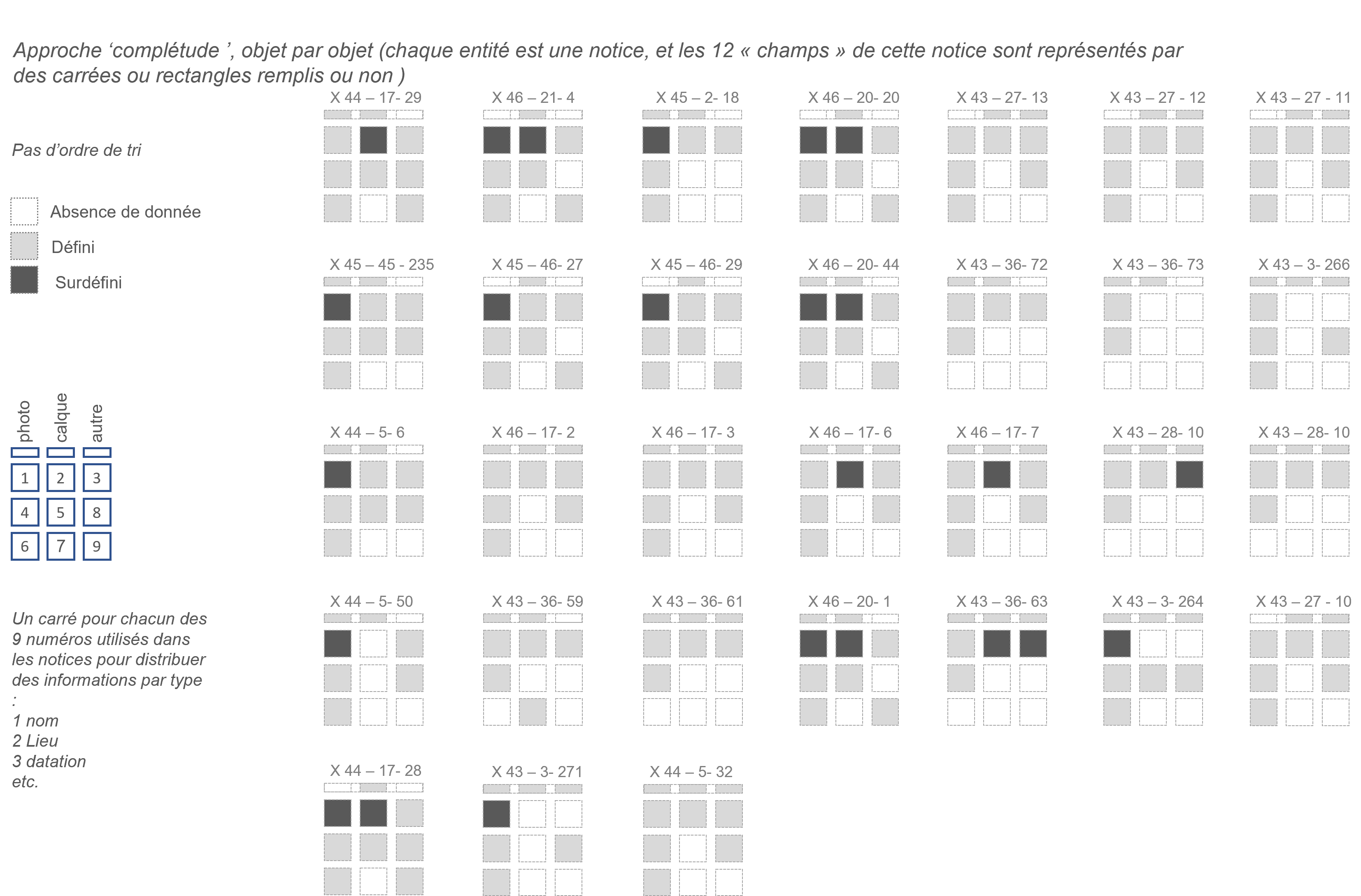
Prefiguration of visual tools for analysing the quality and completeness of object records contained in one of the MuCEM’s collection, the “X file”.
These visualizations serve as a basis for discussion/exploration of possibilities in the context of work in preparation between MAP and MuCEM around the museum's Agriculture and Food collection.
J.Y. Blaise (conception, pilotage), I. Dudek (participation à la conception), R. Lançon-Ville (implémentation)
An online visual tool for representing and comparing architectural profiles, whatever the underlying 3D object. The development of this online interface is based on an original “Universal Characterization of Molded Profiles” formalism we introduced in previous research works. This formalism makes it possible to reduce different types of 3D molded objects to a common analysis mechanism, by reducing each 3D object to a 2D profile (the profile is described as a list of segments - molded or not - isolated by control points corresponding to significant curve inversions). This formalism is used to render the fundamental features of a molded object (rhythms, proportions, sequences, etc.) in abstract graphic form. The online tool is a proof-of-concept that combines raw data (XML), segments represented in a 2D grid, the abstract visualization and 3D evocation of profiles, all of which can be manipulated and modified at the user's request.
I. Dudek, J.Y. Blaise
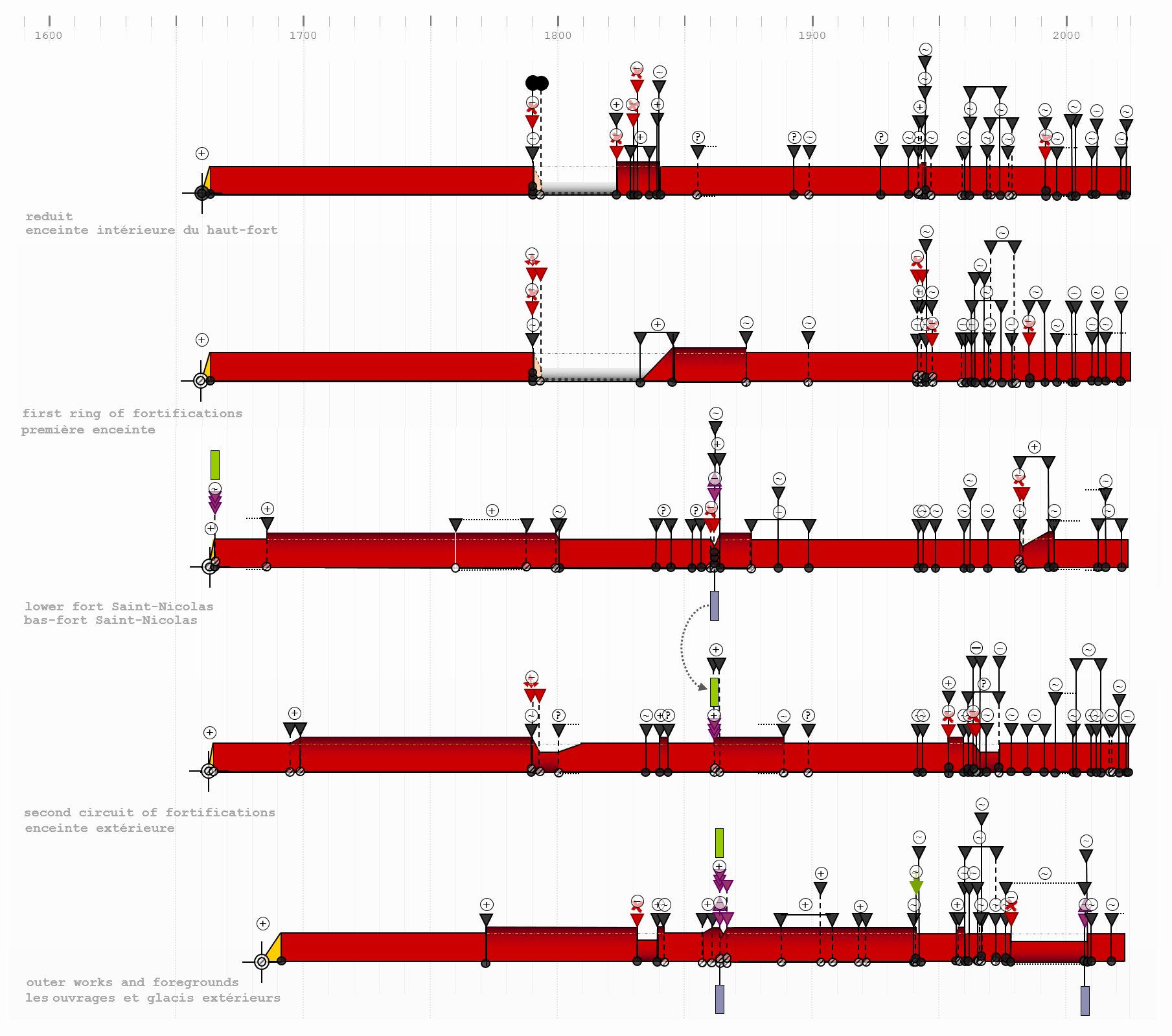
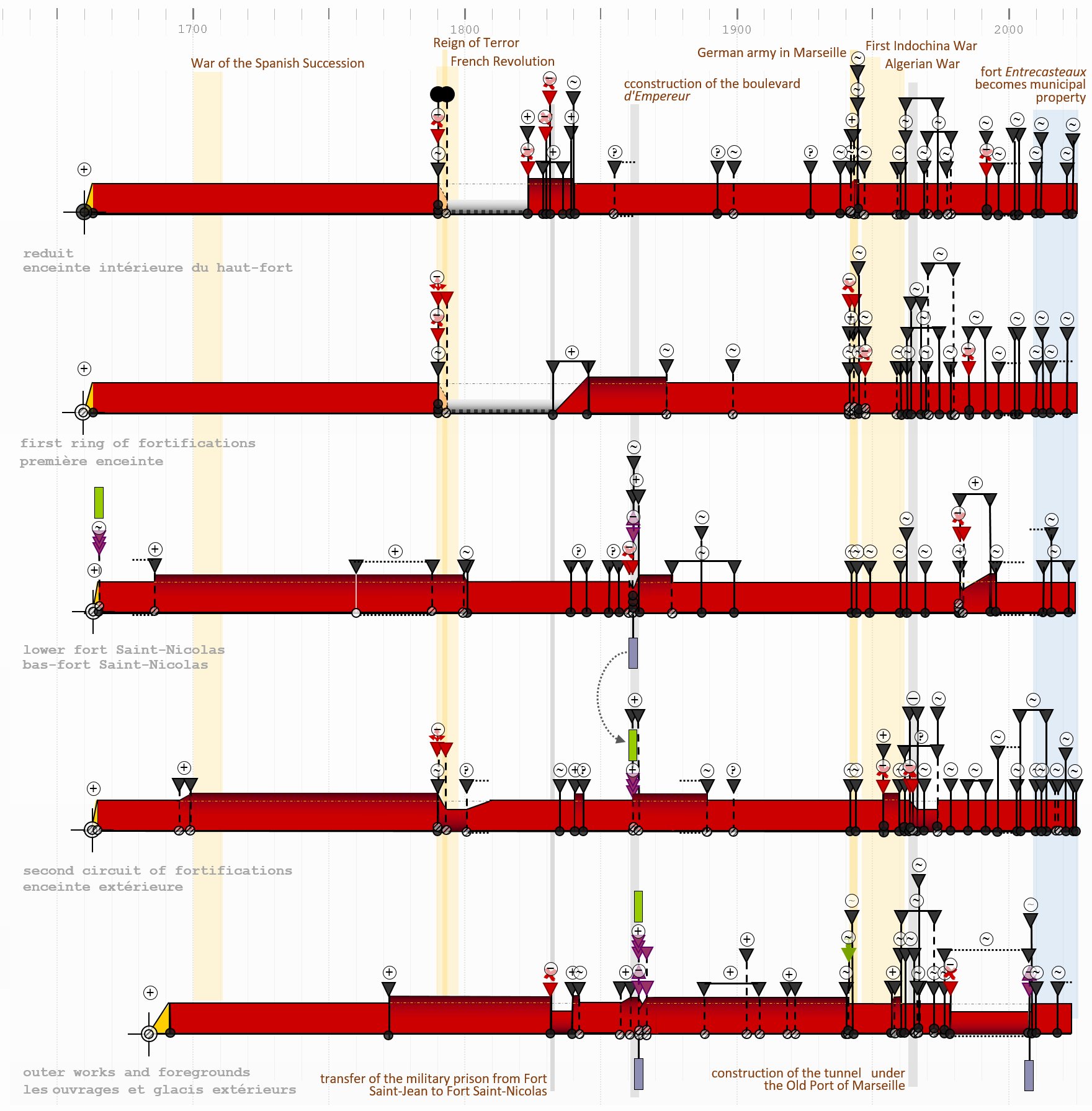
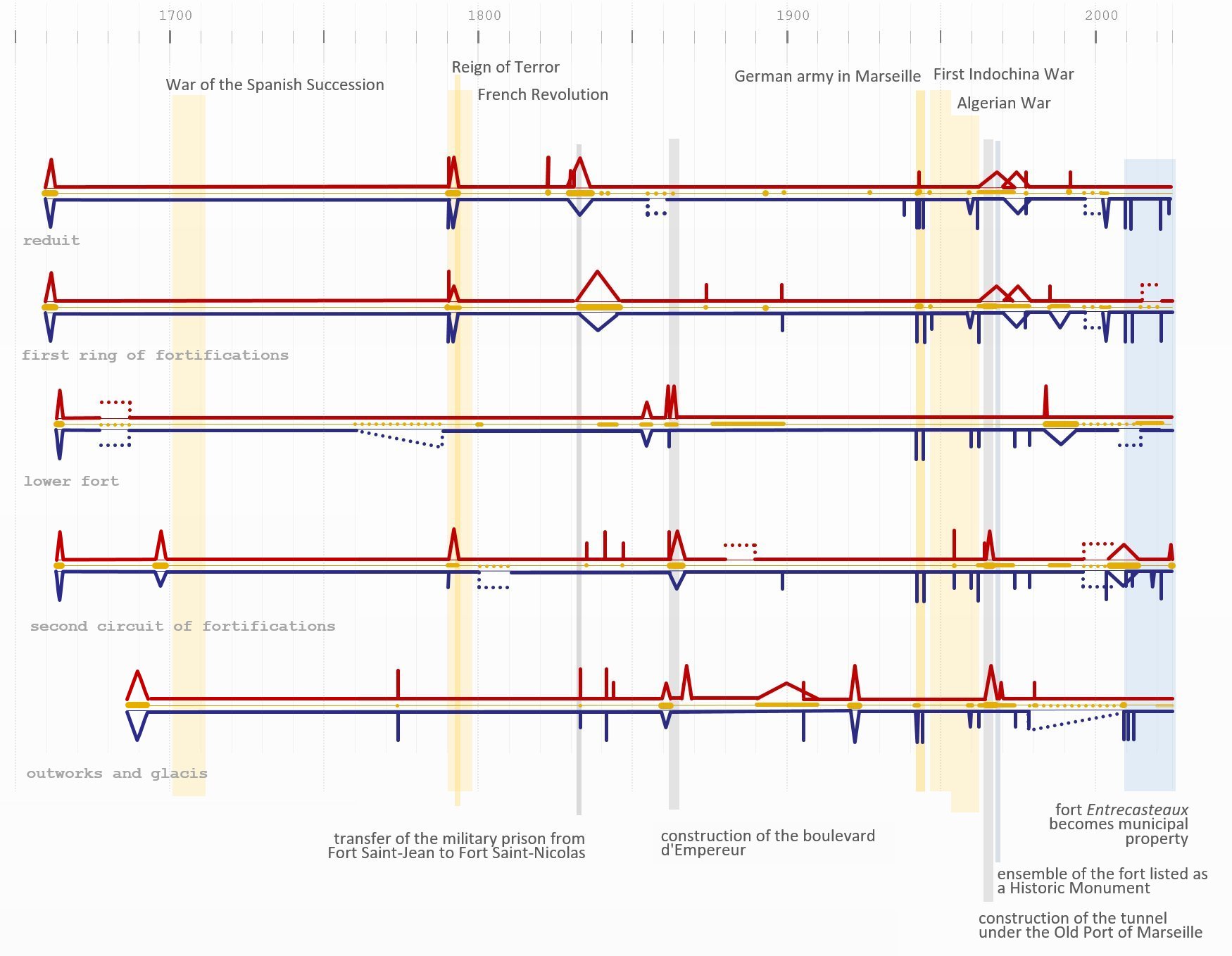
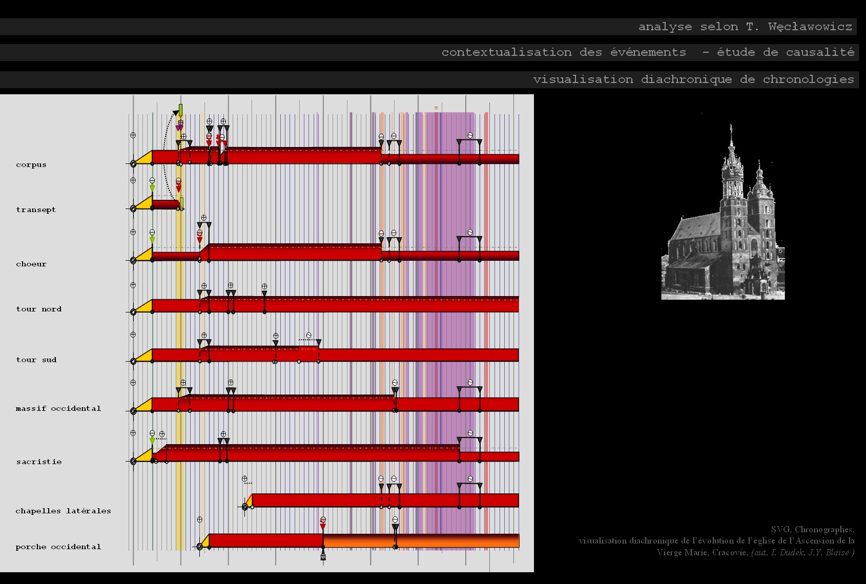
A compilation of individual diagrams of sub-parts of the fort of Saint-Nicolas in Marseille using a ‘multiple perspectives’ approach and a common contextualisation to gain insight into the main phases of the site's evolution. Placing the ensemble of elements in a broader historical context helps to pinpoint the possible causes of successive transformations.
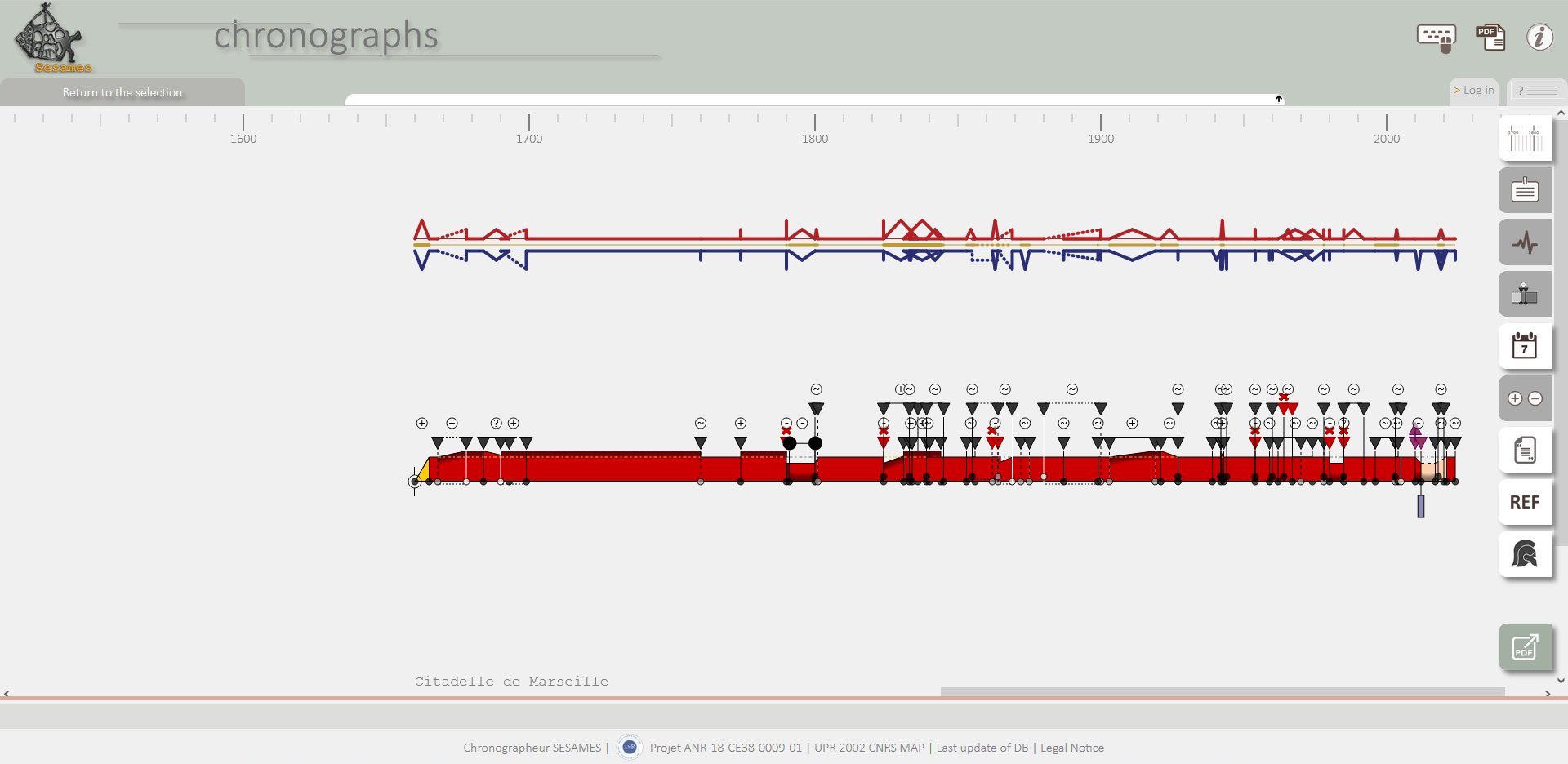
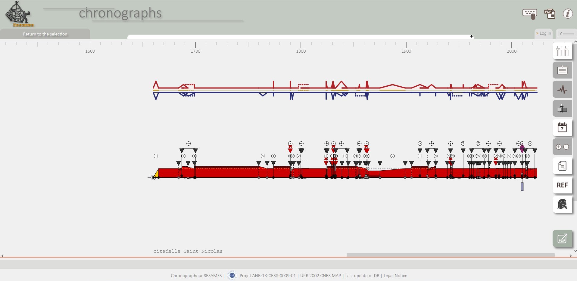
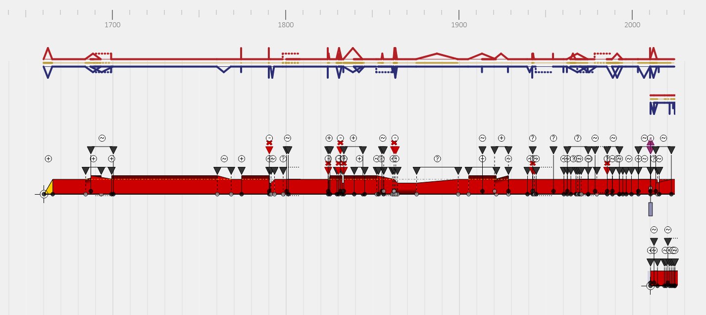
J.Y. Blaise, I. Dudek
Diachronic analysis of the fort Saint-Nicolas (Marseilles) recorded and visualised using the online application 'chronographs' conducted in two separated phases.
The first phase involved two analyses of the fort at Saint-Nicolas - the fort was considered here as a whole (i.e. as a single object). The analyses were carried out by two independent analysts on the basis of the same documentation - a conservatory's report (I. Guérin). They resulted in diagrams relating to the citadel of Saint-Nicolas and the fort of Entrecasteaux (after the sale of the upper part of the fort to the town). We then compared the diagrams obtained in order to highlight any differences in interpretation of the report's content by different analysts.
J.Y. Blaise
Diachronic analysis of the transporter bridge in Marseille recorded and visualised using the online application 'chronographs'.
A simple example produced for teaching purposes - illustration of the diachronic analysis model, the analysis methods (diachronic tables) and the results of the interactive visualisations.
I. Dudek, J.Y. Blaise
This PDF document is a graphical translation of the information gathered and structured in a memoria workflow diagram. It is dynamically generated and can be created and downloaded for any process (currently only available in the version dedicated to MEMORIA IS development).
The document contains :
- URL links to items corresponding to the process selected in the SI MEMORIA,
- a set of metadata and paradata corresponding to this process (e.g. name of the process, comments, dates, lists of external sources, inputs outputs, previous processes, instruments used, individuals and organisations involved in its creation, etc.)
- a process diagram enriched with a grid to facilitate the identification of individual activities,
- metadata and description of individual activities organised and structured (by alphanumeric code).
J.Y. Blaise (conception, pilotage), I. Dudek (conception)
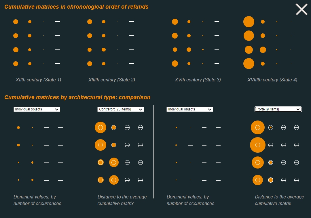
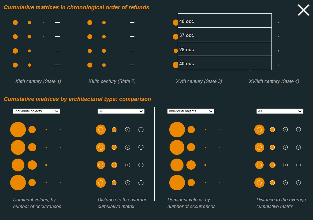
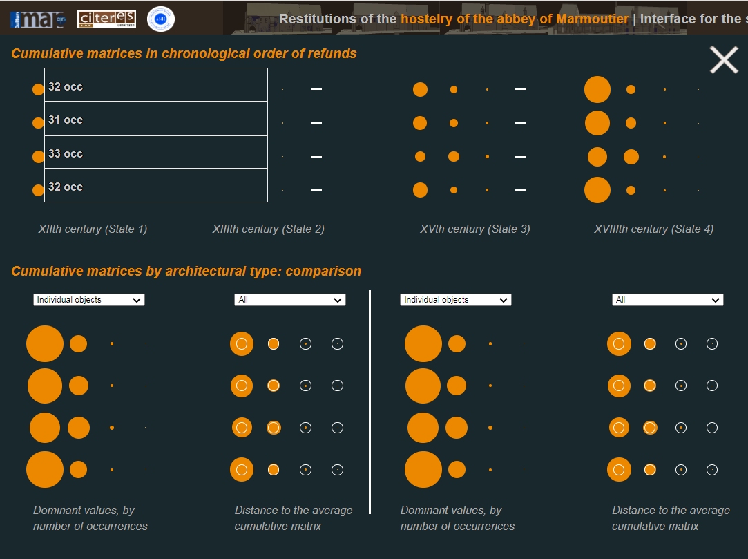
The basic interaction modes developed in the Justifiers IS web interface focus on the use of a 3D environment that allows a user to interact with one architectural element, or one matrix, and one synchronic state at a time.
A more abstract visualisation has also been developed, building on the concept of ‘cumulative matrices’. Cumulative matrices base on the same visual formalism as this used elsewhere in the interface: a grid in which each row corresponds to a plausibility criterion (existence, location, shape, and dimension) and each column corresponds to a plausibility value (attested, likely, possible, unassessed). The visualisation shows in an abstract way values for collections of elements, either promoting chronological comparisons across the four synchronic states, or comparisons basing on architectural types.
J.Y. Blaise (conception, pilotage), I. Dudek (participation à la conception), R. Lançon-Ville (implémentation)
Exploratory work on the visualisation of relationships between concepts in an original device inspired by the distance tables found in certain road atlases, for example. This visualisation serves as a general map of the relationships between concepts, but it is still work in progress.
I. Dudek, J.Y. Blaise
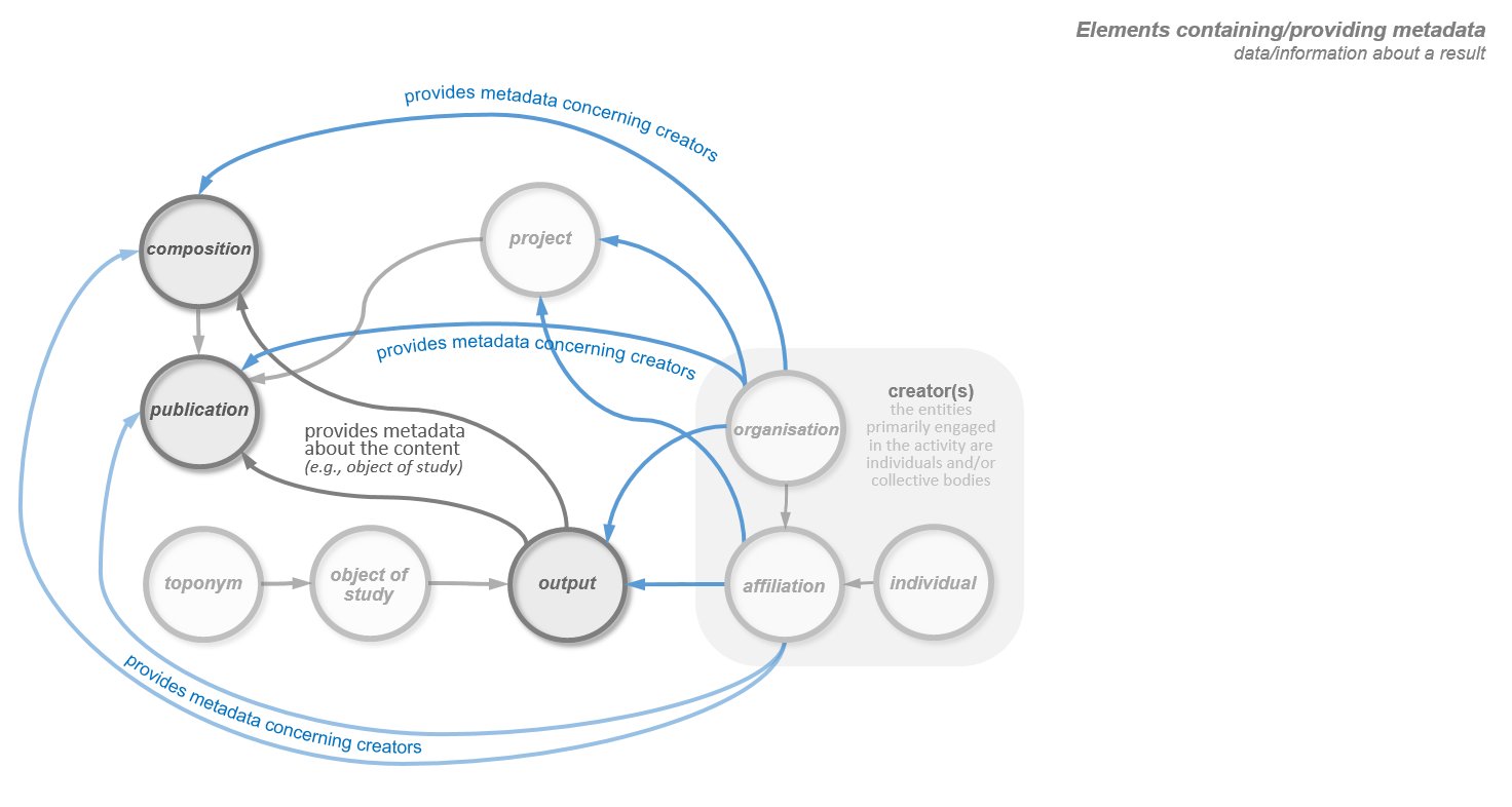
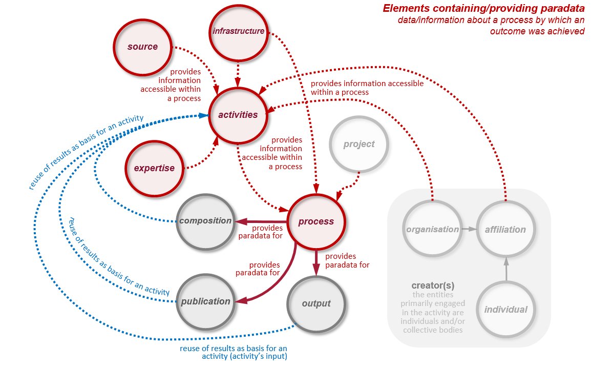
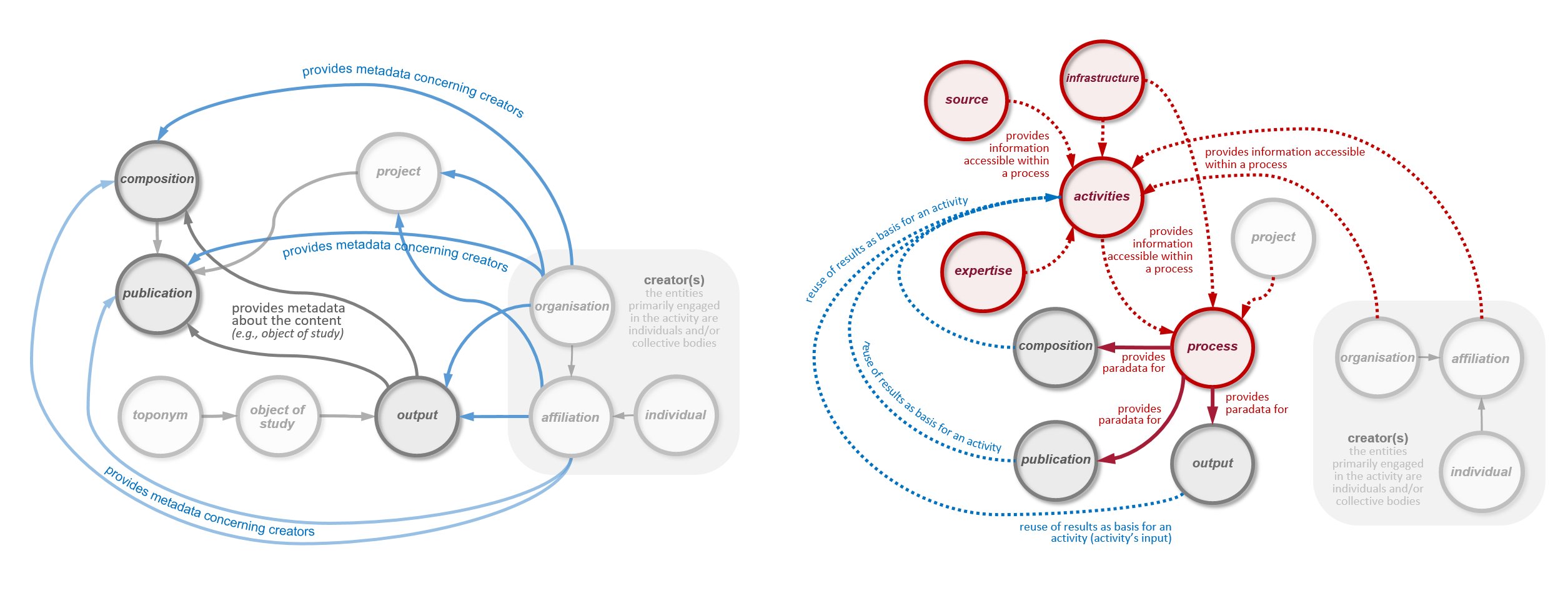
A collection of still visualisations showing how the notion of metadata and paradata is deployed in practical terms in the MEMORIA IS.
The role of metadata in the system is to facilitate the search and filtering of results and to enable their comparative analysis. Paradata concerns the process of results’ production. Their function in the system is to enable the protocols involved in producing the results to be recorded, shared and explained, and to enable their comparative analysis.
J.Y. Blaise, I. Dudek, A.K. Assoumane Mamane
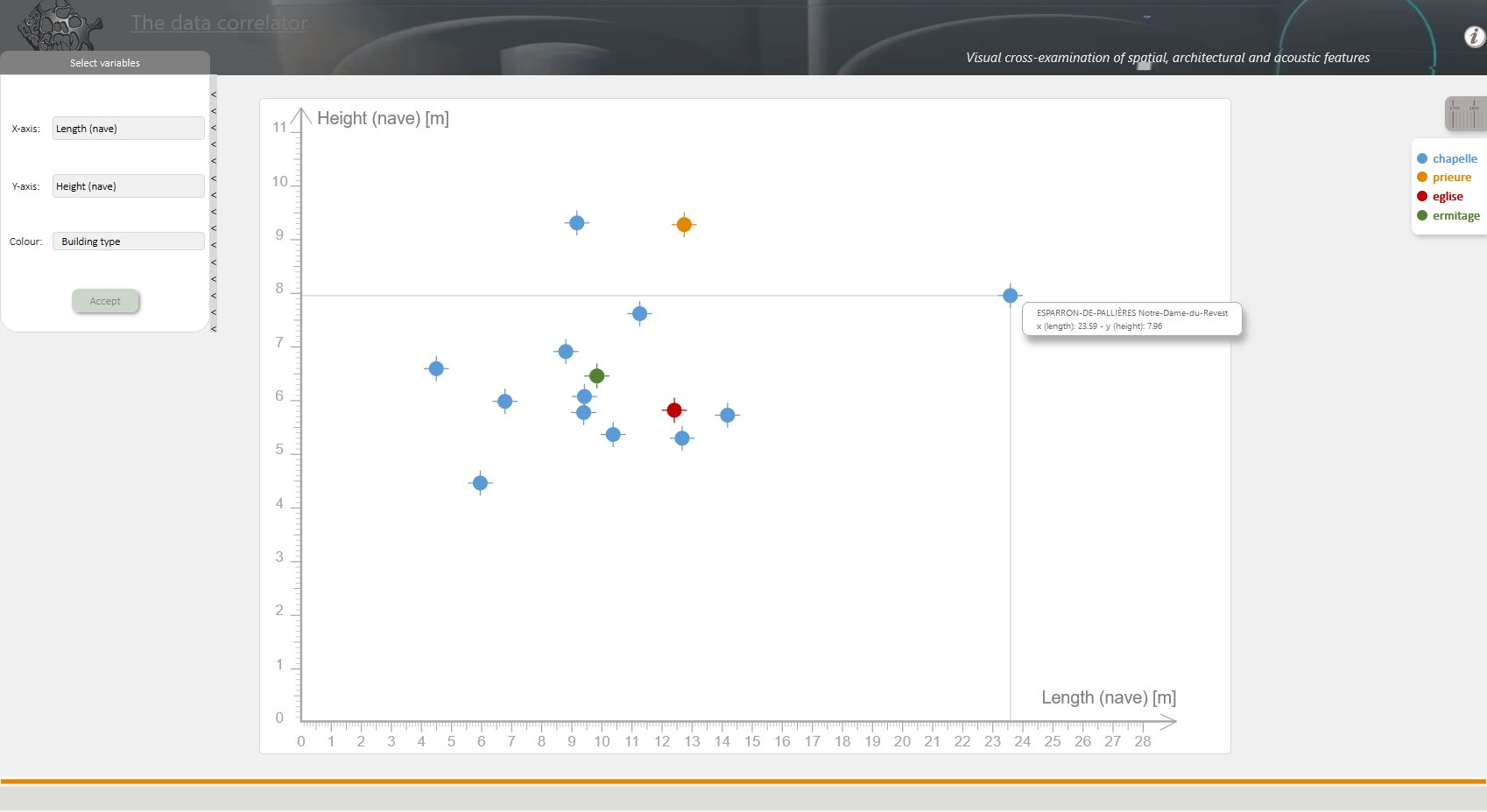
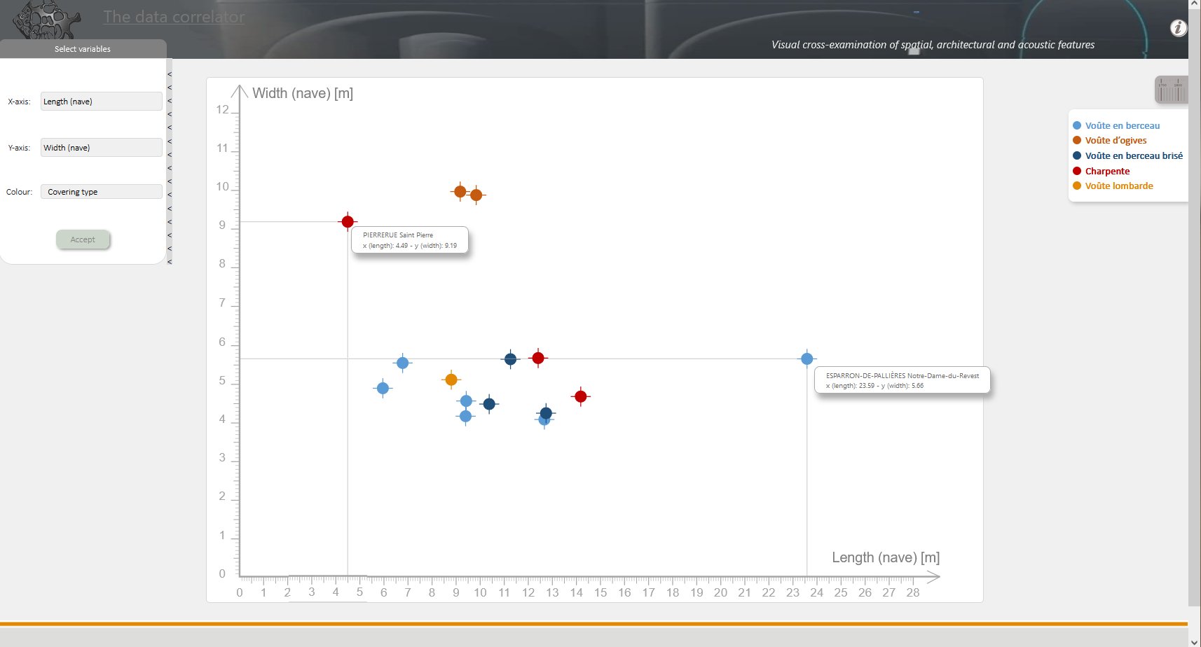
Visualisation based on the distribution plot formalism. It allows you to read the biunivocal correlations (or non-correlations) between acoustic indicators and dimensional data. The colours are used to map architectural features.
The visualisation is integrated within the SESAMES spatial, architectural and acoustic data correlator (a repertoire of visualization devices used to correlate a range of data sets acquired as part of the SESAMES research programme, ANR-18-CE38-0009-01 project). The purpose of the correlator is not only to facilitate the analysis (by a human expert) of the correlation between different architectural and acoustic parameters in a rural chapel, but also to compare different architectural object.
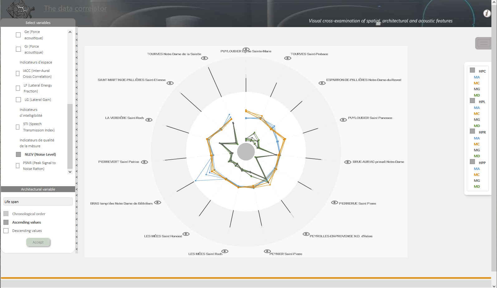
J.Y. Blaise, I. Dudek, A.K. Assoumane Mamane
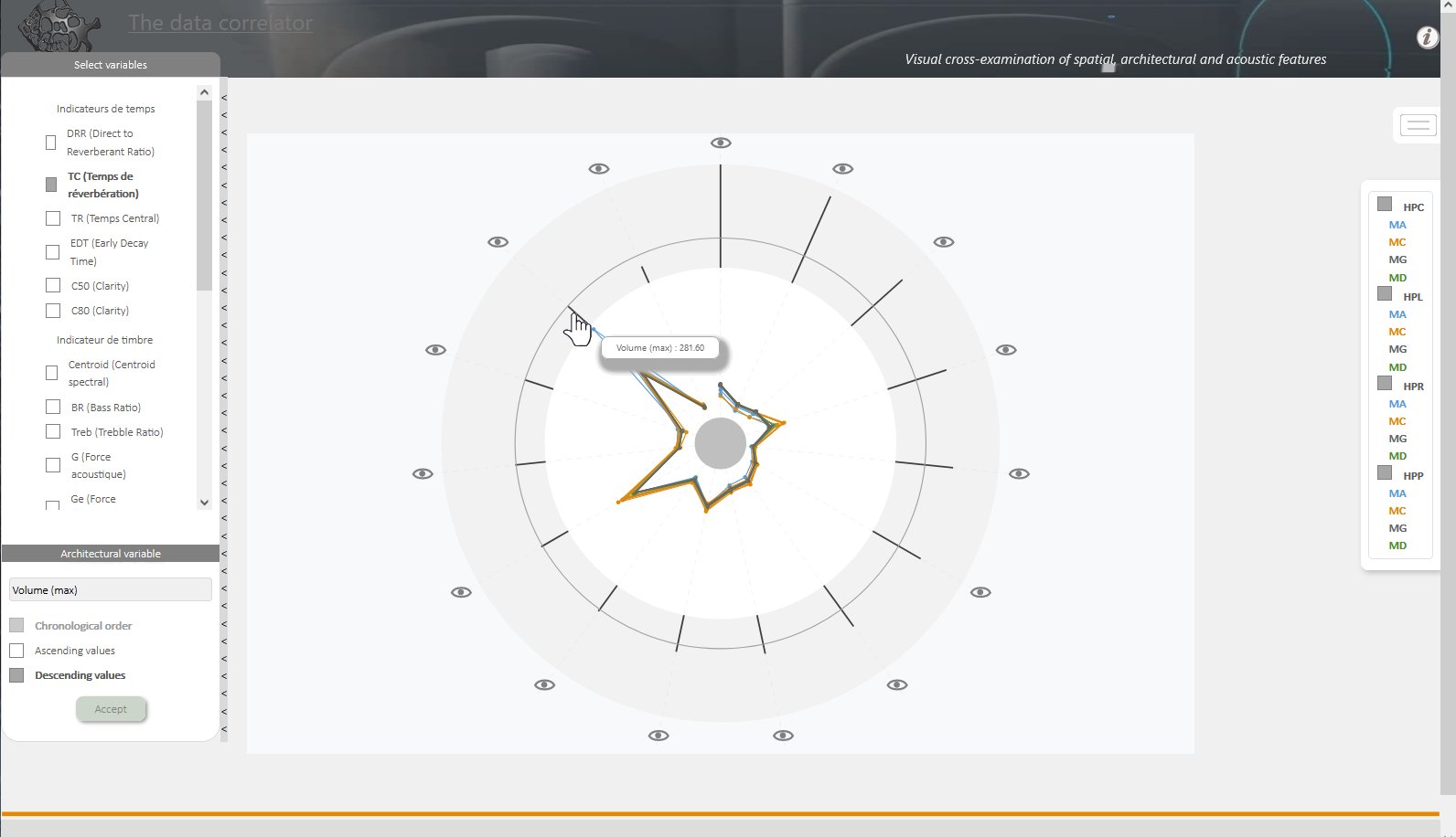
Visualisation based on the classic radar chart formalism. Allows a comparative reading of acoustic indicators as calculated for different emission/reception points tuples, across the collection of edifices. Order of radials according to architectural variables.
The list of architectural parameters taken into account includes: building lifespan, height (max.), length (max.), width (max.), volume (max.), wall thickness and orientation. Acoustic variables include indicators of time (reverberation time, direct to reverberant ratio, central time, early decay time, C50 - clarity, C80 - clarity ), timbre (centroid spectral, bass ratio, treble ratio, acoustic strength - G, Ge, Gi), space (inter-aural cross correlation, lateral energy fraction, lateral gain), intelligibility indicator (speech transmission index) and measurement quality (noise level, peak signal to noise ratio).
The visualisation is integrated within the SESAMES spatial, architectural and acoustic data correlator (a repertoire of visualization devices used to correlate a range of data sets acquired as part of the SESAMES research programme, ANR-18-CE38-0009-01 project). The purpose of the correlator is not only to facilitate the analysis (by a human expert) of the correlation between different architectural and acoustic parameters in a rural chapel, but also to compare different architectural object.
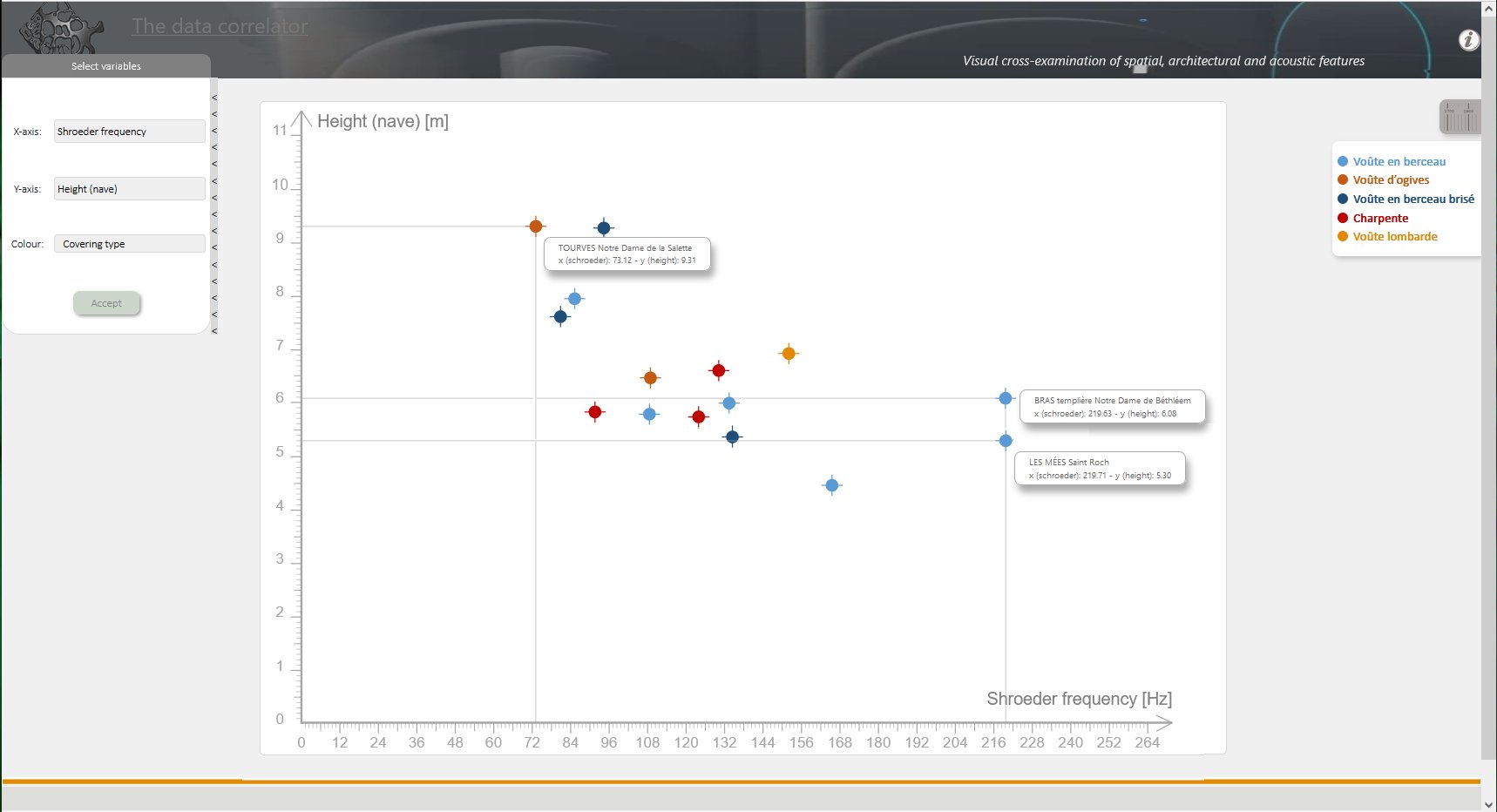
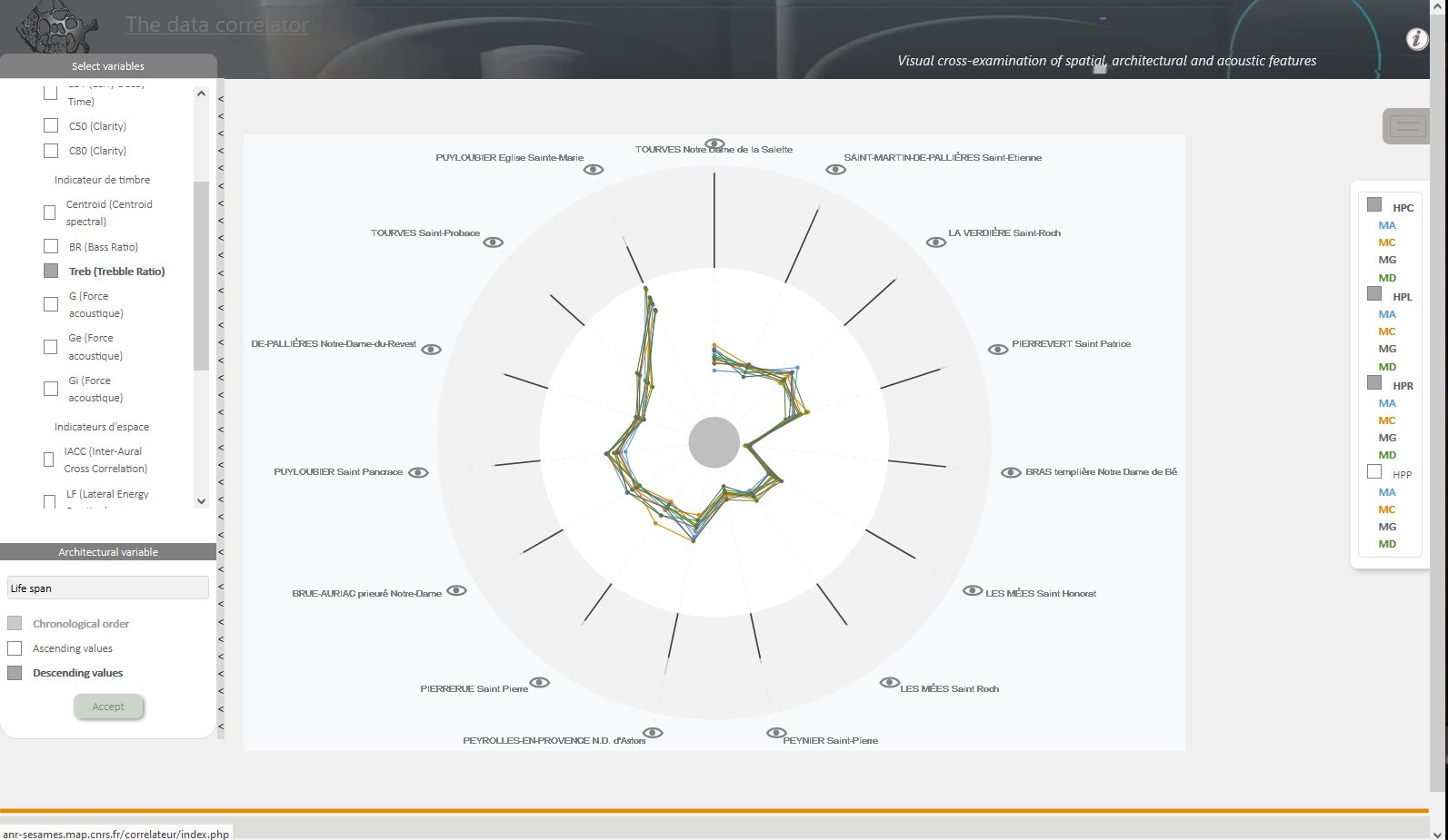
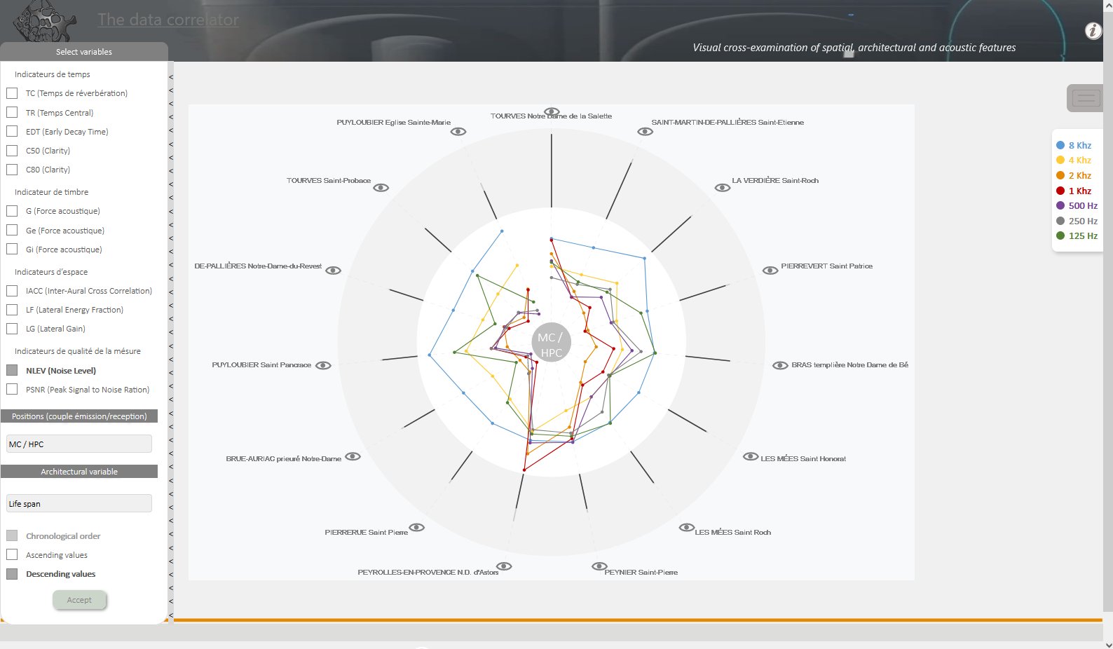
J.Y. Blaise, I. Dudek, A.K. Assoumane Mamane
Visualisation based on the classic radar chart formalism. Allows a comparative reading of frequency-dependent acoustic indicators, across the collection of edifices. Order of radials according to architectural variables.
The list of architectural parameters taken into account includes: building lifespan, height (max.), length (max.), width (max.), volume (max.), wall thickness and orientation. Acoustic variables include indicators of time (reverberation time, central time, early decay time, C50 - clarity, C80 - clarity ), timbre (acoustic strength - G, Ge, Gi), space (inter-aural cross correlation, lateral energy fraction, lateral gain ) and measurement quality (noise level, peak signal to noise ratio).
The visualisation is integrated within the SESAMES spatial, architectural and acoustic data correlator (a repertoire of visualization devices used to correlate a range of data sets acquired as part of the SESAMES research programme, ANR-18-CE38-0009-01 project). The purpose of the correlator is not only to facilitate the analysis (by a human expert) of the correlation between different architectural and acoustic parameters in a rural chapel, but also to compare different architectural object.
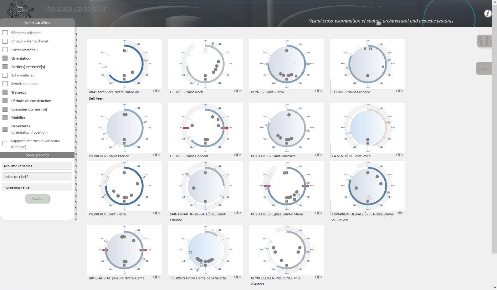
J.Y. Blaise, I. Dudek, A.K. Assoumane Mamane
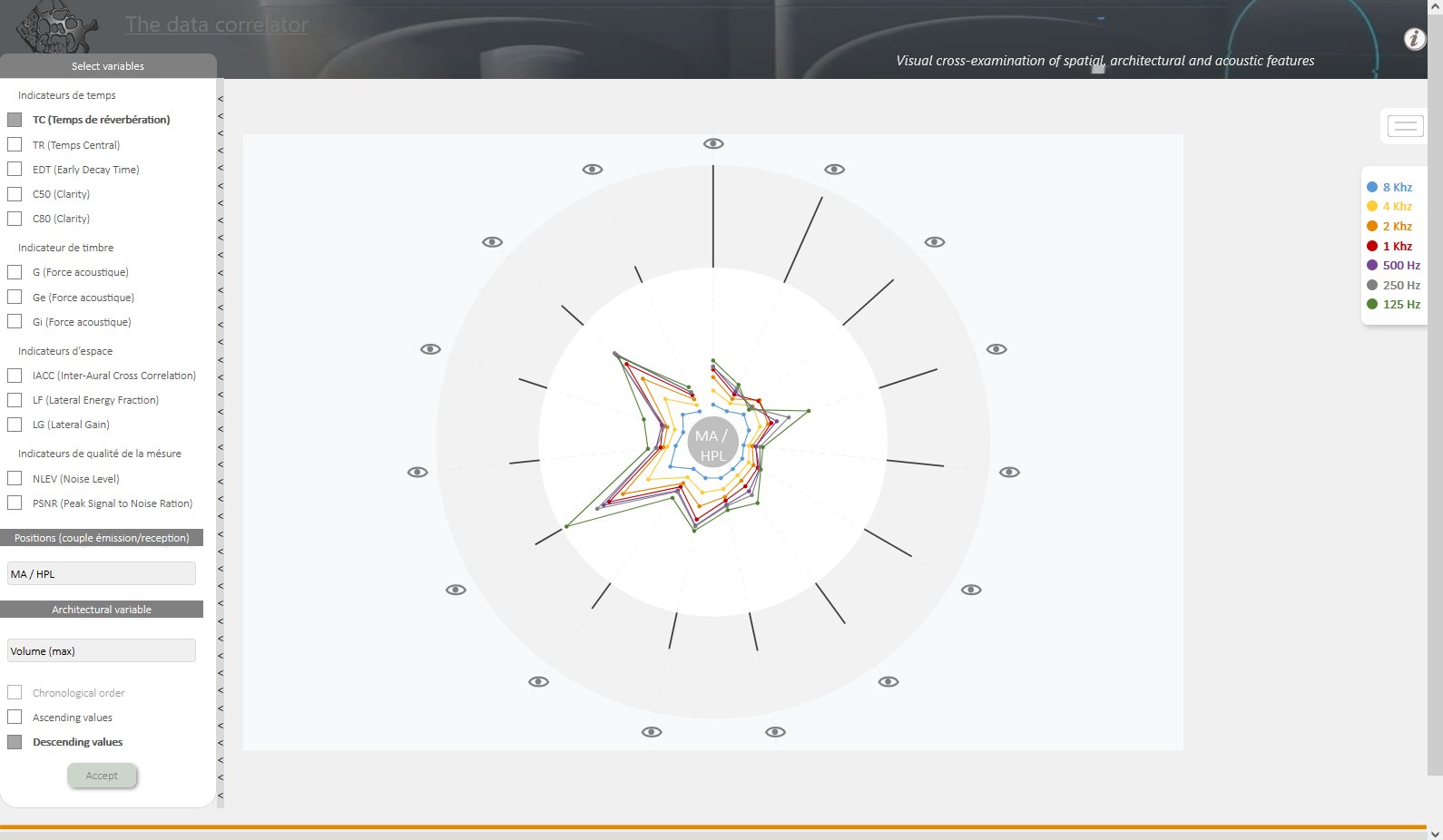
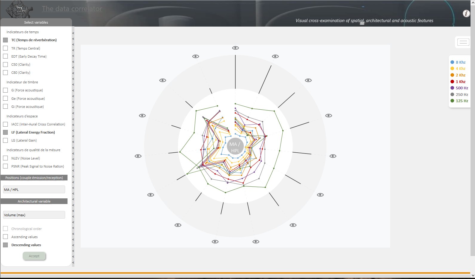
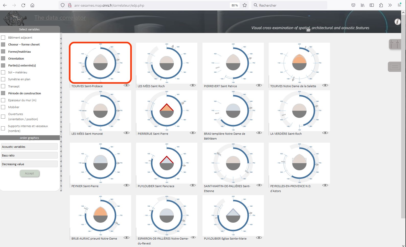
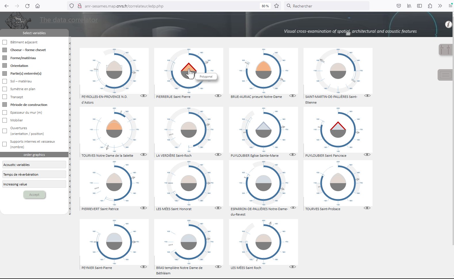
Development of a visualisation enabling visual cross-examination of spatial, architectural and acoustic features integrated within the SESAMES spatial, architectural and acoustic data correlator (a repertoire of visualization devices used to correlate a range of data sets acquired as part of the SESAMES research programme, ANR-18-CE38-0009-01 project).
The purpose of the correlator is not only to facilitate the analysis (by a human expert) of the correlation between different architectural and acoustic parameters in a rural chapel, but also to compare different architectural object.
The list of architectural parameters taken into account includes: materials used, shape of choir, characteristics of the ground (material), symmetry in plan, orientation of the building, presence of a transept, period of construction, thickness of the wall (m), presence of furnishings, openings (orientation and position), internal supports and vessels (number), adjacent buildings, presence and position of buried parts.
Acoustic variables include reverberation time, clarity index, acoustic strength, bass ratio and treble ratio.
J.Y. Blaise, I. Dudek, C. Zekhnini
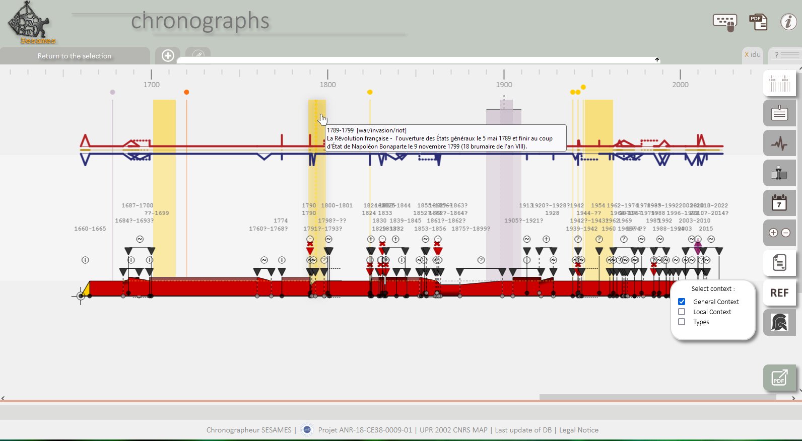
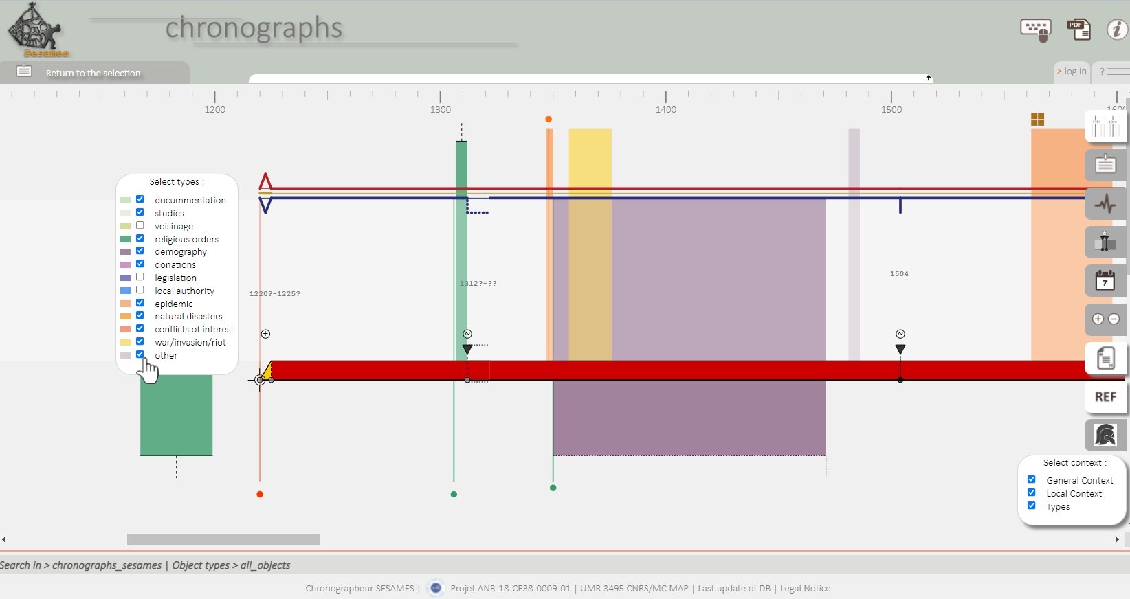
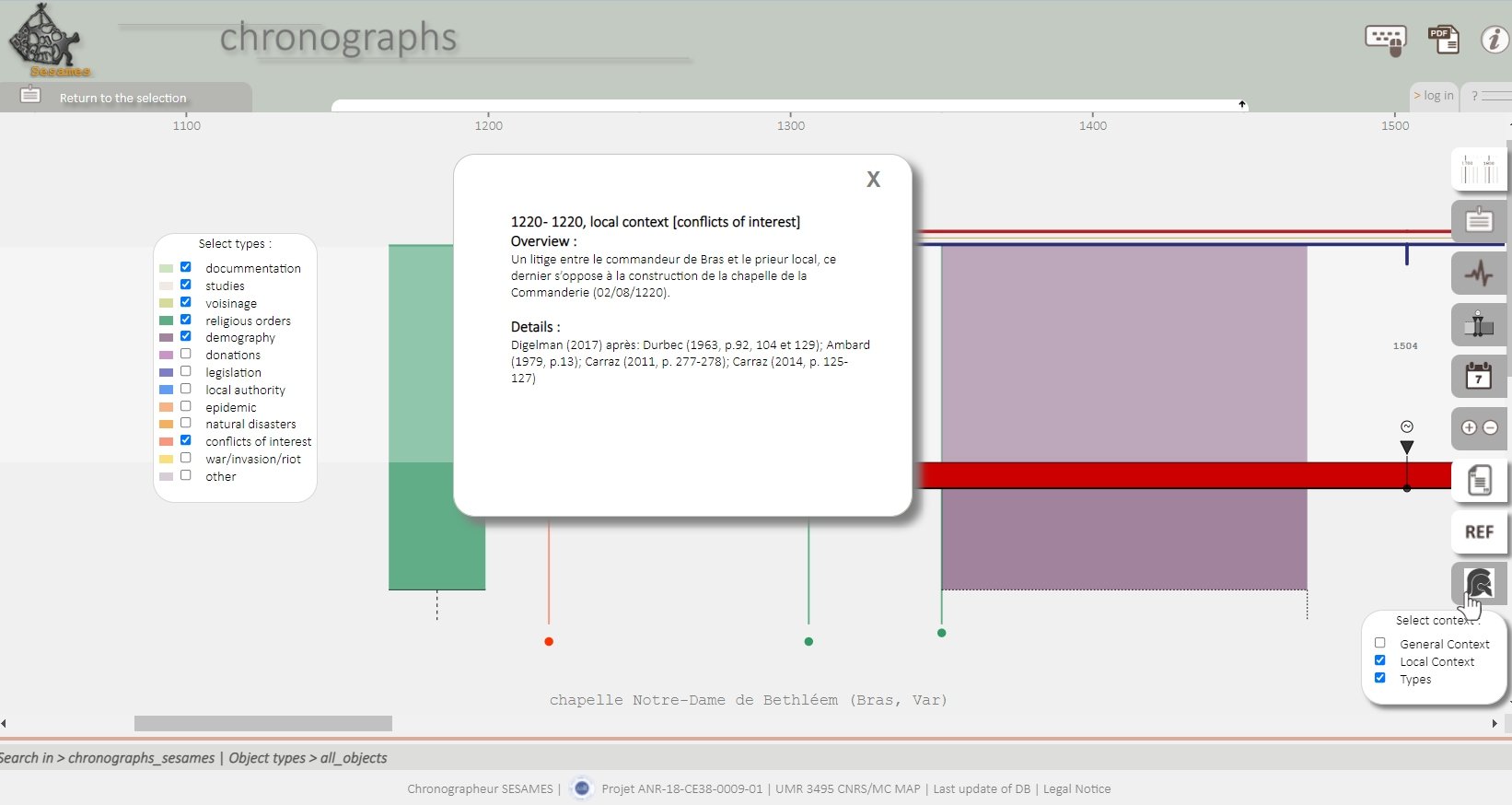
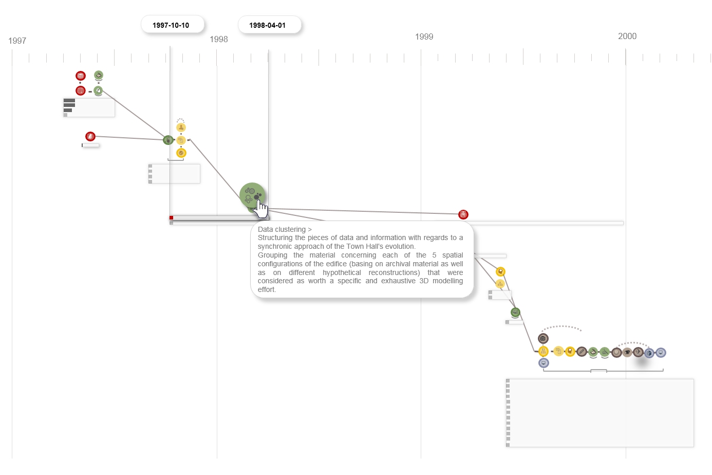
Extension of the chronographs graphic language to exploit the historical context data sets associated with the chronologies described via the chronographs states and transitions model.
Introduction of graphical components that are inserted in the background of diachrograms and variograms, and that map visually the ‘nature’ of each contextual data (date, duration, type, scope). Fours graphic variables are used - dimension, position, shape and colour. The situations when contextual elements overlap in time are among the difficult points (both in terms of graphic coding and user interaction) specific to this work. The interface allows users to filter types and scope of context to be displayed, in order to lighten the graph and to help highlight possible correlations between context elements and architectural changes.
I. Dudek (design, testing), J.Y. Blaise (design participation), M. Rabefandroana (implementation)
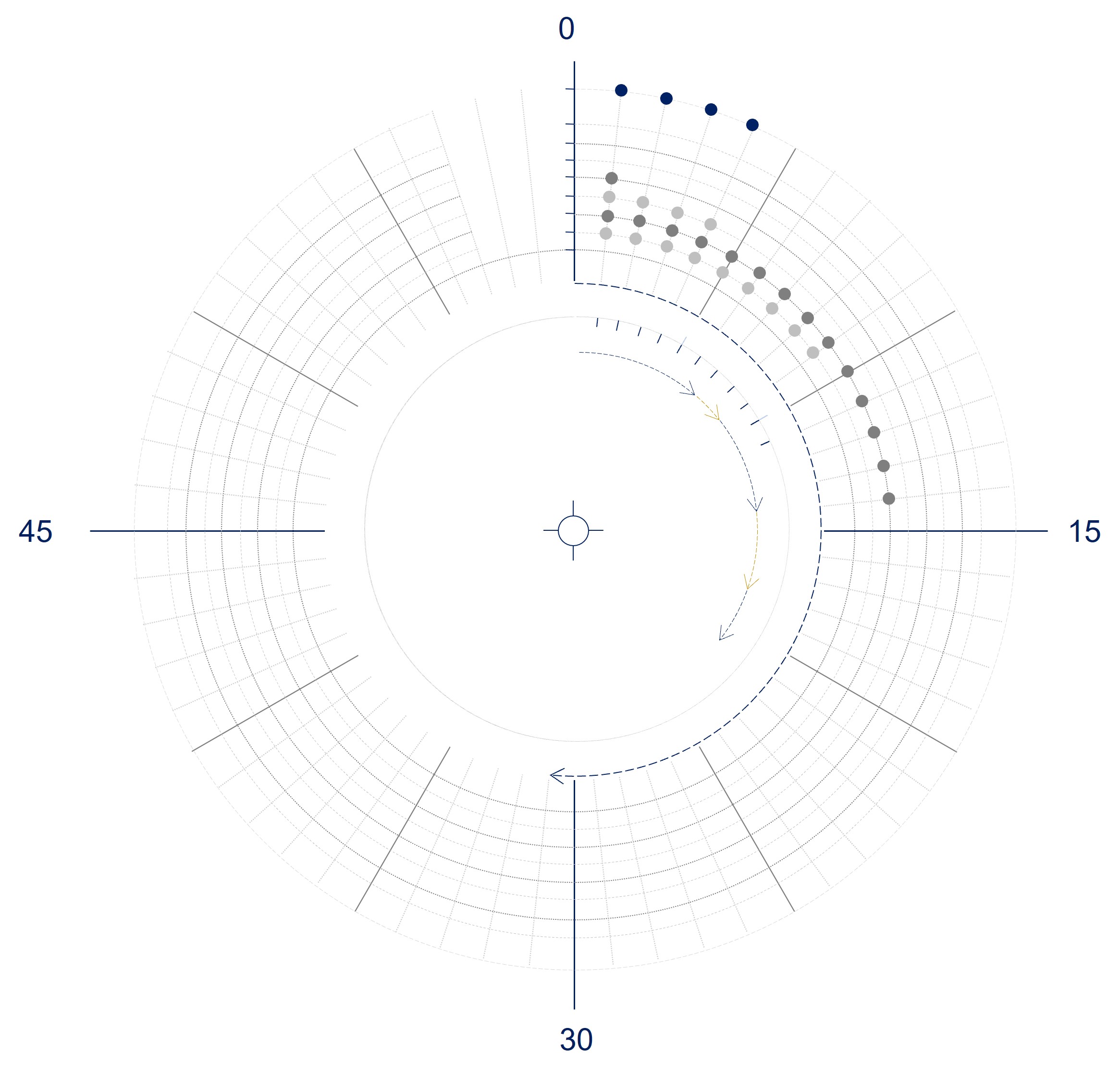
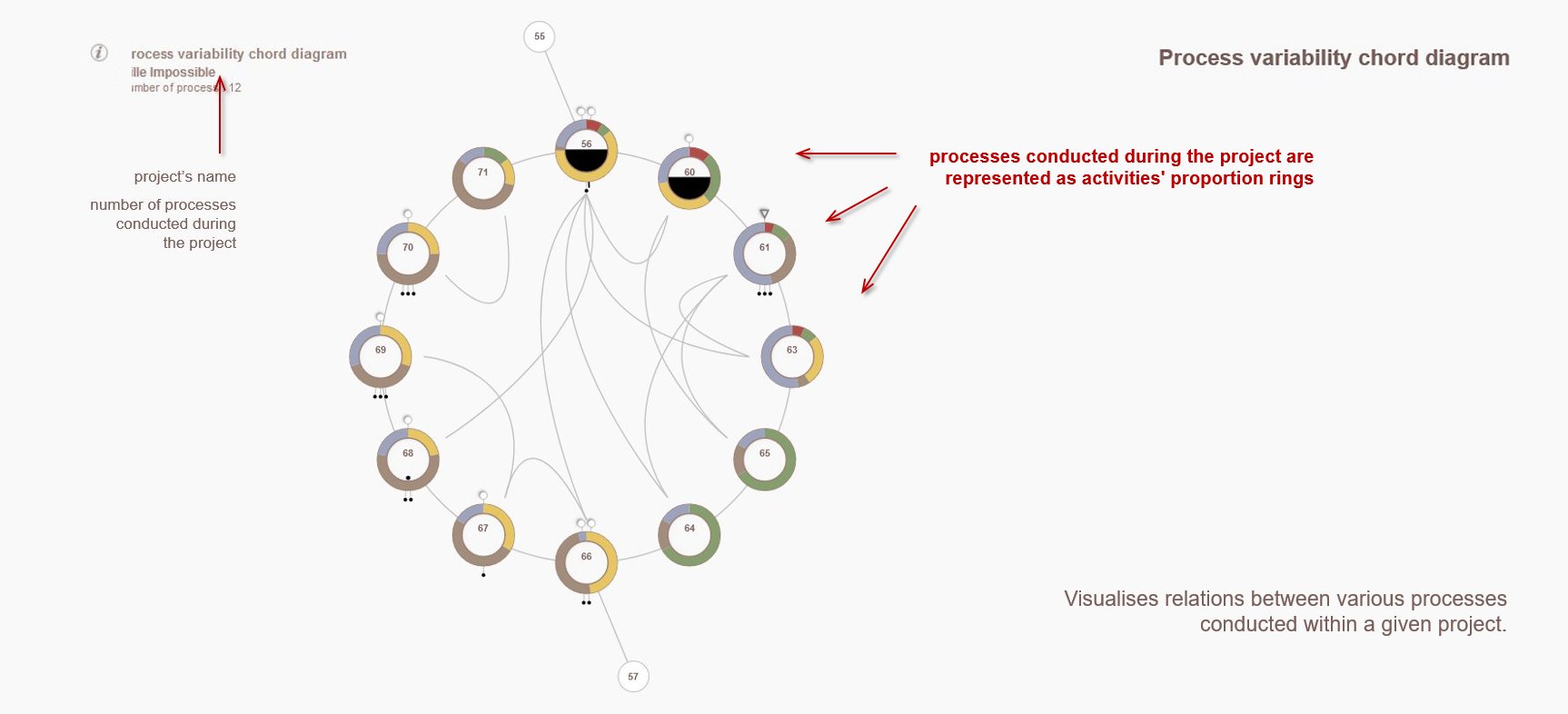
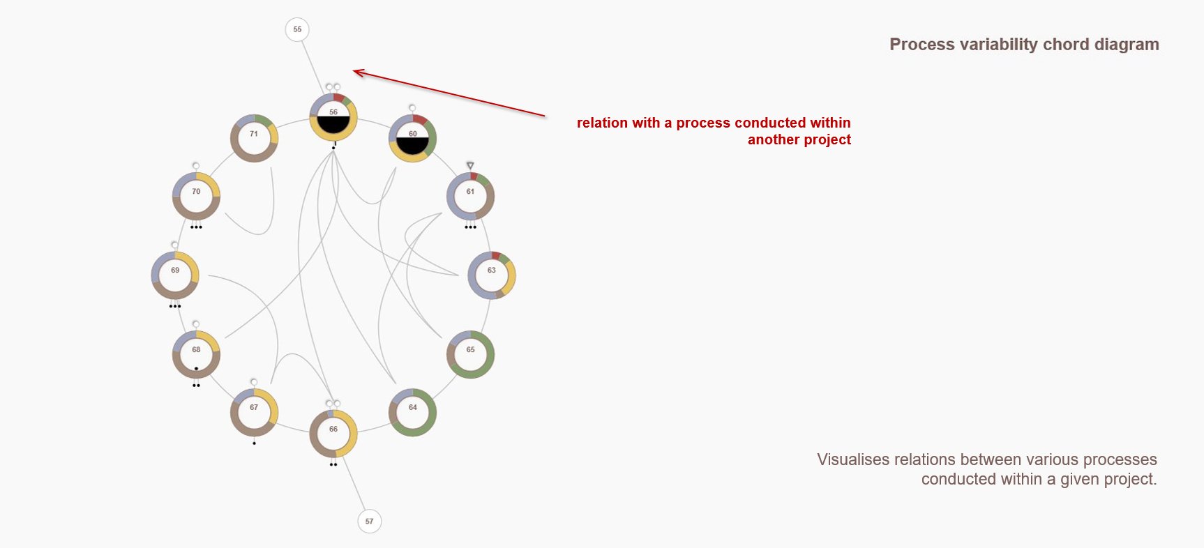
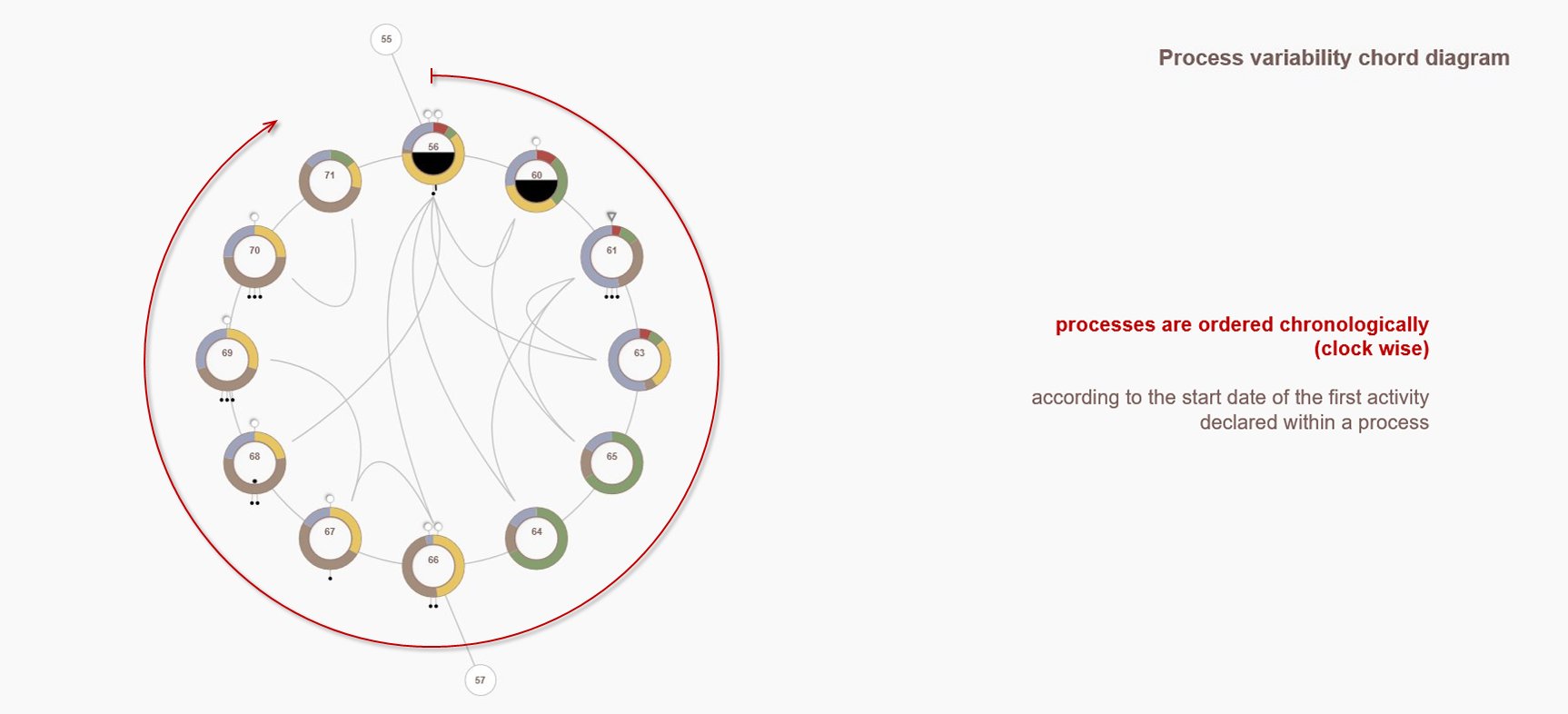
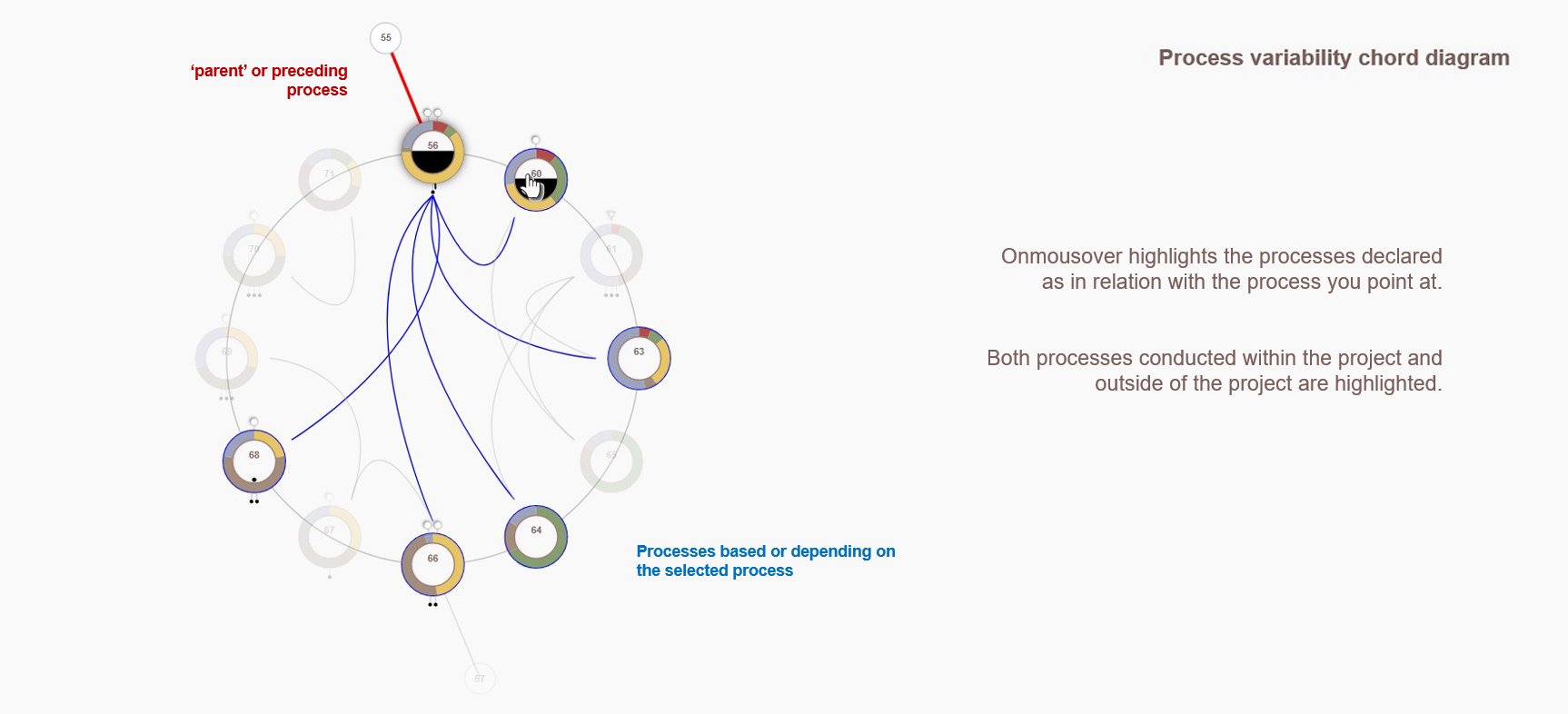
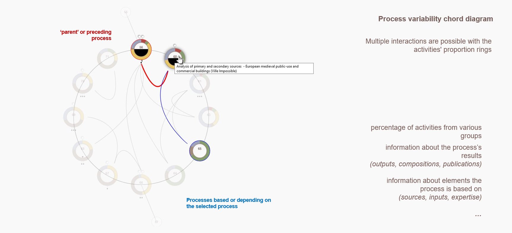
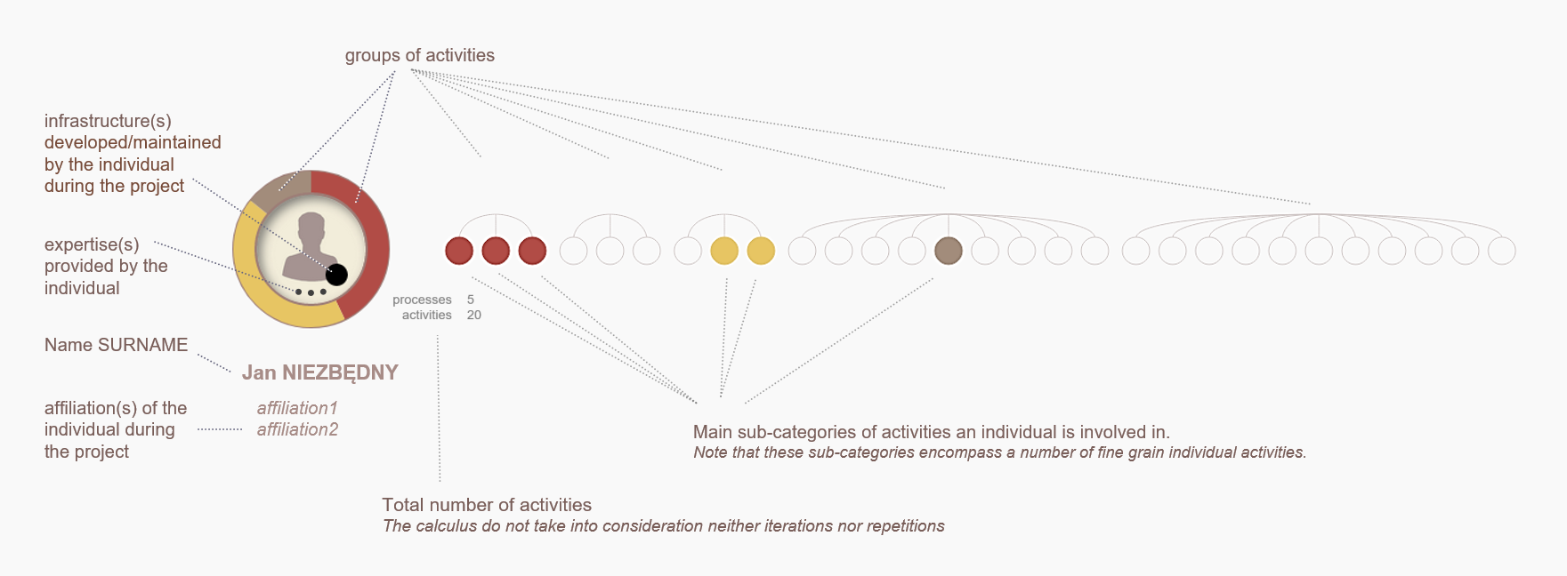
The visualisation is an answer to the following question: what are relations between various processes conducted within a project?
The visualisation shows connections that have been declared between the processes conducted within a project. Each process is represented by a ‘ring of activities’ forming a circular diagram. Processes are organised chronologically (clockwise) according to the first activity declared within a process (process start date). Processes for which this information is missing are set according to their ID number, and positioned following those that have information on the date of the start of the process.
Hovering the cursor over a process highlights the processes declared as having a relationship with the selected process. Red lines indicate preceding processes, blue lines indicate posterior processes, based on or dependent on the selected process.
The small circles placed outside the circular arrangement represent processes executed within another project and that the current project bases on.
J.Y. Blaise, I. Dudek, M. Zawieja
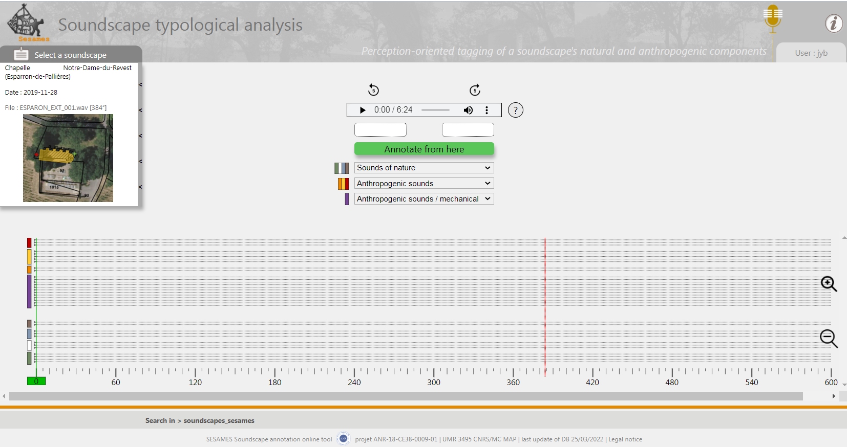
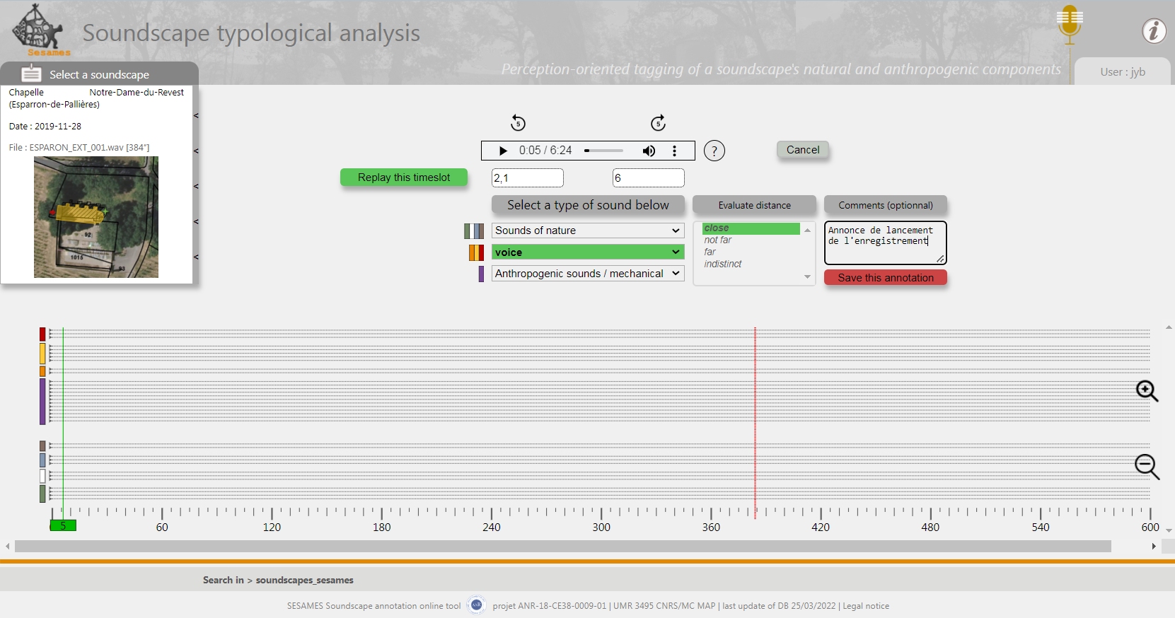
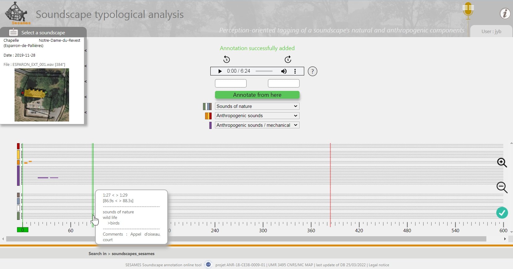
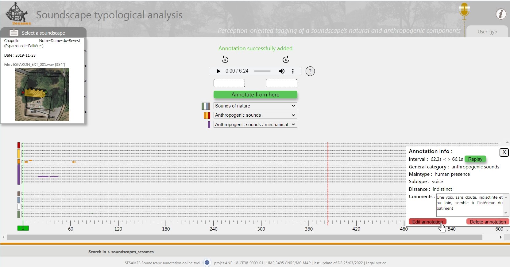
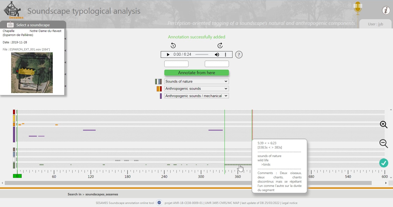
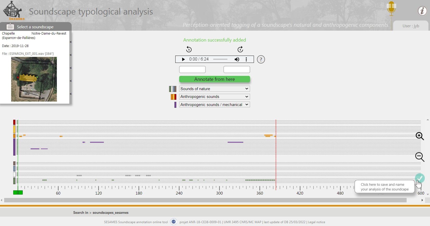
The interface of the online soundtrack annotation tool, prepared within the framework of the SESAMES research programme (ANR-18-CE38-0009-01 project), includes a graphic space allowing users’ annotations to be visualised during the annotation phase and then in simple reading.
The tool’s primary objective is to exploit one of the raw data sets acquired in situ, the “soundscapes": these are sound tracks in which the "sounds" heard on site (anthropic or not) are recorded. The tool allows a user to annotate sound tracks interactively, by associating to a segment of the recorded sound track a "type of sound". A grid of types is proposed, distinguishing between natural and anthropogenic sounds. Other "perceptual" indicators are proposed, allowing the user to report on his perception of the distance to the sound, or the movement of this sound.
The tool's graphical space consists of parallel lines extending over the duration of the sound track, each line representing a 'type' of sound. Each segment (each sound heard) is positioned on one of these lines according to when it starts, and represented using colour codes (type of sound) and line types (perceived distance).
This tool is an exploratory development, which should eventually allow on the one hand to annotate /type the components of a sound track testifying to a soundscape, and on the other hand to build visualizations highlighting patterns within a site or between sites.
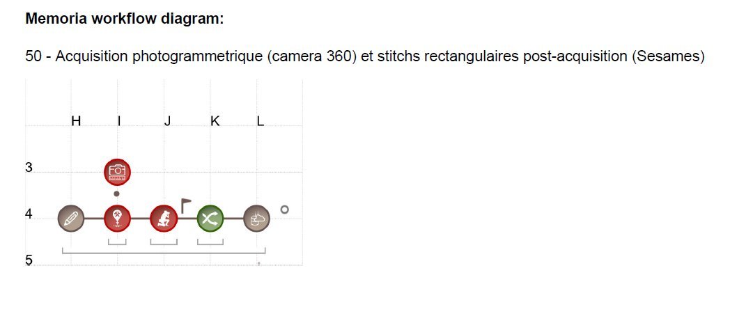
I. Dudek (design, testing), J.Y. Blaise (design participation), M. Rabefandroana (implementation)
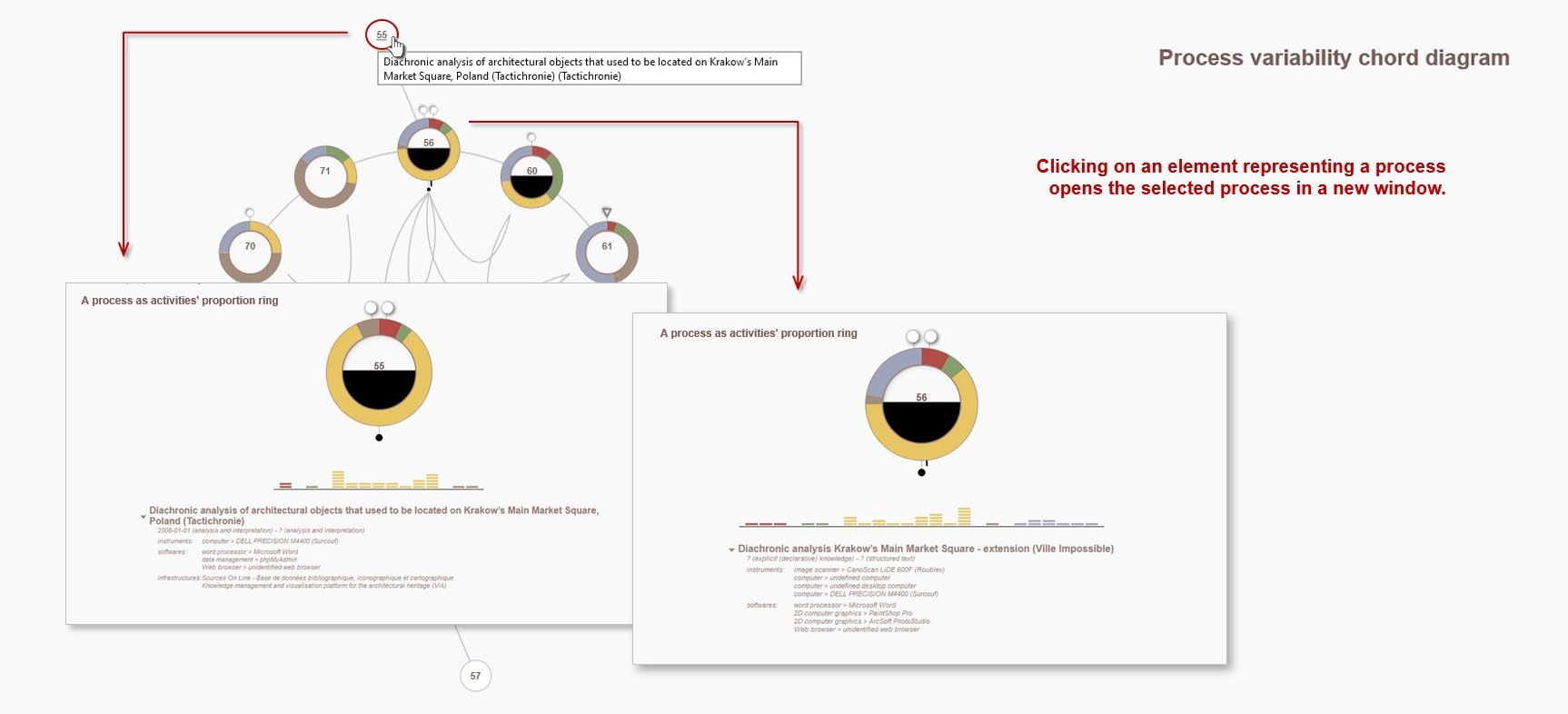
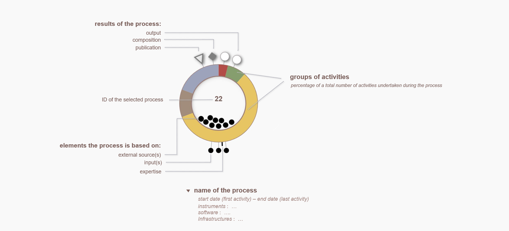
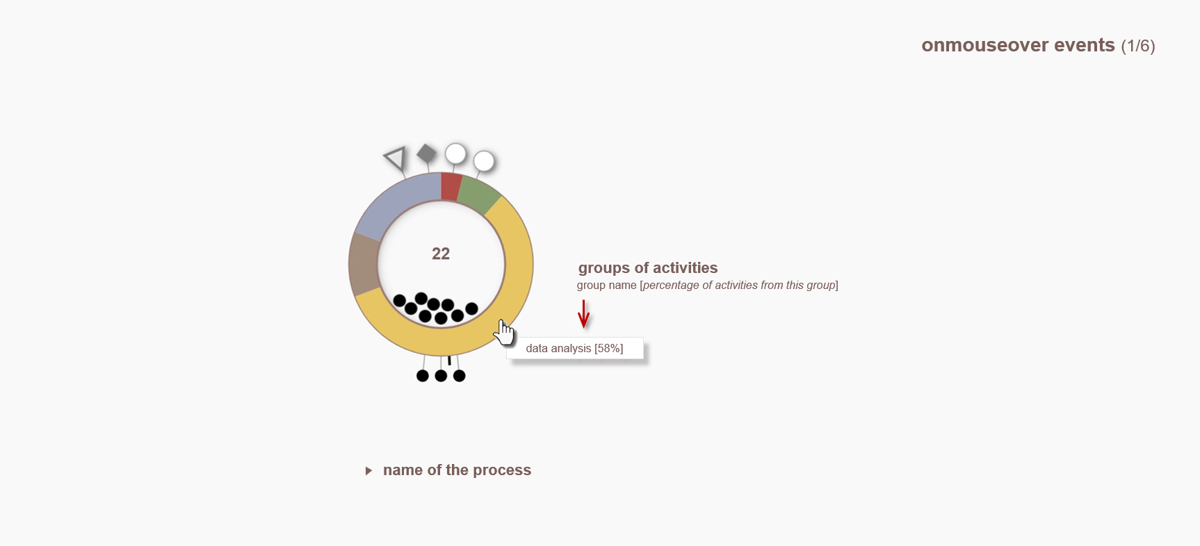
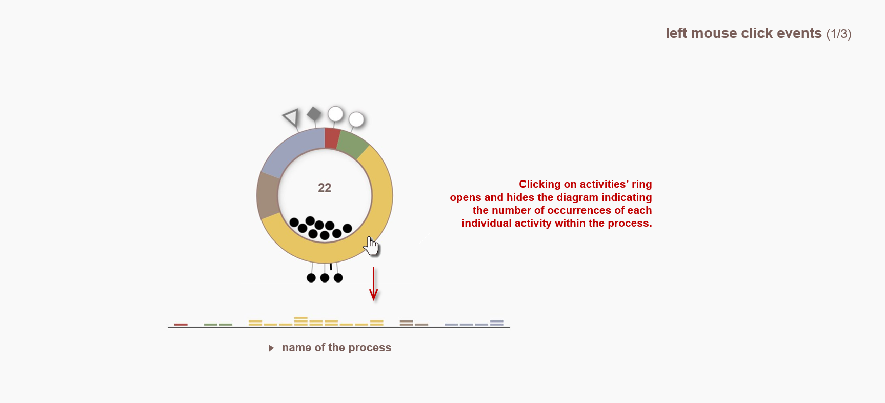
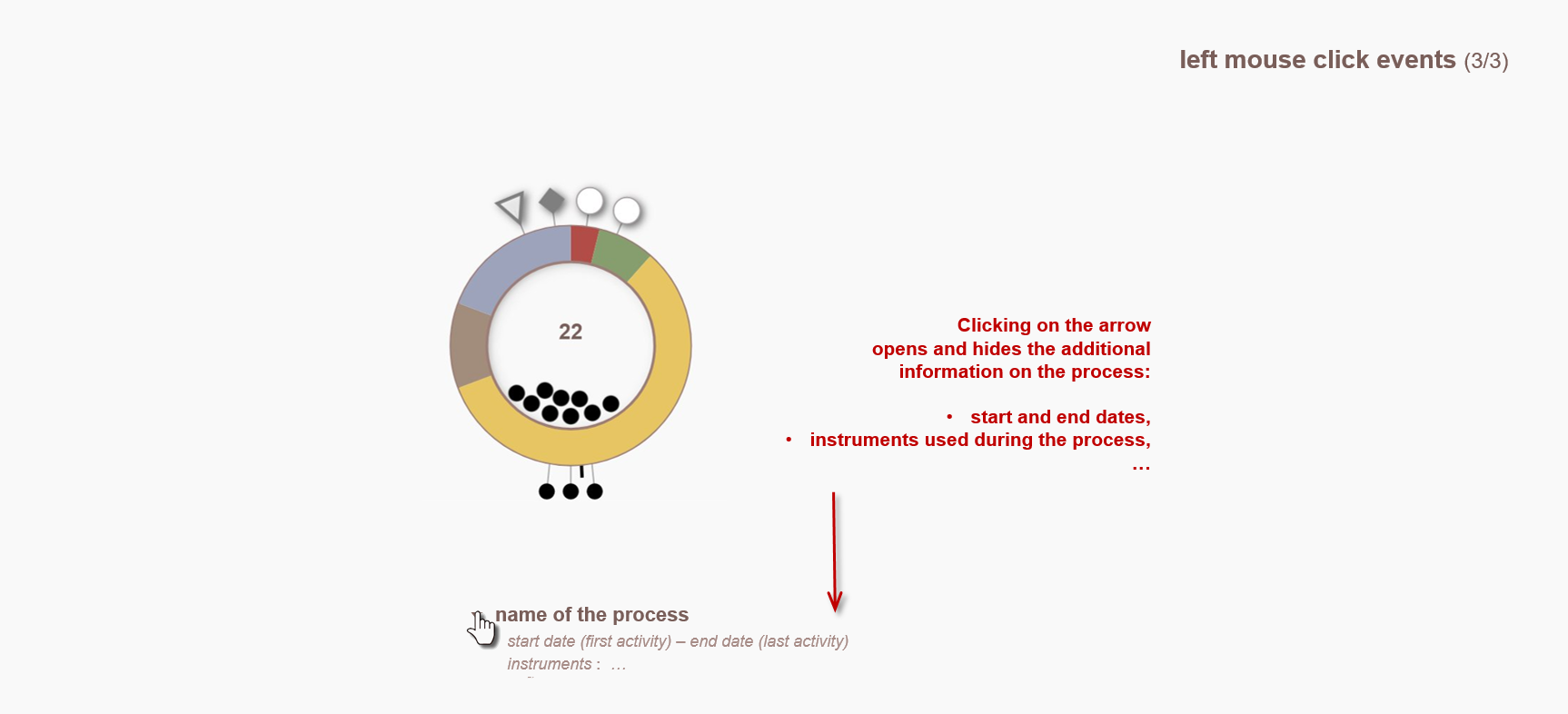
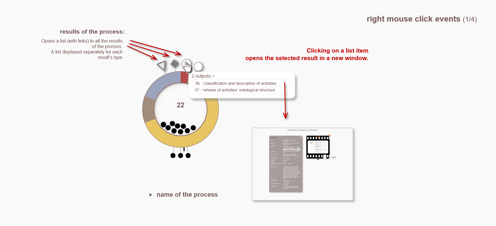
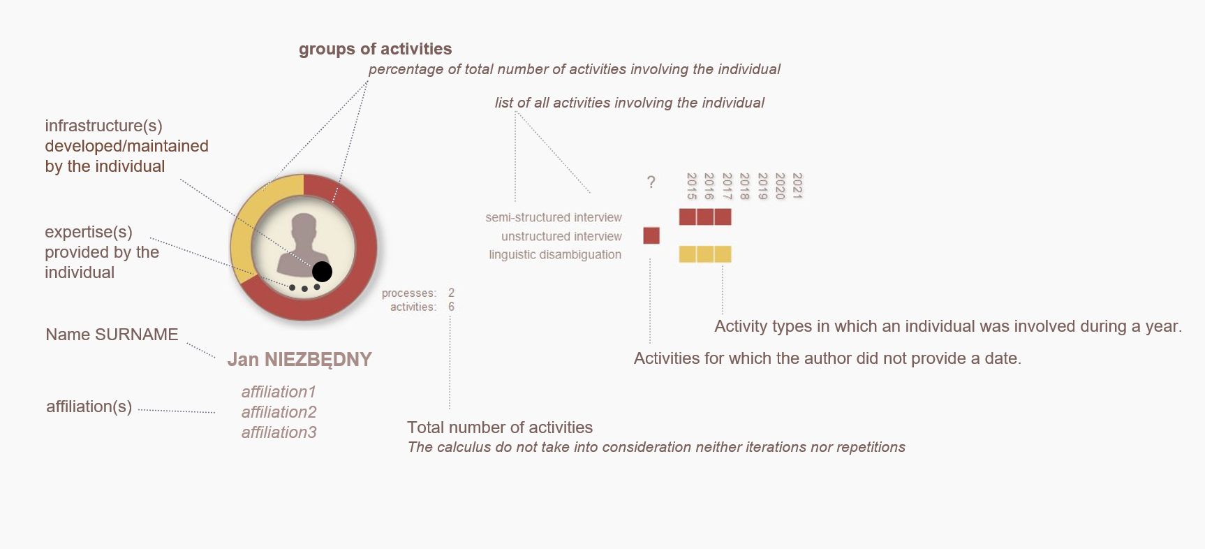
The visualisation is an answer to the following question: what are the relative proportions of each group of activities within a process, what are the outputs of a process and how many inputs and sources are involved?
This visualisation represents the process as proportional portions of activities involved in the process - represented by the colour of the group to which they belong. Each sector - identified by its colour - represents the percentage of activities of a category.
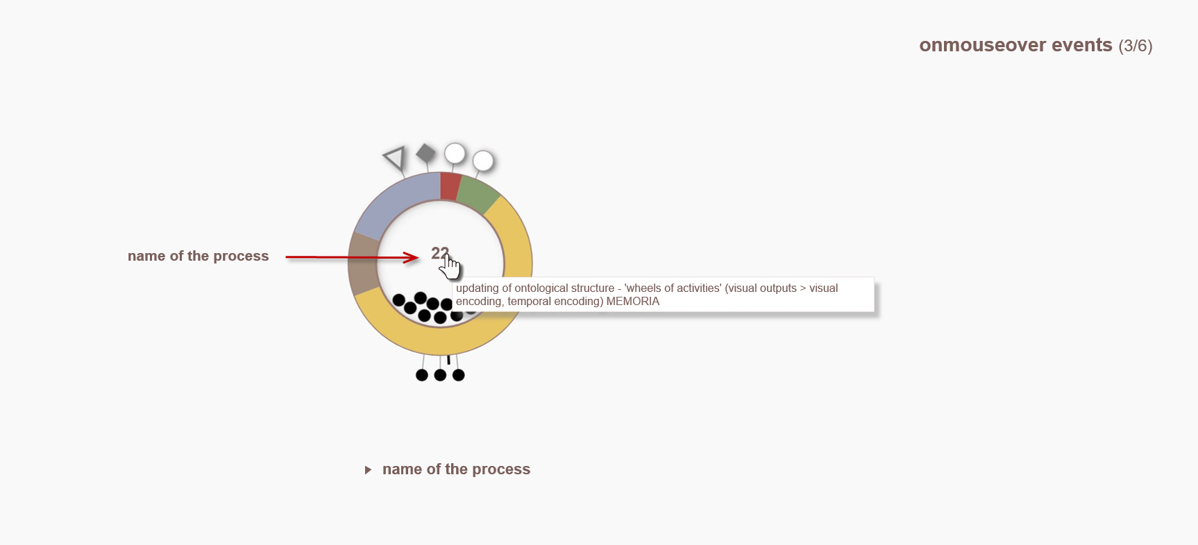
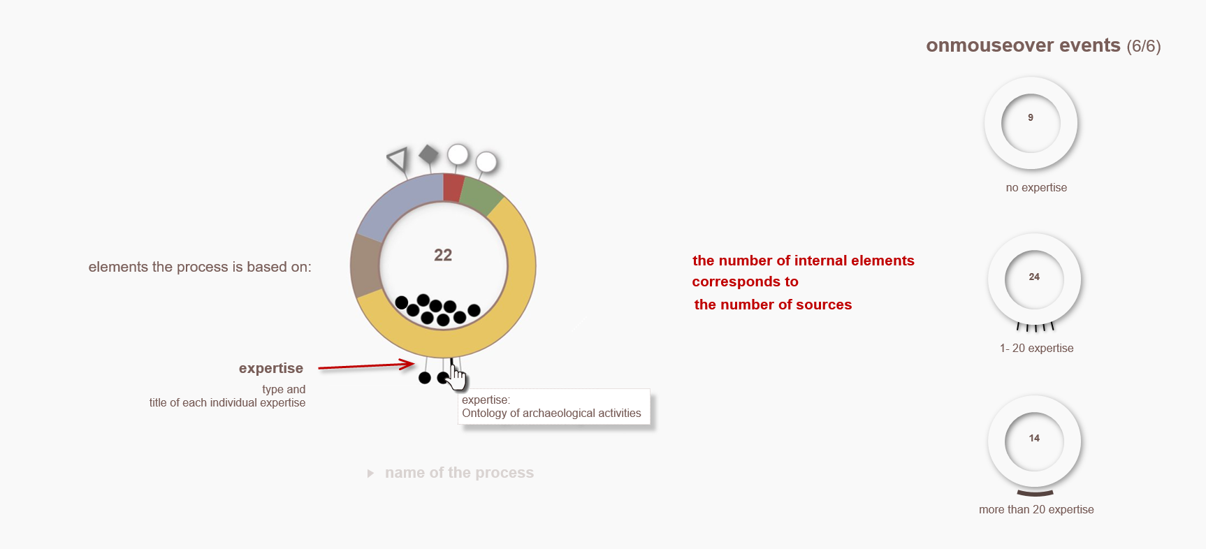
The results of the process are displayed at the top of the diagram – shapes correspond to the type of result (output, composition, publication). Inside the ring, the process ID is displayed and the resources on which the process was based are shown.
Below the ring, two different symbols identify inputs (dots) and expertise (dashes).
By interacting with the diagram a user can:
• open and hide a diagram indicating the number of occurrences of each individual activity within the process ,
• open a representation of the as a chain of activities,
• open and hide additional information on the process such as start and end dates, instruments, software and infrastructures used during the process, ...
• open lists with links to all the results - outputs, compositions and publications - and elements the process is based on – sources, inputs and expertise.
I. Dudek, J.Y. Blaise
Design of a cumulative visualization allowing the contextualization and correlation of architectural data within a collection of 15 rural chapels in the PACA region.
This visualization is a first step towards a system aiming at the correlation of architectural and acoustic data collected in situ.
G. Simon, J.Y. Blaise, I. Dudek (conception), L. Bergerot (implémentation)
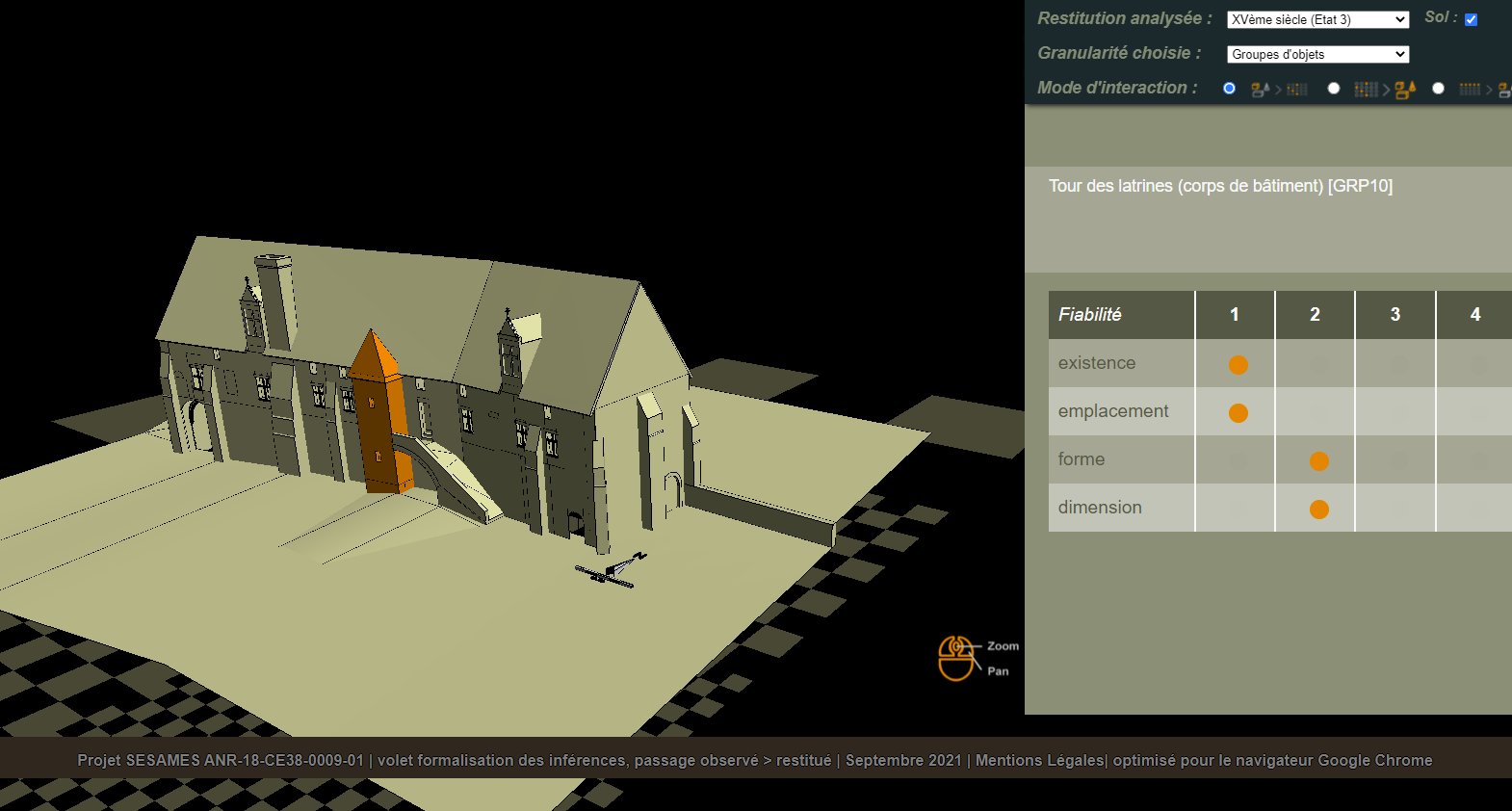
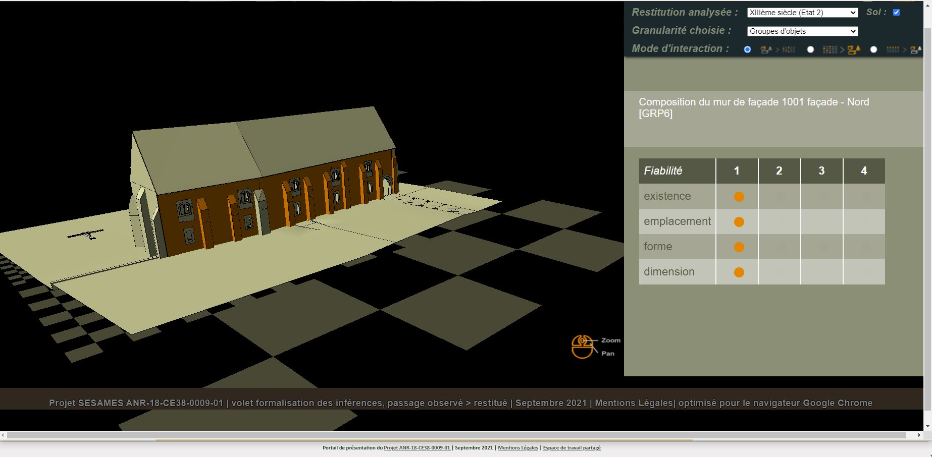
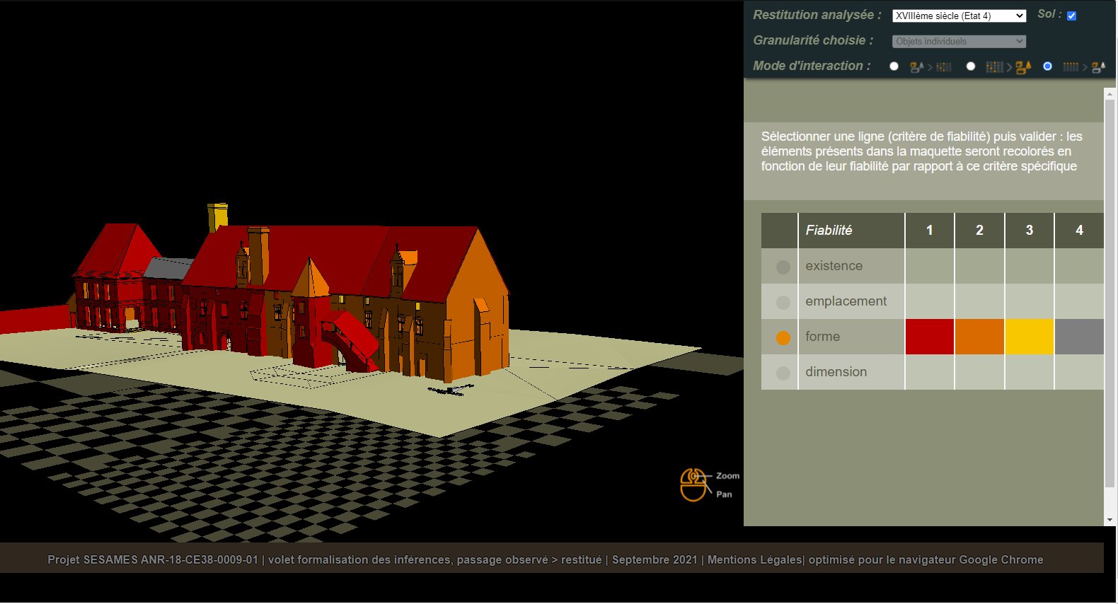
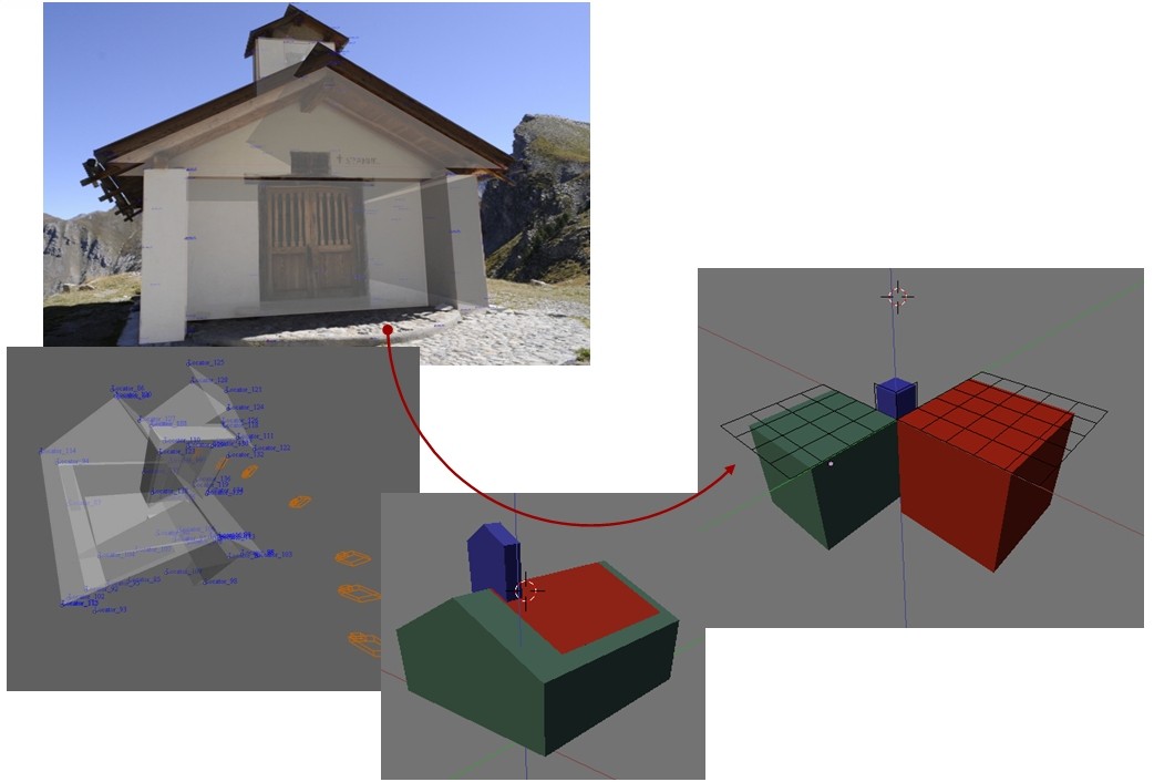
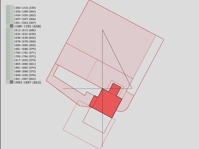
The interface (which has the character of a proof of concept) makes it possible to visually associate a plausibility assessment in the form of a "matrix of justifiers" with the elements of 3D rendering of its hypothetical reinstruction.
The justifiers' matrix summarises the "plausibility" of a given proposal, according to four criteria forming the rows of the matrix: Did the element really exist? Was it really there? Did it really have that shape? Was it really this size?
For each row of the matrix, 4 values are possible, ranging from 1 (maximum reliability) to 3 (most uncertain proposition). The value 4 is used to indicate items for which the reliability analysis has not yet been performed.
The user can select one proposition of reconstruction, its granularity (individual objects or groups), and one of the three interaction modes:
• from an element to its matrix (a click on an element in the 3D scene opens the matrix corresponding to this element),
• from the matrix to the elements corresponding to selected values (select a value for each row of the matrix, then confirm - the elements corresponding to these values will be highlighted in the 3D scene),
• - visualisation of the reliability of the proposed virtual reconstruction for all the elements of the scene (select a reliability criterion - existence, location, shape or dimension - the 3D scene will be recoloured according to the values of this criterion for each object).
I. Dudek, J.Y. Blaise, M. Rabefandroana
I. Dudek (design, testing), J.Y. Blaise (design participation), M. Rabefandroana (implementation)
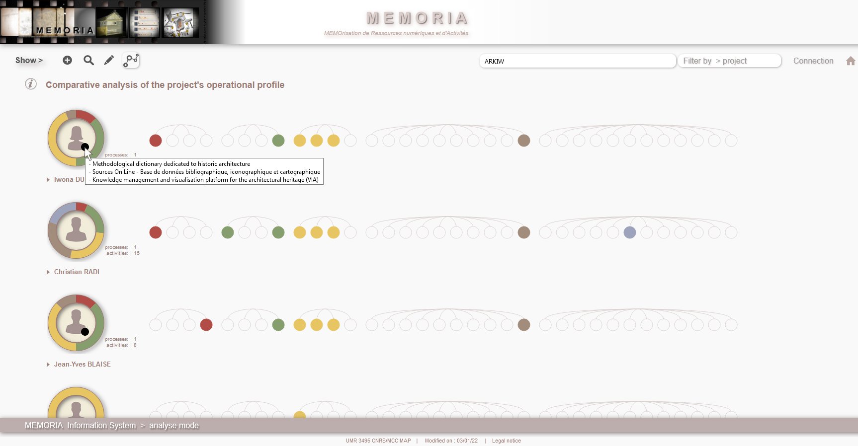
5 dynamic visualisations of the database content are accessible from the visualisation selection area (accessible to all without restriction) :
- comparative analysis of the project's operational profile,
- visual synthesis of a project's operational profile,
- chronological analysis of an individual's operational profile,
- visual synthesis of an individual's operational profile,
- a process as activities' proportion ring (to be finalised).
J.Y. Blaise, I. Dudek
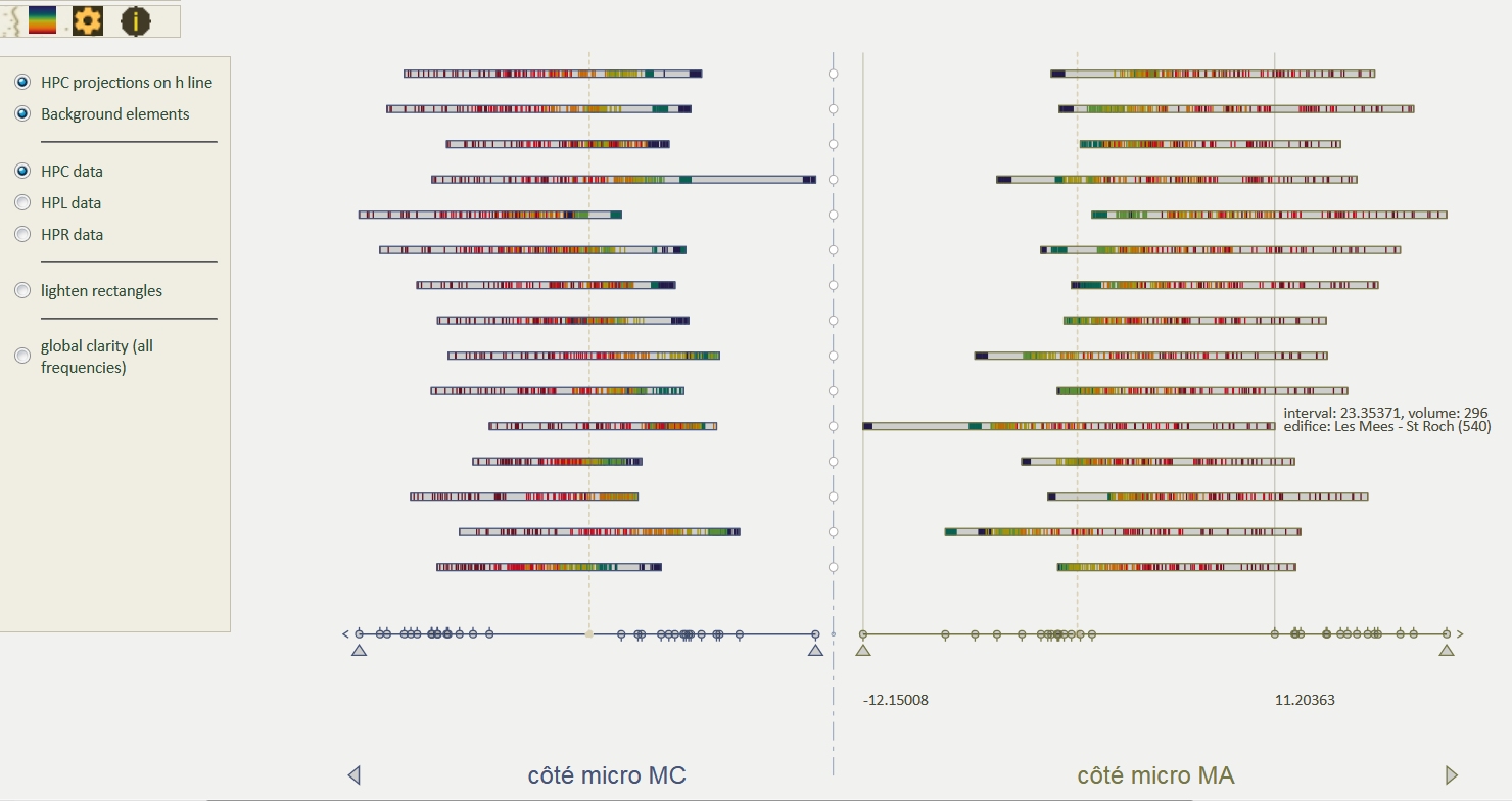
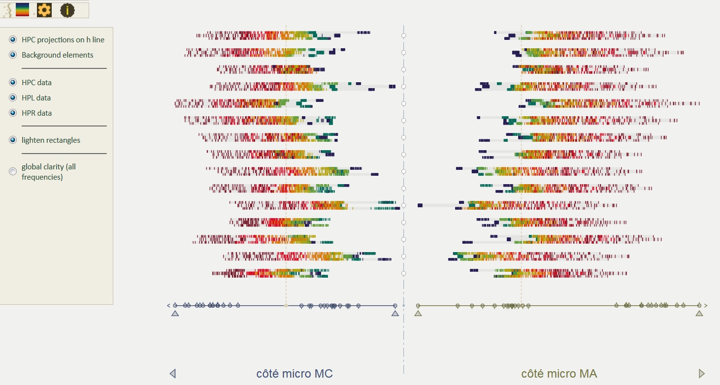
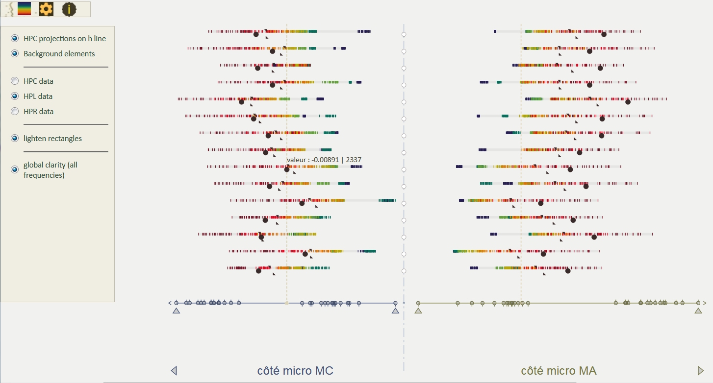
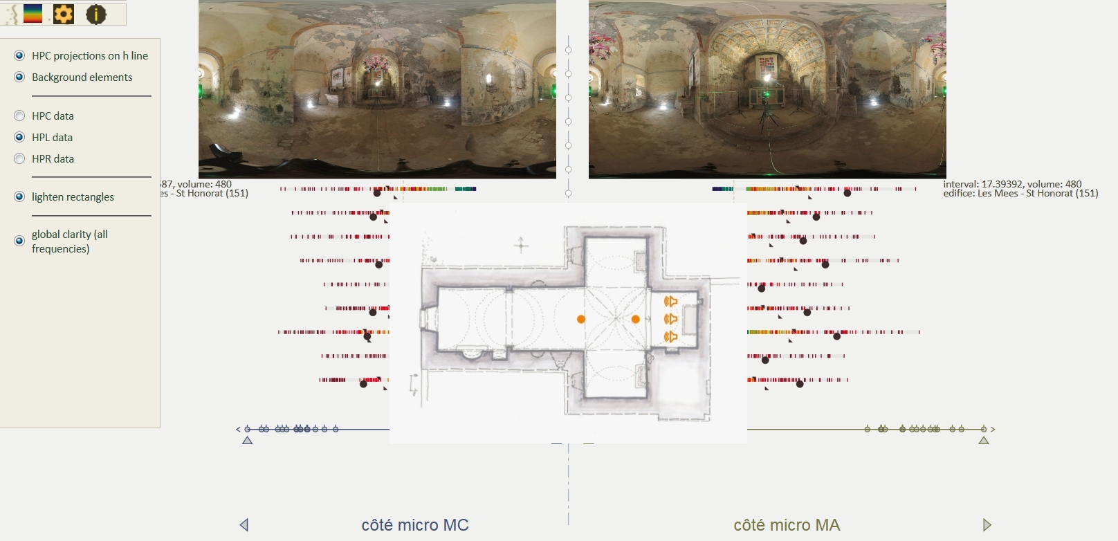
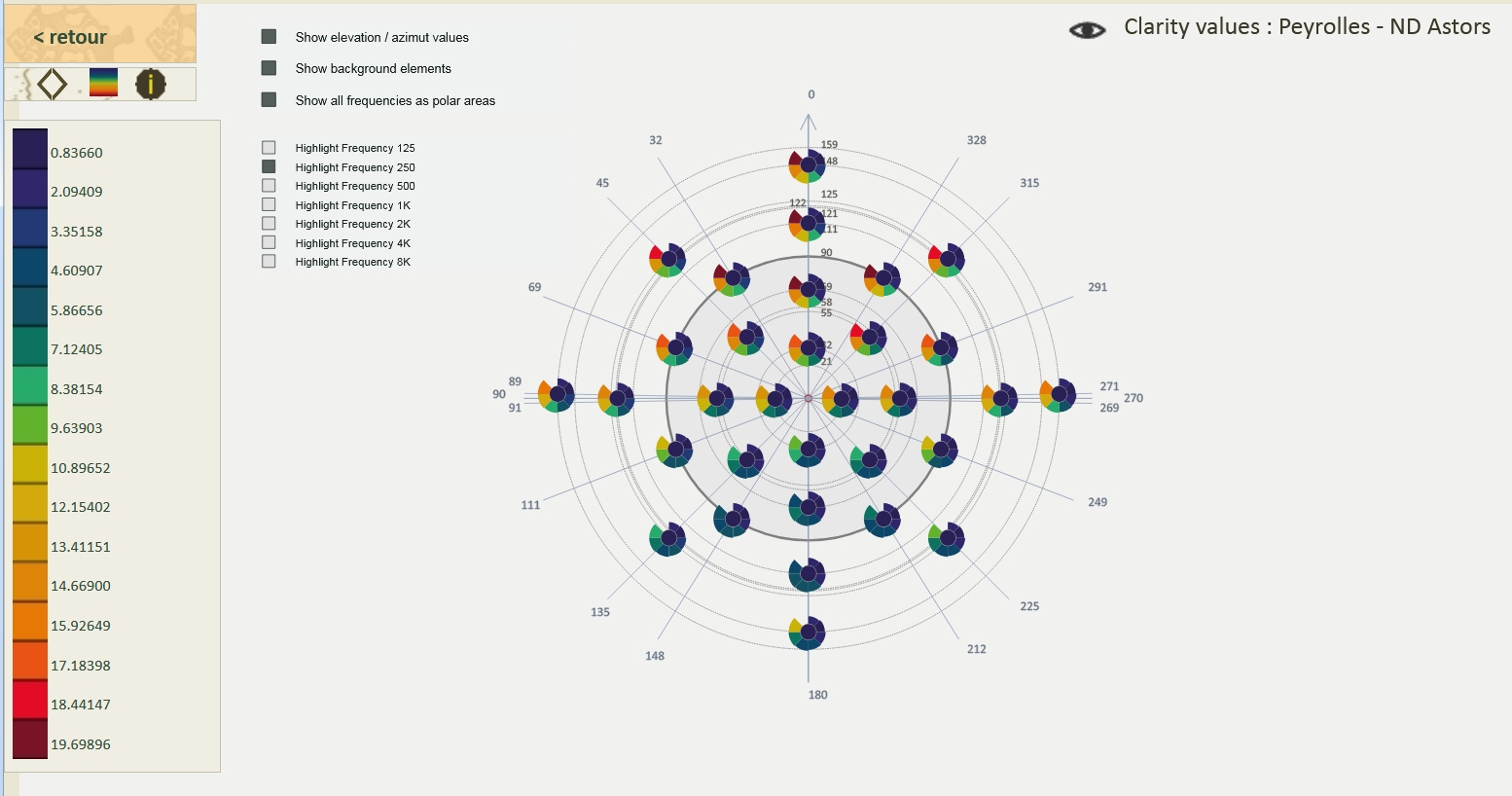
Finalization of the clarityIntervals visualization: the visualization represents the values of the C50 clarity acoustic indicator, for the MC and MA recording points, calculated for three different emission points. Values for the two recording points are distributed on both sides of a vertical axis. Each line corresponds to a building, and shows the individual values of the clarity indicator for each of the 32 capsules of the Eigenmike32 spherical microphone used during the sound recording campaigns (values for 7 frequencies, colors according to the frequencies).
This visualization allows comparison of the ranges of lightness values for 15 buildings, and reveals recurring patterns as well as counter-intuitive behaviours.
Data provided by the PRISM research unit (UMR 7061).
J.Y. Blaise, I. Dudek, F. Luminet
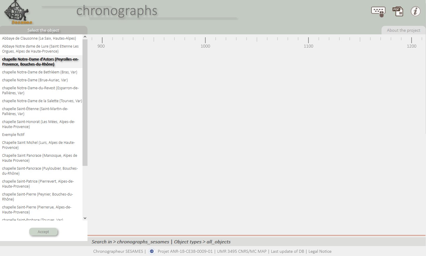
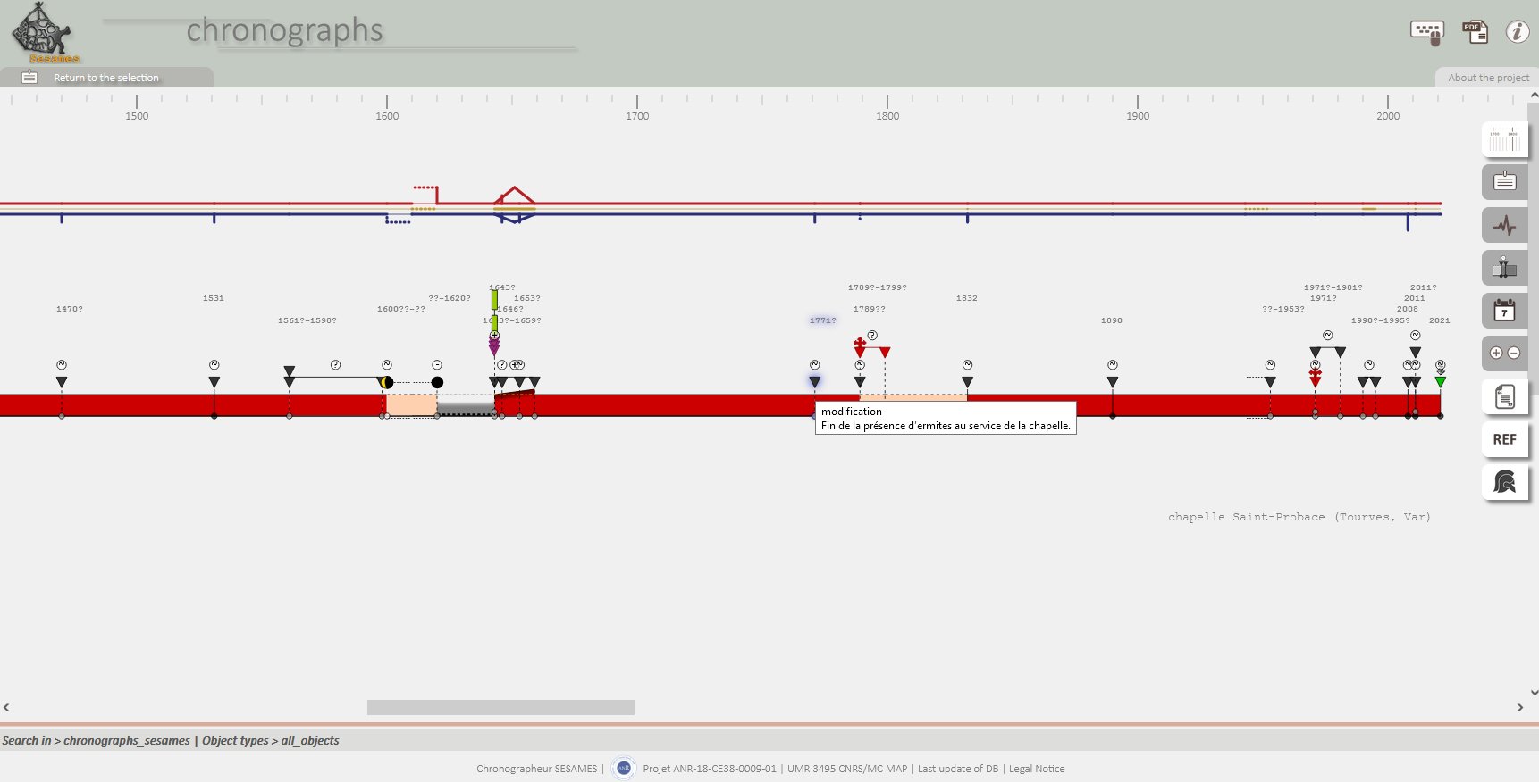
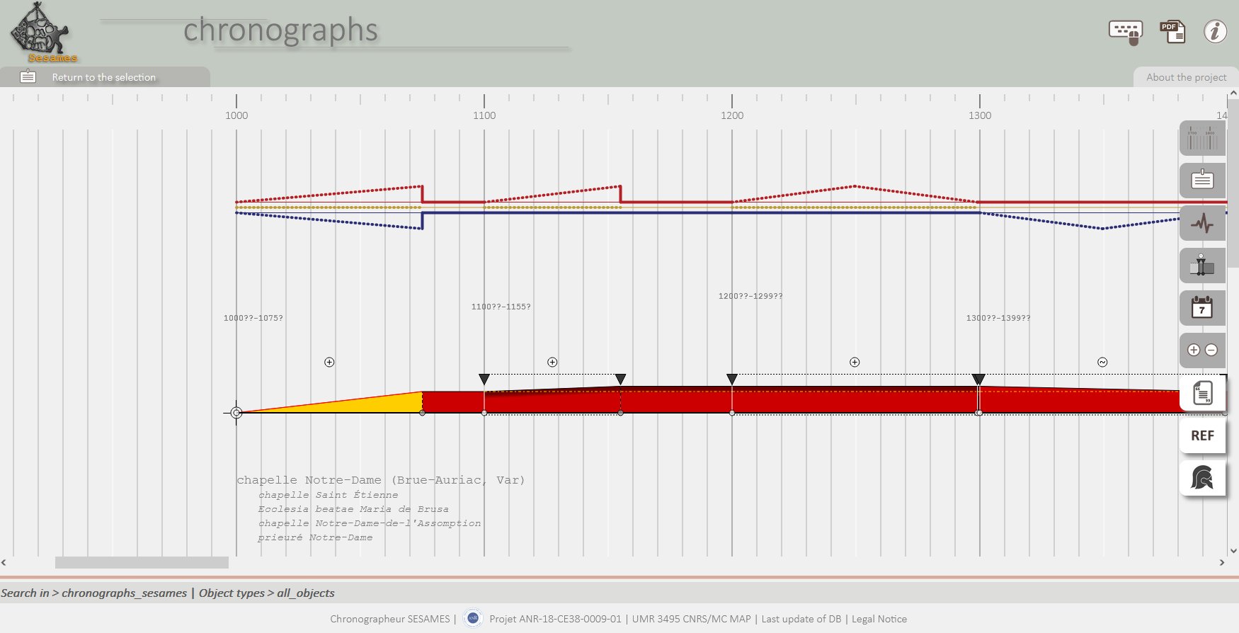
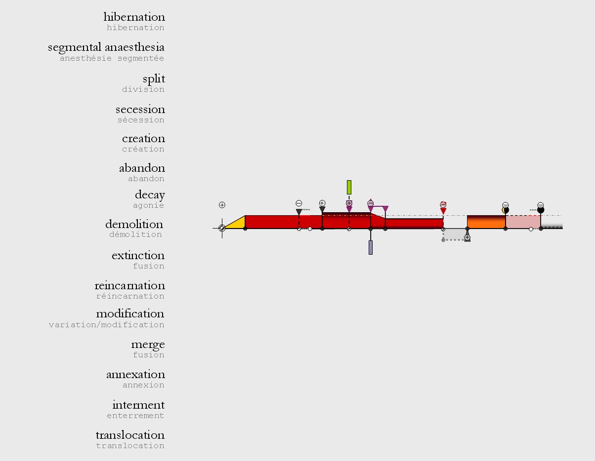
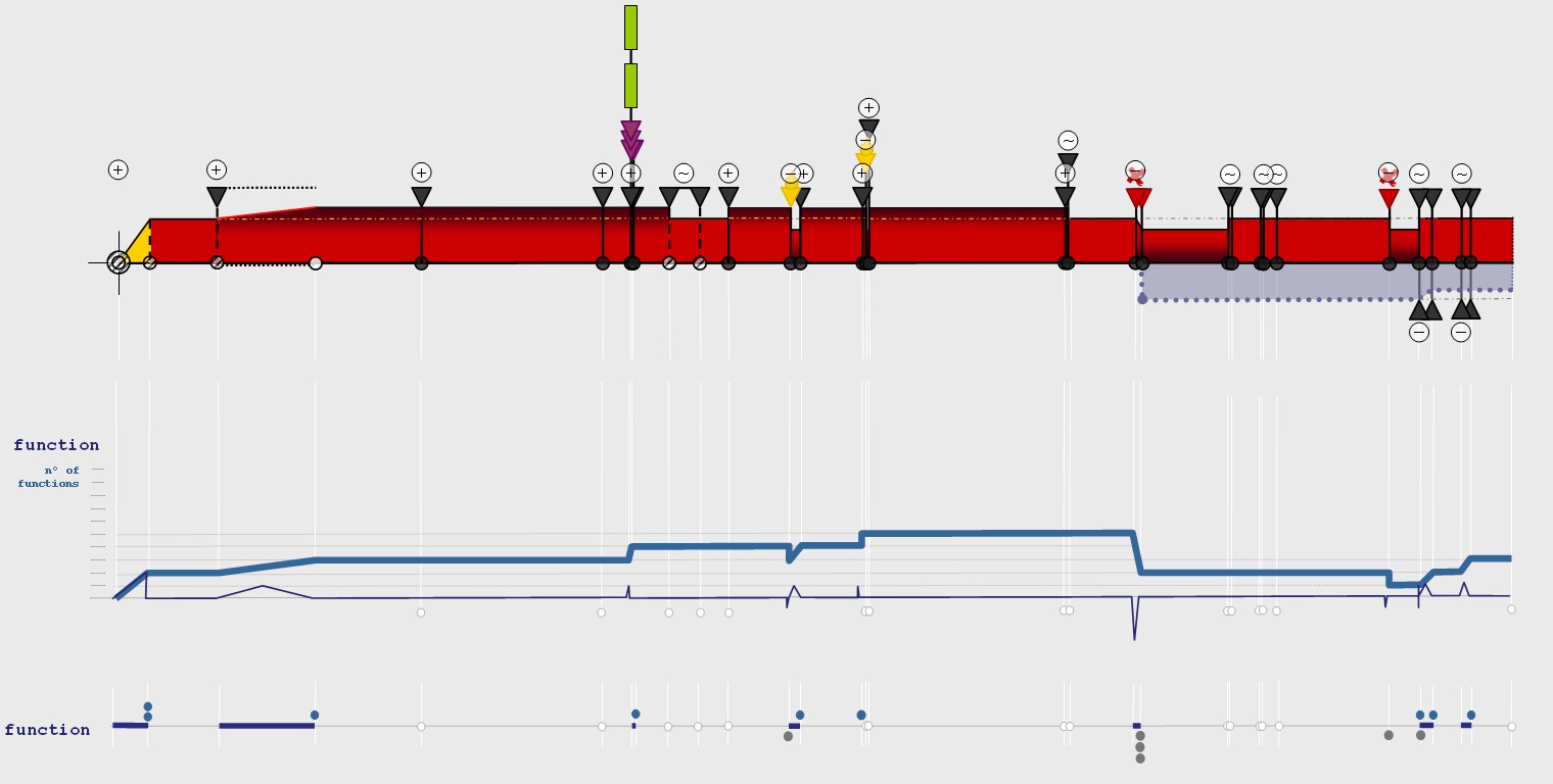
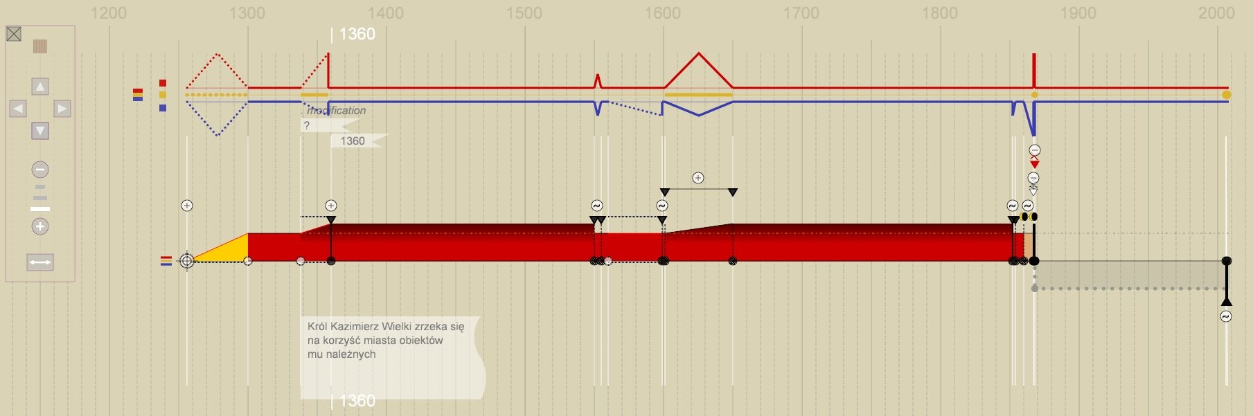
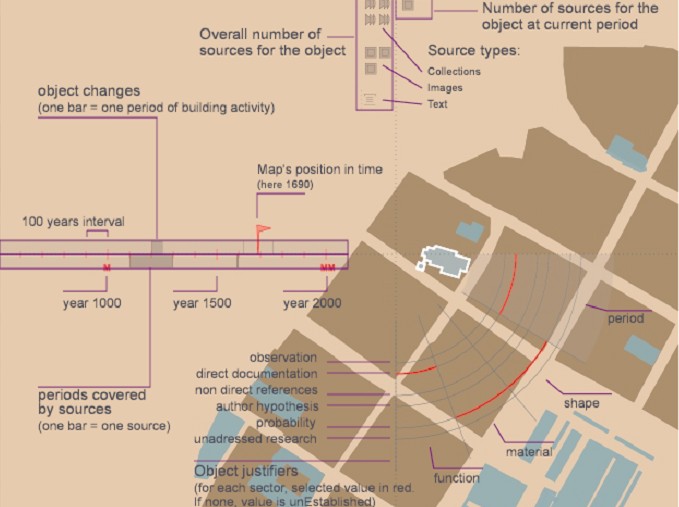
Adaptation of a model for the analysis and representation of the evolution of buildings ("chronographs") - implementation based on web technologies.
Chronographs is in fact the name given to a set of graphics, composed of different visualizations:
• Diachrograms present the evolution of an artefact along a time axis that positions transitions, states, and causality assessments along the time scale.
• Variograms summarize visually types and intensities of changes under three broad families of changes: morphology, structure, function.
The visualization device highlights key moments in the transformation by differentiating the types of changes and the successive states. As this visualisation device does not refer to the morphology of the objects, it allows comparisons of different evolutionary patterns. It allows an analyst to formalise an evolutionary scenario, and to do so in a visual form that encourages intersubjective discussion.
The description framework and the visual language have been developed and refined over a 14 years period, with applications on various corpora.
J.Y. Blaise (design, coding, testing, debugging), I. Dudek (testing)
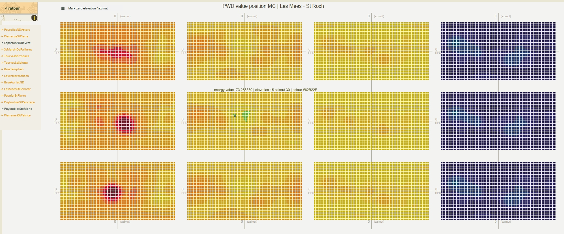
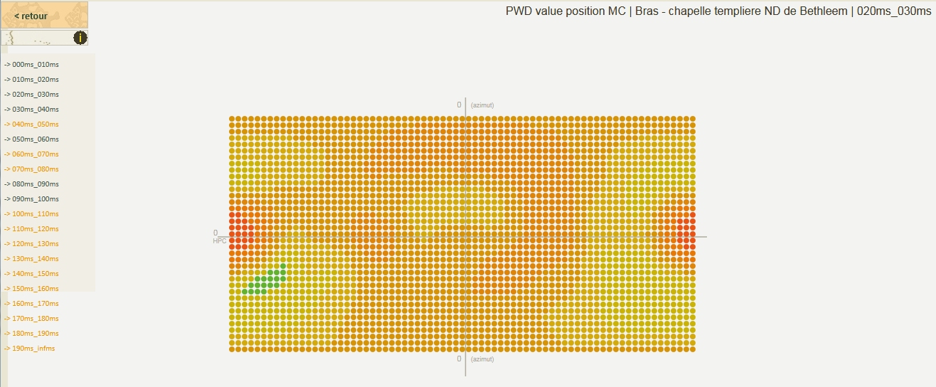
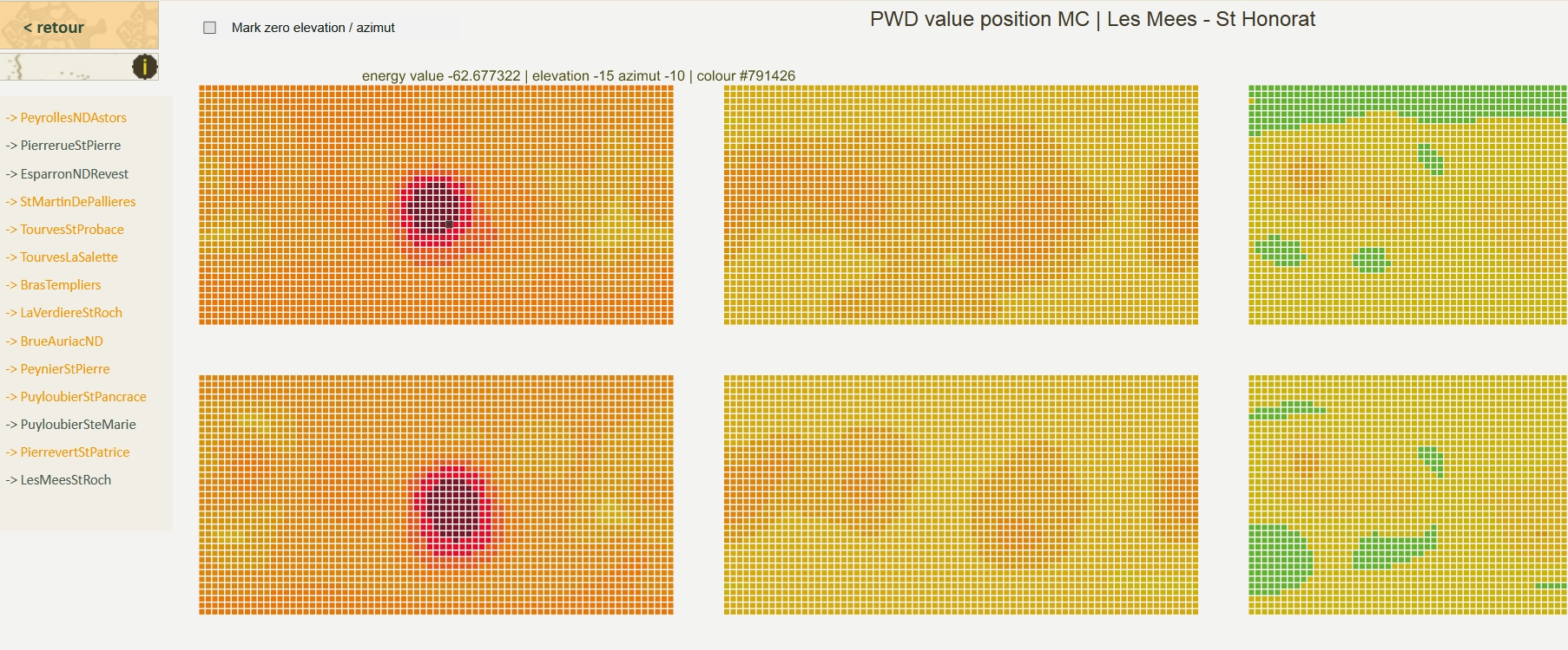
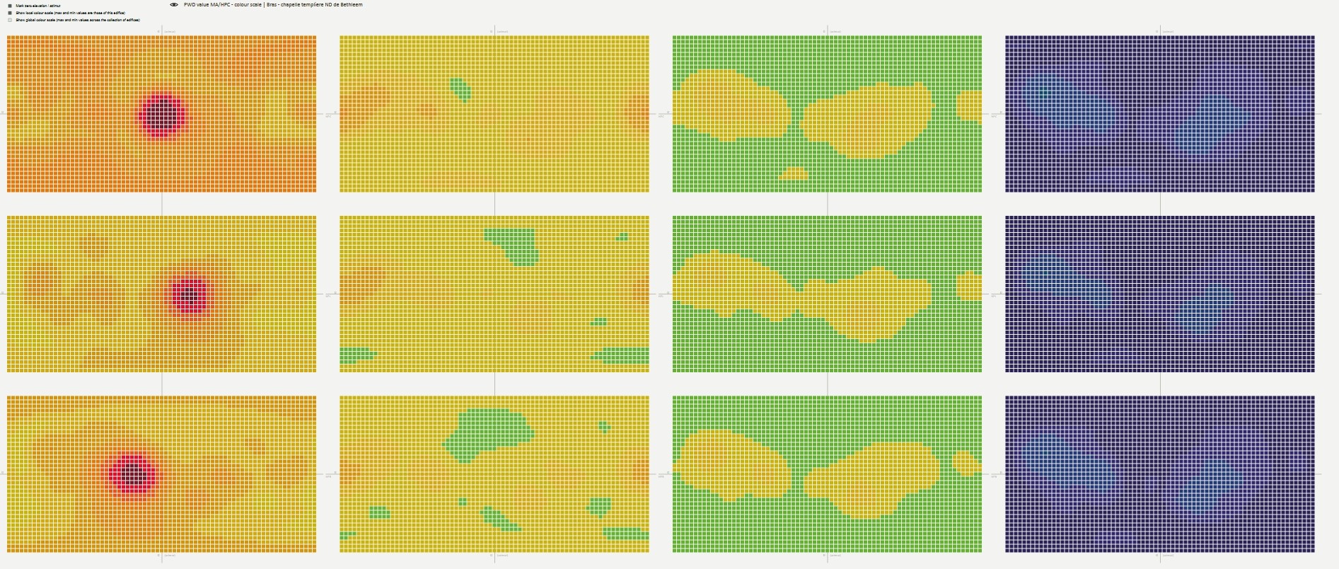
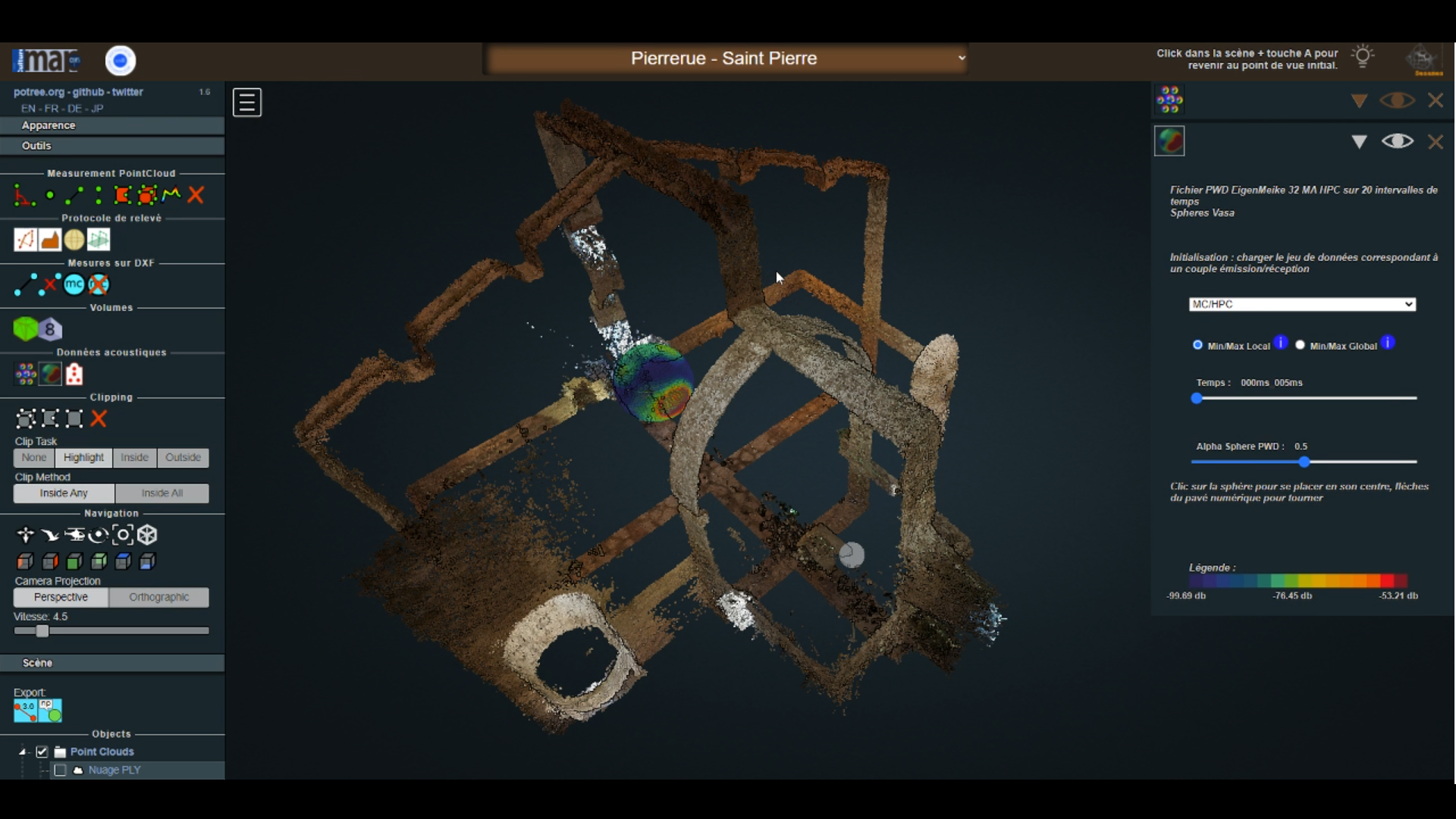
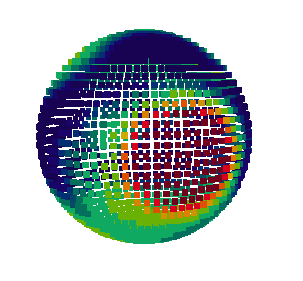
Visualization of the PWD acoustic indicator ("mapping" of the energy for a measurement, calculated with the "Plane Wave Decomposition" method). The visualization associates each listening point (spherical microphone 32 voices) with three emission points (speakers), and represents the values of the PWD indicator for four time frames. Each point of each grid therefore represents an energy value at a time T and for a pair [azimuth, elevation] corresponding to a sector of the spherical microphone.
A variant of this visualization calculated on 20 time frames rather than four was also tested.
Interactive online visualization (SVG), using a colour scale to map the energy value, complemented by a 3D equivalent developed in the 3D integrator.
J.Y. Blaise, I. Dudek
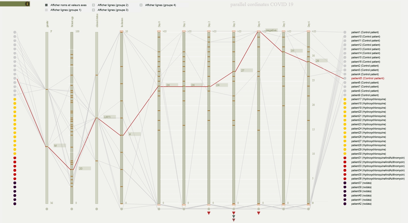
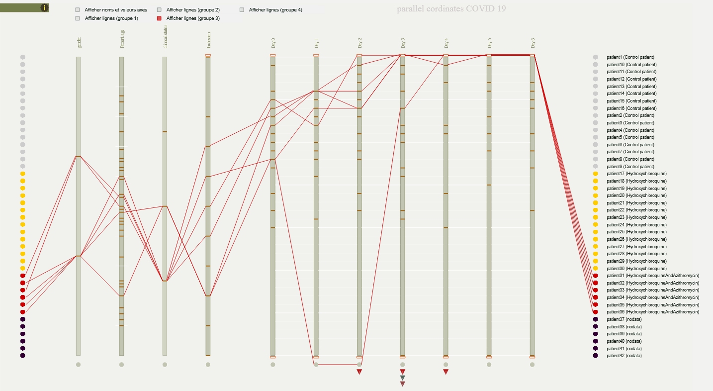
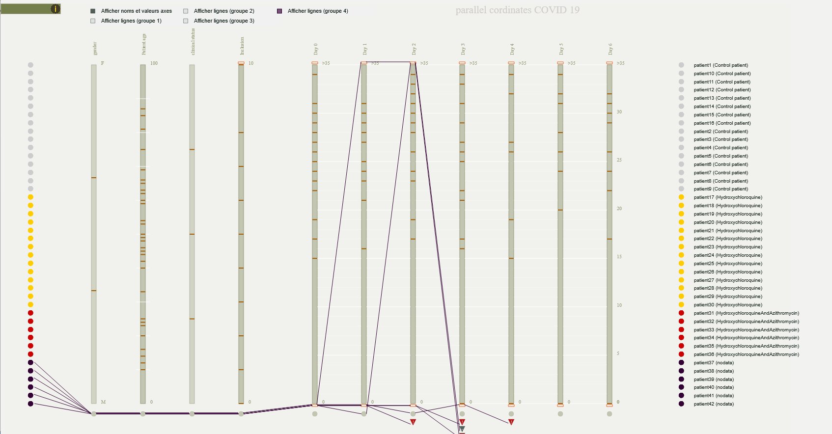
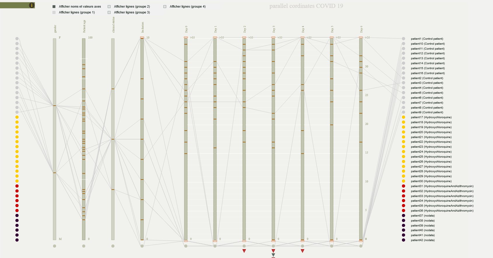
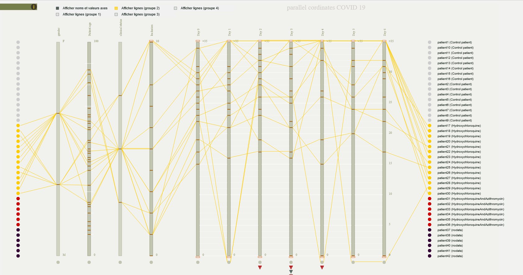
Re-use of the "parallel coordinates " visual formalism as a tool for analysing a scientific paper describing the consequences of different treatments administered to a set of patients over a period of several weeks.
Reuse as an interactive device for web browsers, for educational and critical reading purposes.
J.Y. Blaise, I. Dudek
Design and implementation of sonification and visualisation solutions aimed at realising the potential of the “contours” data model (analysis of discontinuities – systematic horizontal and vertical planes). Data is extracted from manual surveys and from a photogrammetric model, scaled for data extraction in the Potree point cloud renderer.
Implementation of a visualisation reusing the bar chart formalism (test of 4 versions) and implementation / perceptual evaluation of three sonification strategies (dynamic, static and ecological) by the PRISM research unit (A. Vidal, S. Fargeot, G. Larmagnac) on 5 edifices.
L. Bergerot (design, coding, testing, debugging)
J.Y. Blaise (design, testing)
I. Dudek (contribution)
A. Pamart (contribution)
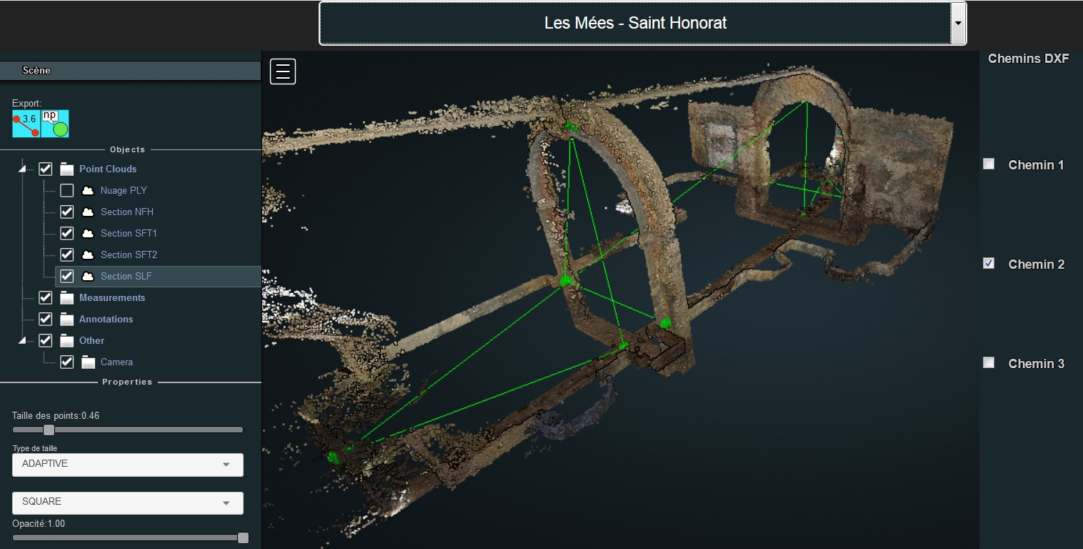
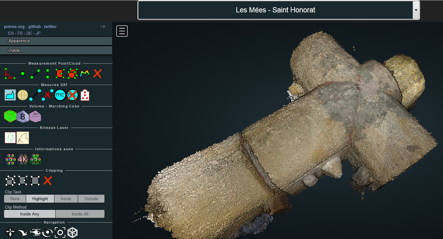
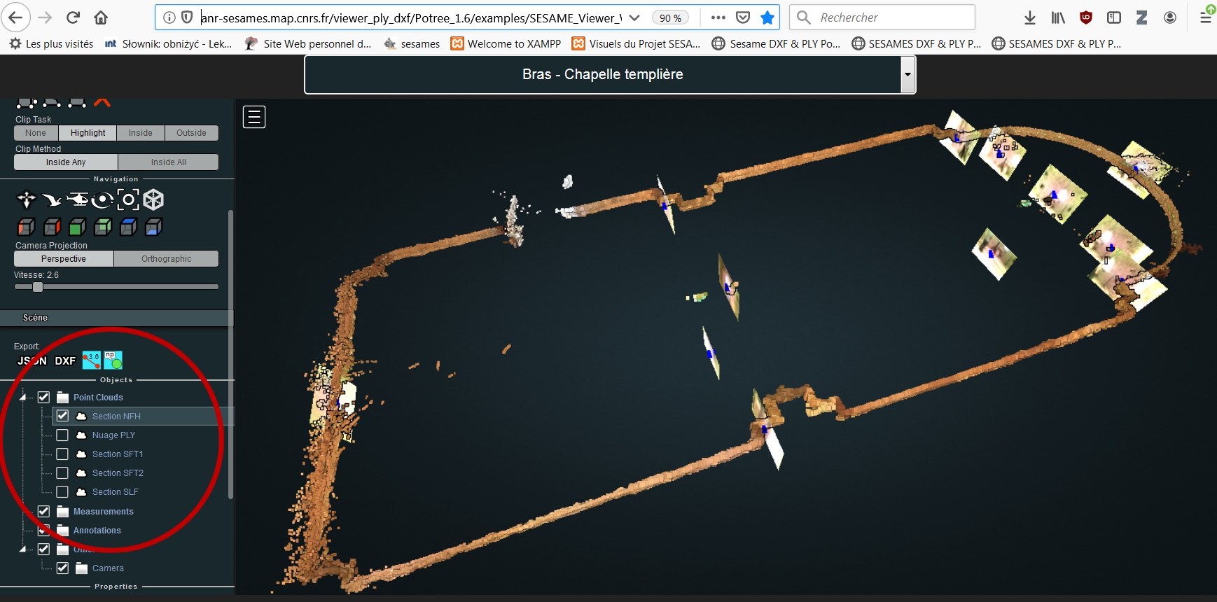
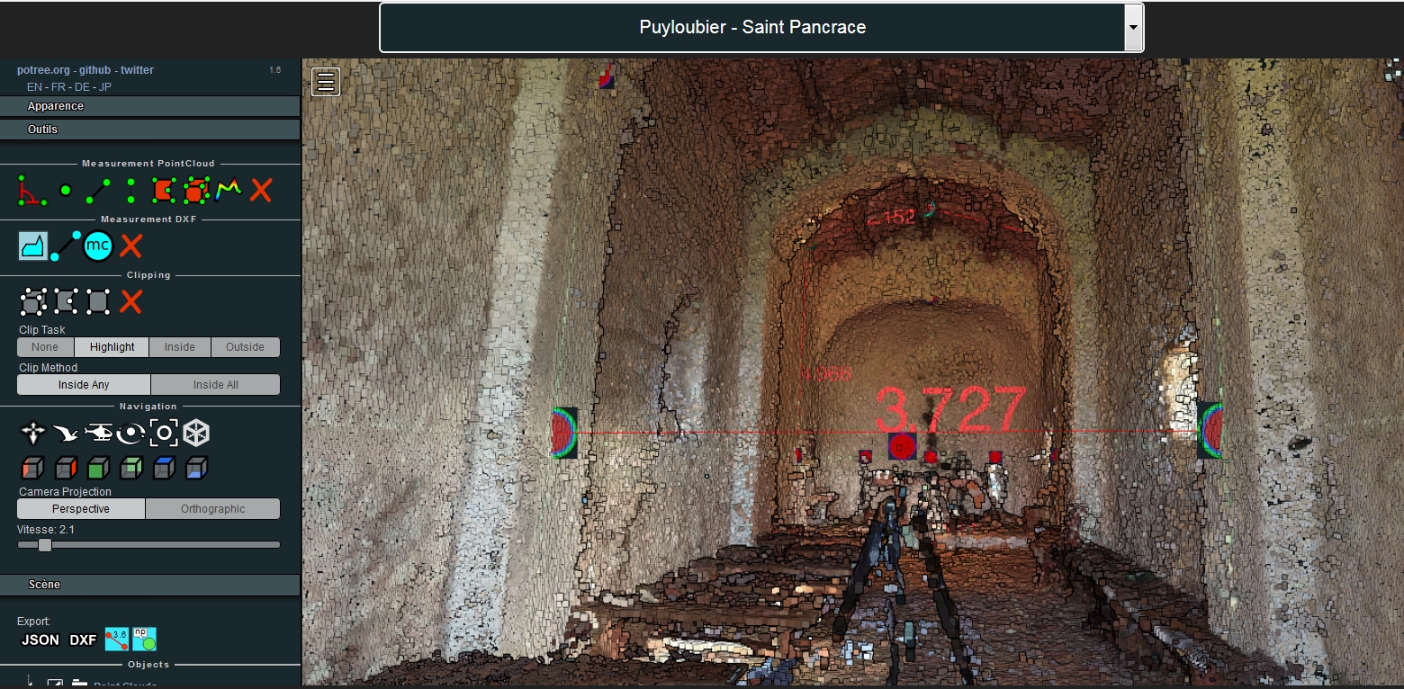
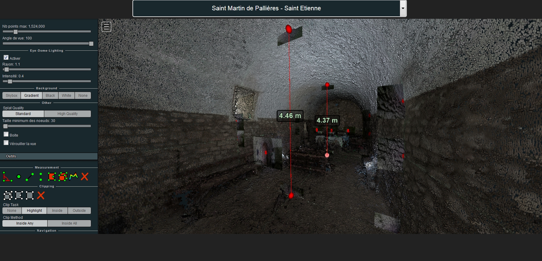
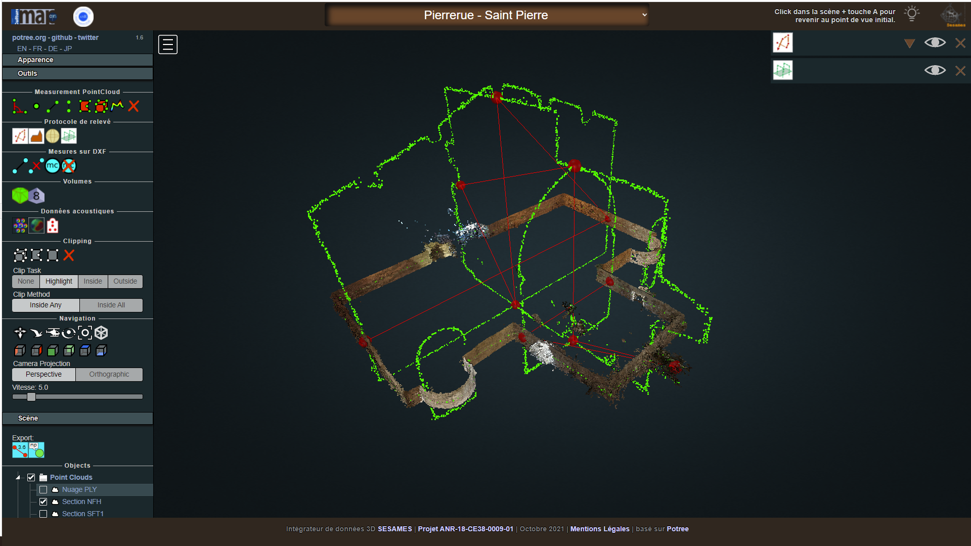
The 3D integrator is a web-based 3D data visualisation tool that consists of a series of overlays developed over the Potree 3D point cloud renderer ( a free open-source WebGL based point cloud renderer developed at TUWien - cf. https://potree.github.io/).
It is used to display visually, in an interactive environment, the 3D point clouds resulting from a survey protocol tailored to the specific needs of the corpus under scrutiny – fifteen small scale edifices often referred to as “minor heritage assets” - and to the research’s overall ambition, reasoning on architectural and acoustic features at an interdisciplinary level. One of the tool’s distinctive features is to project abstract information (acoustic descriptors) in a “close to real” 3D space (point clouds), hence merging scientific visualisation and information visualisation practices. A 3D point cloud (resulting from a photogrammetric process) acts as a spatial background for various analytical overlays. These overlays use the spatial background to position and correlate data: metric, visual, acoustic data are “projected” inside that spatial background.
Native services offered by the Potree renderer allow for classic distance measurements used for instance in retrieving dimensions and positions (measurement on recalibrated and concatenated DXF inputs imported from the Laser rangefinder).
Beyond that, a series of analytical overlays are proposed:
- display of images corresponding to named points,
- representation of each camera inside the 3D scene,
- switch between instruments positions (acoustic instruments),
- display of the dxf polylines (part of the survey protocol, used for scaling),
- link to online panoramas (viewed using the Panolens js library),
- sub-cloud selection (corresponding to the « contours » data model),
- volume calculation (marching cube method),
- exploratory 3D representation of sound data (clarity and energy indicators).
I. Dudek (design, testing), J.Y. Blaise (coding, testing, debugging)
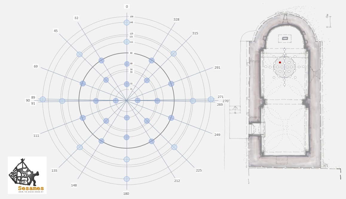
A visualisation of clarity values corresponding to the 32 capsules of the eigenmike 32
microphone used for acoustic data acquisition by the PRISM research unit. The visualisation acts as a projection in 2D of the capsules 3D positions, oriented with regards to the SESAMES survey protocol. It displays values for seven frequencies. Applied to each of the 15 edifices concerned by the SESAMES research project, and for each edifice on two reception points (online, SVG/javascript).
I. Dudek, J.Y. Blaise
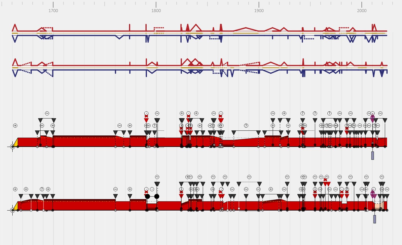
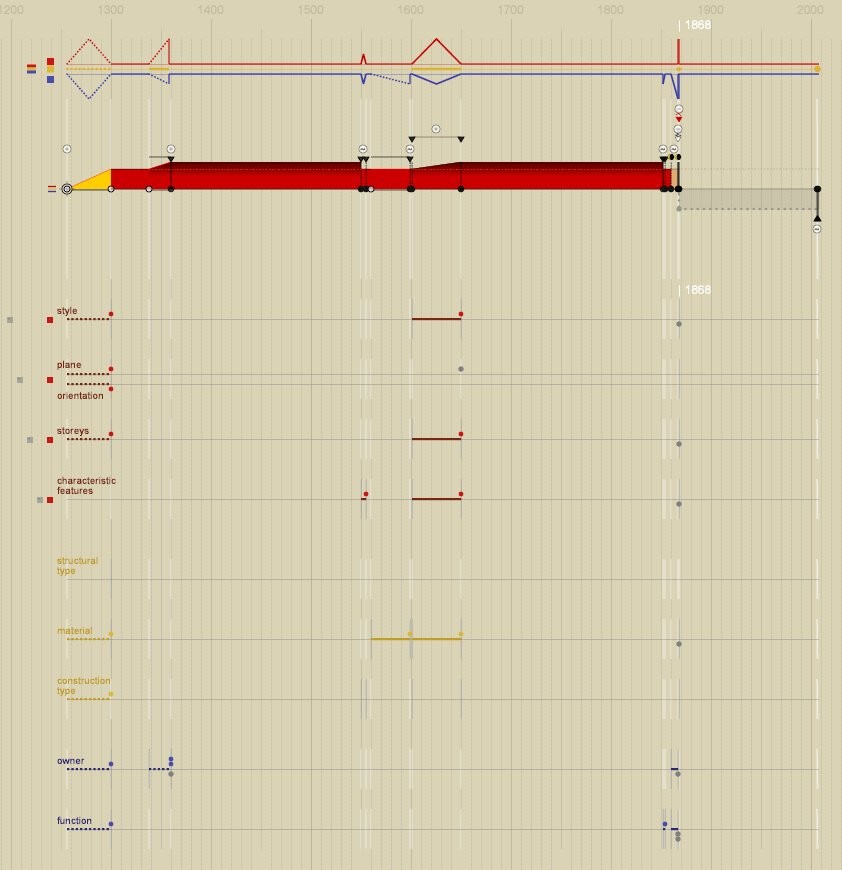
Extension of the "diachrogram" formalism (originally created and developed by I. Dudek and J.Y. Blaise), a visual formalism that bases on a conceptual model allowing for the description of diachronic evolution of heritage objects (buildings) - characterization of new transformations and states, exemplification.
I. Dudek, J.Y. Blaise
These visualizations organise visually in ordinal time heterogeneous pieces of information collected on each building (indications established or discussed, specific to the history of the building itself or to the context in which it evolved) with links to the sources.
interactive documents.
Note: This interactive version can be opened using PDF readers like AcrobatReader or FoxitReader - pay attention to the fact that web browsers will limit user interactions.
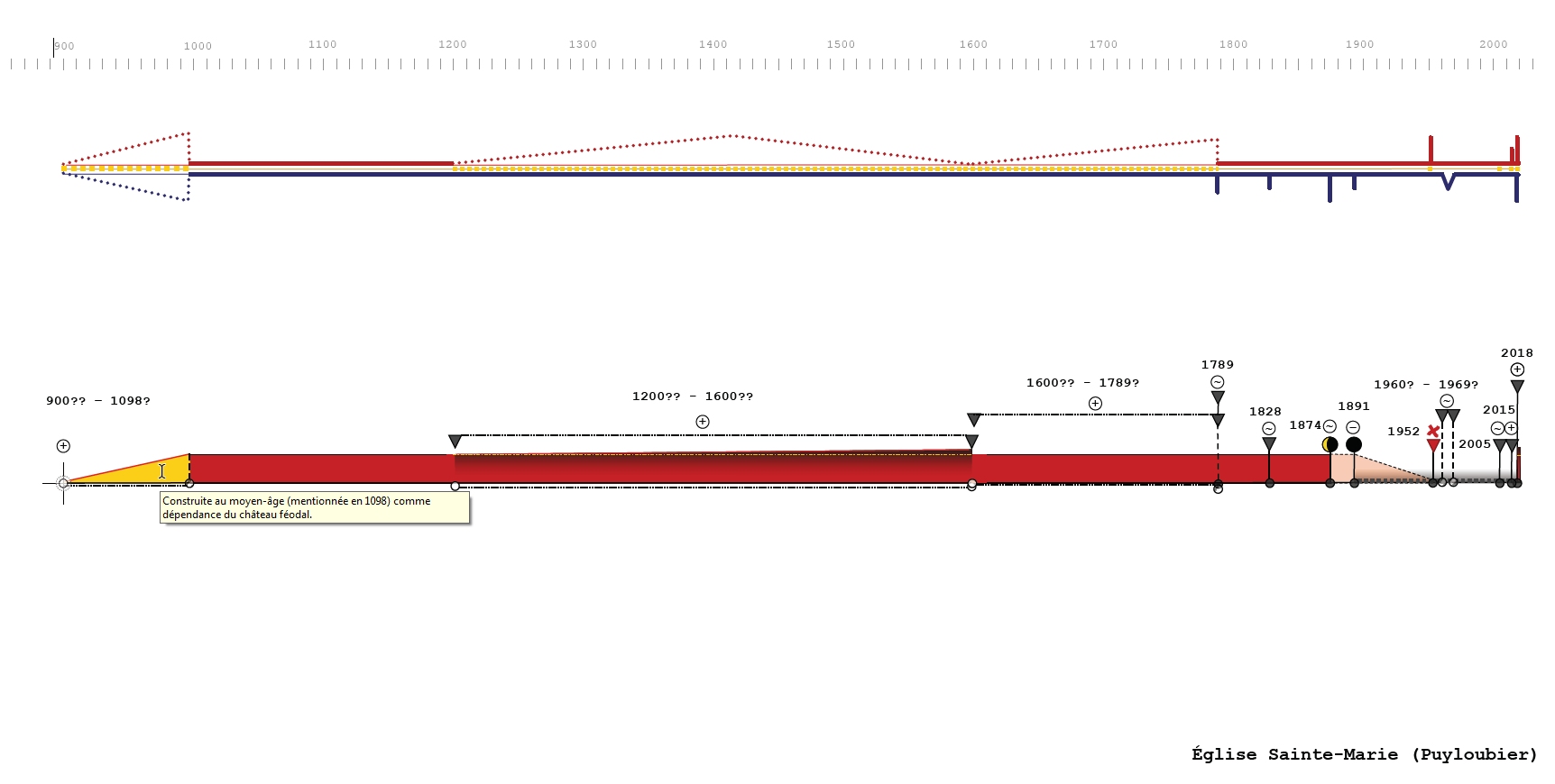
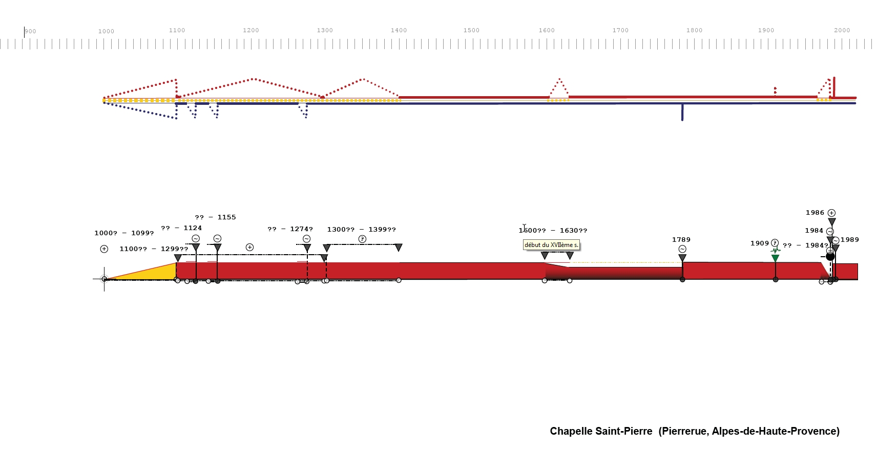
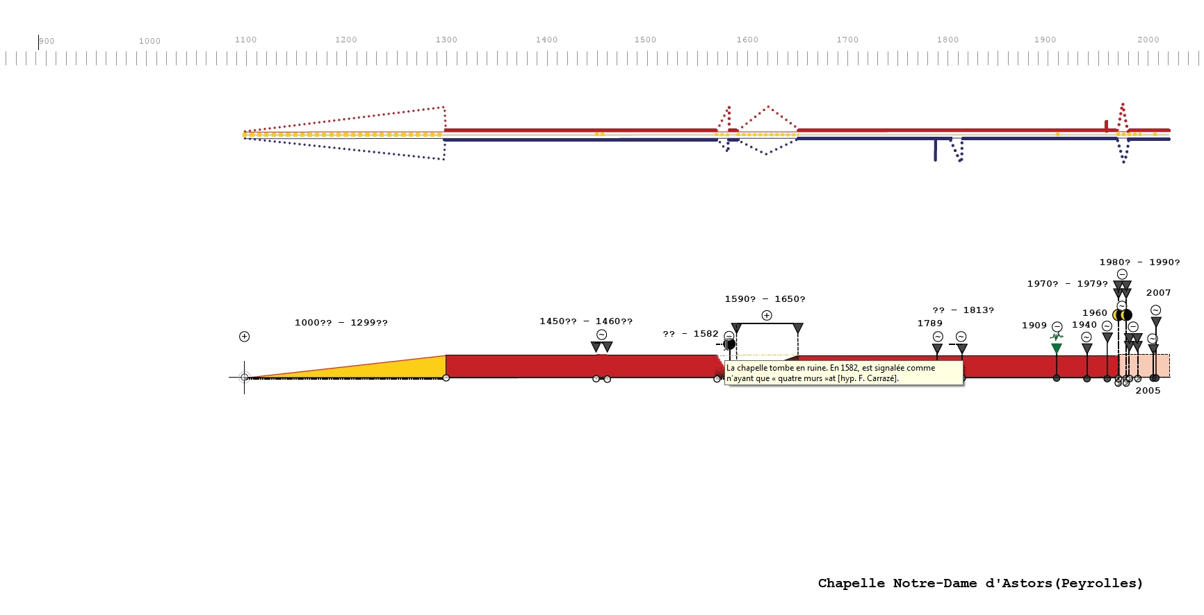
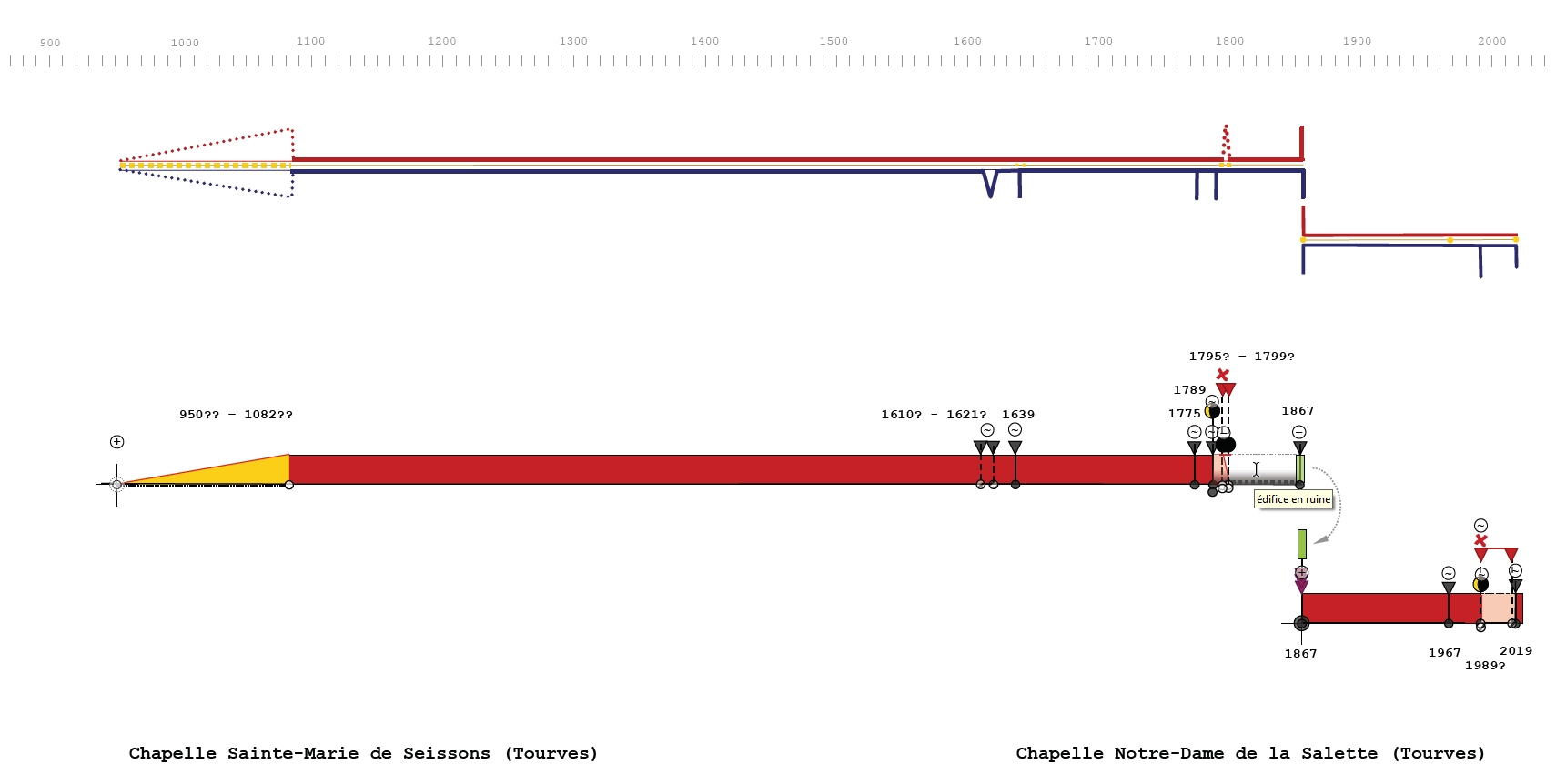
I. Dudek, J.Y. Blaise
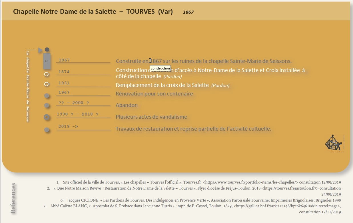
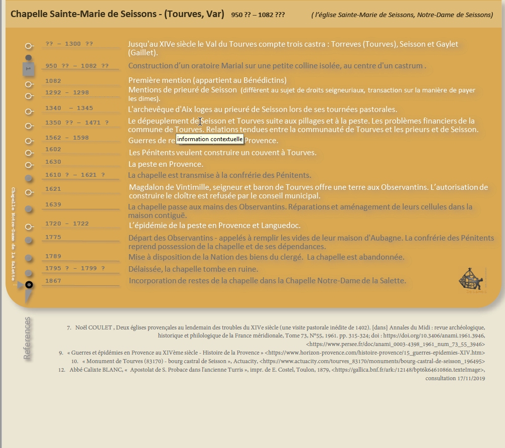
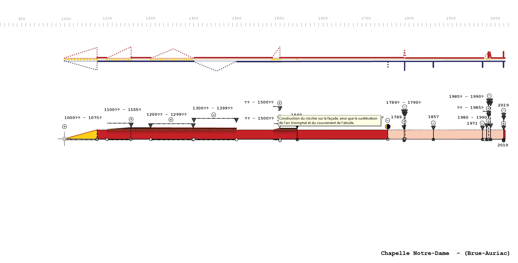
These visualizations (close to the chronological timeline) summarise the chronology of transformation of each building. The ‘diachrogram’ highlights key moments in an artefact’s evolution by displaying successive transformations and states. The ‘variogram’ characterises particularities of transformations by differentiating types of change: morphological (red), structural or material (yellow) and functional (blue).
15 interactive documents (one for each building).
Note: This interactive version can be opened using PDF readers like AcrobatReader or FoxitReader - pay attention to the fact that web browsers will limit user interactions.
I. Dudek, J.Y. Blaise, I. Cao
The flowchart representing the process of categorisation of sources used to formulate definitions of the MEMORIA controlled vocabulary.
The objective was to allow for an analysis of obstacles in case of full automatization of the process.
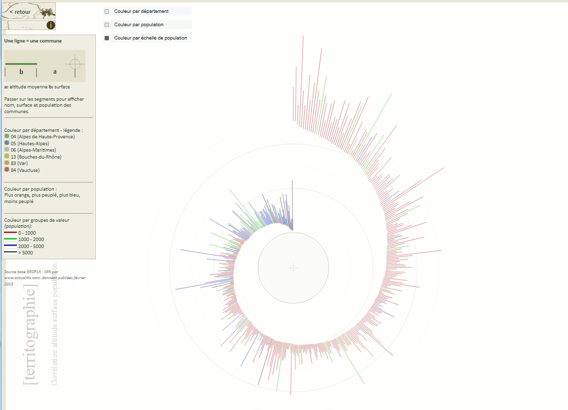
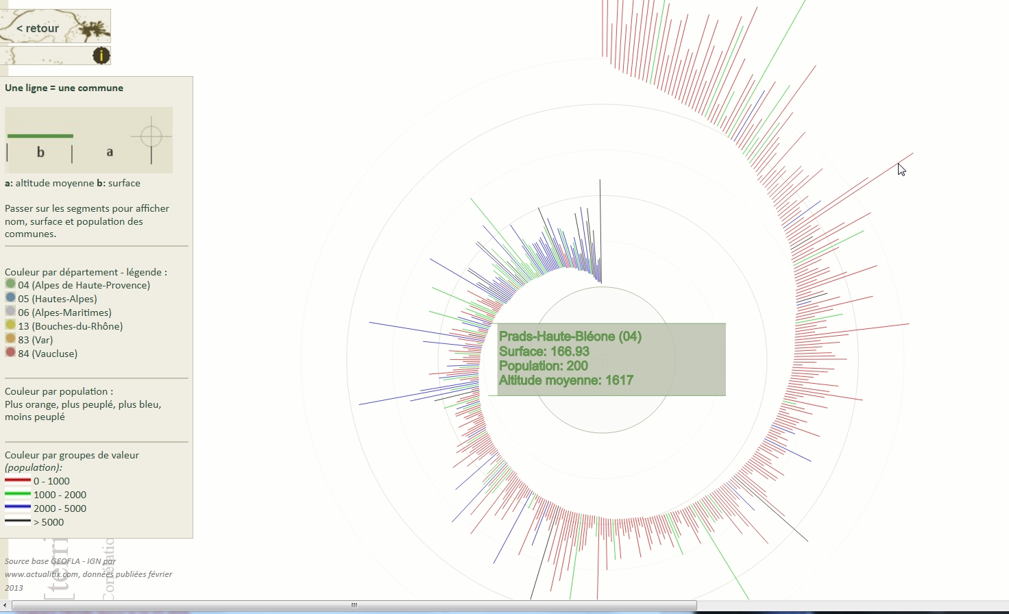
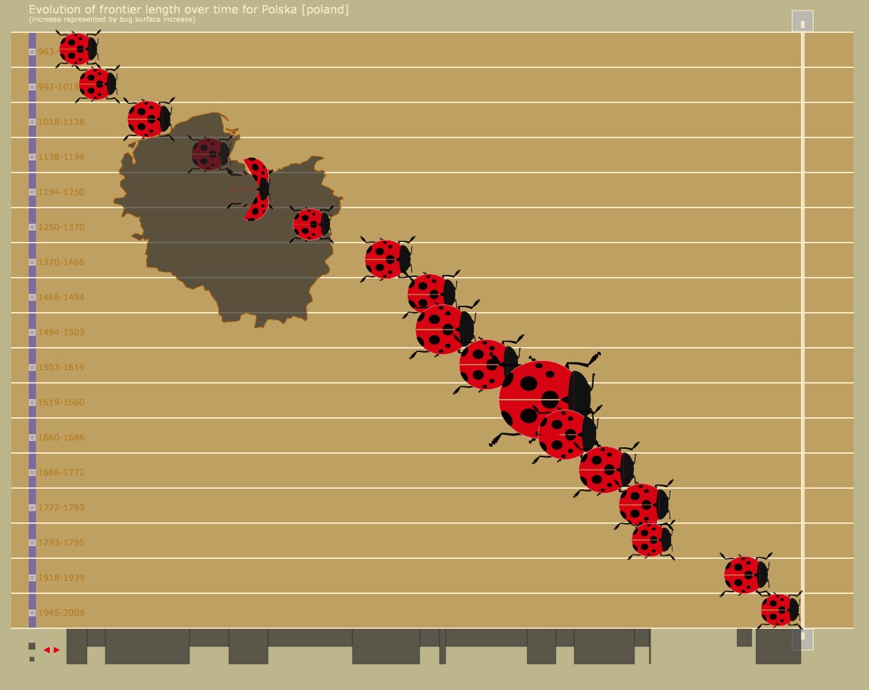
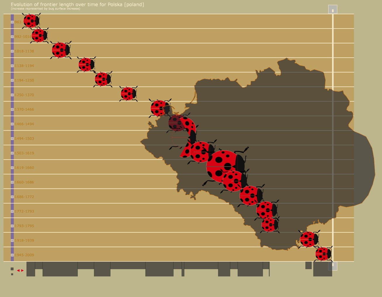
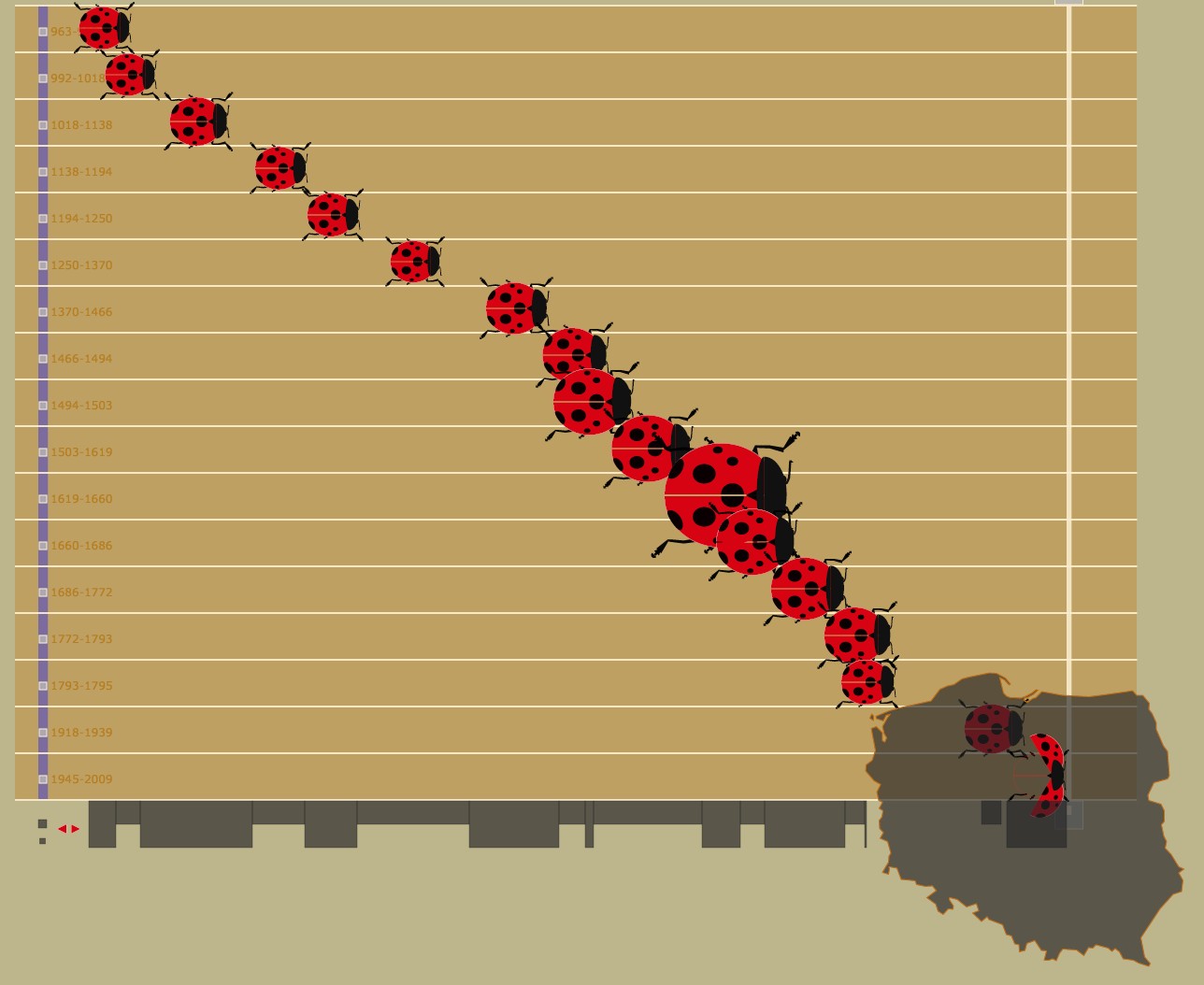
J.Y. Blaise, I. Dudek
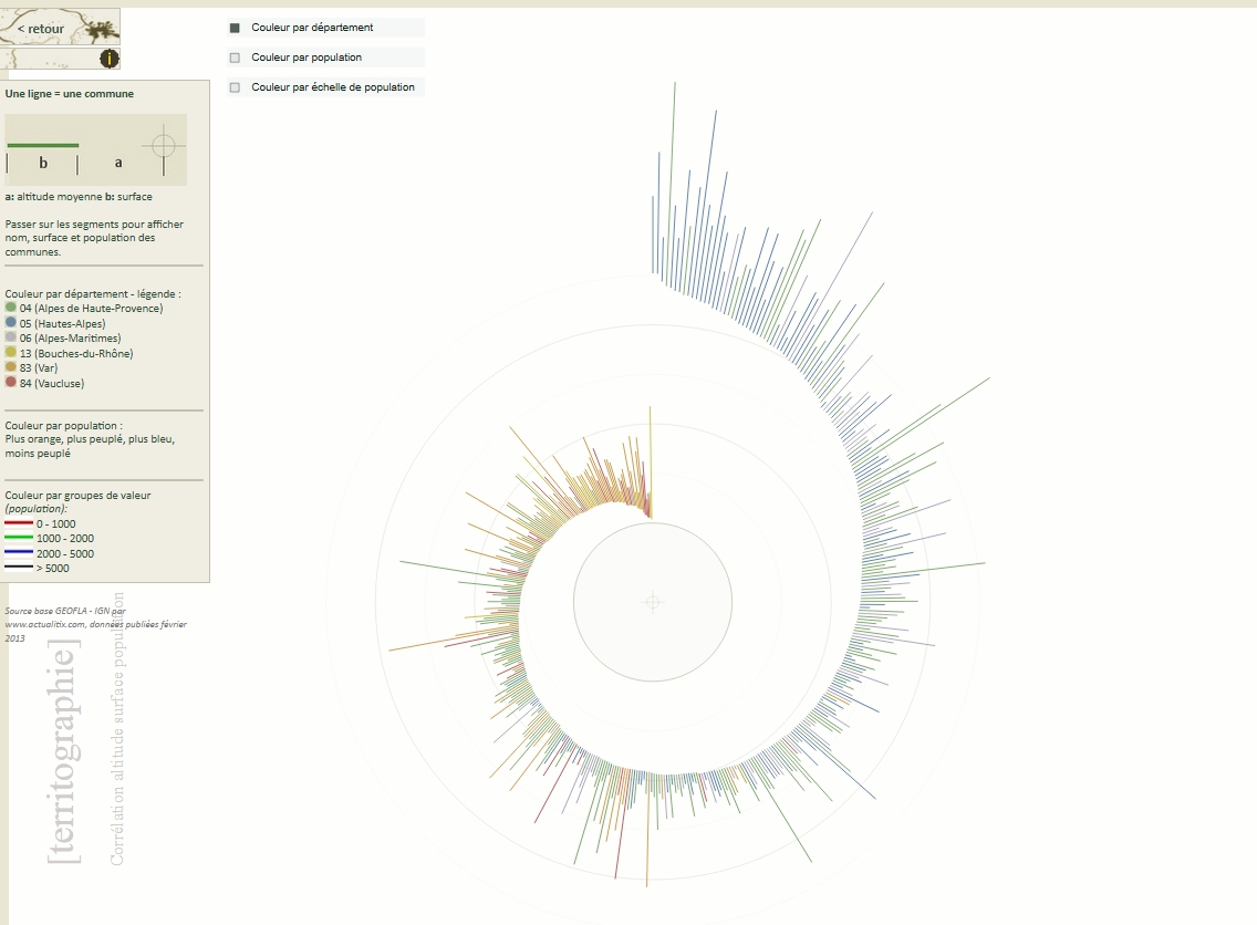
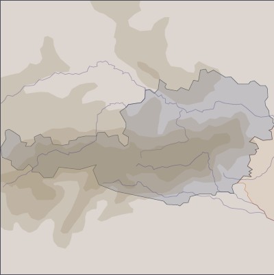
Visual tool displaying the correlation of altitude, area and population of localities (town or villages). The device represents relations between these three parameters in the form of a ‘spiral’.
J.Y. Blaise, I. Dudek
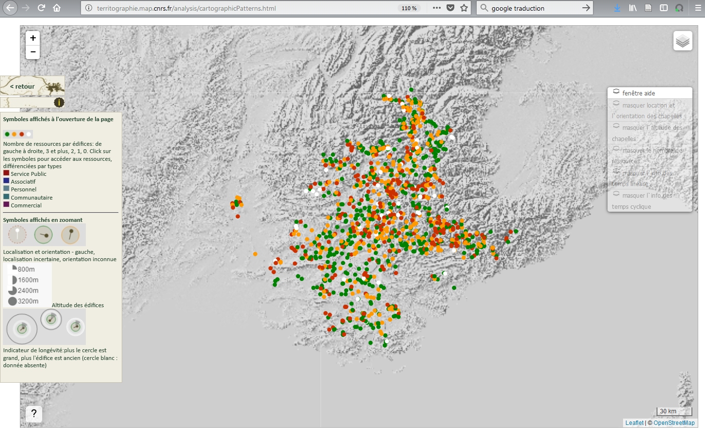
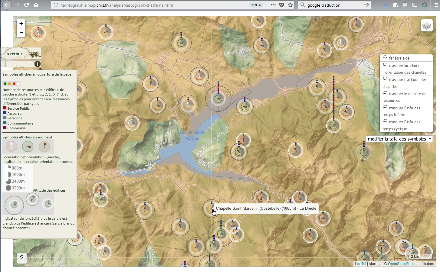
Visual formalism displaying spatial distribution, orientations and altitudes of a selection of rural chapels. Visualisation combines cartographic background with 3D elements.
Experimentation, on a set of objects (territory: Guillestrois and Queyras), of the X3Dom library to highlight spatial patterns.
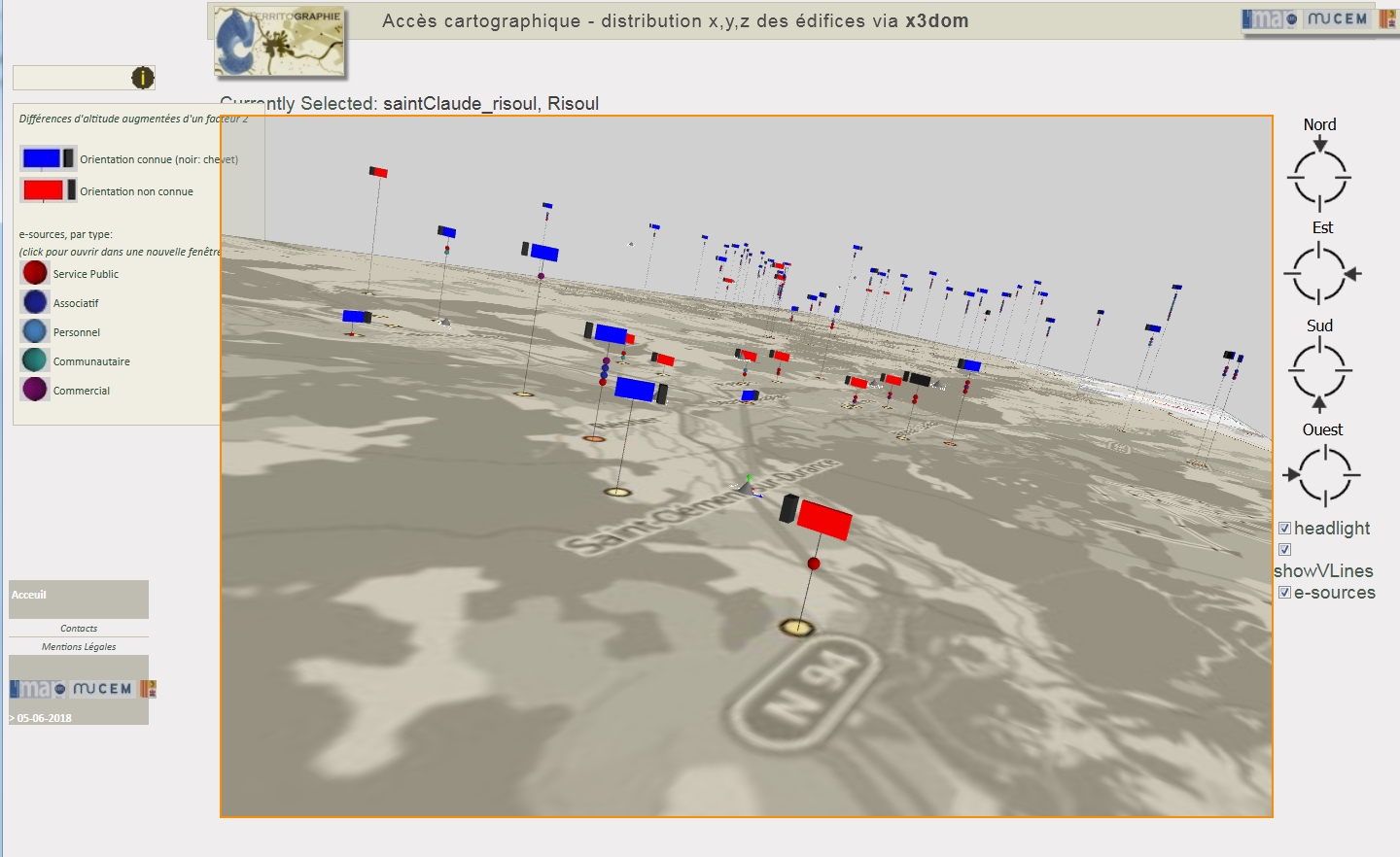
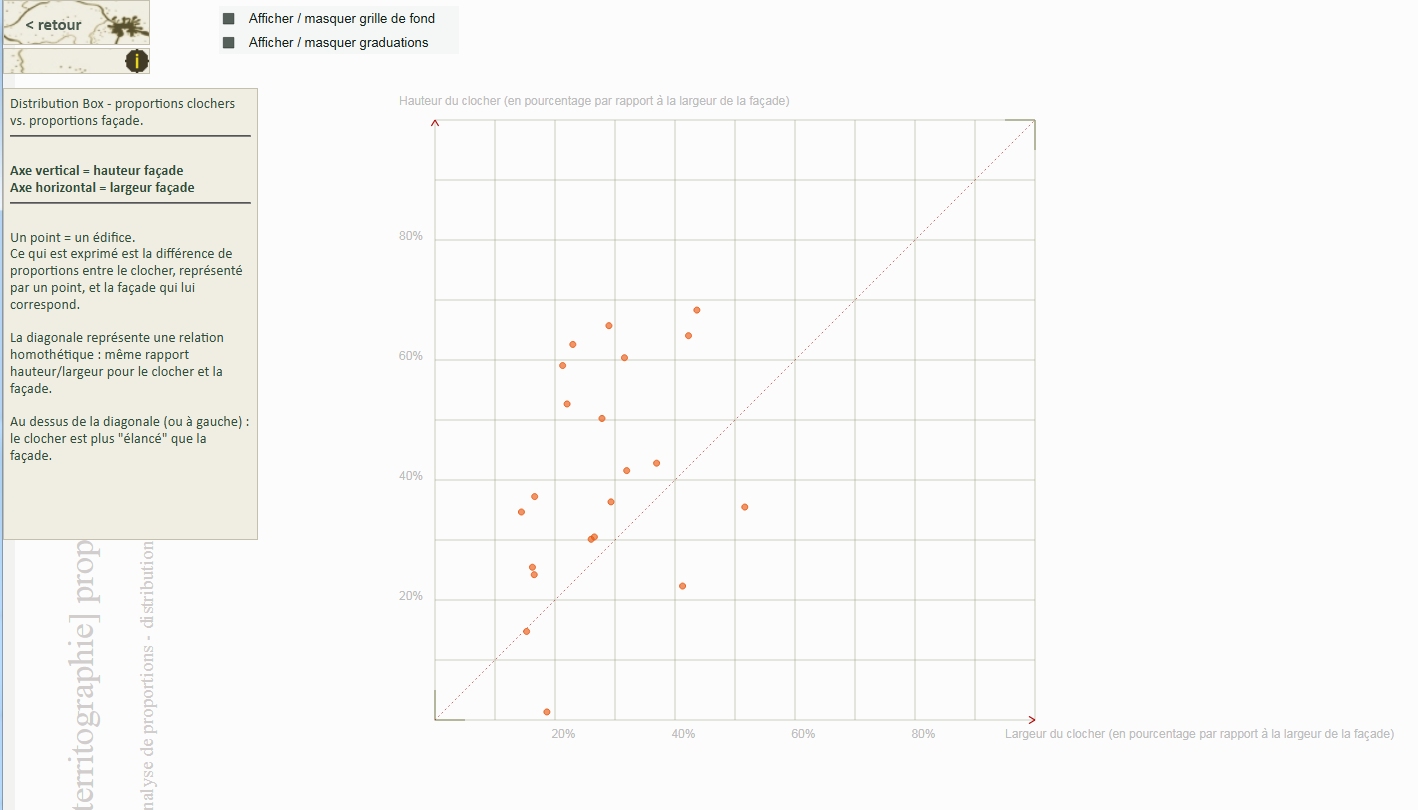
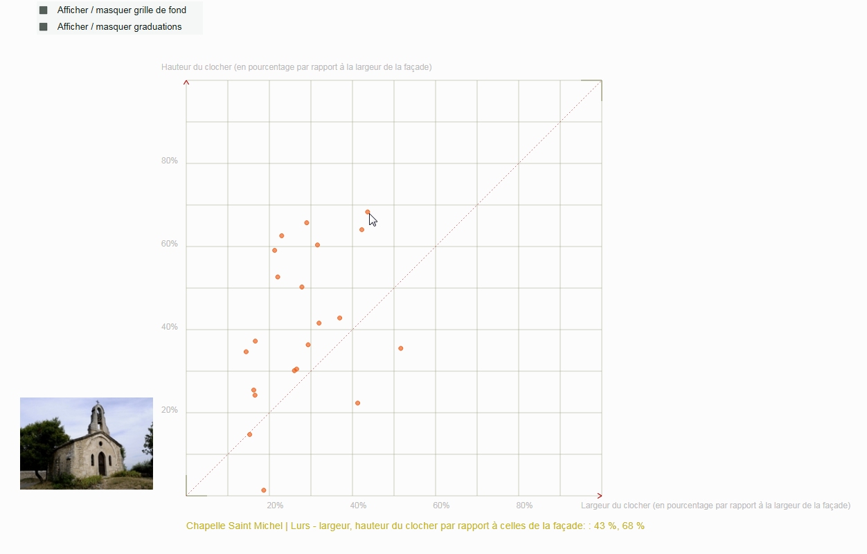
J.Y. Blaise, I. Dudek
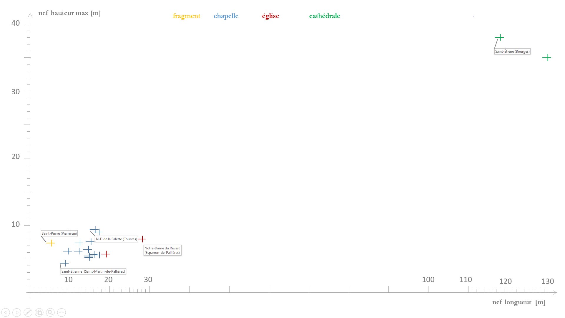
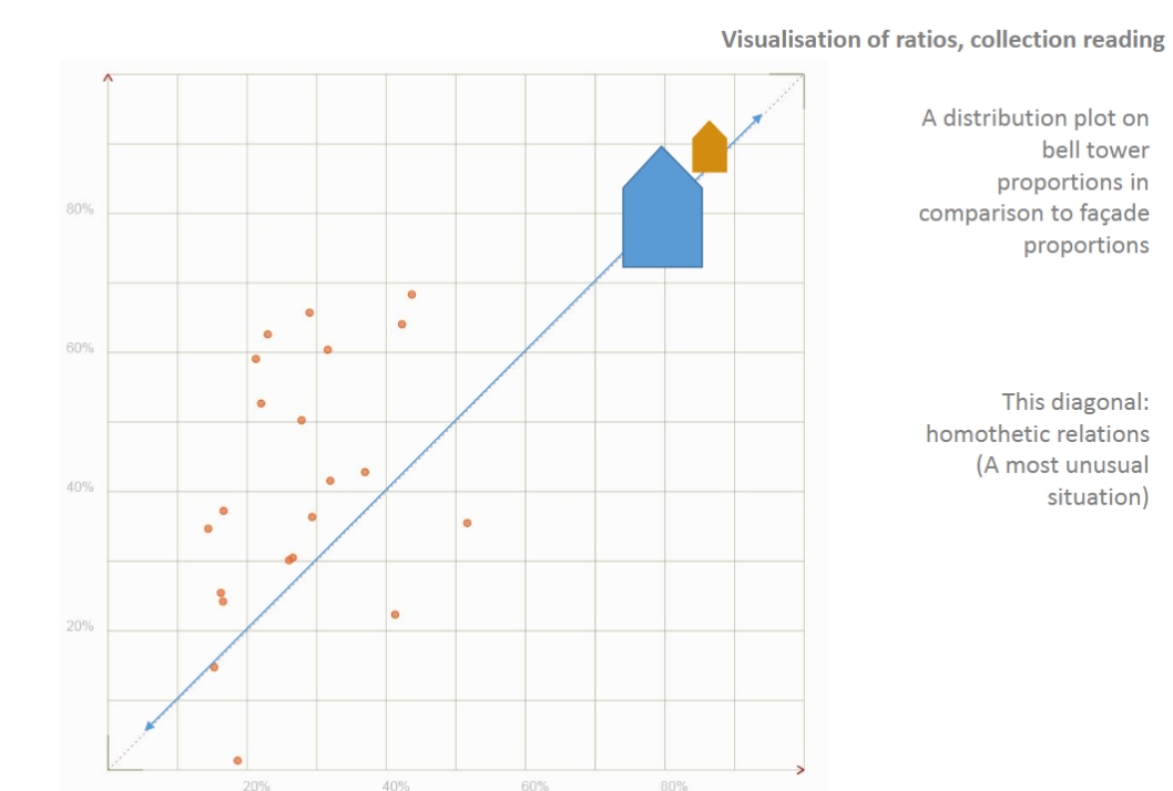
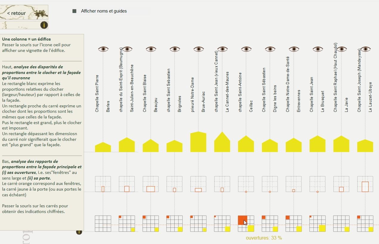
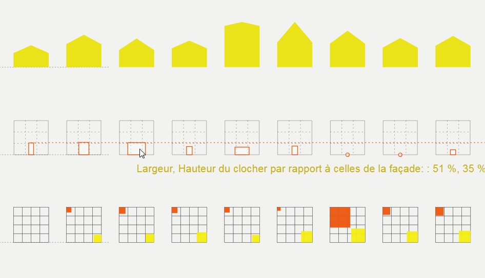
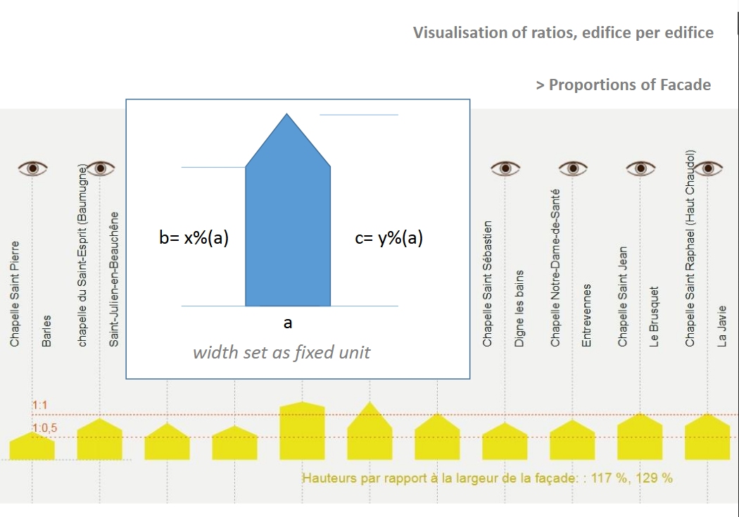
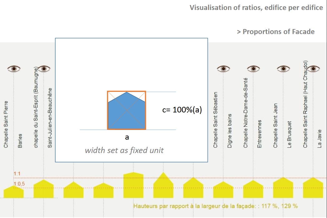
A graph showing differences in proportions between bell towers and facades – correlation of widths and heights. The diagonal represents a homothetic relation: same height - width ratio for the belfry and the facade.
J.Y. Blaise, I. Dudek
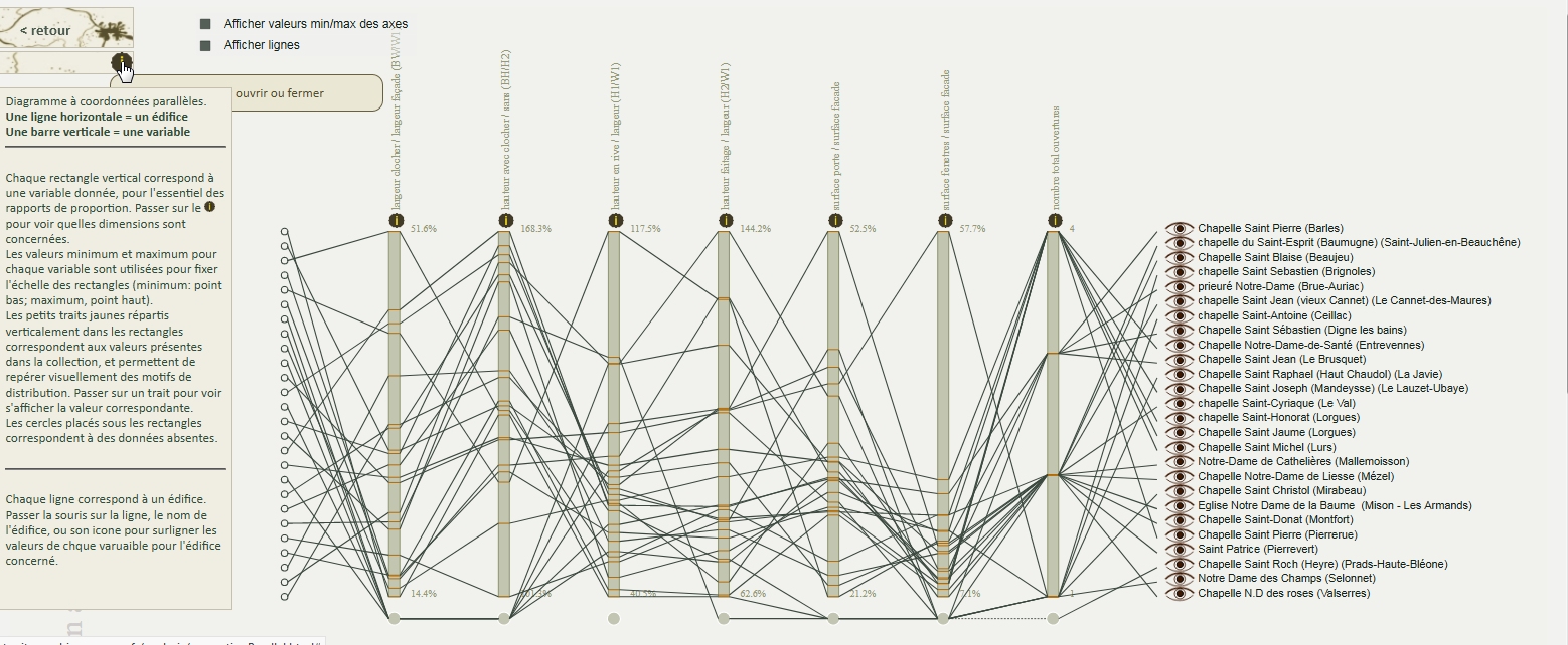
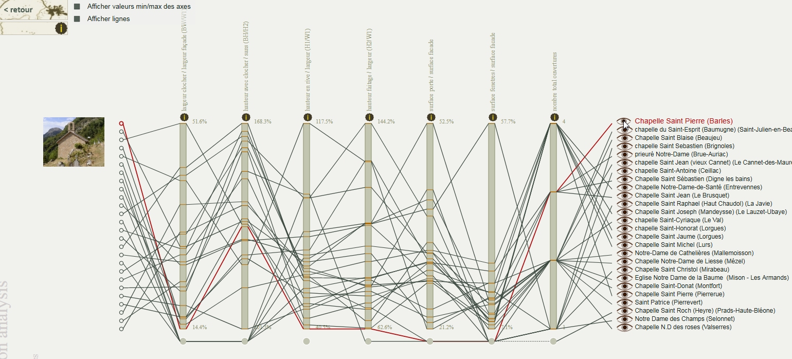
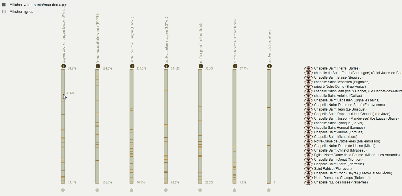
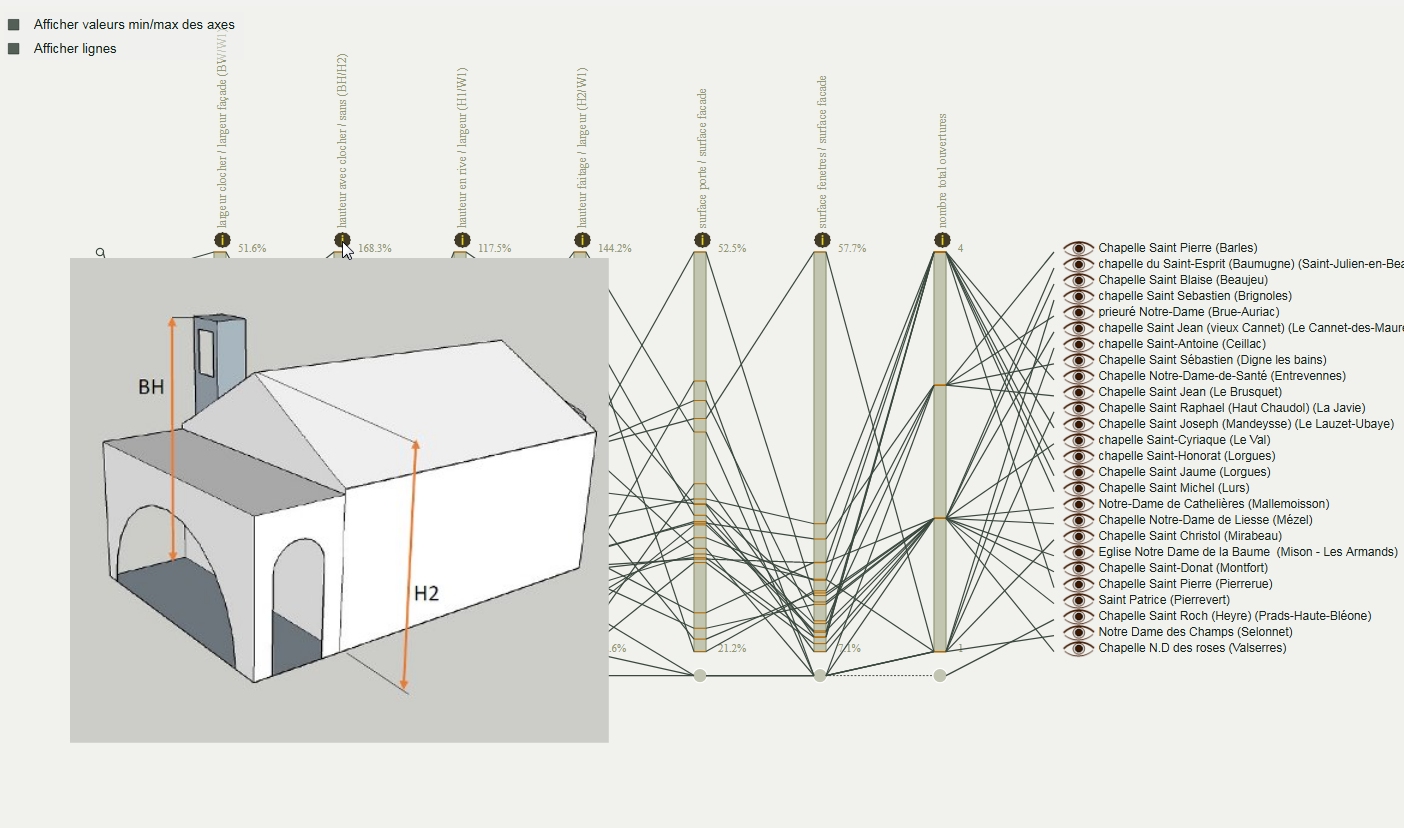
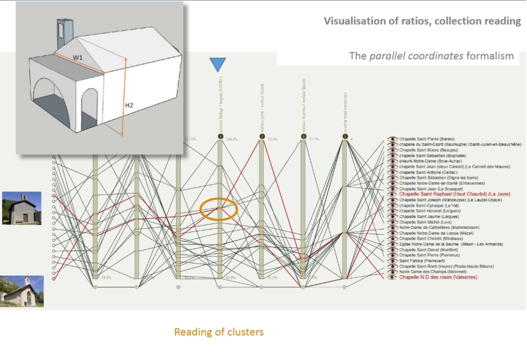
Highlighting dependencies between variables representing proportion ratios.
Reuse of the parallel coordinates formalism to analyse proportions of basic components of buildings (bell tower / openings / facade).
J.Y. Blaise, I. Dudek
Visualisation of ratios, edifice per edifice - comparative evaluation of proportions of basic components of buildings (bell tower / openings / facade) to highlight similarities, regularities and exceptions.
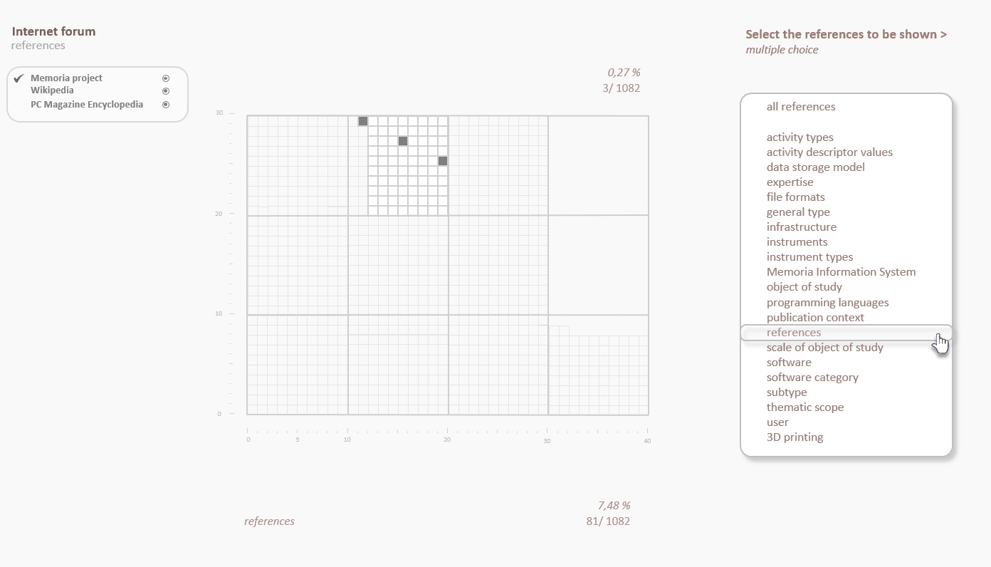
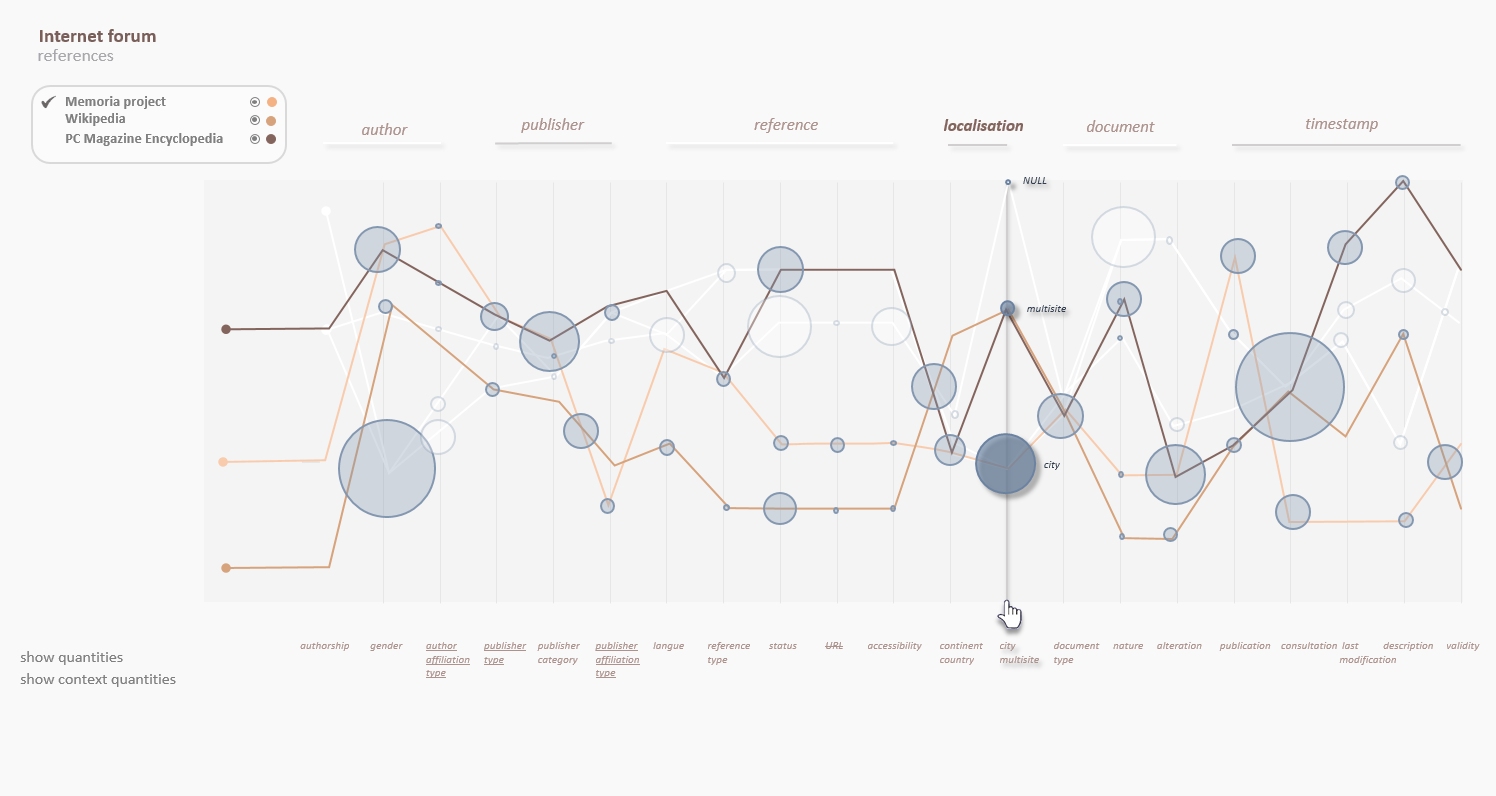
I. Dudek, J.Y. Blaise
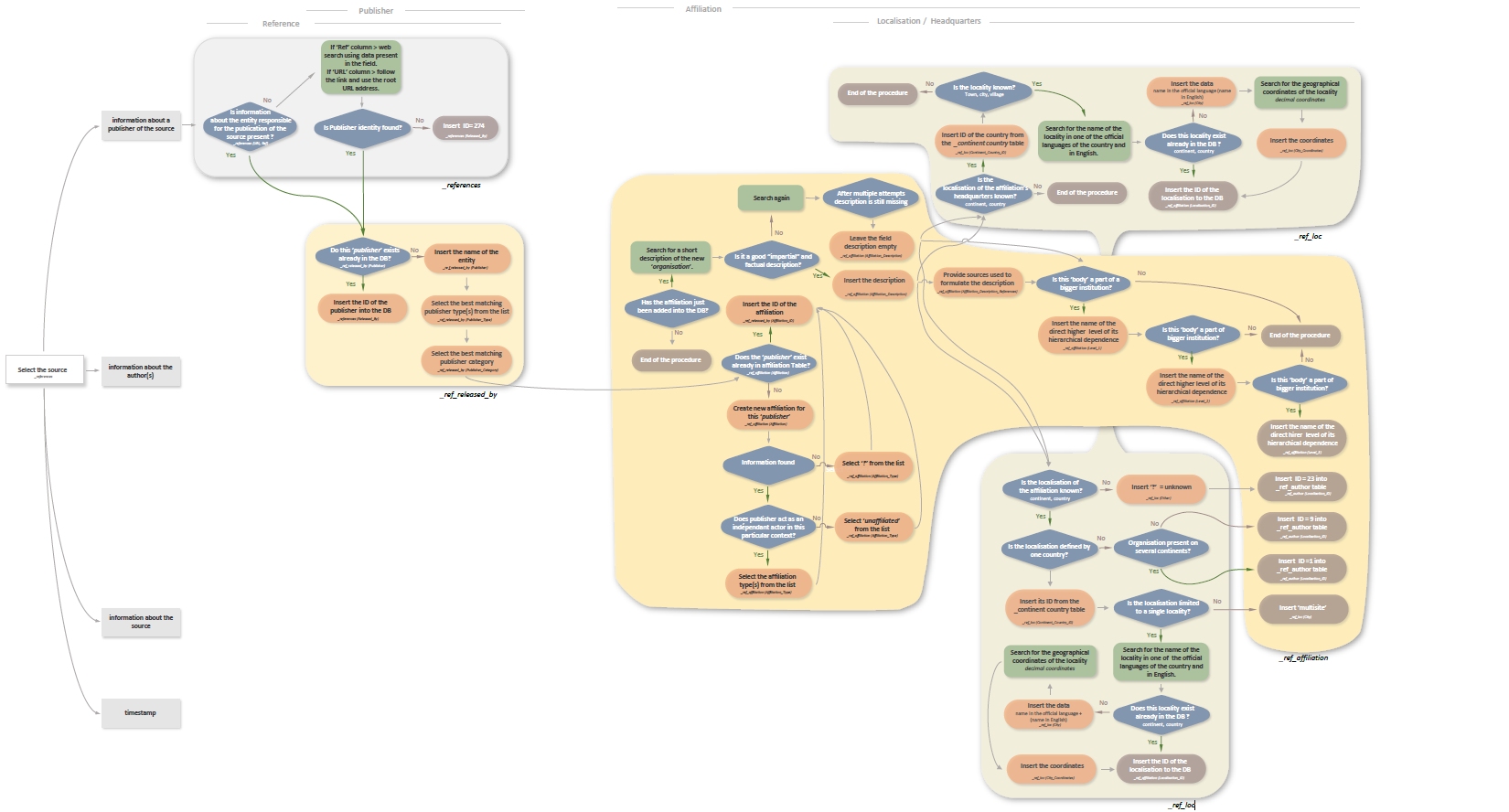
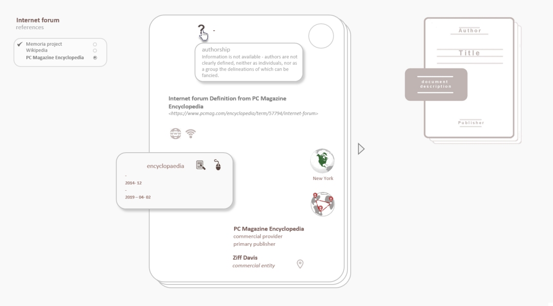
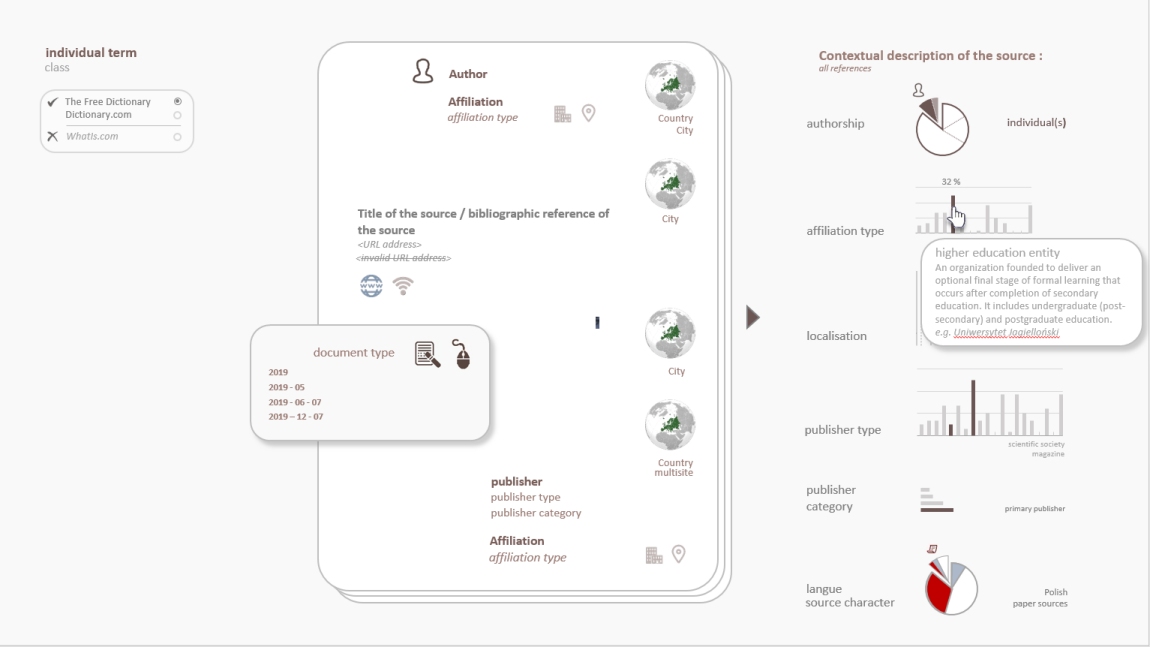
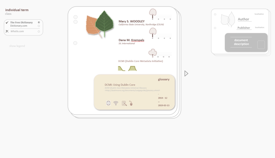
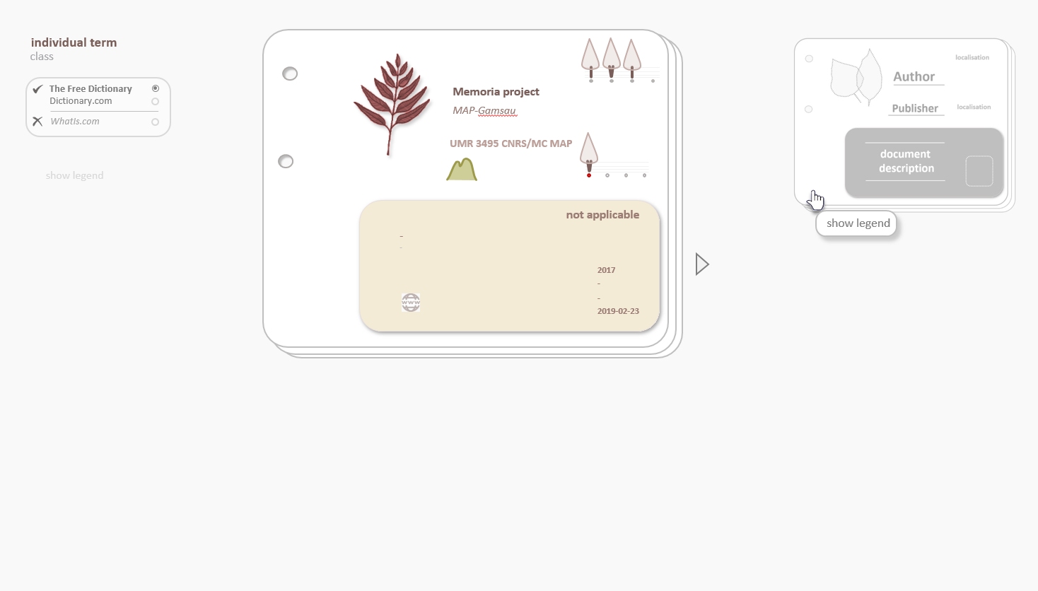
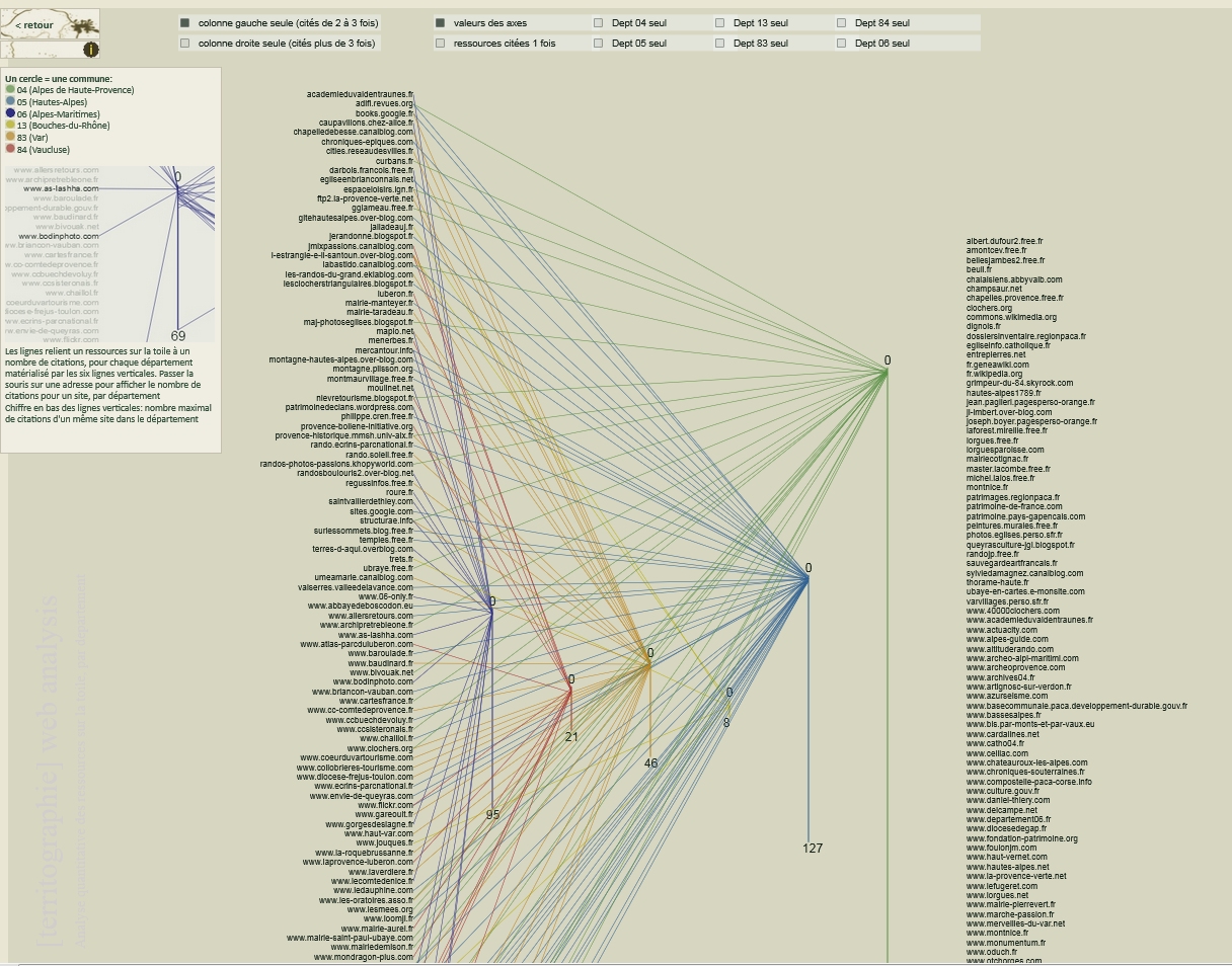
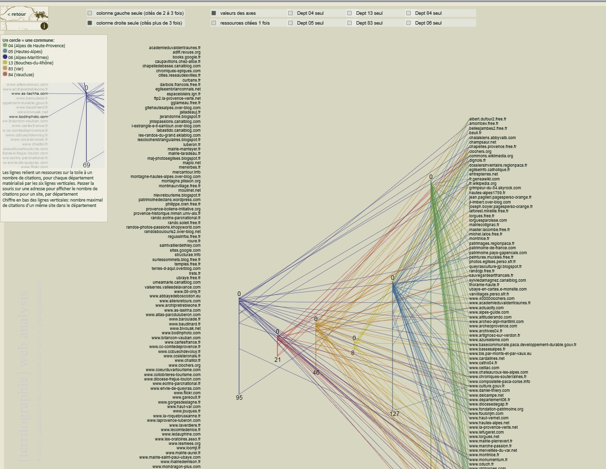
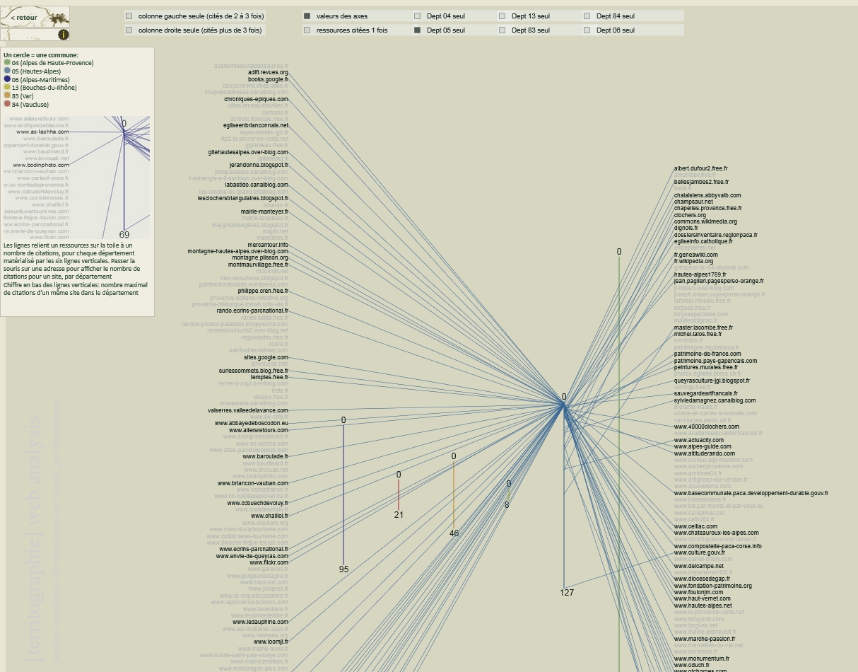
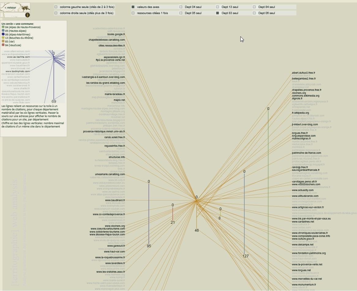
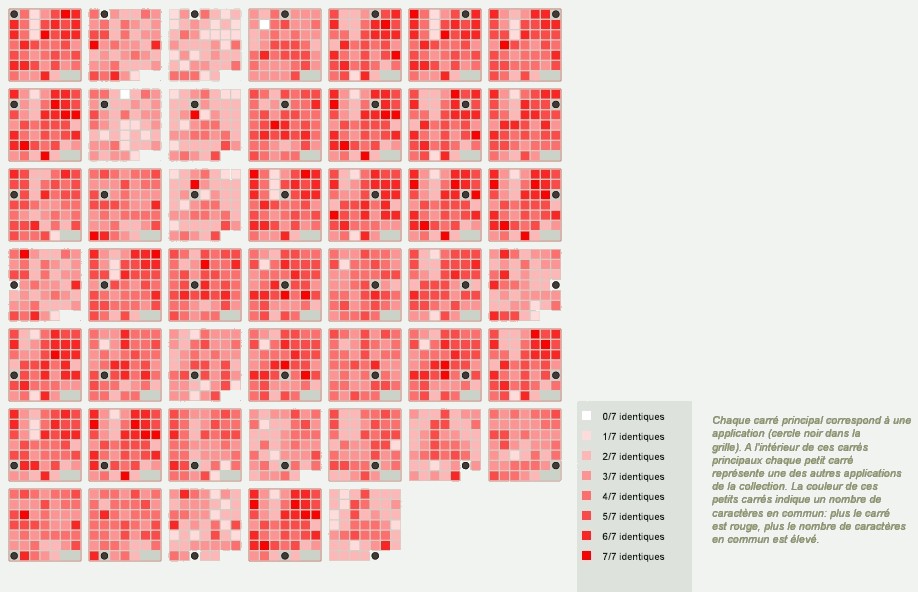
A set of comparison-enhancing visualisations assisting the analysis of resources (e-sources and bibliographic resources) in relation to the categorization criteria defined in the 'memoria-ref' database.
These visual tools combine different types of visualisations giving access to:
- detailed information about a specific resource,
- specificity of a resource in relation to the whole collection of references, or in relation to a specific group of references – various indicators are shown by different visual formalisms,
- comparative visualisation of the specificities of different resources (or groups of resources) in comparison to the whole collection of references, or in relation to a selected group of references.
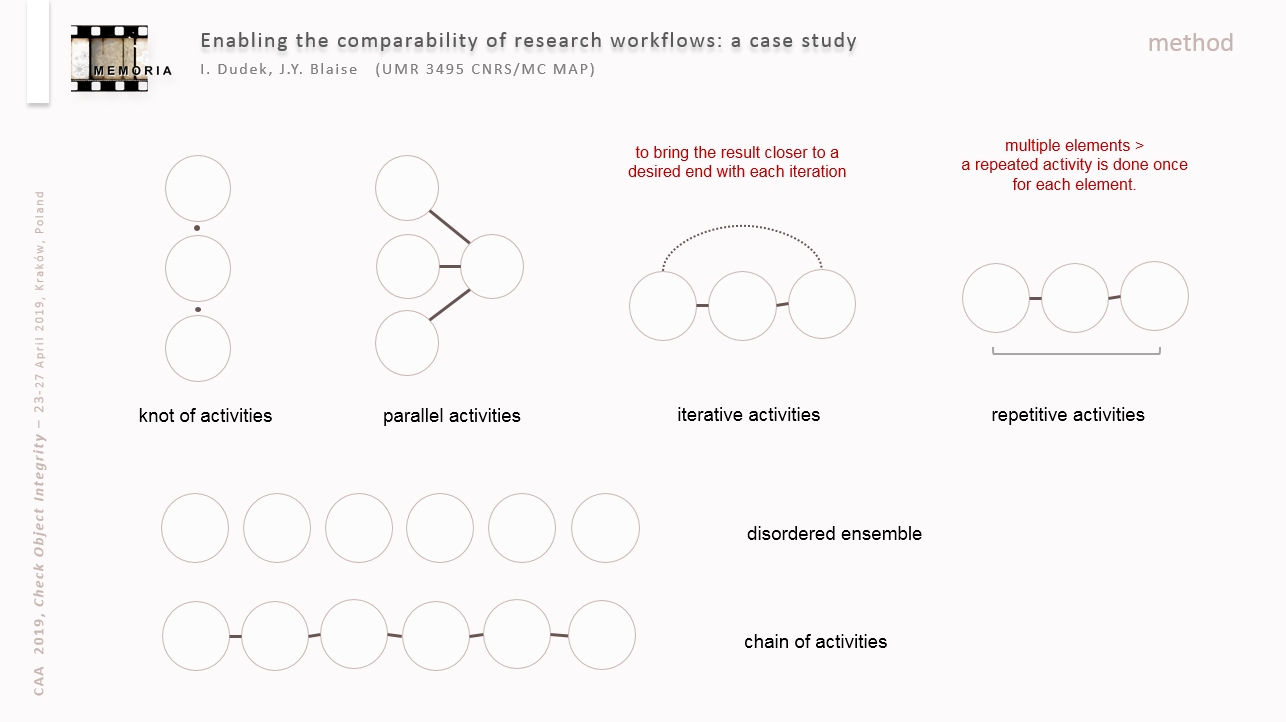
I. Dudek, J.Y. Blaise
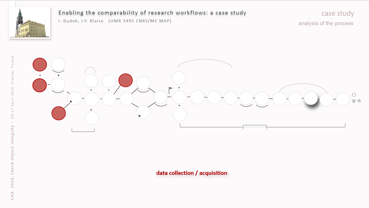
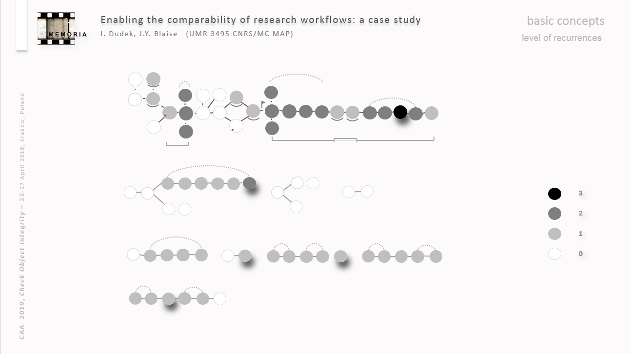
A process (defined as a set of activities mobilised to produce an output) is visualised as a graph underlining characteristics and temporal relations of the activities carried out during the process. This graph summarises the structure of the process (chains of activities, disordered activities, parallel activities, iterative activities, knot of activities, …), gives access to preceding processes as well as detailed descriptions of engaged activities. It may be represented in ordinal or ordered time, or compared to other processes.
The main objective is to ensure the verifiability, reproducibility and comparability of research workflows, facilitate the reasoning (including comparative) on our working methods and their evolution and ensure the intersubjectivity of these processes.
J.Y. Blaise
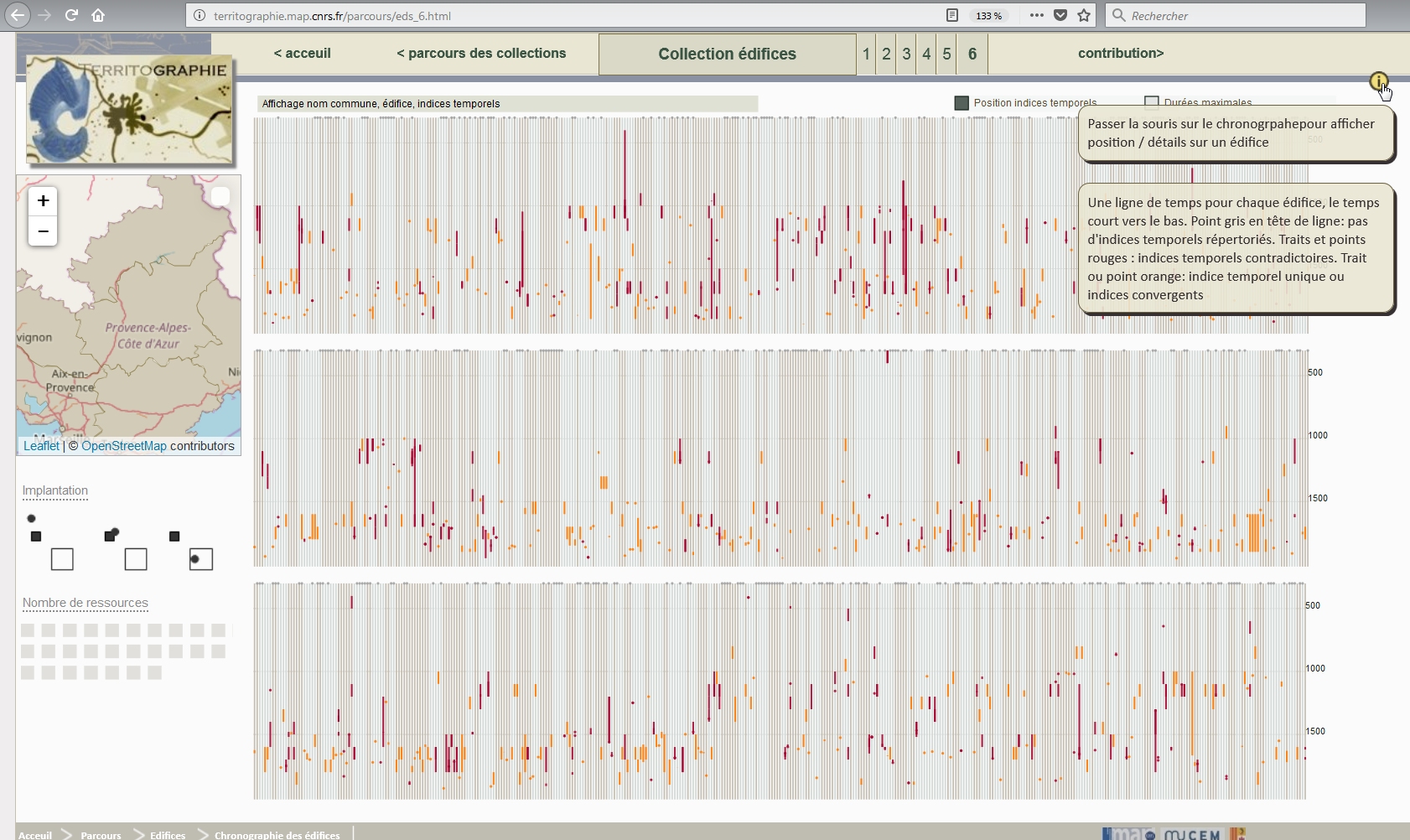
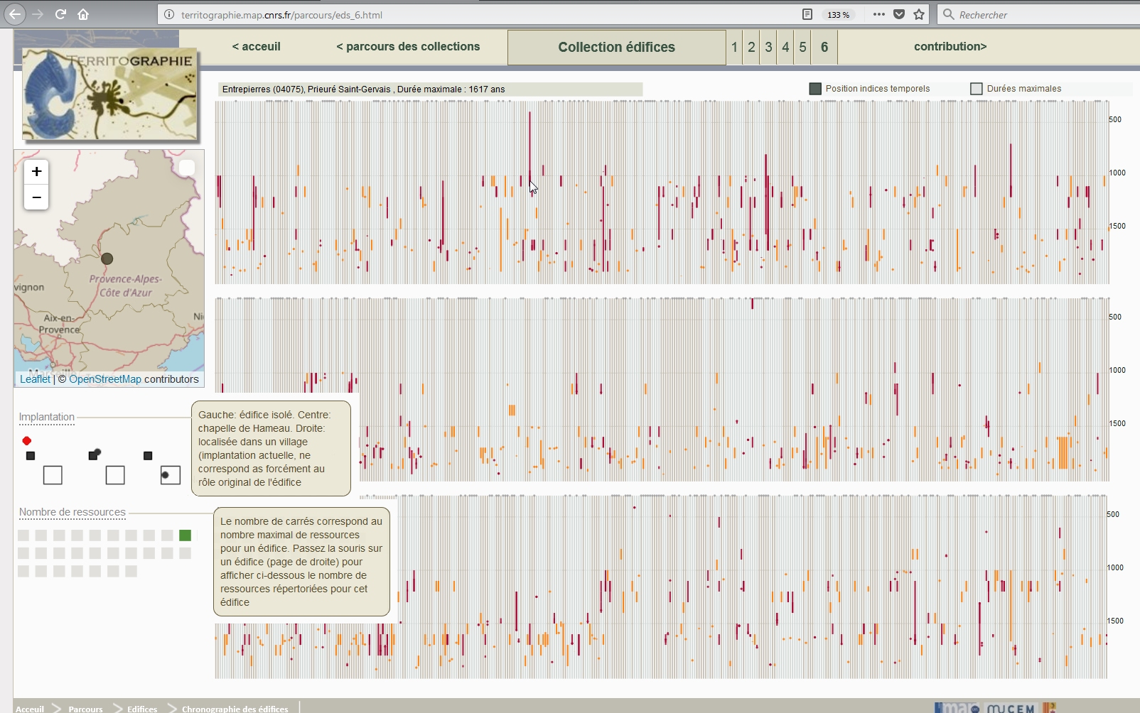
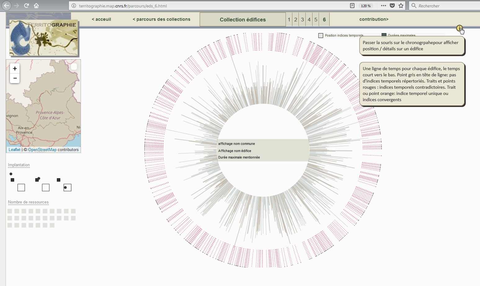
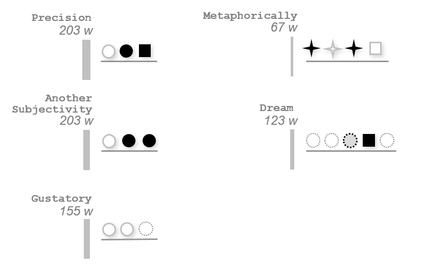
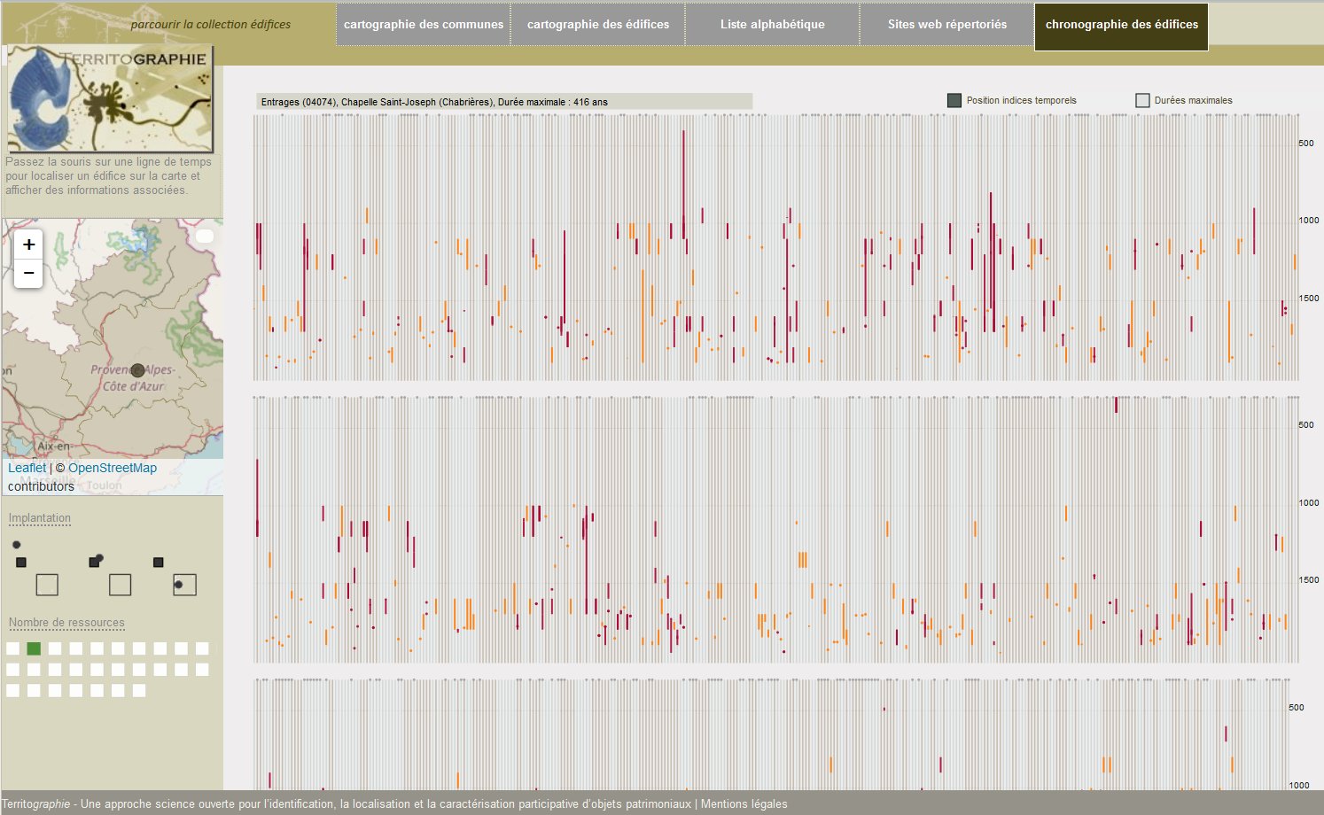
In this comparison-enhancing visualisation temporal hints corresponding to an edifice are distributed along narrow vertical bars, with colours marking consensus or contradiction (or missing data). The visual displays helps reading significant patterns, groups, differences in “precision”, etc.
A variation of this display, based on the same data set, but structure as a radial visualisation, is proposed that shows the maximal lifetimes rather that the amount and precision of the temporal hints.
J.Y. Blaise, I. Dudek
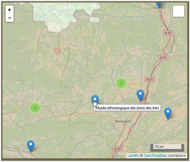
This map is used to position communes for which we have testimonies showing this or that practice was duly present on the territory of the commune at one moment in history.
Ultimately, as a result of the crowdsourcing effort, this map could facilitate an analysis of spatial patterns (distribution, flows, densities) related to the local craft and trade practices collection .
31 pages plus portal page
J.Y. Blaise, I. Dudek
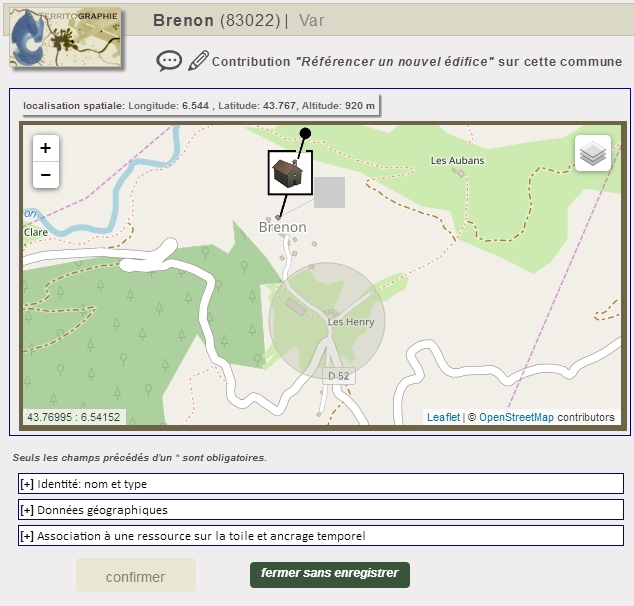
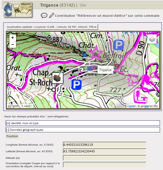
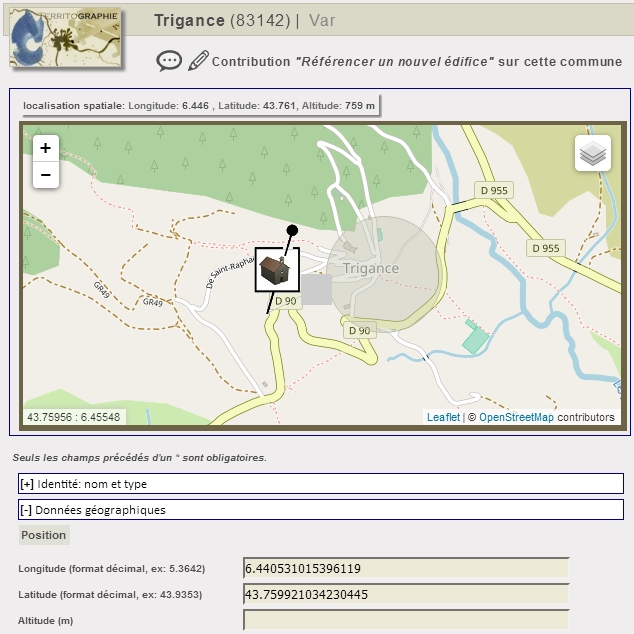
The contribution (crowdsourced information) part of the Territographie web site gives access to a module that allows contributors to position immovable objects on a leaflet/OSM map and thereby to record long/lat values. This service is available in the online contribution mode only (user account required). The module at this stage remains elementary and hardly foreshadows what a volunteered CH (Cultural Heritage) data cartography needs to be.
J.Y. Blaise, I. Dudek
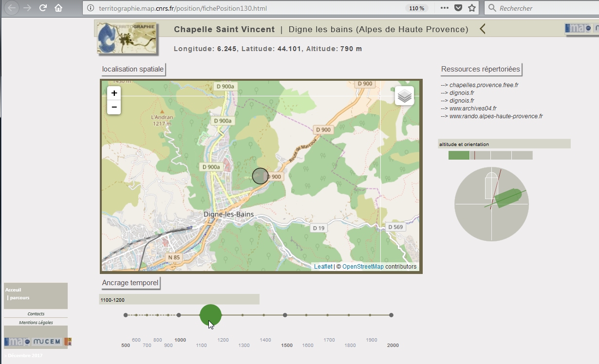
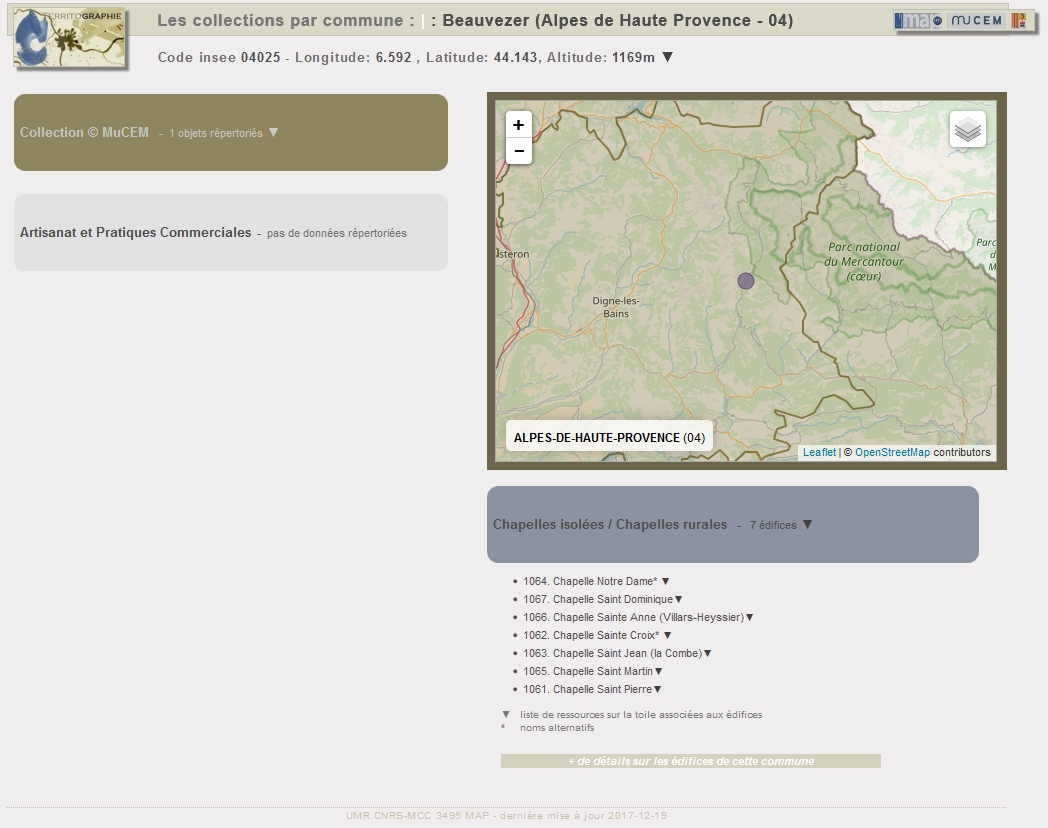
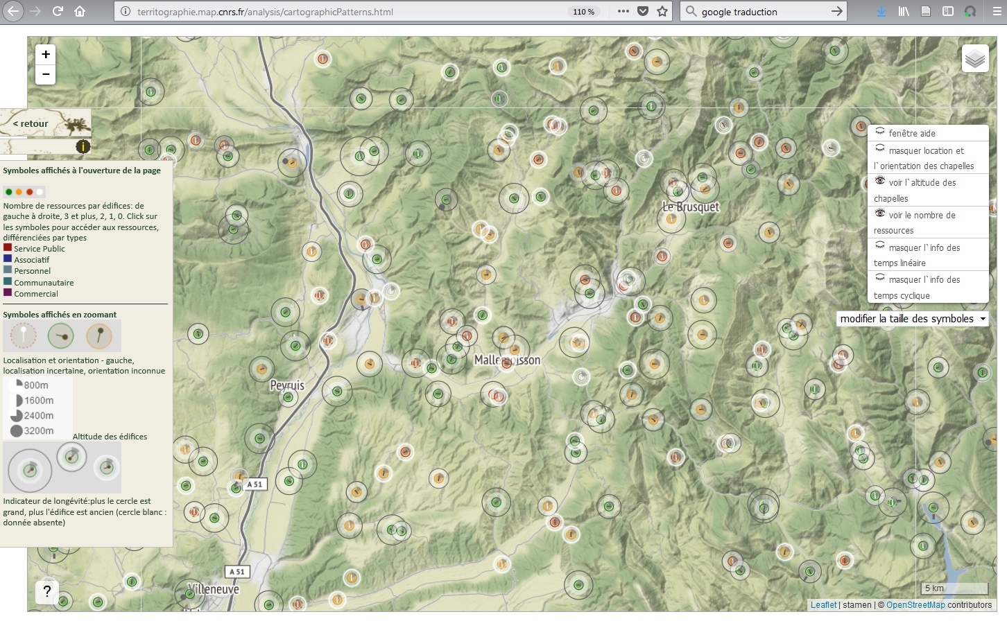
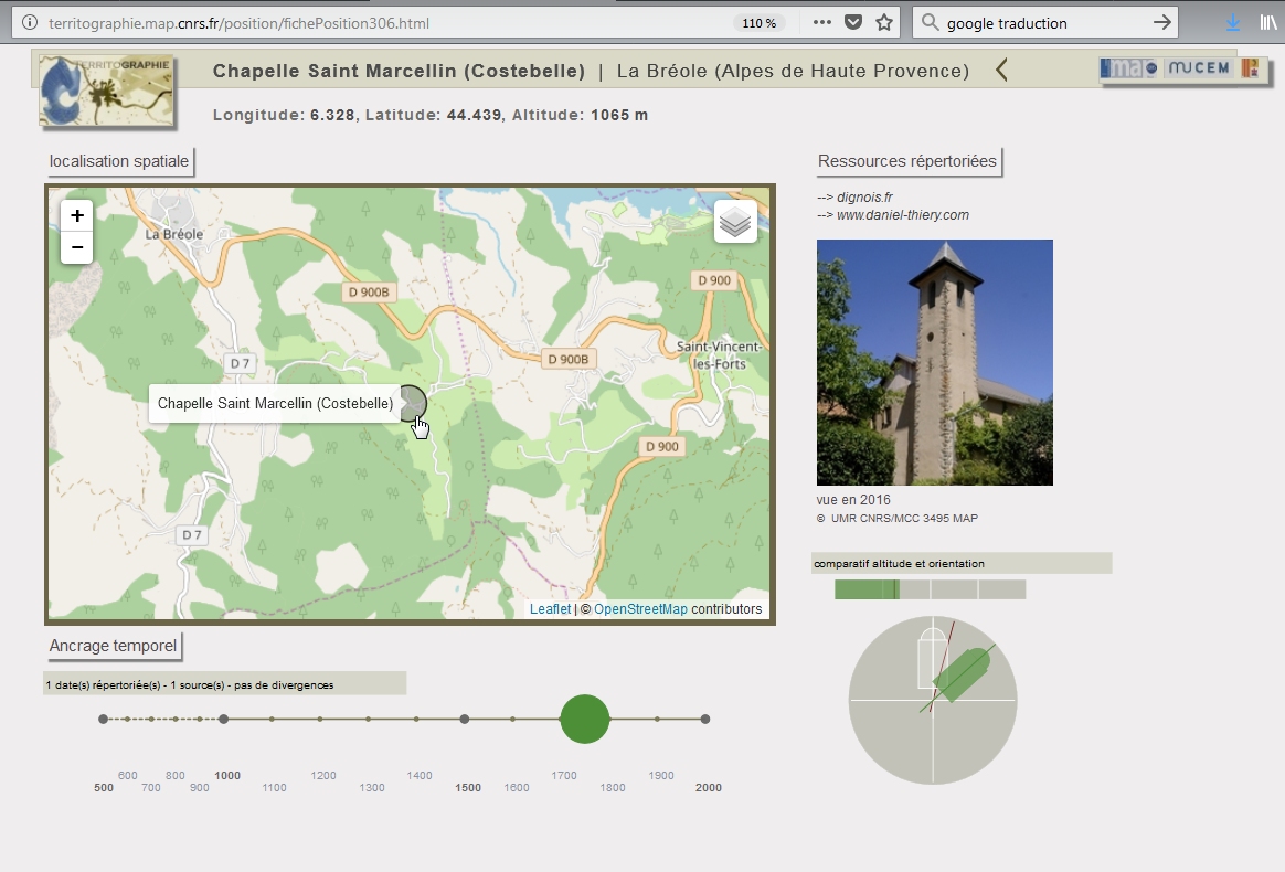
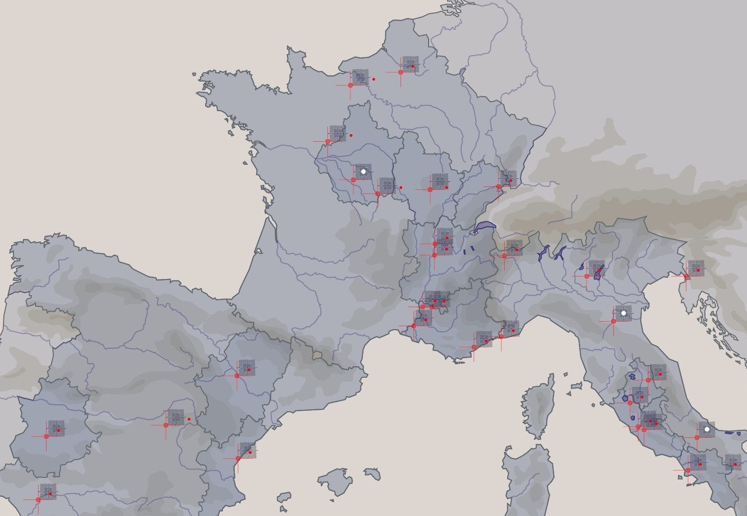
To each edifice corresponds a web page that features a map showing the position of the edifice along with diagrammatic representations (SVG) that are used to display information about the edifice’s dating, its altitude, its orientation, or cyclic events it is related to. Mean values for these parameters across the collection are given as a reference framework.
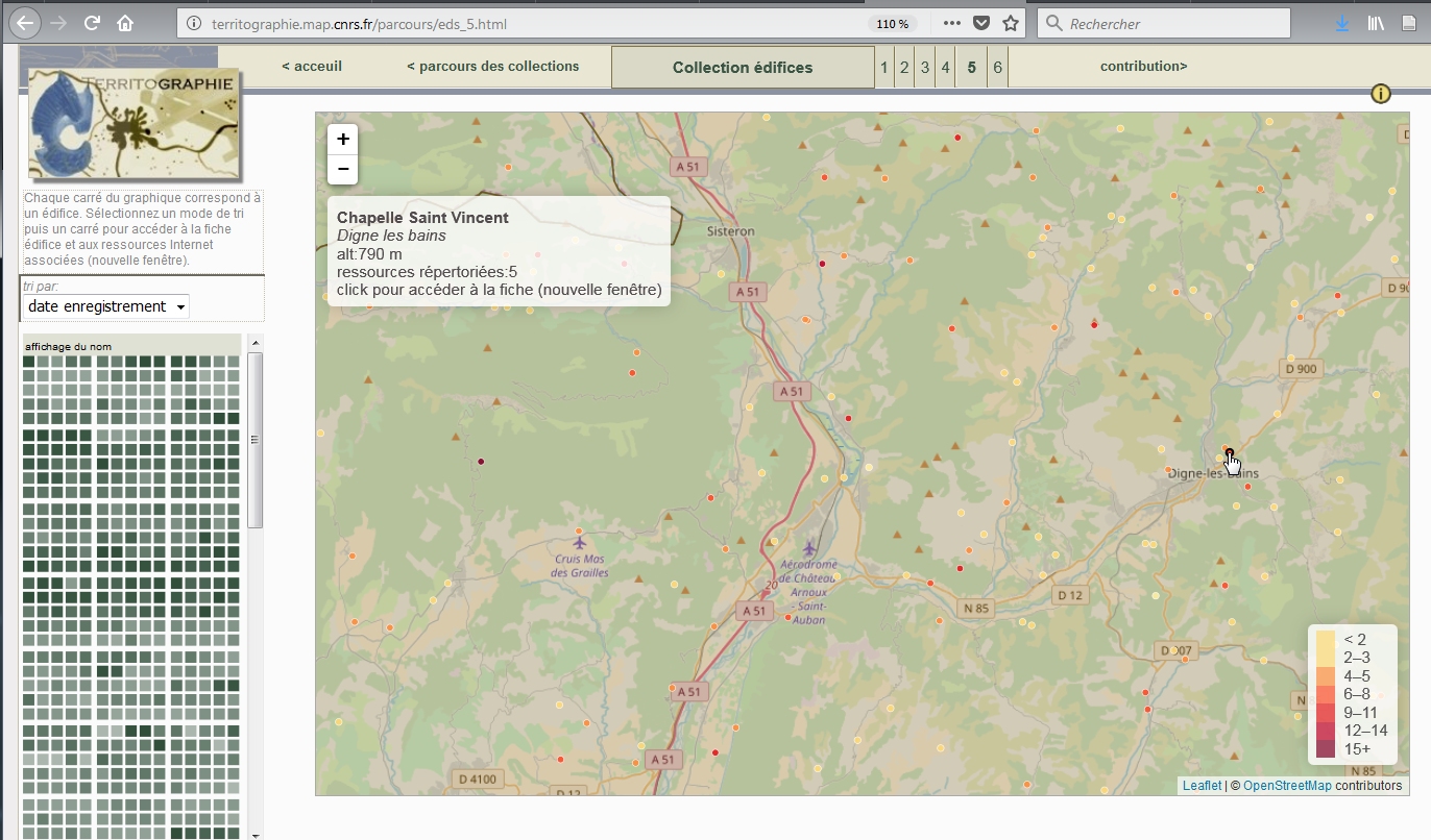
Users reach these edifice-by-edifice pages from a portal page with a map showing all edifices registered across the region (and using a colour that show how many e-sources are registered for each of them).
1205 edifice-specific pages, plus portal page
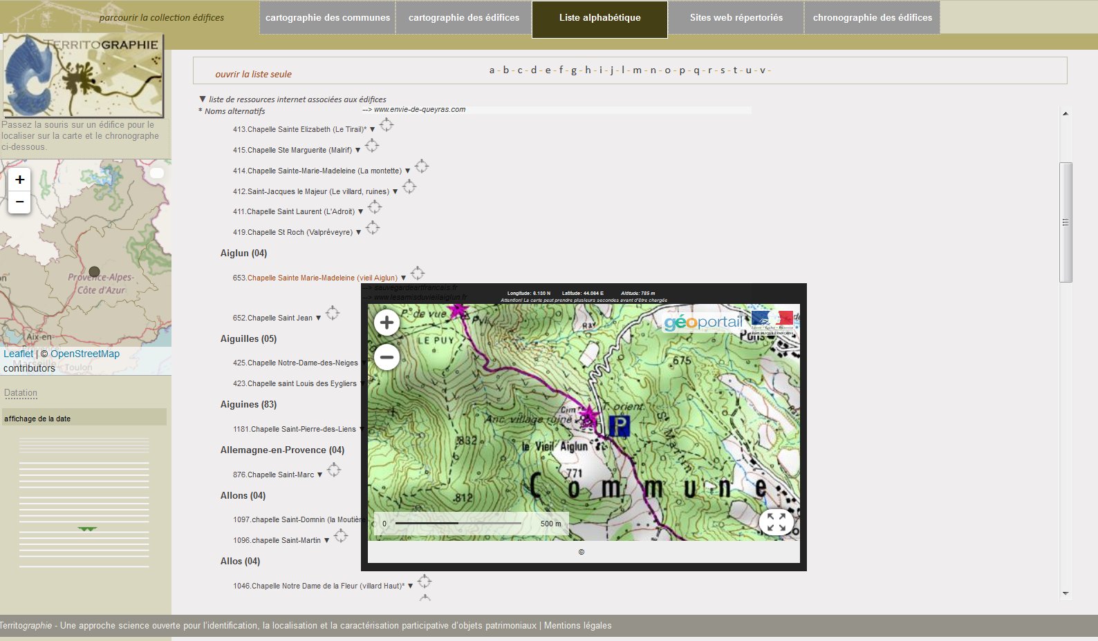
J.Y. Blaise, I. Dudek
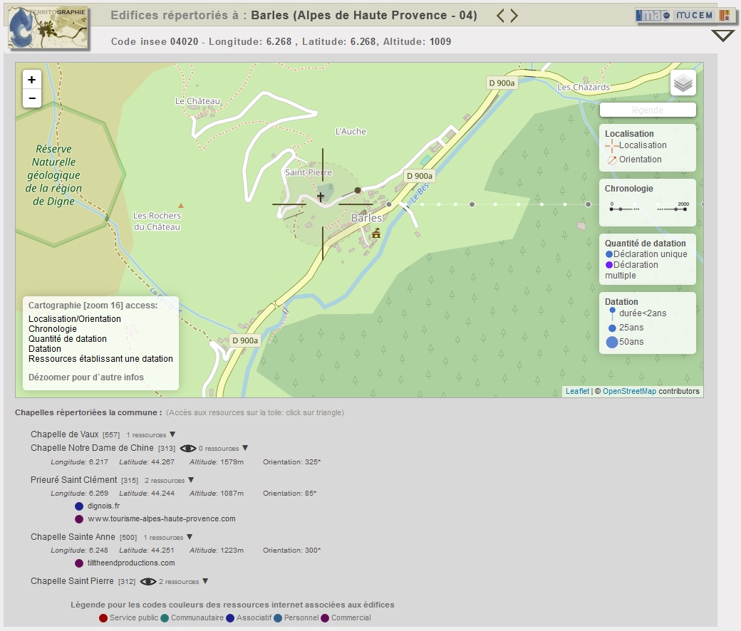
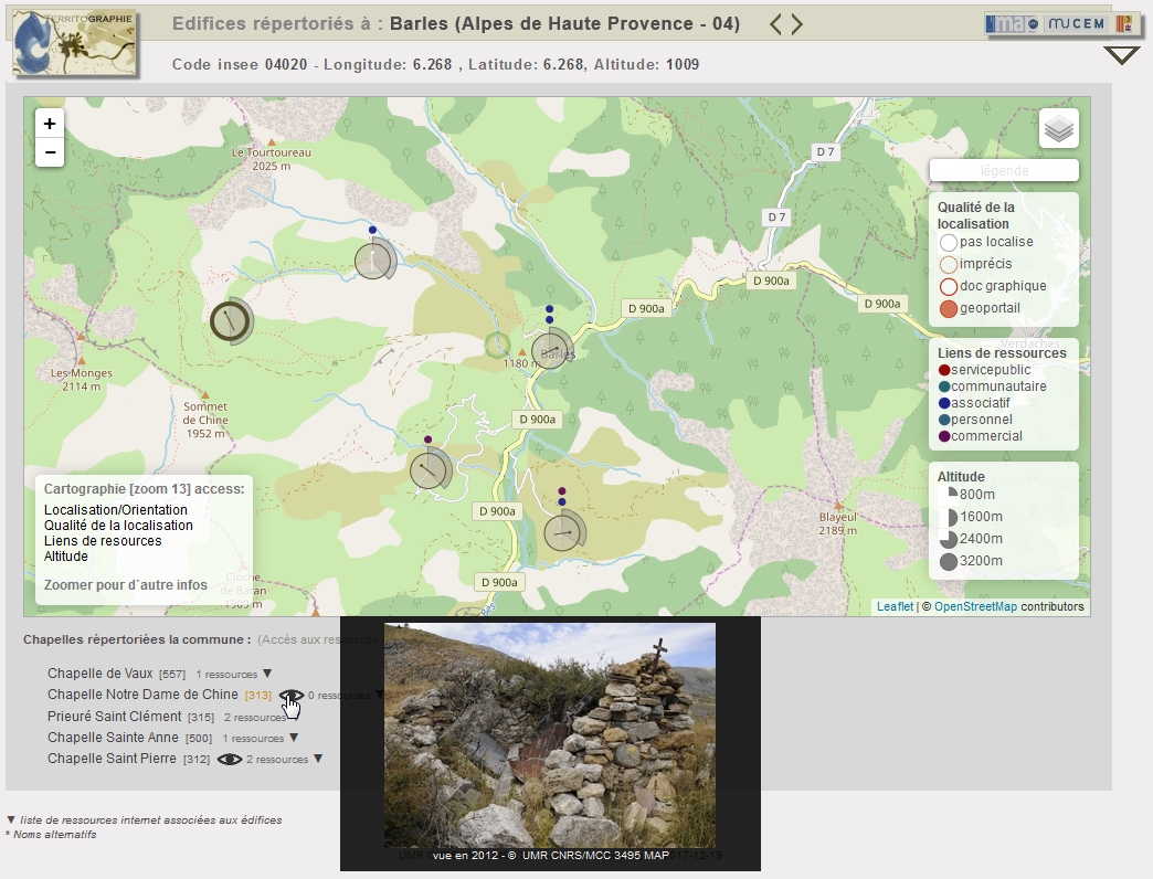
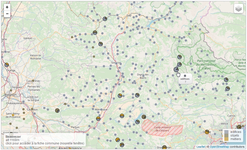
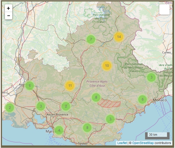
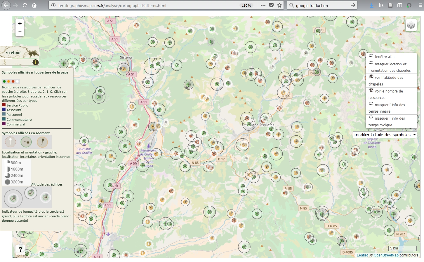
To each locality (commune) that hosts edifices corresponds a web page that features a map showing the position of the edifices (or when the position is not known a textual notification). The cartographic solution bases on the concept of implicit sorting by zoom levels: For each zoom level (i.e. each spatial granularity) a specific set of variables are given to read inside the whole set of descriptors associated with an edifice (data, amount of e-sources available, orientation, altitude, thumbnails, etc.).
Users reach these commune-by-commune maps from a portal page with a map showing all communes concerned (and using a colour that show how many edifices are registered for each of them).
373 commune-specific pages, plus portal page
J.Y. Blaise, I. Dudek
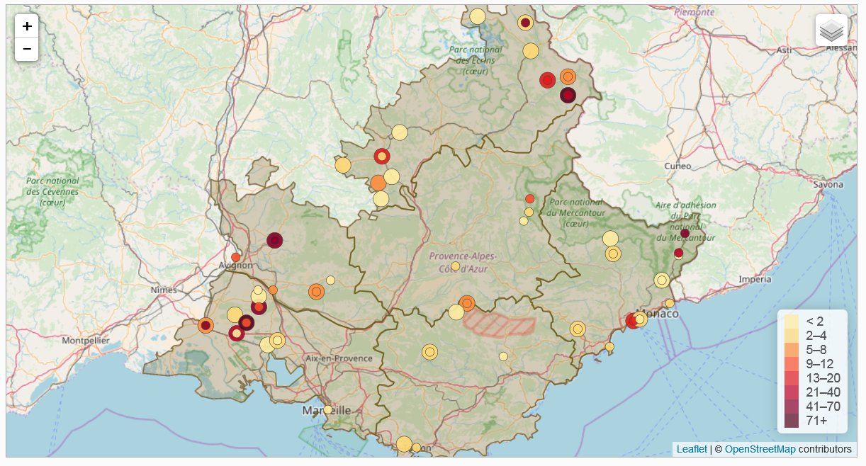
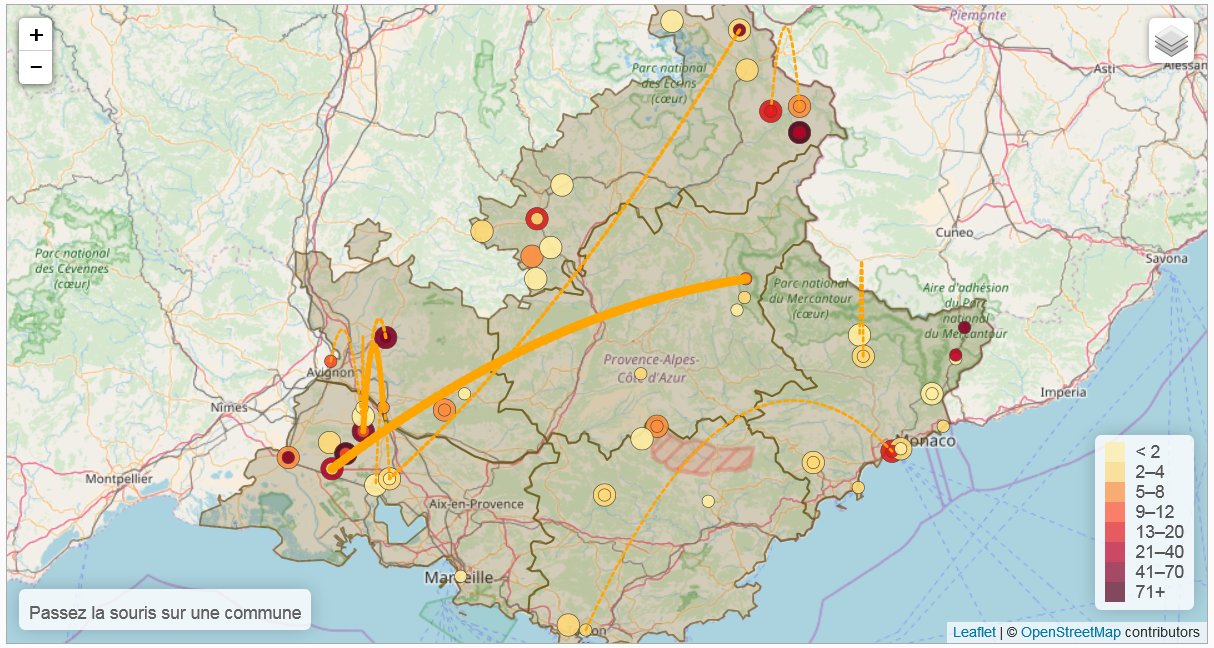
This maps allows the reading of the information available on the position of the Mucem objects (agriculture, farming and breeding collections), and more precisely the information available on the place of creation of the objects vs. their place of usage (hence the notion of “flow”). For each commune concerned two concentric circle mark on hand the amount of objects created in that commune and on the other hand the amount of objects used in that commune. When the information is available, an arc is drawn that links a commune of provenance (creation) to a commune of use. The thickness of the arc represents the intensity of the exchanges.
J.Y. Blaise, I. Dudek
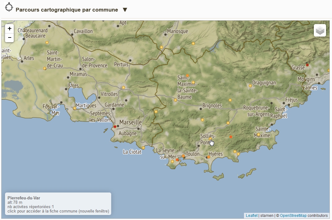
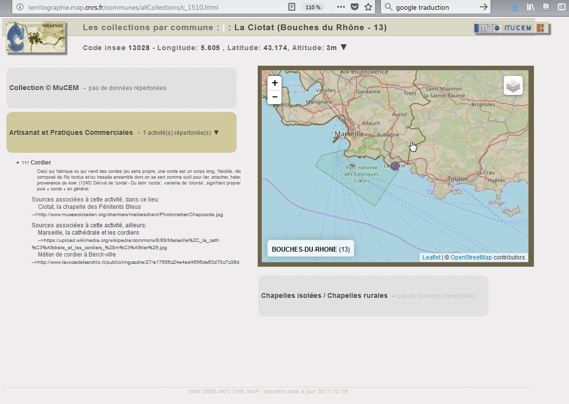
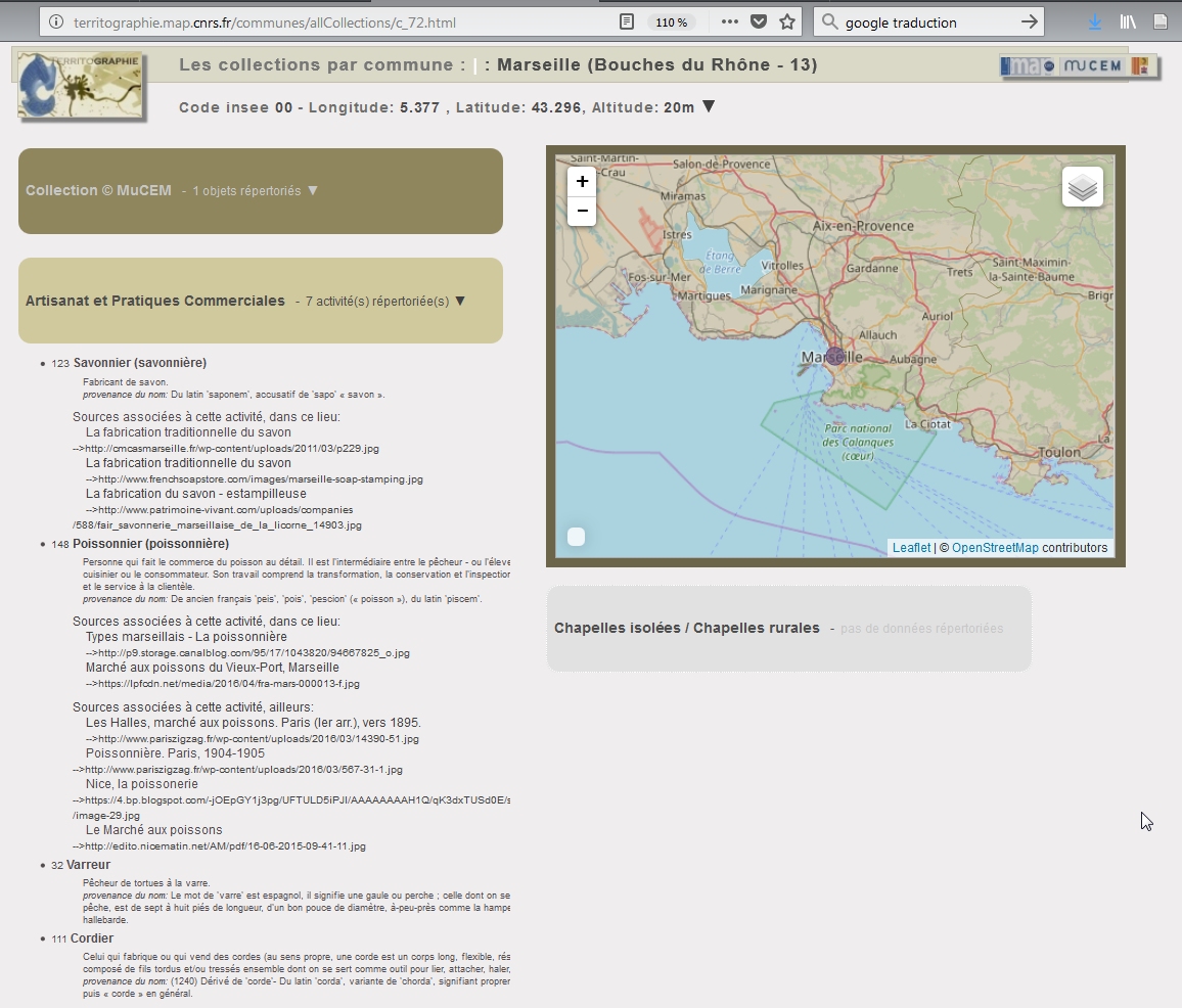
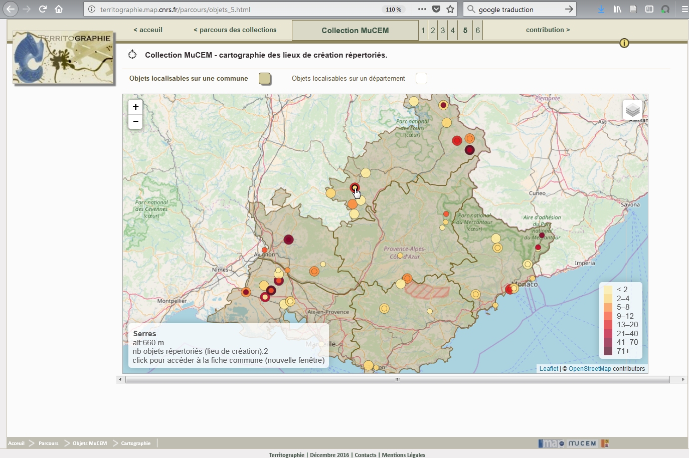
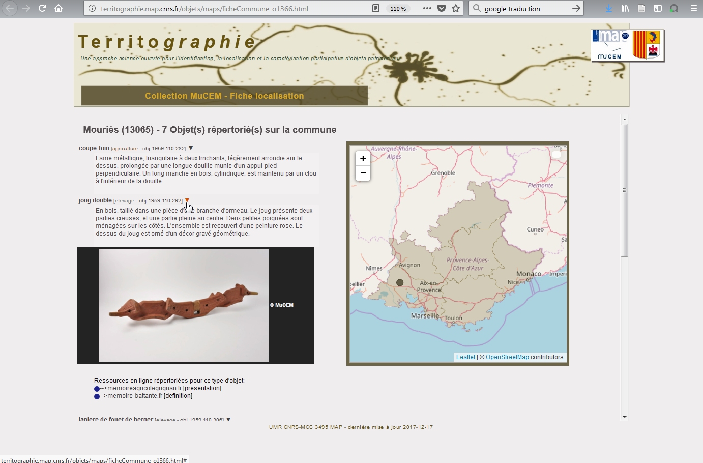
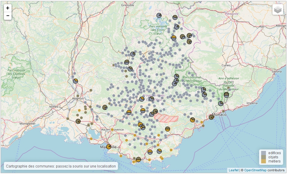
This map positions all the communes with which one or several elements of any of the three collections are associated. Each circle corresponds to a commune, the colours of pie-chart sectors (based on the leaflet-dvf markers) correspond to the various collections, and the dimension of sectors to the relative importance of a collection inside that commune (number of elements). Selection of a circle opens a page (new window) dedicated to the corresponding commune. On each such commune-specific page a map is used that positions the commune inside the region (centre and contour) and when relevant edifices inside the commune (displayed or not according to zoom levels)
419 commune-specific maps, plus portal page
J.Y. Blaise, I. Dudek
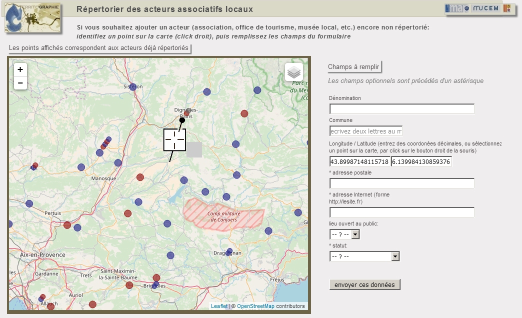
This map positions and identifies the local actors that have been registered (an online updating module is provided). Circles correspond to groups of actors (classic territorial grouping provided by the markercluster leaflet module).
J.Y. Blaise, I. Dudek
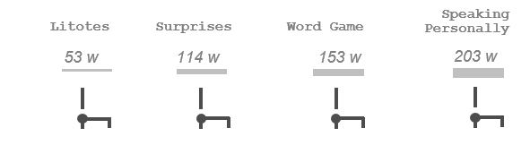
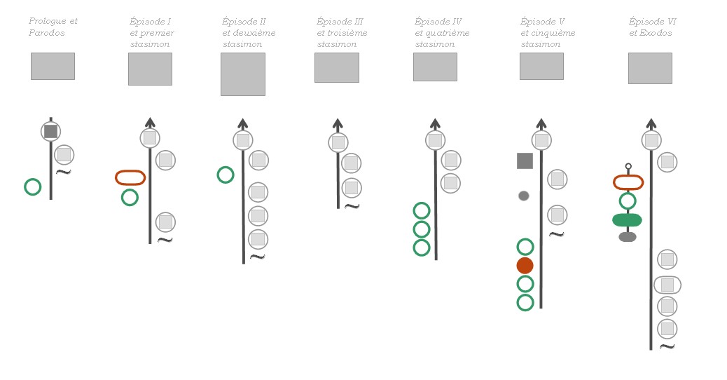
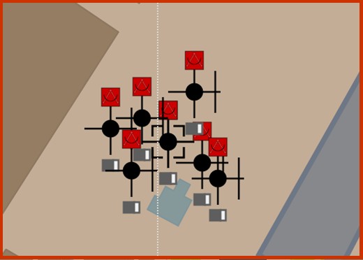
Raymond Queneau’s Exercises in Style is a 1947 book in which the author retells the same story 99 times, each time in a different “style”.
The objective of the study was to compare how situations unfold in time and space in various recounts of the same story.
In four types of visualisation successive chains of events are presented in ordinal time. The past events are separated from the thread of the story by a bar, while colours and shapes are used to distinguish the spatial scales and the temporal continuum.
Visualisations were tested in order to verify if there are some significant resemblances and contrasts between different versions of the same story.
Because the method we explored involved exclusively relations between time, space, actors and movement, we naturally make no claim that the segmentation procedure we propose, and the visualisations we have tested, are adapted to point out all contrasts between a storyline and its wording.
The approach does help highlighting differences between the various versions of the story, and spotting groups and patterns (trends and exceptions) within groups. The visualisations also help spotting across the set of stories what can be called invariant features – e.g. when the initial and final situations rest intact.
J.Y. Blaise, I. Dudek, G. Saygi
Introduction of evaluation metrics for the Territographie project visualisations, and experimentation using online forms in a non-supervised evaluation setting. Criteria concerned are:
- evaluation of the visualisation readability,
- evaluation of how the visualisation supports hypothesis generation and interactive cross-examination of data,
- evaluation of the capacities of the visualisation to help users understand pieces of knowledge or to help knowledge holders transfer their knowledge,
- evaluation of the lexical characteristics of the information presented on the screen that may hamper or facilitate the reading of this information,
- evaluation of level of possible adoption and reuse of the visualisation, and of its compatibility with potential users’ practices.
J.Y. Blaise, I. Dudek
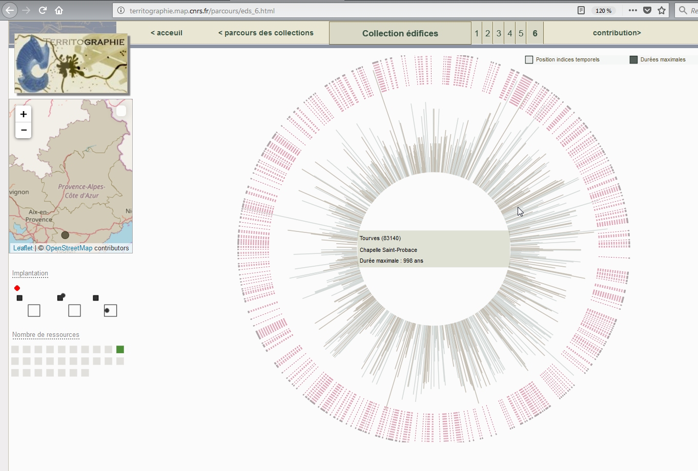
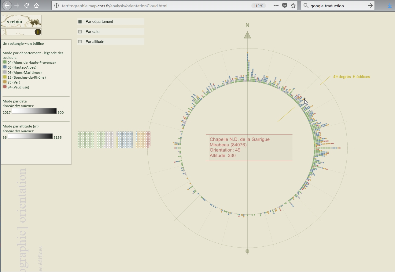
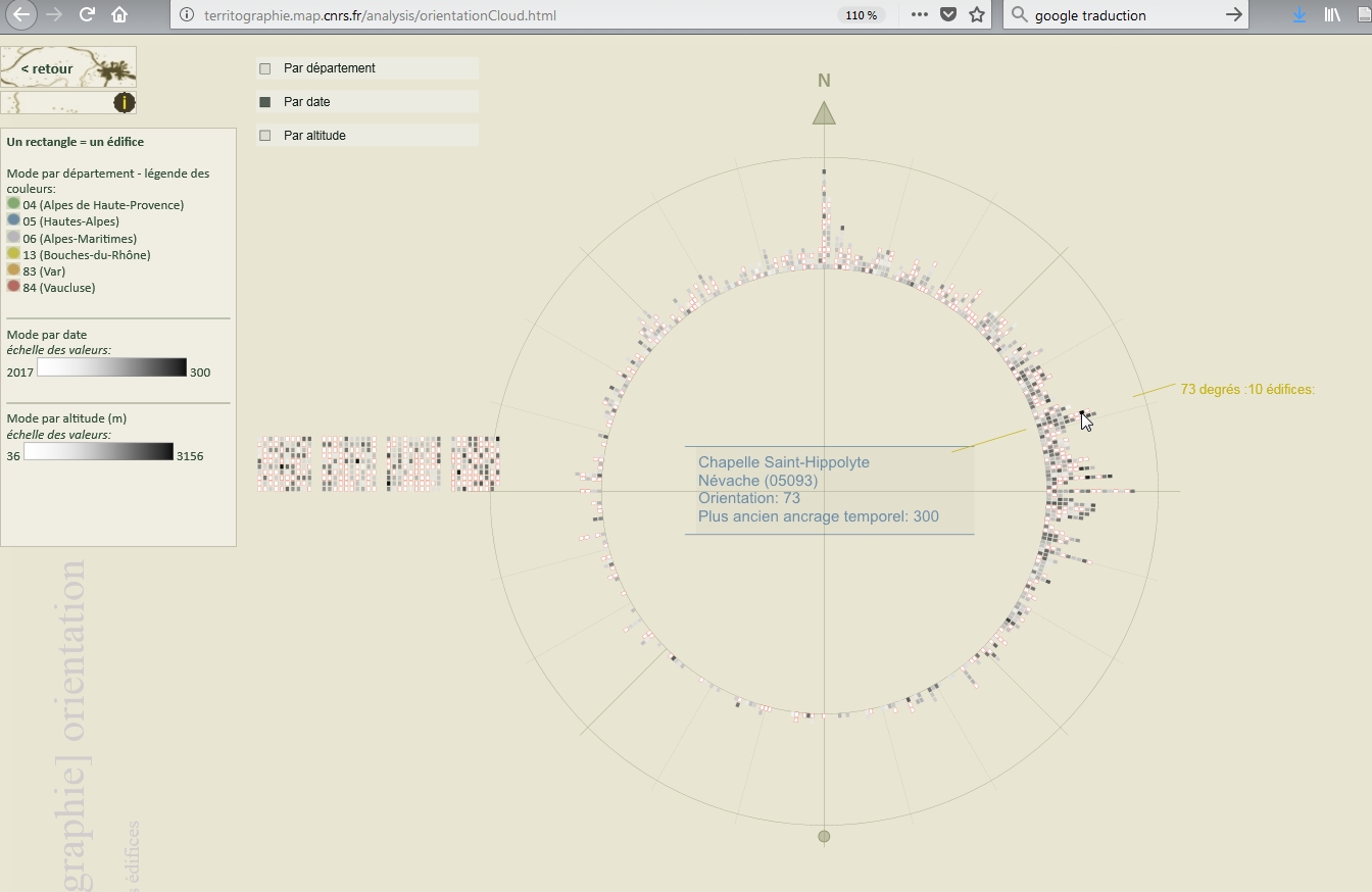
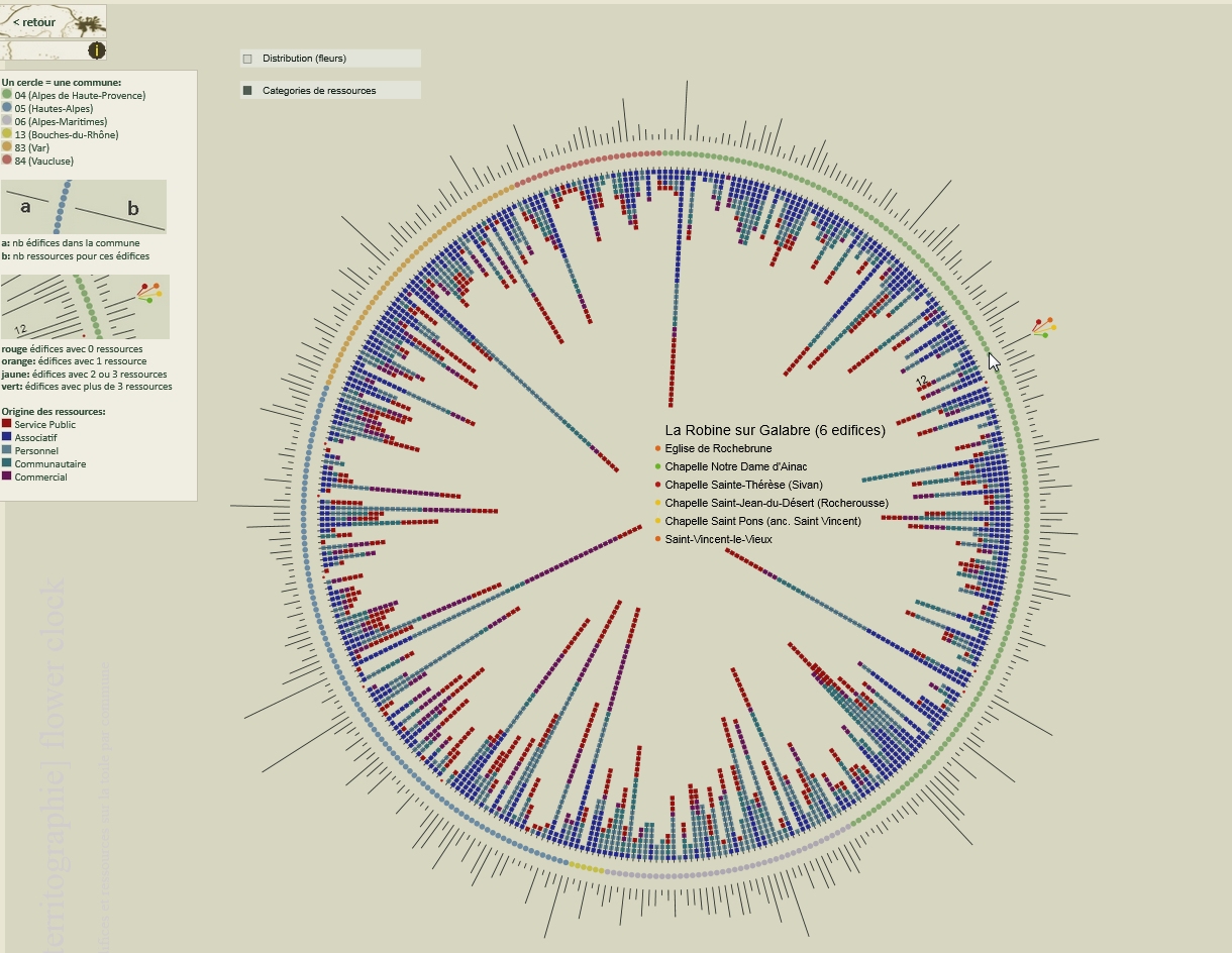
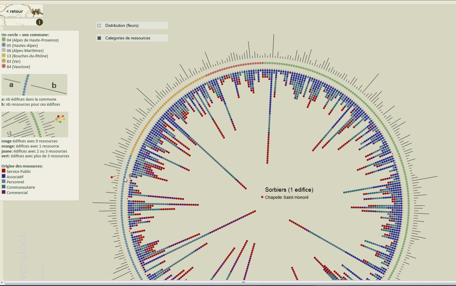
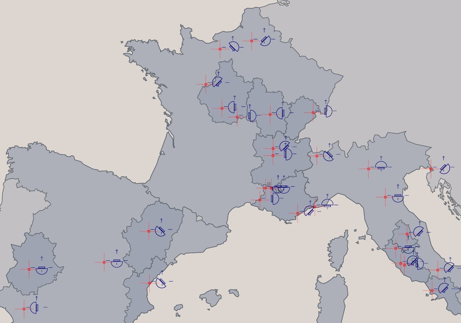
The orientation of edifices is reported all around a central circle that acts as a compass, with colour codes helping to correlate the orientation parameter with the position, altitude or lifetime parameters.
J.Y. Blaise, I. Dudek
In this visualisation edifices are distributed on a cartographic background and for each edifice a set of parameters (in particular the lifetime) can be displayed visually in order to foster a comparative reading of patterns inside and across communes.
J.Y. Blaise, I. Dudek
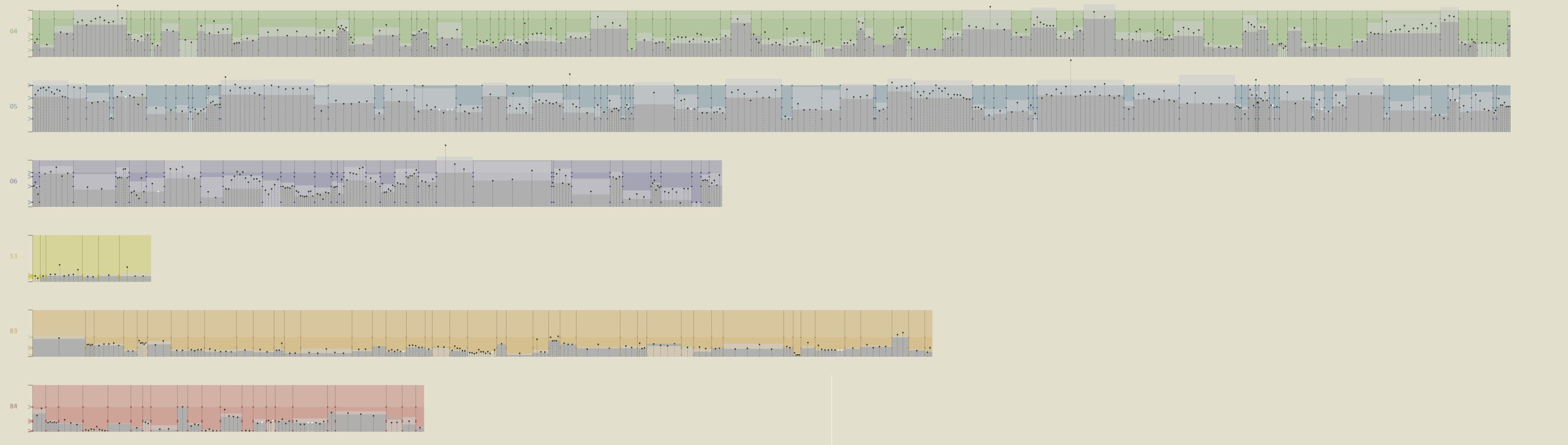
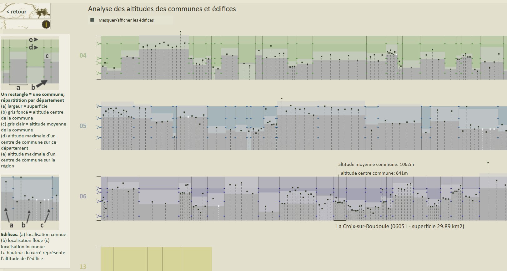
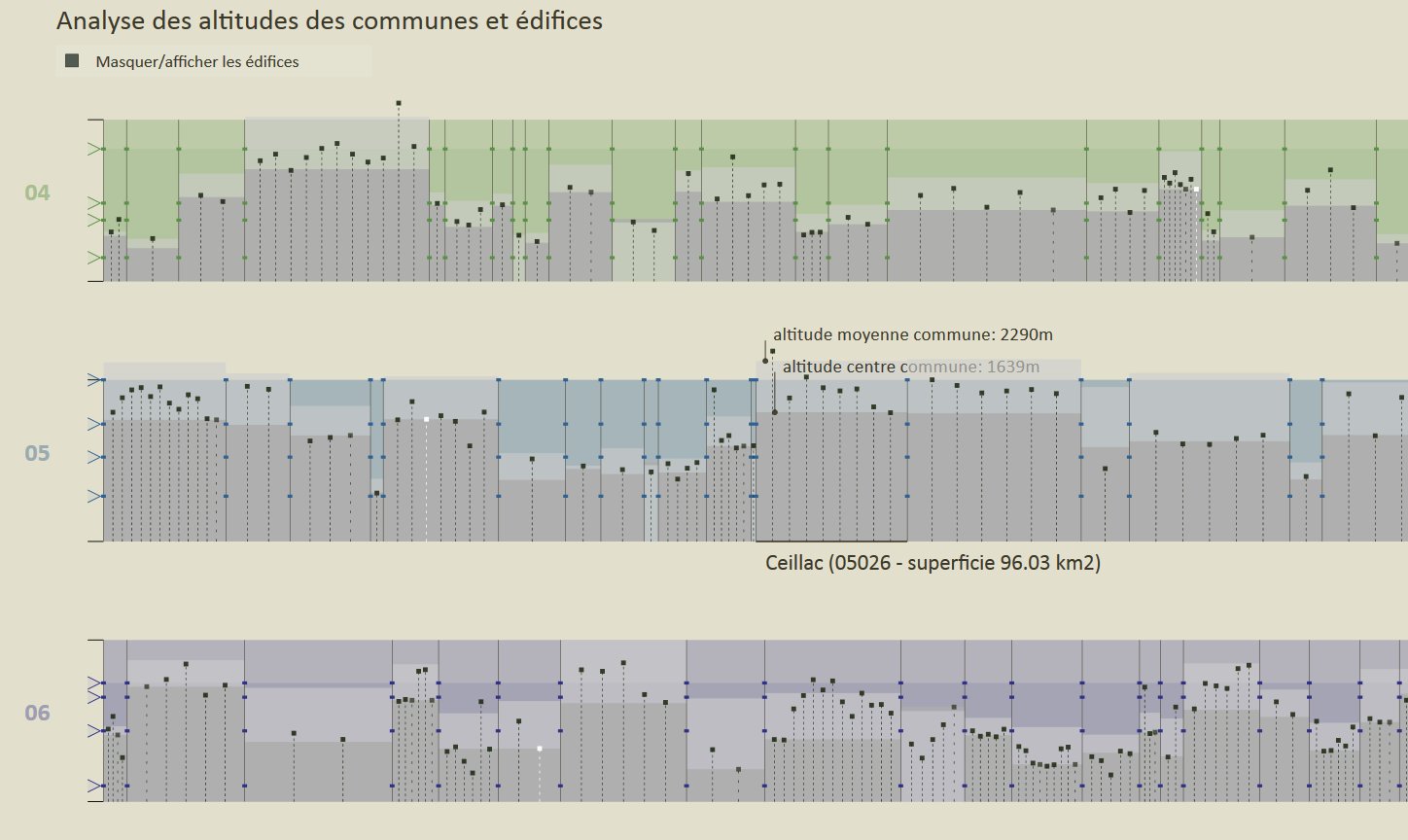
Each rectangle in this visualisation corresponds to a given commune. The commune’s surface is represented by the rectangle’s width, and its height shows significant altitudes (centre of the commune, mean altitude, etc.). Edifices inside the commune are then distributed inside the rectangle and represented by small vertical lines, the height of which representing the altitude of the edifice.
J.Y. Blaise, I. Dudek
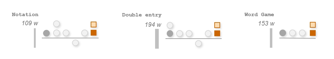
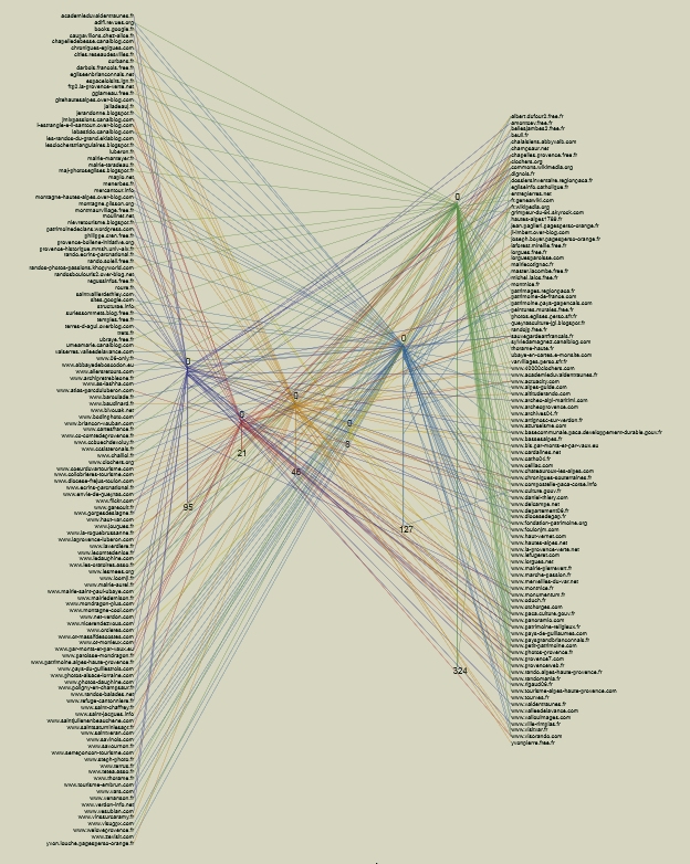
This visualisation helps answering visually to the following question: who documents what? The overall number of e- sources an information provider has produced is counted for each department, and represented by a line that shows its relative importance as an information provider for that department.
J.Y. Blaise, I. Dudek
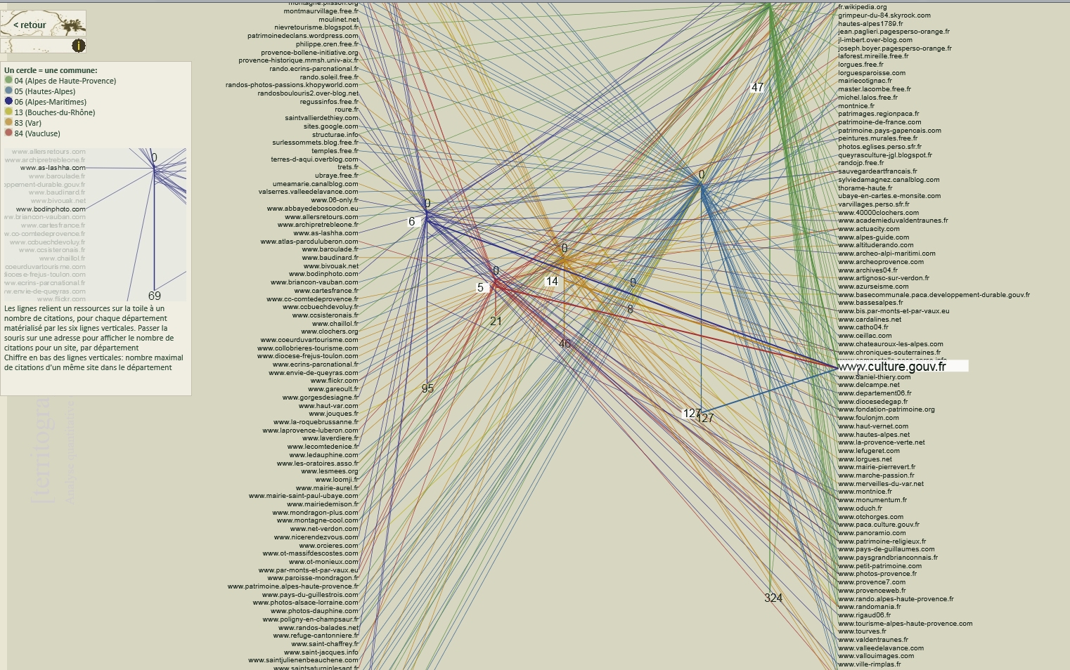
This visualisation helps answering visually to the following question: are edifices evenly documented? Each commune is represented by a circle, with a colour corresponding to its department. From each circle two radial lines are drawn the length of which bear indications on the number of edifices in the commune and on the overall number of e-sources documenting the edifices.
J.Y. Blaise, I. Dudek
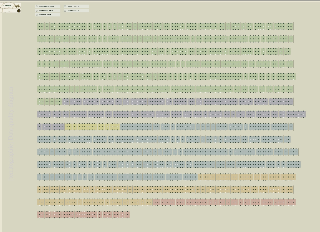
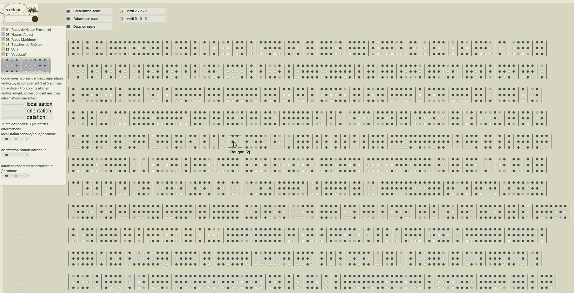
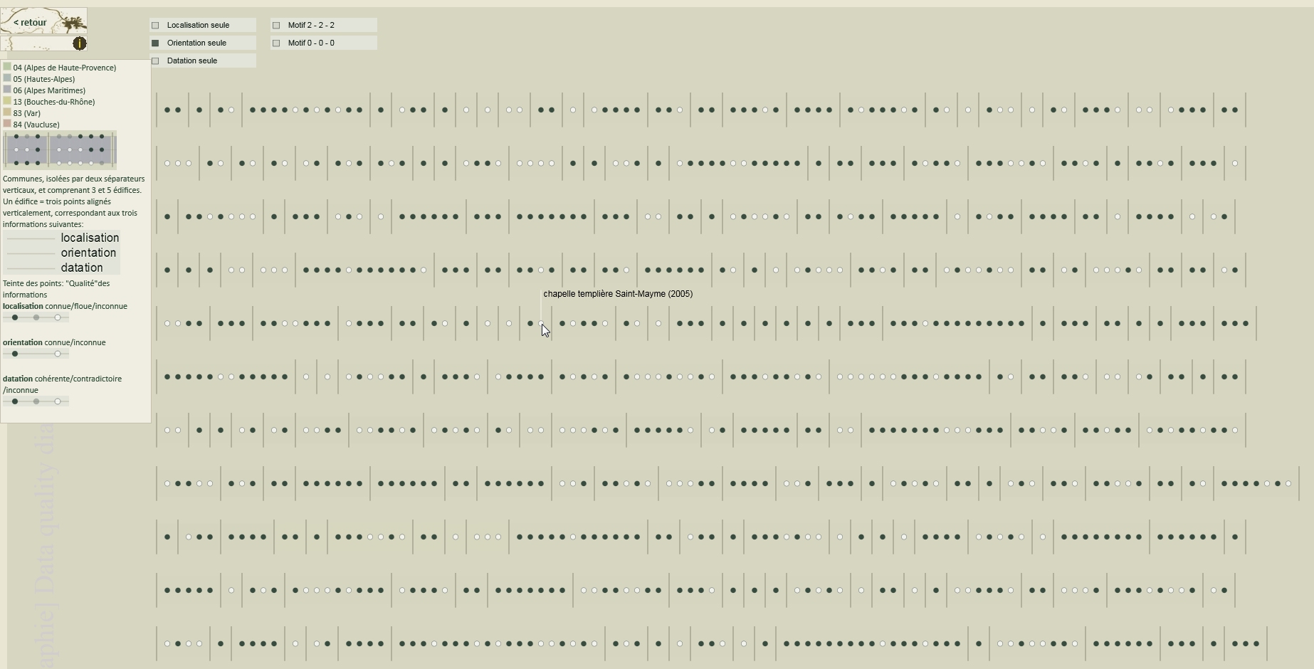
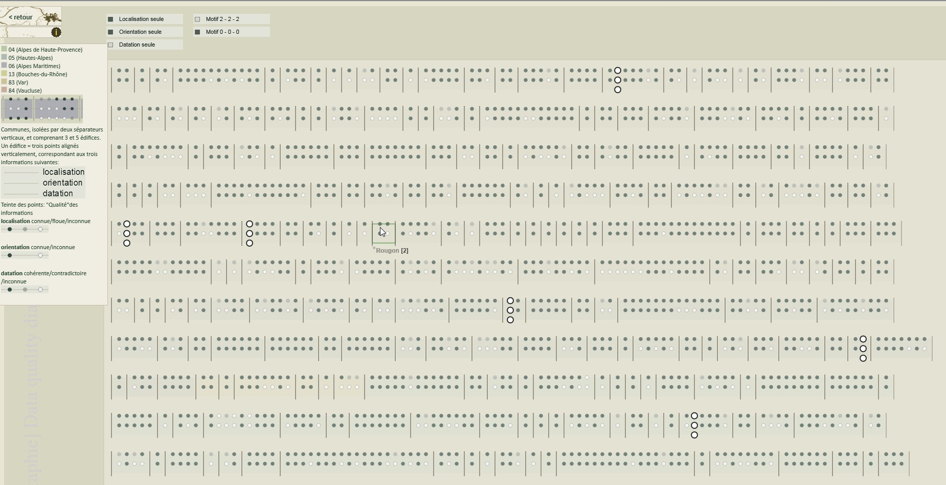
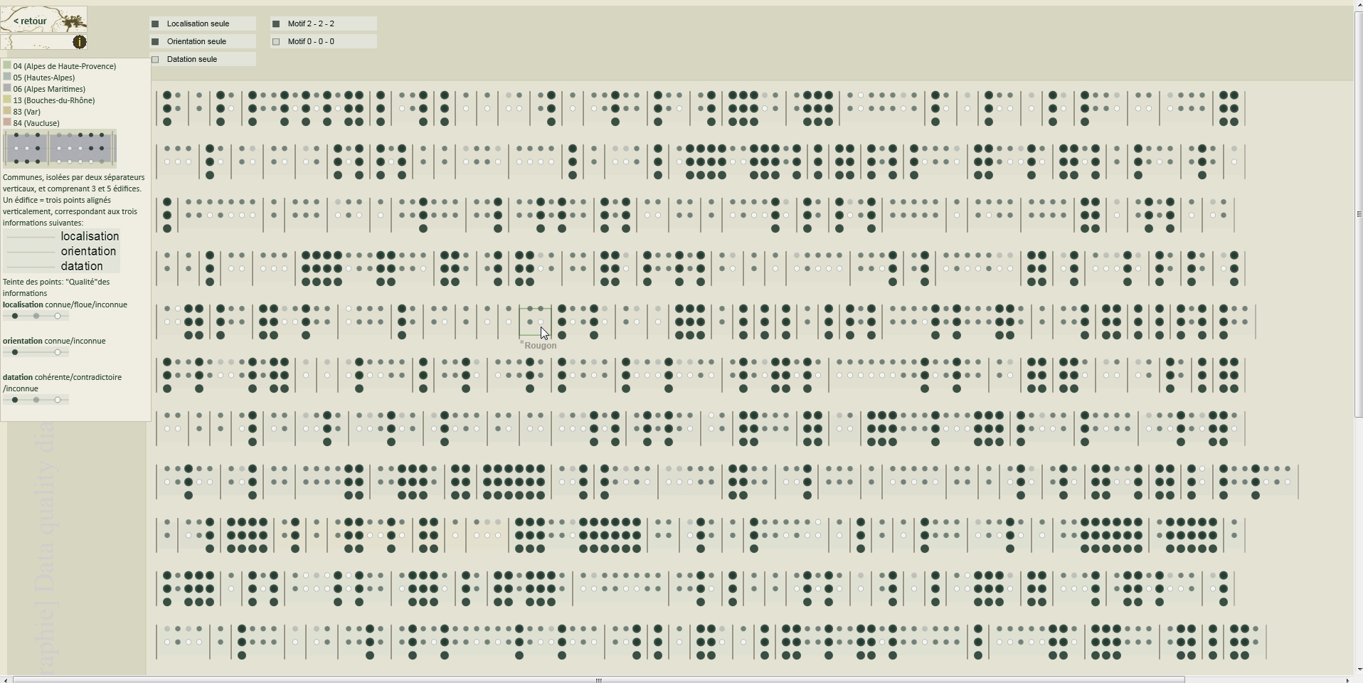
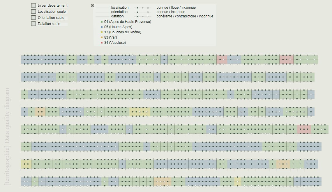
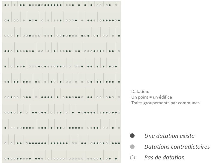
This visualisation helps answering visually to the following questions: is the quality of the data dependent on a commune, is it consistent for that commune, is it consistent for various properties of an edifice?
The quality of the information for each edifice is represented by three points that are aligned vertically. These points correspond to three parameters: position, orientation and date of construction. Different shades of grey are used that show the differences between the “data quality” of each of the three parameters. Edifices are grouped by communes.
J.Y. Blaise, I. Dudek
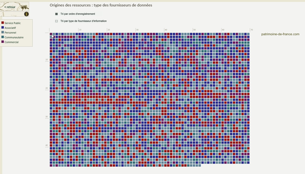
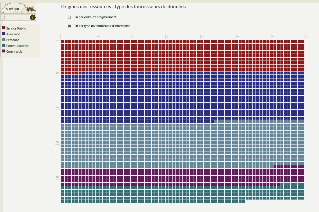
This visualisation enables a visual analysis of the information providers’ types.
Each little square corresponds to a given e-source, with its colour corresponding to a type of provider (personal pages, associations, public bodies, etc.).
E-sources can be sorted out either on the basis of their recording date or of the providers’ types.
J.Y. Blaise, I. Dudek
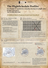
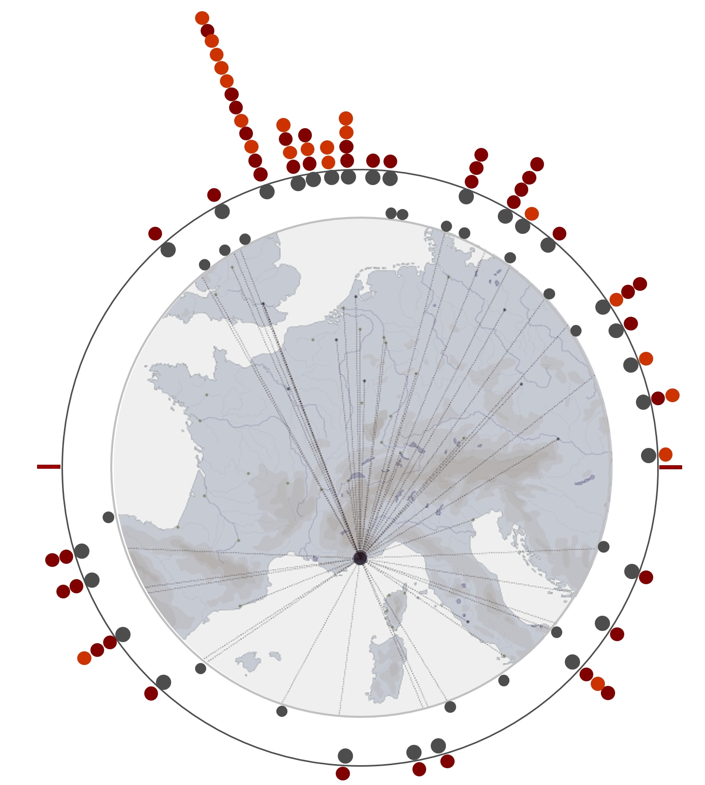
An online app that lets users get an overview of the flight offer at the Nice airport. The visualisation combines the reading of flights in ordinal time and an assessment densities per geographic sectors.
applied to : airport Nice Côte d'Azur, winter 2013-2014 schedule
(published research)
J.Y. Blaise
I. Dudek
In MEMORIA the knowledge extraction and representation steps were supported by a set of visualisations facilitating workgroup discussions - for example to clarify the position of each activity in its hierarchy or highlight relationships.
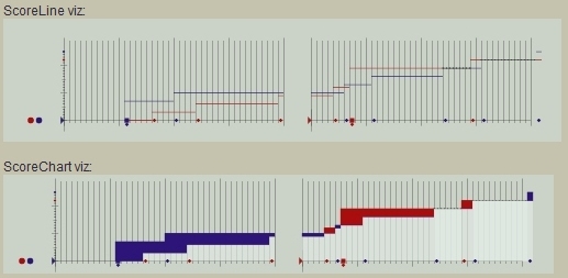
J.Y. Blaise, I. Dudek
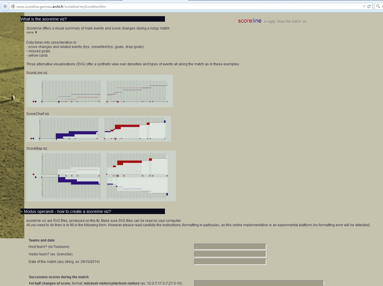
Scoreline is a small online app that allows users to build a visual summary of main events and score changes during a rugby match.
Three alternative visualisations (SVG) offer a synthetic view over densities and types of events all along the match.
J.Y. Blaise, I. Dudek
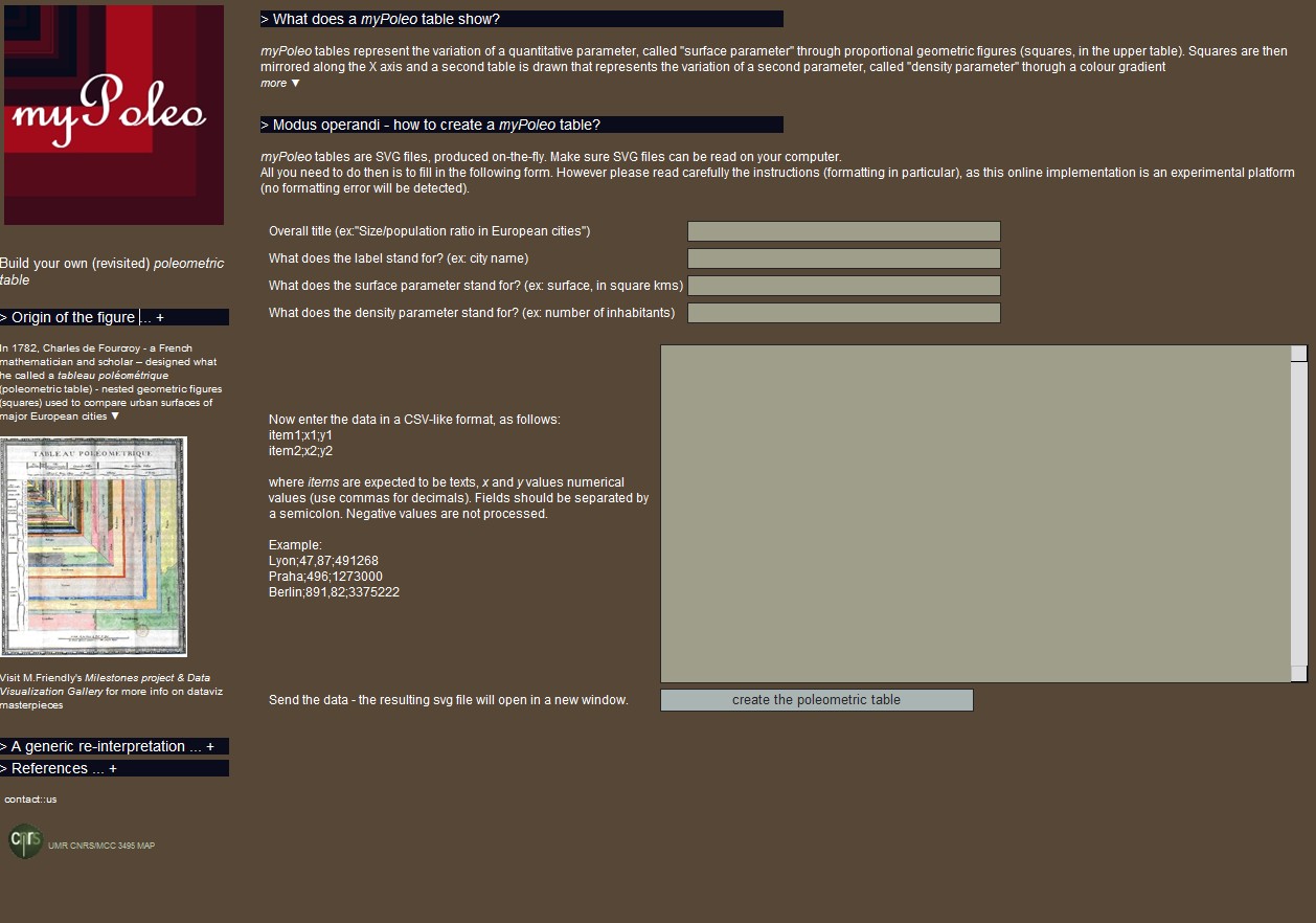
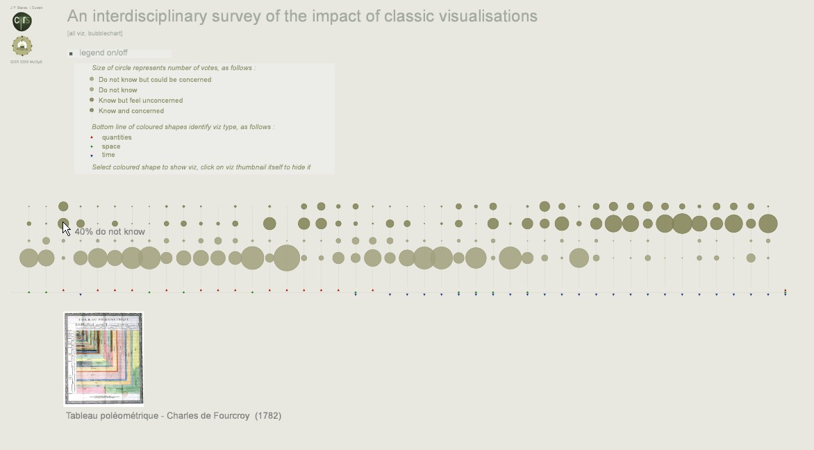
A generic web implementation and reinterpretation of Charles de Fourcroy's poleometric tables. "myPoleo" tables represent the variation of a quantitative parameter, called "surface parameter" through proportional geometric figures (squares, in the upper table). Squares are then mirrored along the X axis and a second table is drawn that represents the variation of a second parameter, called "density parameter" through a colour gradient. The implementation is free to use : it delivers on-the-fly an SVG visualisation on uploading by users of data (in a CSV-like format, item1;x1;y1 etc.). applied to : user data published research
J.Y. Blaise, I. Dudek
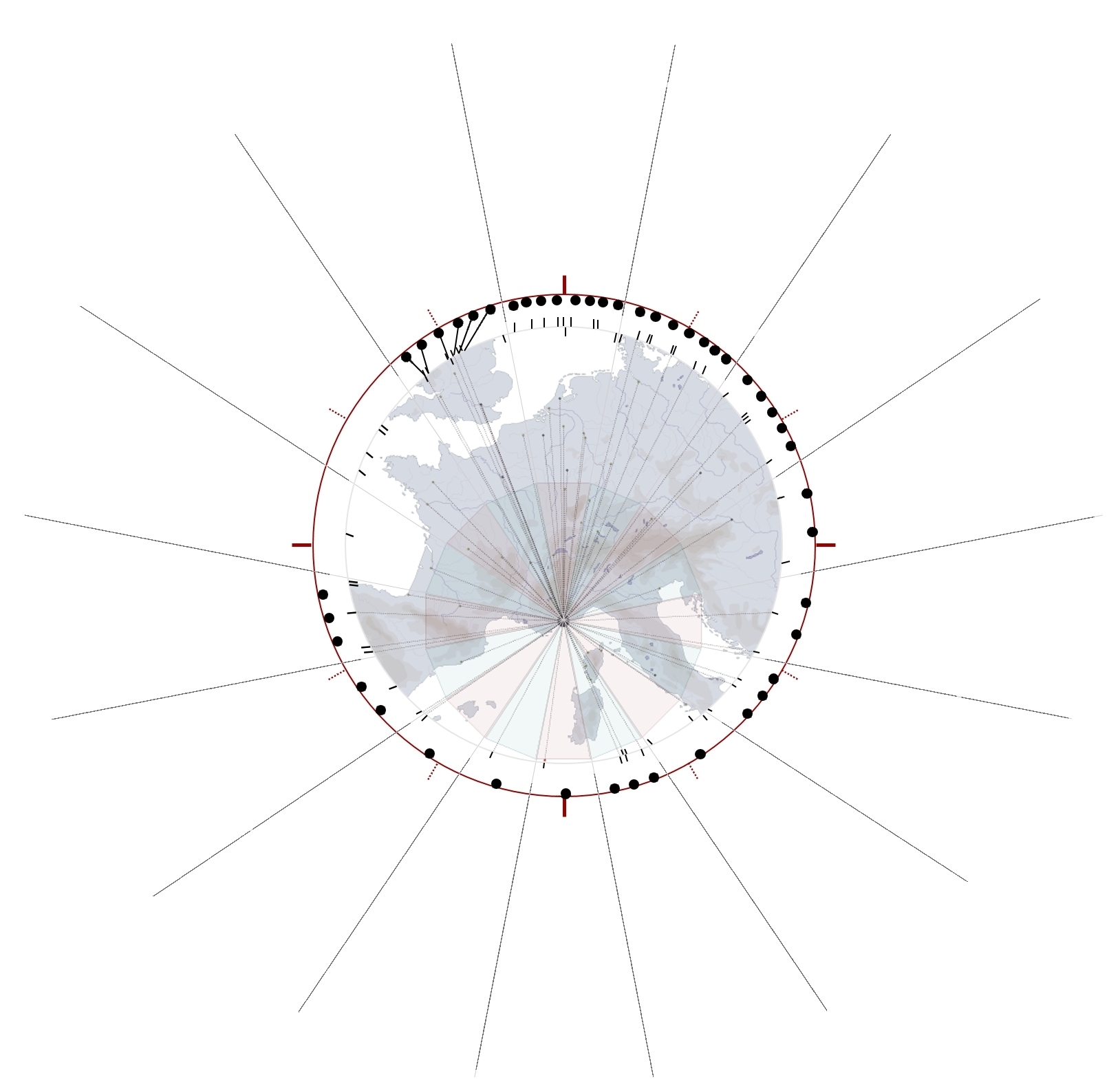
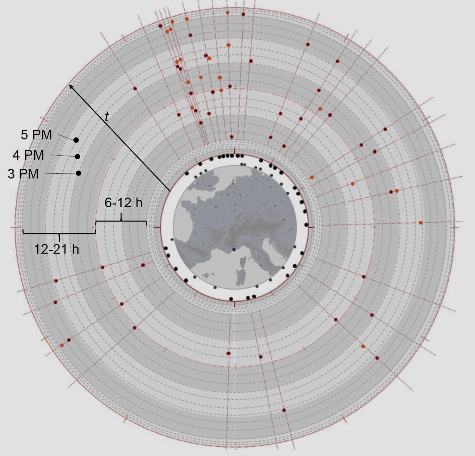
The visualisation summarises flight schedules at Nice Côte d'Azur airport over a month, with multiple time granularities, ordinal time and discrete time, geographical sectorisation.
applied to: Nice Côte d'Azur airport
J.Y. Blaise, I. Dudek
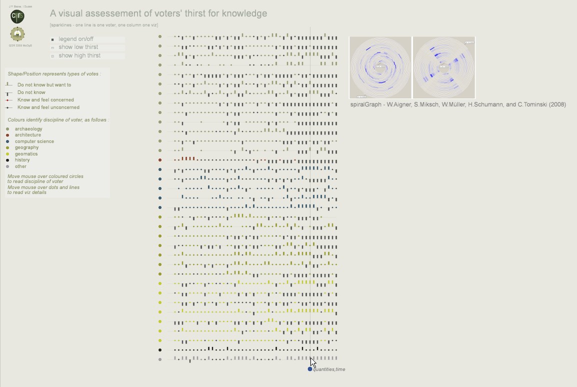
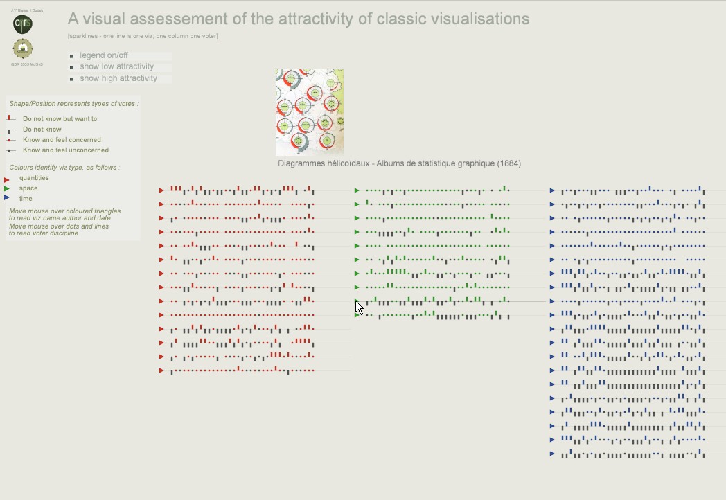
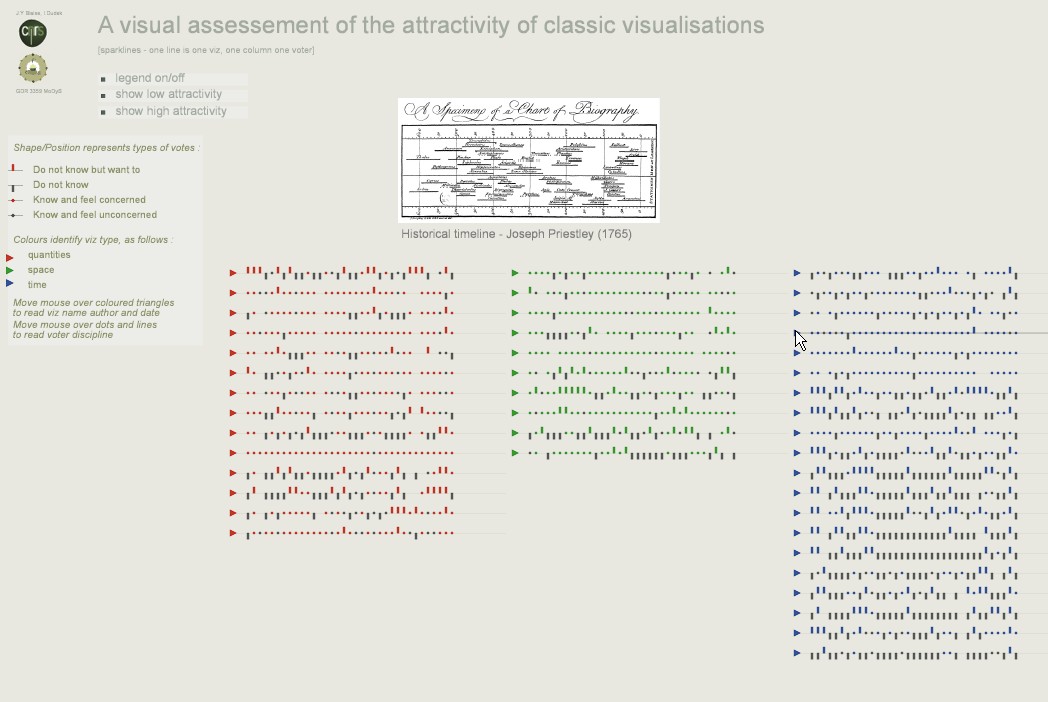
Impact sparklines: The visualisation shows the relative impact of some "classic" visualisations (depending on whether they are focused on quantitites, space or time) in a target group.
Involvement sparklines: The visualisation shows to which extent some "classic" visualisations call the attention of testers in a target group depending on whether they are focused on quantitites, space or time.
J.Y. Blaise, I. Dudek
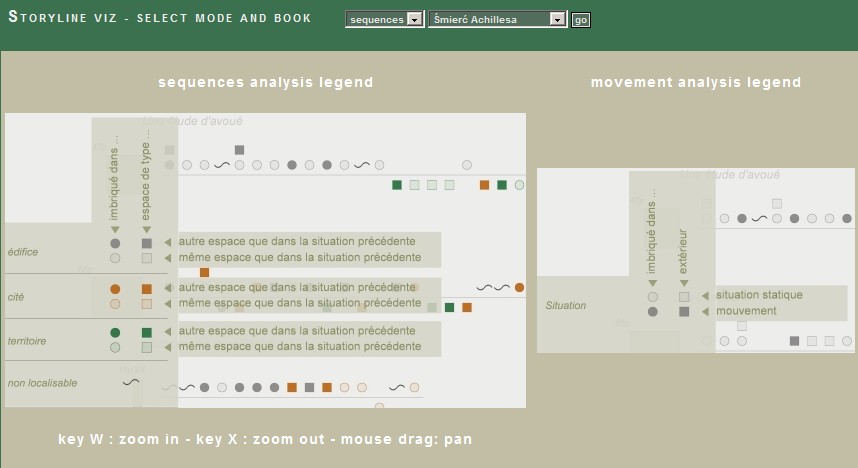
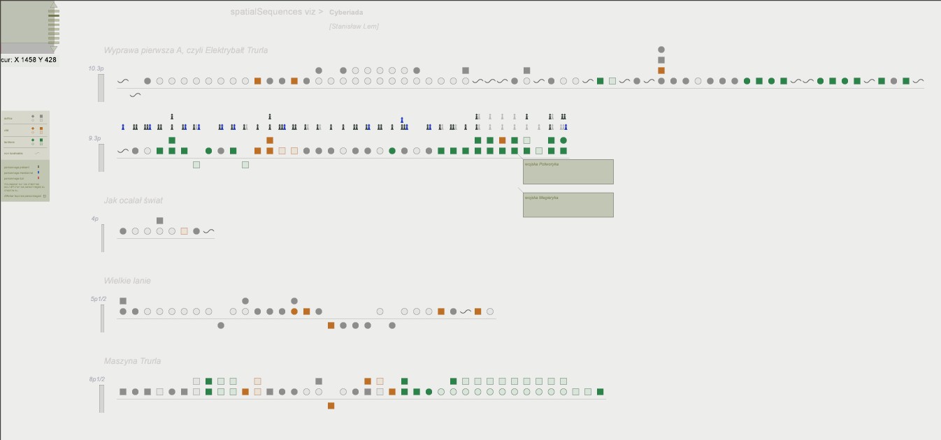
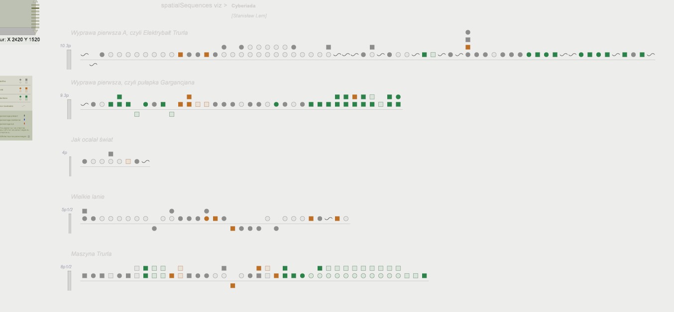
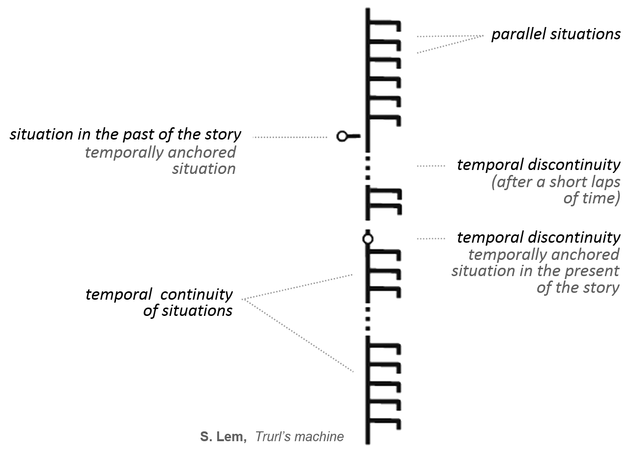
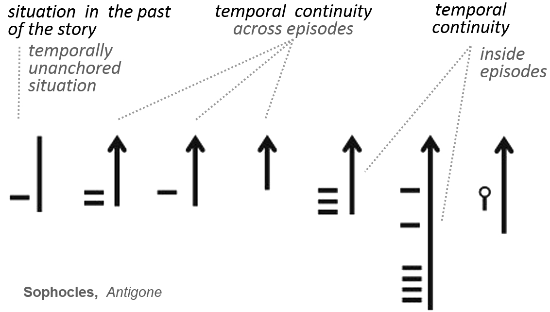
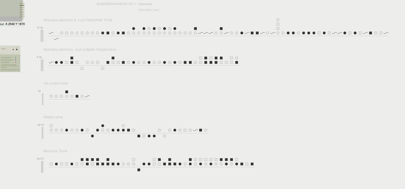
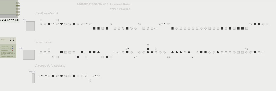
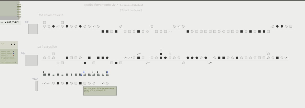
The StorylineViz study aims at developing a generic approach to narrative analysis, supporting the identification of significant patterns inside textual data, and ultimately knowledge discovery and sensemaking. It builds on a text segmentation procedure through which sequences of situations are extracted. A situation is defined by a quadruplet of components: actors, space, time and motion.
In the spatial sequences visualisation situations are represented in ordinal time from left to right along horizontal bars. Each horizontal bar corresponds to a sequence of situations. All reminiscences are situated below horizontal bars. Colour and shapes are used to differentiate the occurrences of various spatial scales.
experimented on : spatio-temporal analysis of 12 stories
published research
J.Y. Blaise, I. Dudek
The spatio-temporal continuity visualisation builds on the same design as the Temporal Continuity visualisation, but adds symbols representing the space parameter. Whereas in the spatial sequences visualisation we only deliver an indication about the group of scales corresponding to a situation, we here allow for a visual coding of each of the thirteen individual scales. experimented on : spatio-temporal analysis of 12 stories published research
J.Y. Blaise, I. Dudek
The StorylineViz study aims at developing a generic approach to narrative analysis, supporting the identification of significant patterns inside textual data, and ultimately knowledge discovery and sensemaking. It builds on a text segmentation procedure through which sequences of situations are extracted. A situation is defined by a quadruplet of components: actors, space, time and motion.
The temporal continuity visualisation focuses on assessing visually to which extent the story unfolds without interruption in time.
experimented on : spatio-temporal analysis of 12 stories
published research
J.Y. Blaise, I. Dudek
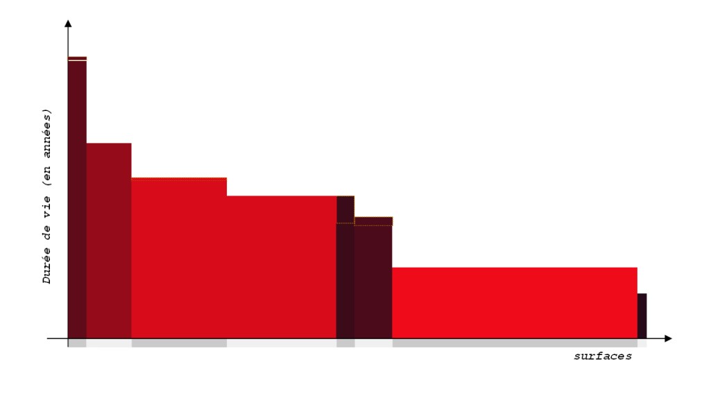
A re-vision of Minard's "tableaux graphiques", where the X axis corresponds to each part of the edifice’s surface (a quantity, in square meters) and the Y axis to the lifeline of each of these parts (a quantity, in years). The surface then represents an unthought-of metrics for historic architecture: a “sustainable usability” measure (the idea is simple: an edifice can be considered as more “useful” if it is big, but also if it lasts long).
applied to : Cracow's Main Square
J.Y. Blaise, I. Dudek
A sort of state-of-the-art reading of the main solutions available when wanting to represent changes over time - at the scale of territories, and with varying time granularities.
The project proposes a framework of interpretation on which various visualisations are built. Globally these visualisations help picturing a situation where the time parameter appears as too poorly taken into consideration (both in terms of modelling and in terms of visualisation).
Several visualisations are proposed:
Witches rings metaphor, where test cases are distributed according to 2 criteria of the framework of interpretation.
Interactive multi-criteria distribution, a visualisation that focuses on how the time parameter is taken into consideration across the whole collection of test cases.
Consistency grid, a visual measure of how "similar" (or not) solutions implemented across the test cases are (in terms of granularity and handling of time).
approximately 50 test cases
J.Y. Blaise, I. Dudek
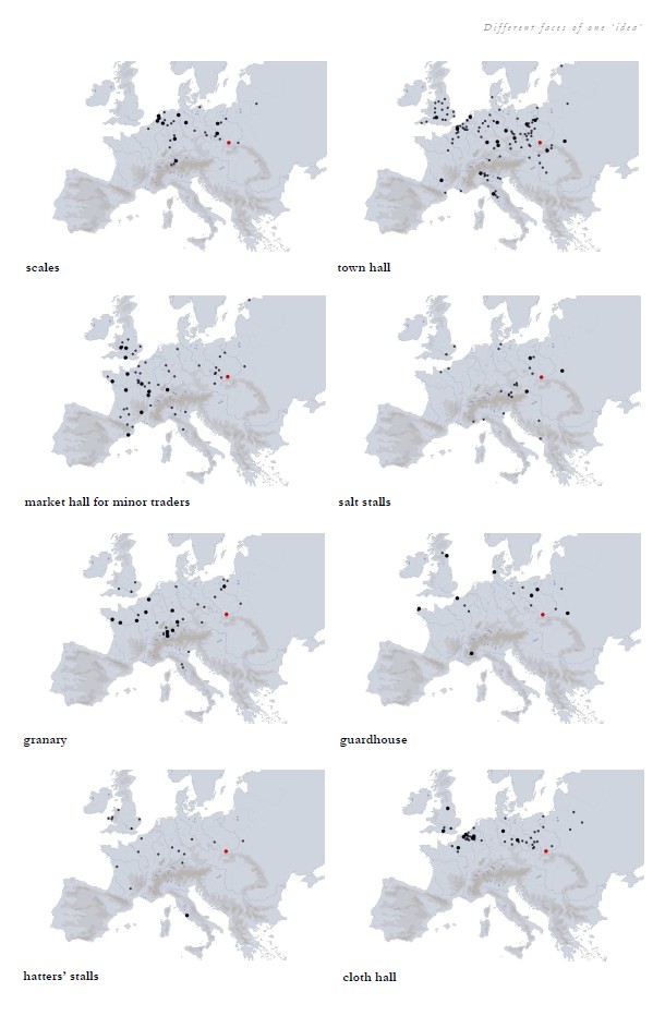
Visual material produced in the context of a paper publication entitled "Architectural transformations on the Market Square in Krakow - A systematic visual catalogue". An SVG cartography is used to locate, in the European territory, administrative or commercial facilities, distributed across Europe, that can be compared to those we analyse in the city of Cracow.
J.Y. Blaise, I. Dudek
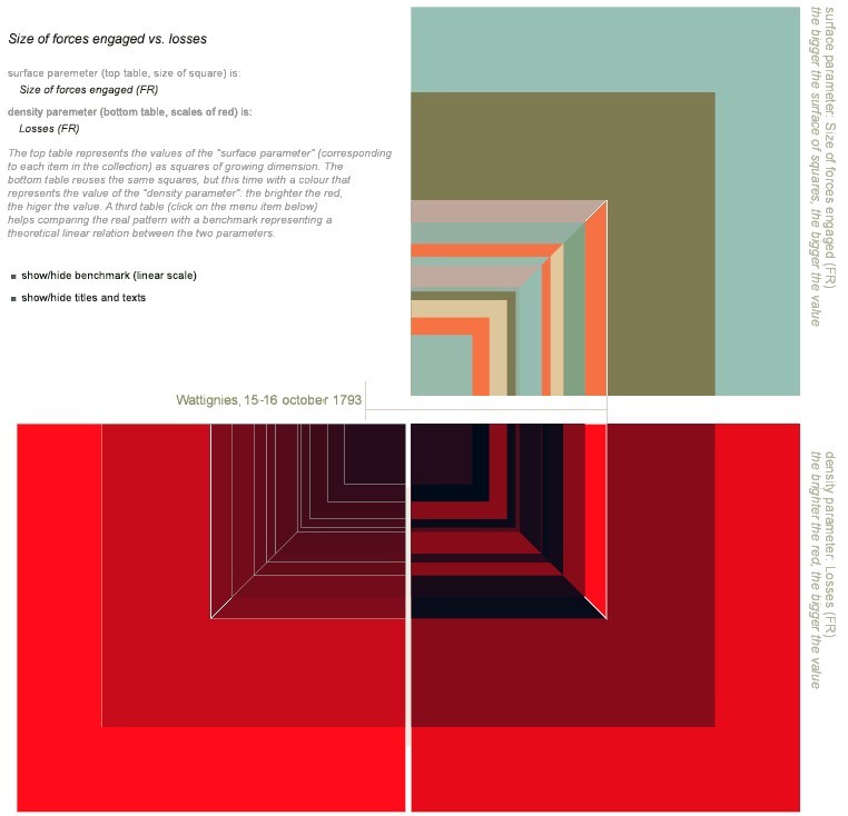
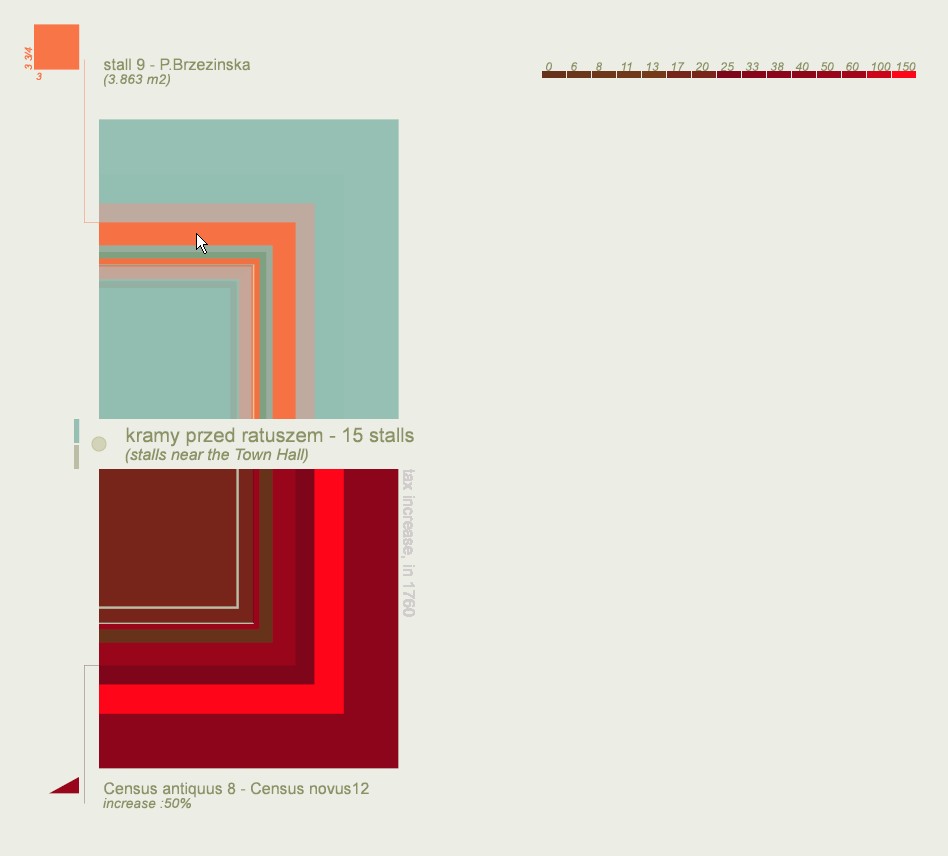
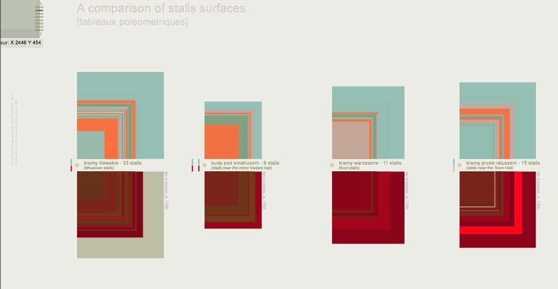
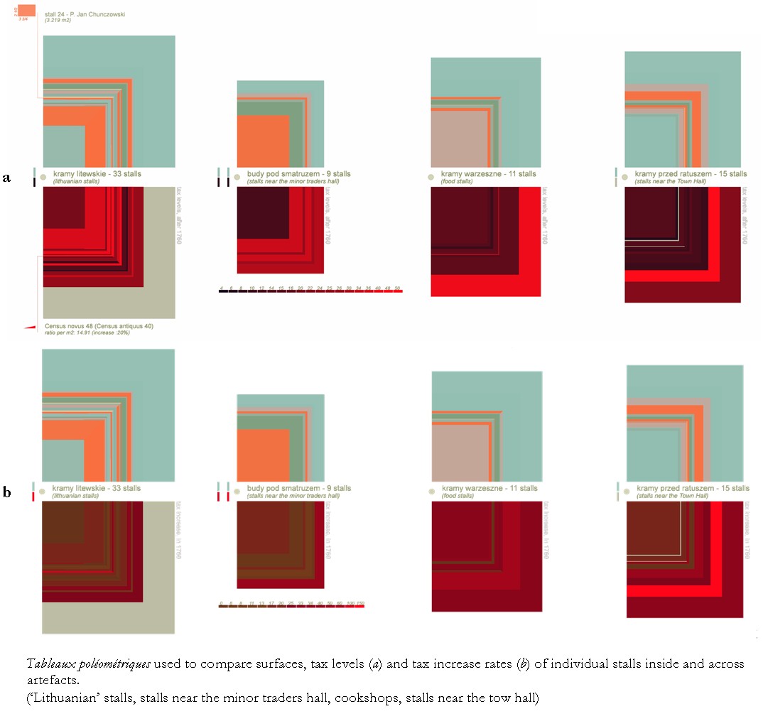
In 1782, Charles de Fourcroy designed what he called a "poleometric table" – nested geometric figures (squares) used to compare urban surfaces of major European cities
We reinterpret his concept to analyse tax / surface proportionality for a group of ill-documented commercial facilities. Visual analysis of the results demonstrates, amongst other things, that there is no such relation.
applied to : Cracow's Main Square
published research
J.Y. Blaise, I. Dudek
The StorylineViz study aims at developing a generic approach to narrative analysis, supporting the identification of significant patterns inside textual data, and ultimately knowledge discovery and sensemaking. It builds on a text segmentation procedure through which sequences of situations are extracted. A situation is defined by a quadruplet of components: actors, space, time and motion. Past events and narrative are represented in ordinal time along a horizontal bar, the former below and the latter above the line. Colour and shades of grey are used to differentiate static situations from movements.
The approach aims at facilitating visual reasoning on the structure, rhythm, patterns and variations of heterogeneous texts in order to enable comparative analysis, and to summarise how the space/time/actors/motion components are organised inside a given narrative.
experimented on : spatio-temporal analysis of 12 stories
J.Y. Blaise, I. Dudek
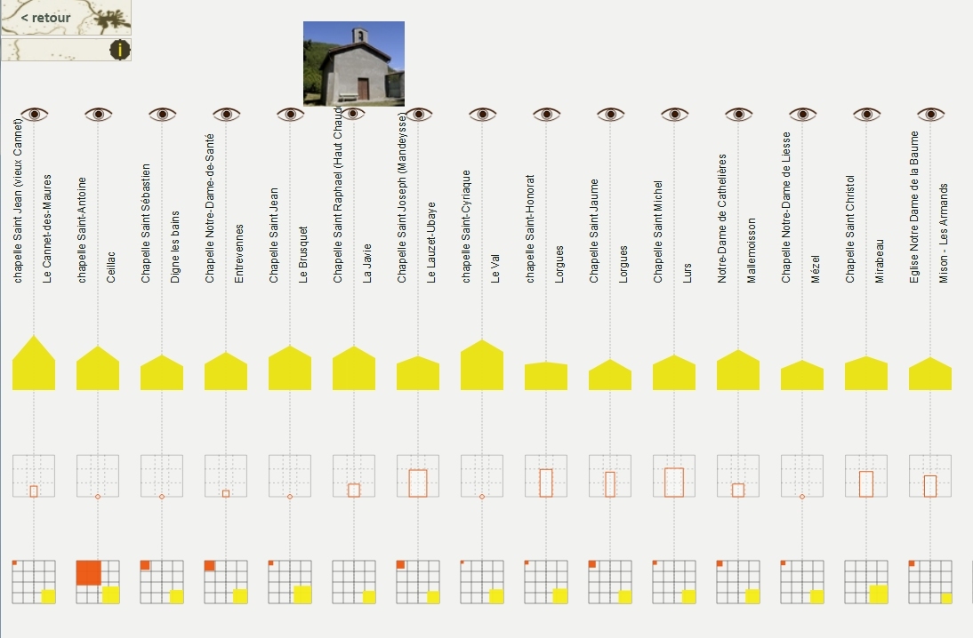
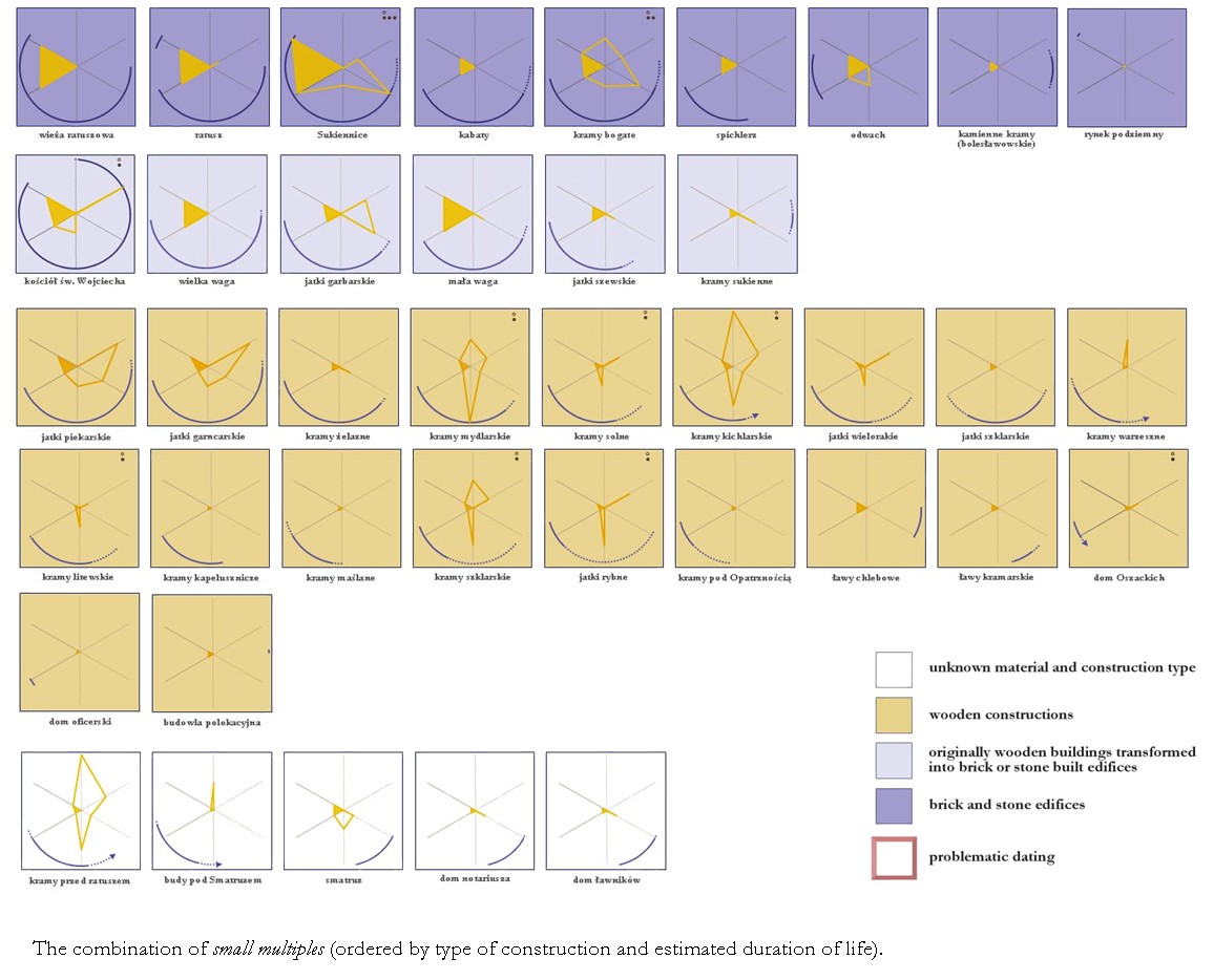
The visualisation combines two classic InfoVis concepts, small multiples and multidimensional icons, so as to allow the comparison of nine variables across the whole collection of edifices (life span, typology, amount, type and credibility of transformations, etc.).
applied to : Cracow's Main Square
J.Y. Blaise, I. Dudek
A visual metaphor that combines for each artefacts five spatial or temporal variables.
It is used to pinpoint visually temporal and spatial imbalances in the layout of the Main Square (contrasting densities per sectors for instance).
applied to : Cracow's Main Square
J.Y. Blaise, I. Dudek
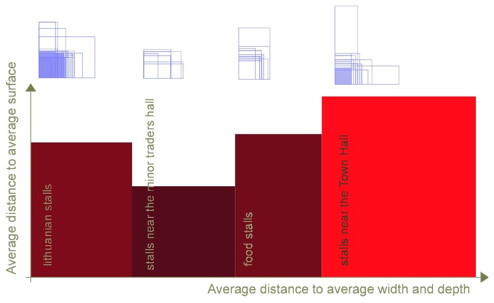
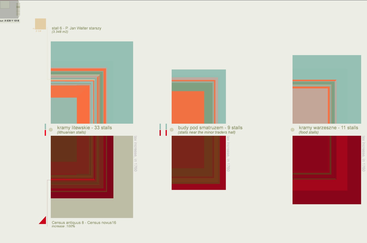
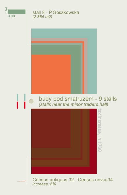
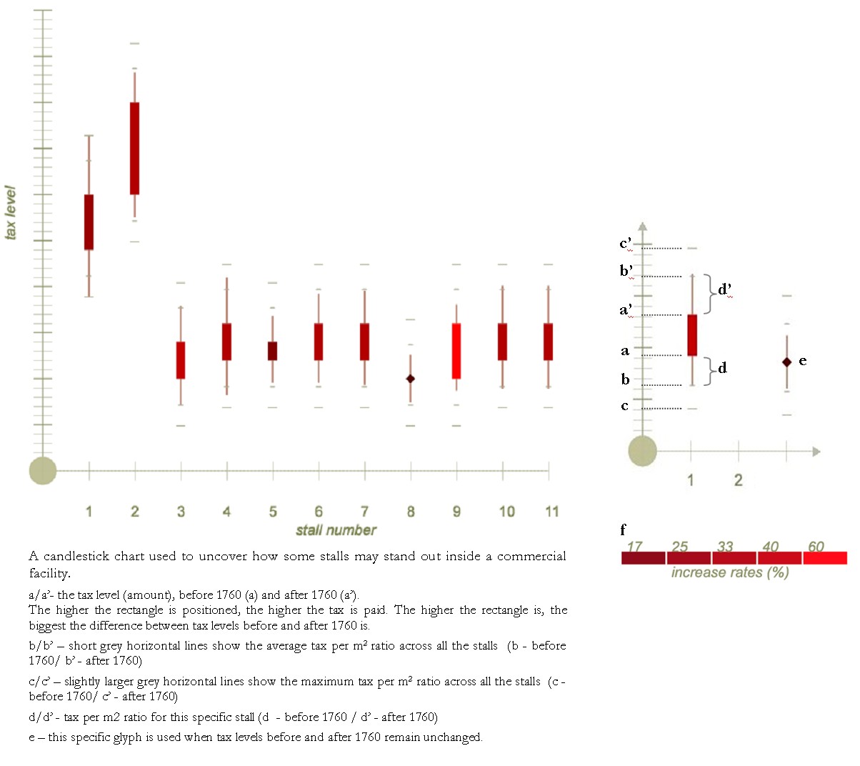
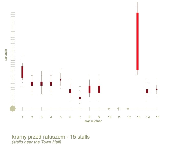
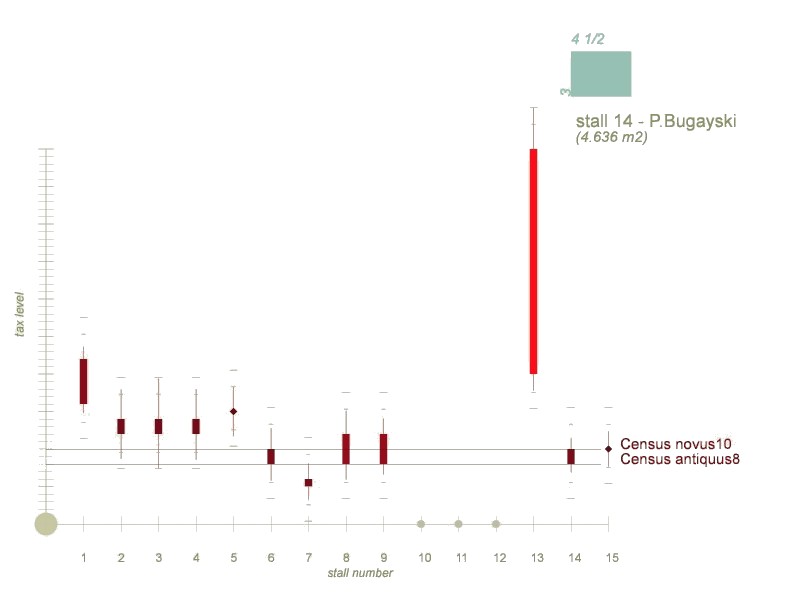
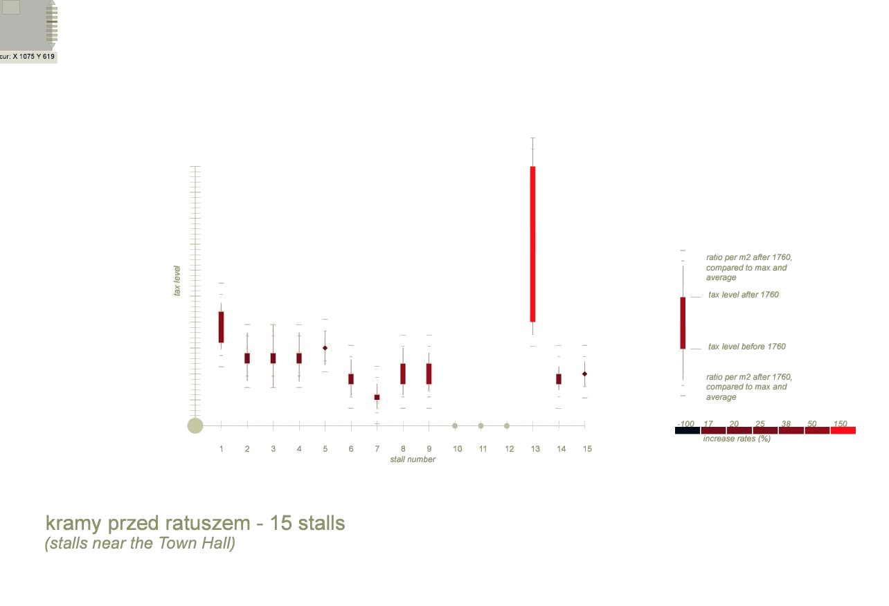
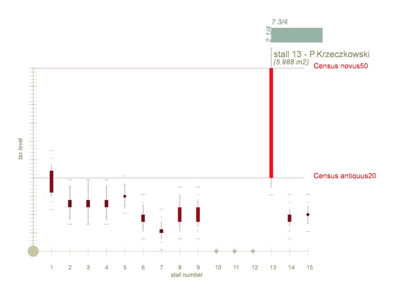
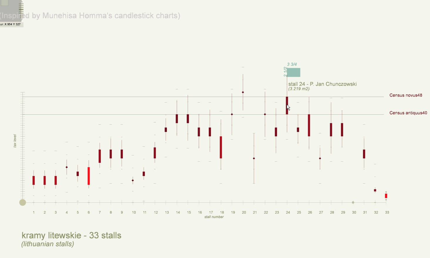
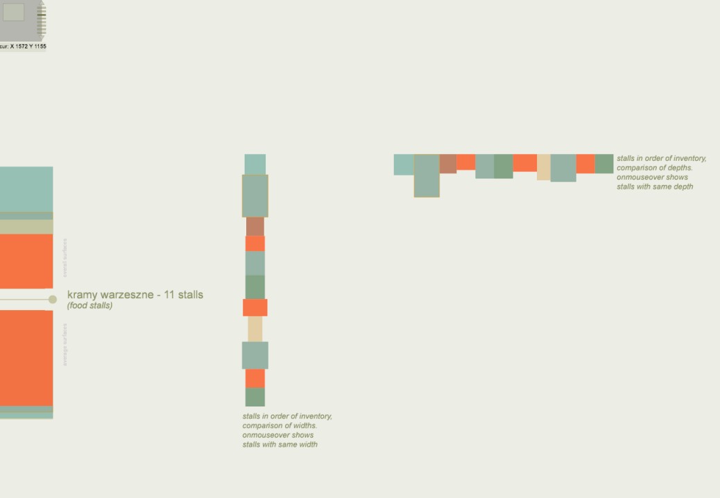
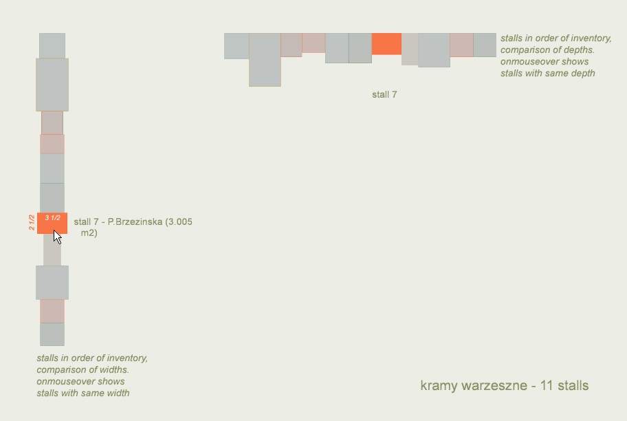
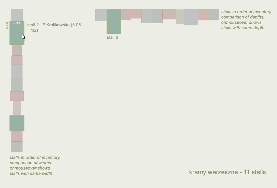
Introduced by the Japanese rice trader M.Homma during the 18th c. "candlesticks" are here reinterpreted in order to analyse the tax/layout relation for a group of ill-documented commercial facilities. A candlestick is produced for each stall inside a facility, and stalls are then represented side by side, in the inventory’s order of appearance. In other words, what we show is not a time series any more – with each candlestick corresponding to values for a day – but a “spatial” series – with each candlestick corresponding to a stall, to a location in space. The resulting viz fruitfully underlines puzzling patterns and exceptions in the data set.
applied to : Cracow's Main Square
published research
J.Y. Blaise, I. Dudek
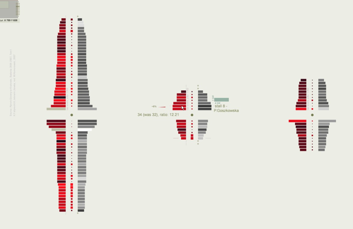
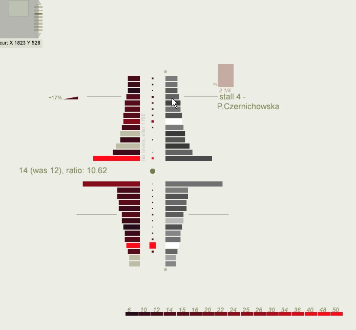
A 2D sort-of spatial puzzle allowing users to evaluate visually alternative possible spatial layouts, and possible grouping mechanisms for a series of ill-documented commercial facilities. This interactive visualisation builds on a simple priority: encourage a trial and error approach, and workgroup discussions. (It is complemented with sort-of histograms focusing on information about tax levels and increases). applied to : Cracow's Main Square published research
J.Y. Blaise, I. Dudek
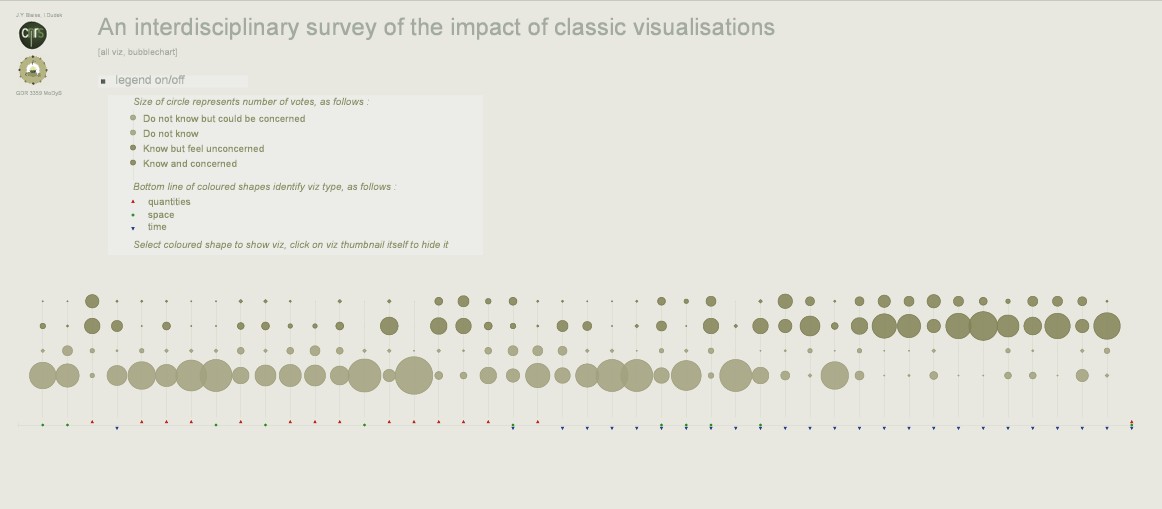
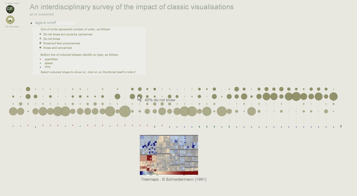
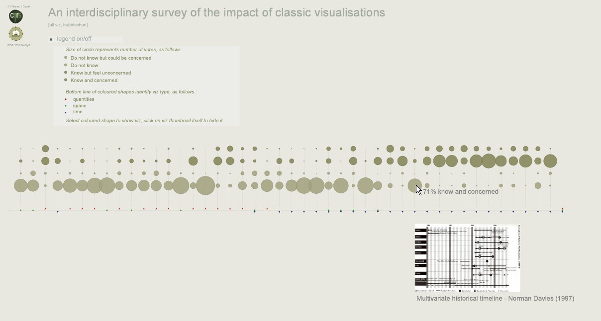
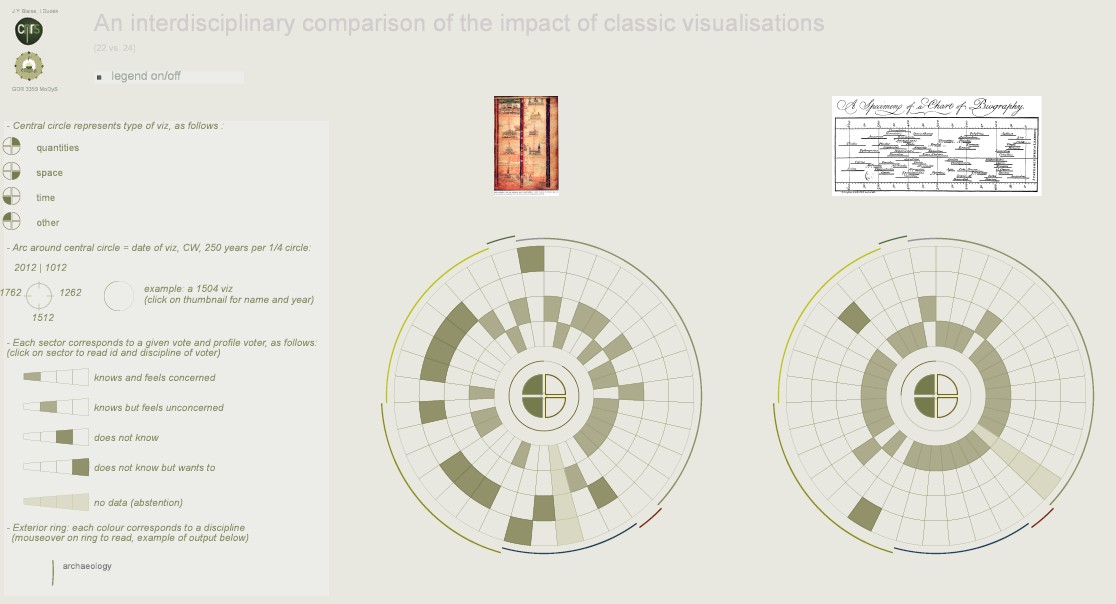
A bubblechart used to measure the impact of space, quantities and time categories of visualisations - in particular to check whether time-oriented data visualisations have an impact that compares to this of spatial data visualisations.
The answer is no.
applied to : disciplinary practices of GDR MoDyS
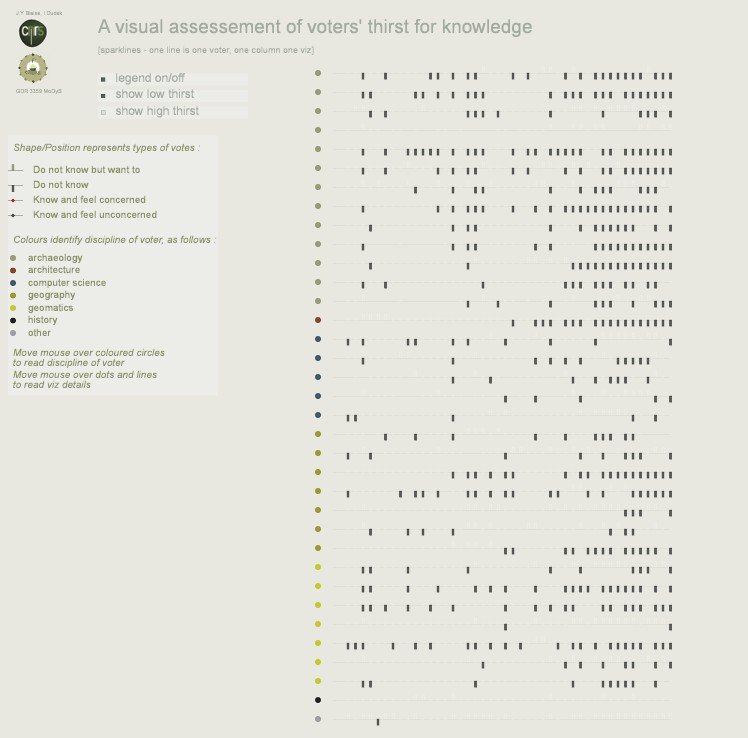
J.Y. Blaise, I. Dudek
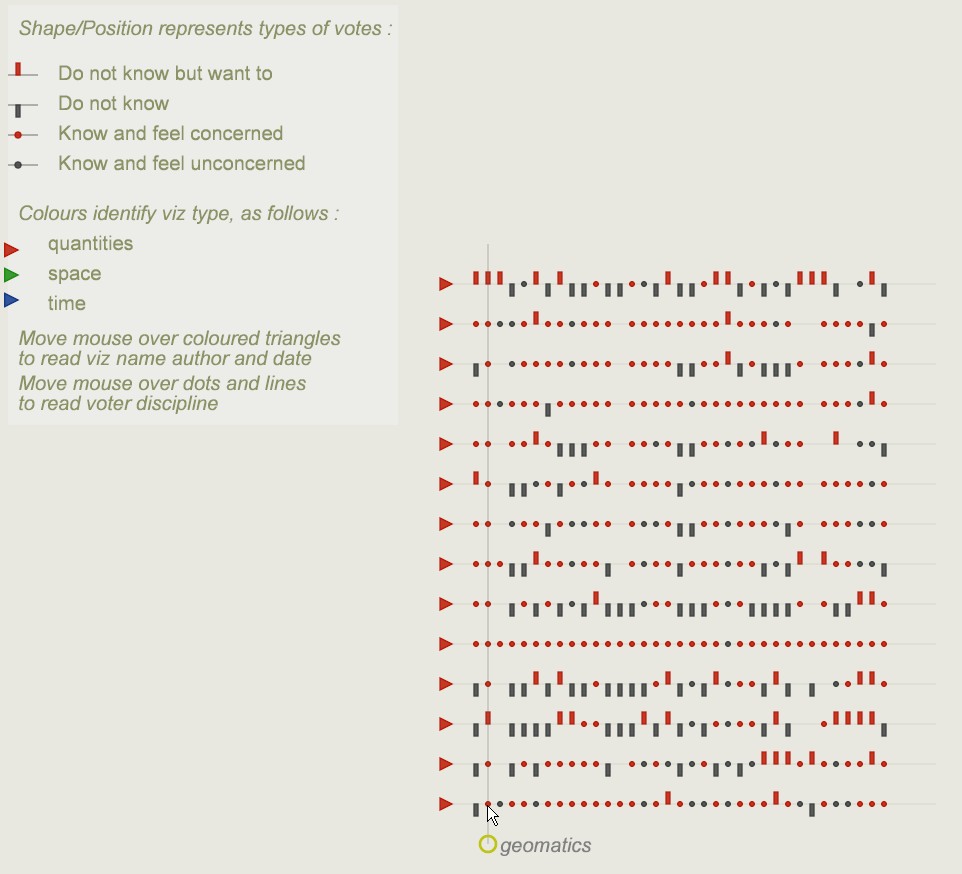
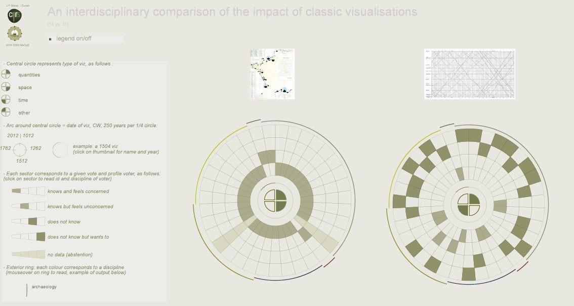
Data rings show each vote (including discipline of a voter) for two visualisations. This is used to compare the impact across disciplinary fields of various visualisations. It helps spotting possible disciplinary patterns. It also helps checking whether some time-oriented data visualisations are equally poorly known across disciplines.
946 possible combinations
applied to : disciplinary practices of GDR MoDyS
J.Y. Blaise, I. Dudek
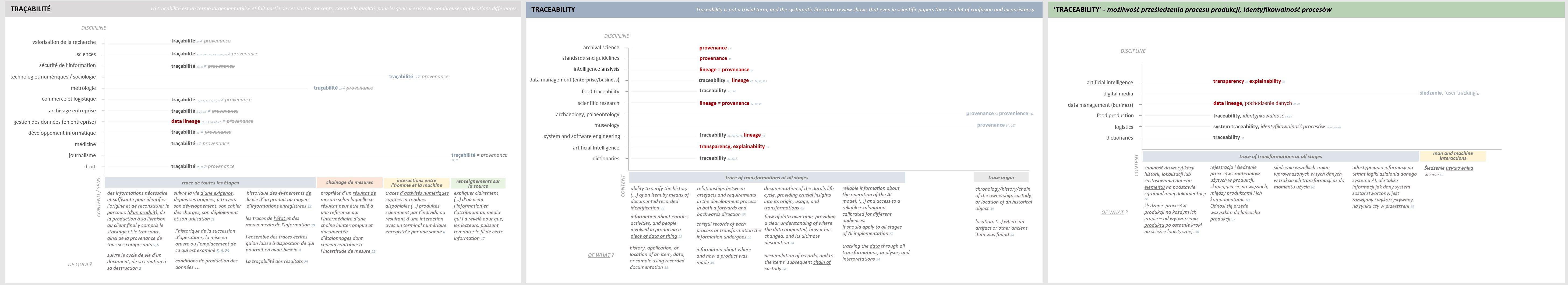
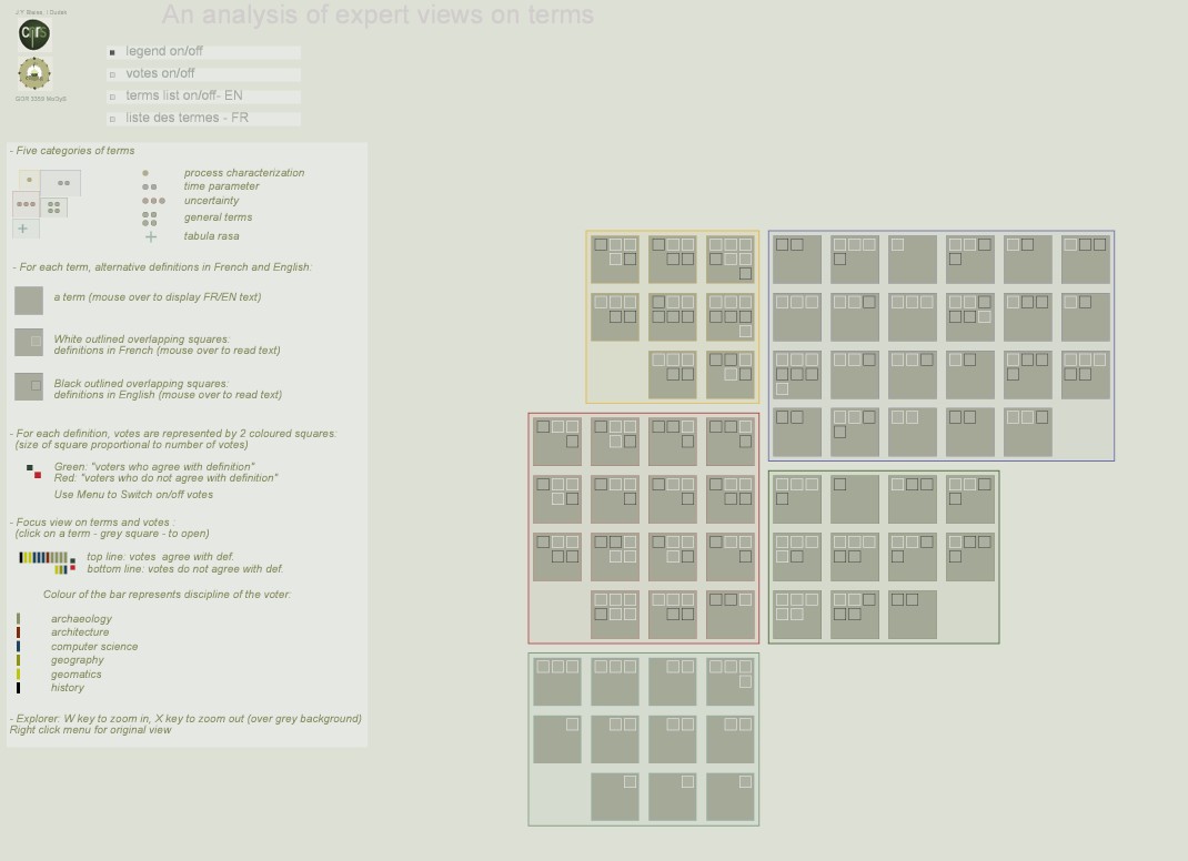
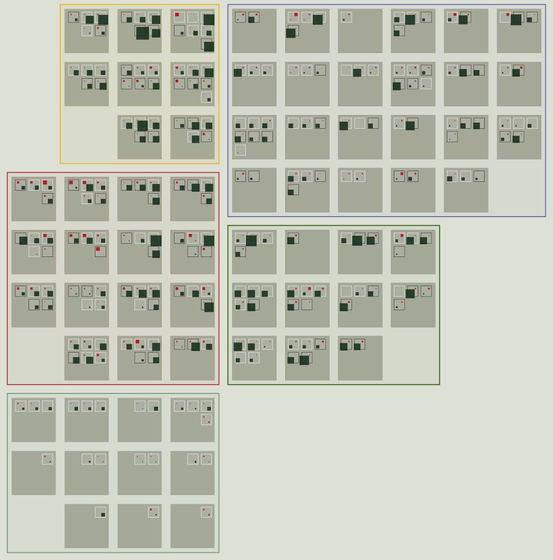
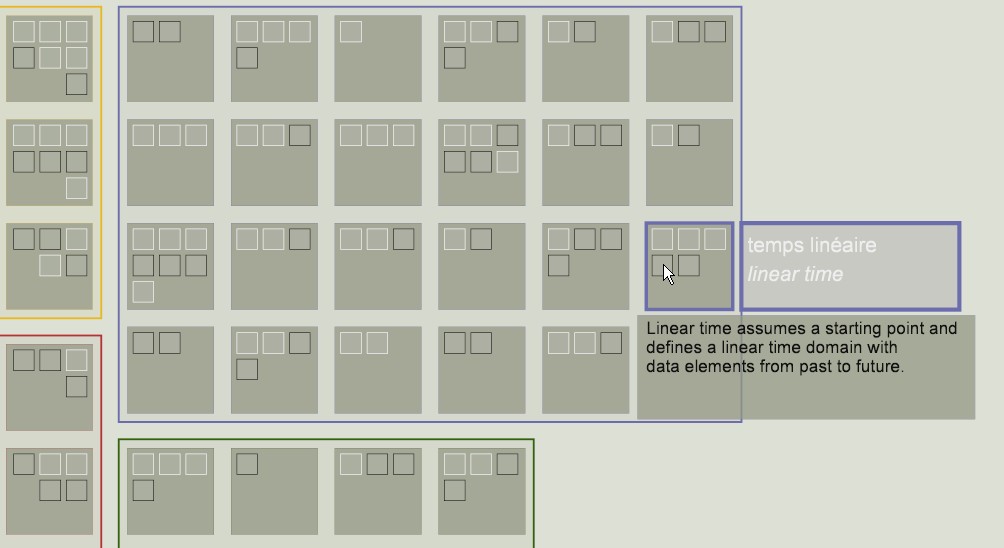
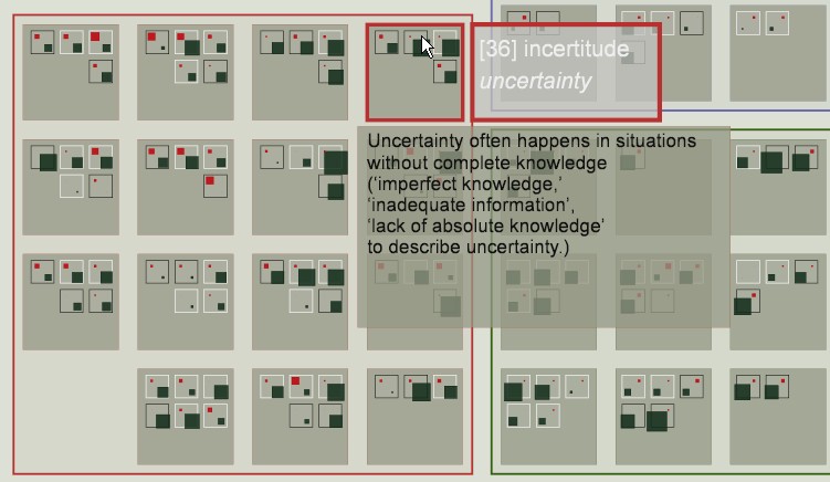
In the context of the MODYS 2012 workshop practical classes, a collection of 2-tuples (terms + definitions, in French or English) was extracted in order to spot similarities and differences in the way actors from various disciplines interpret terms or notions. The visualisation is built like a mosaic inside which each tile represents a term, with layers of information showing alternative definitions and their impact on the actors.
The visualisation underlines a clear lack of common understanding of notions in and around uncertainty and the time parameter.
applied to : disciplinary practices of the MoDyS research group (GDR CNRS 3359)
J.Y. Blaise, I. Dudek
An experimental visualisation designed according to four simple ideas:
- combination of spatial features and chronology allowing comparisons enforced within the eye span,
- application of the context+focus principle,
- support for uncertainty assessment (fuzziness, impreciseness, lacks, etc.),
- a simple visualisation minimising the learning curve and the decoding effort, facilitating information discovery.
applied to : Cracow's Main Square
published research
J.Y. Blaise, I. Dudek
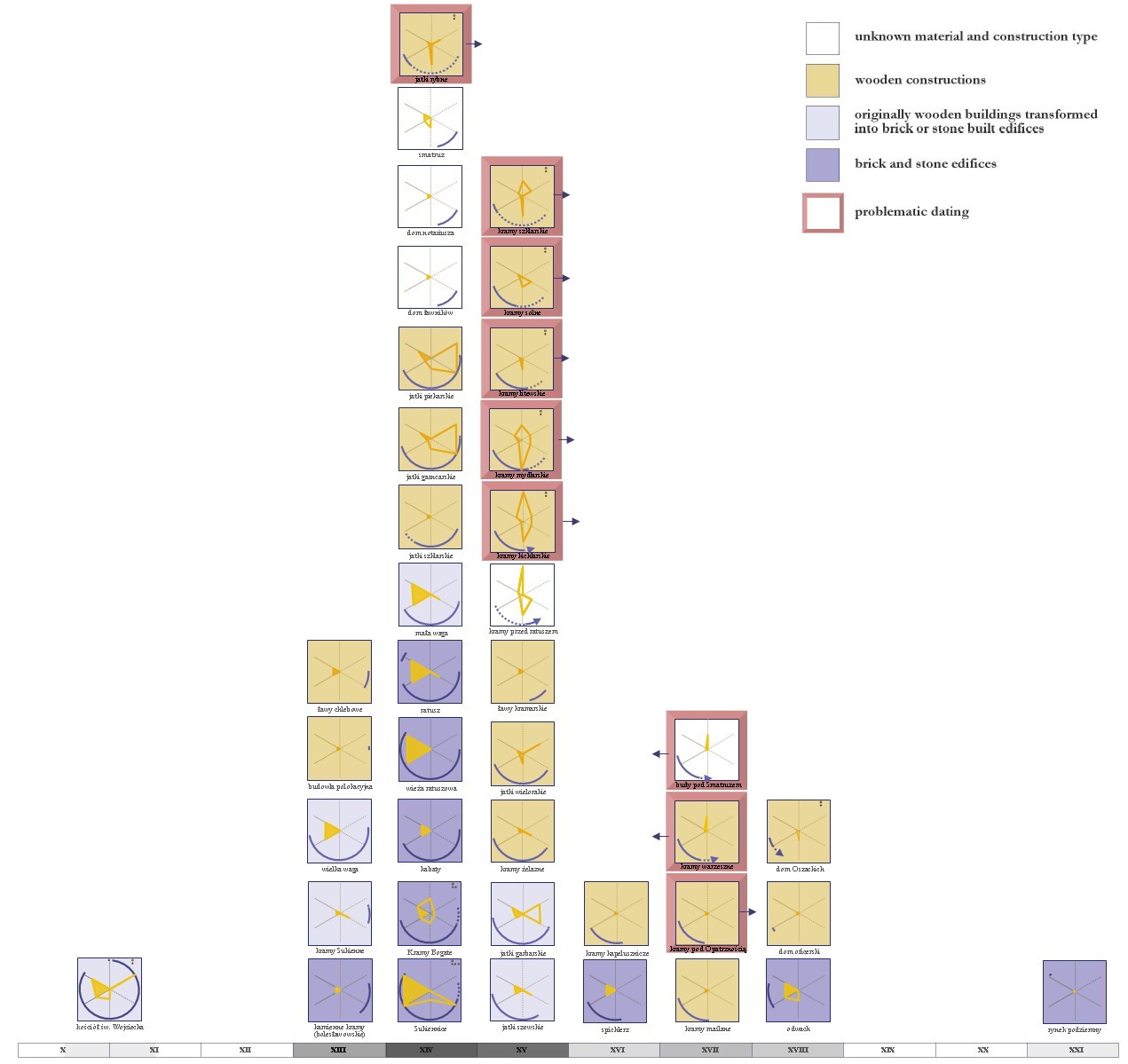
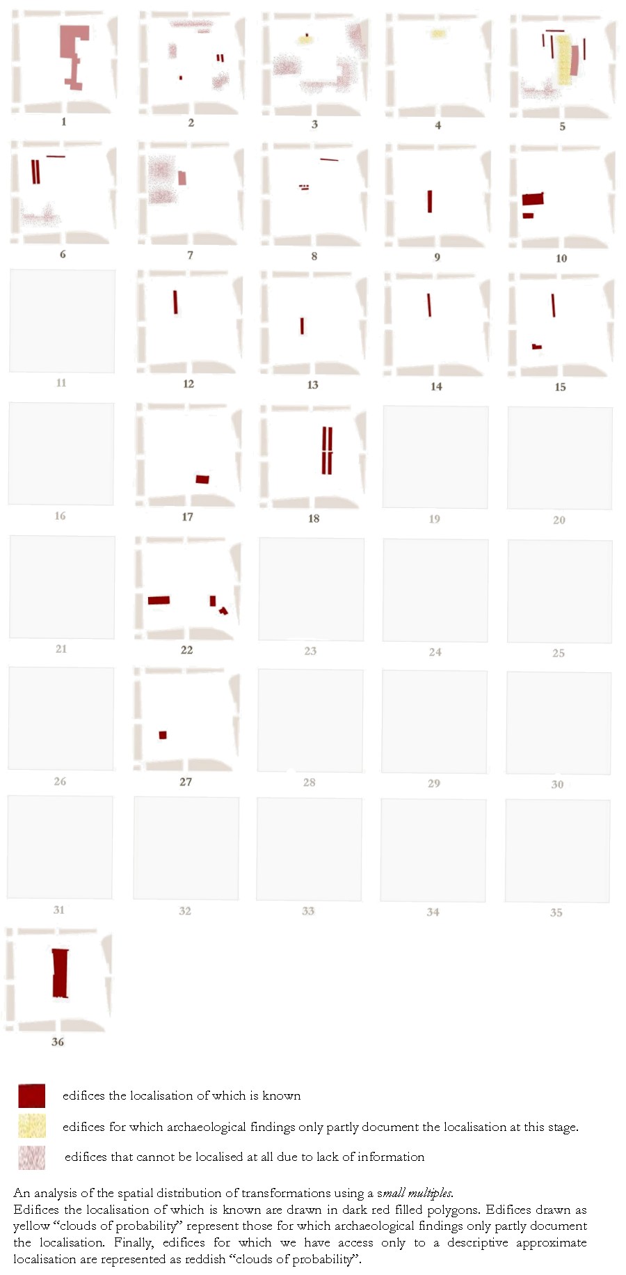
Each square corresponds to a given number of transformations. Squares are sorted by increasing order, left to right, top to bottom (the actual number of transformations is written below each square). Inside each square, edifices for which the overall amount of transformations corresponds to the number written below the square are drawn inside a schematic map of the Market Square.
The visualisation underlines higher numbers of transformations for edifices localised in the south part of the Market Square, and lower numbers for edifices localised in the north part. This however is not a rule, but rather a general pattern, with noticeable exceptions like the officer’s house (south part, two transformations only) or the pottery and lard stalls (north part, 13 transformations).
applied to : Cracow's Main Square
J.Y. Blaise, I. Dudek
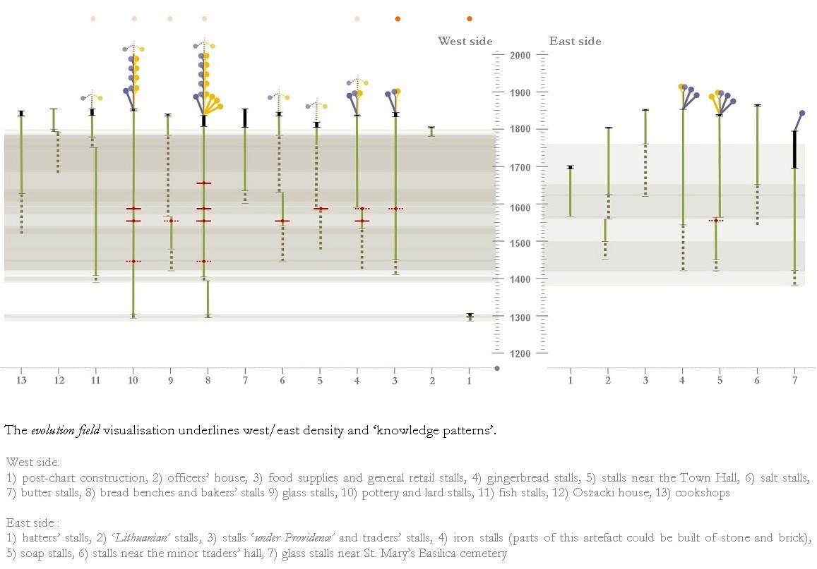
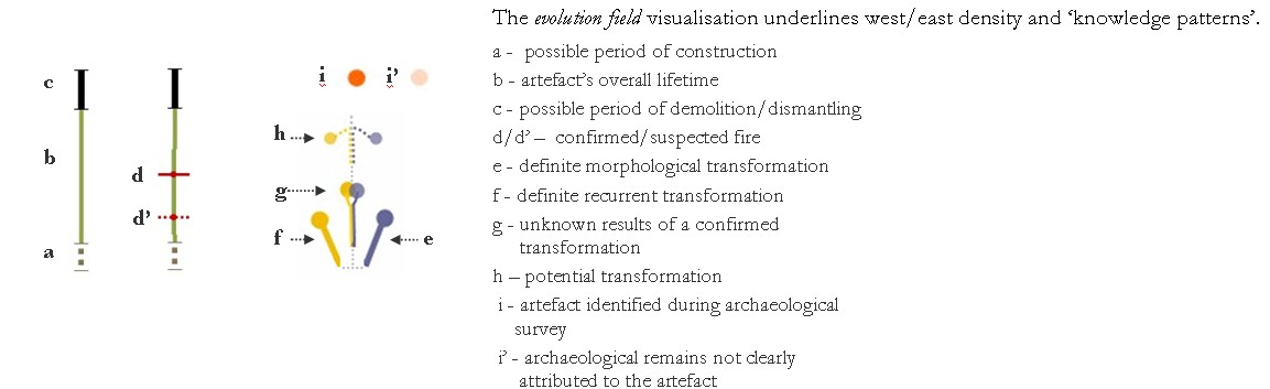
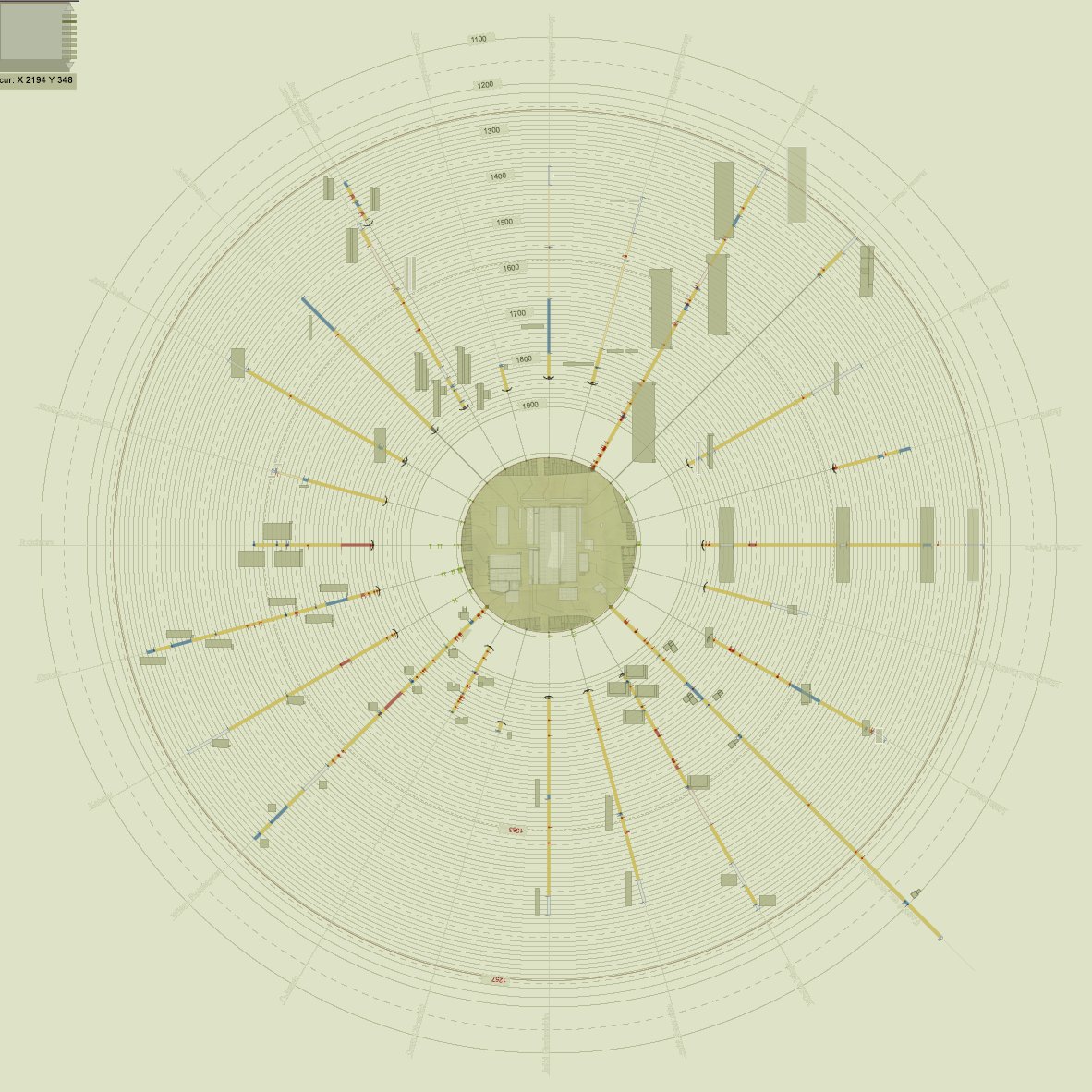
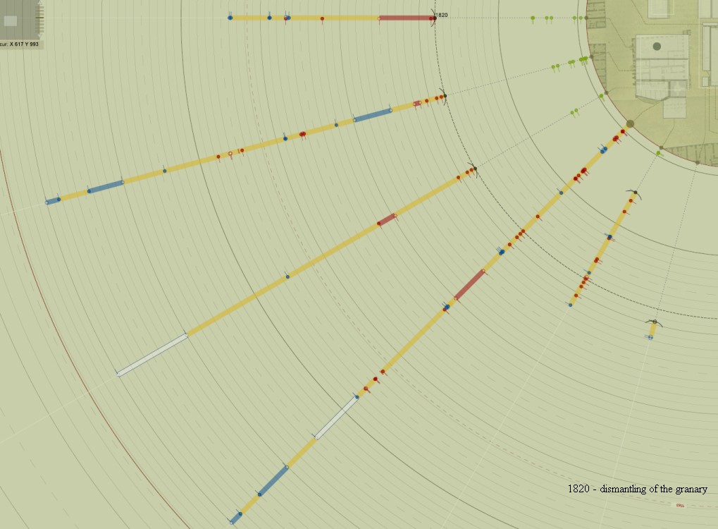
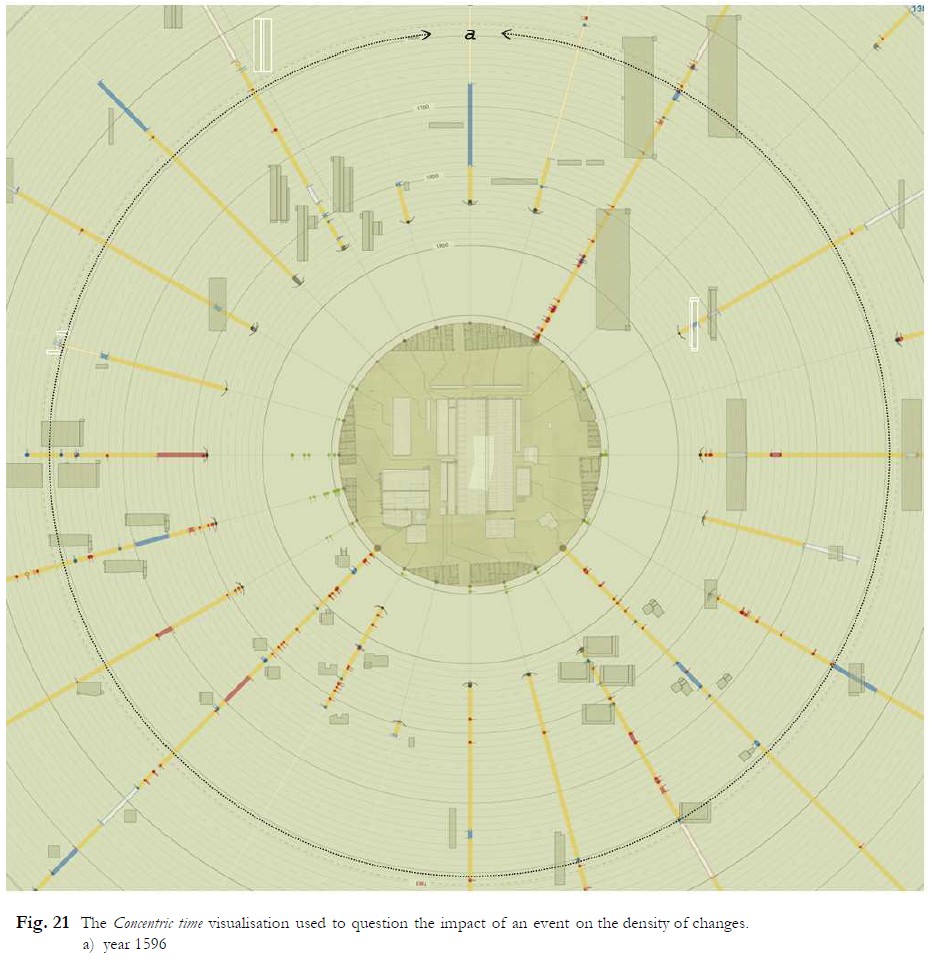
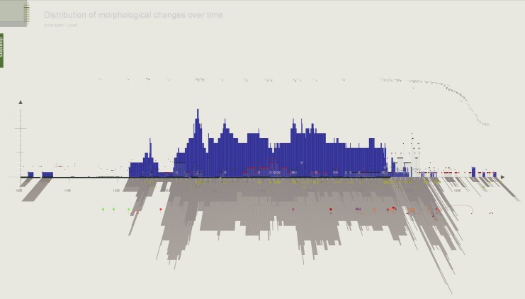
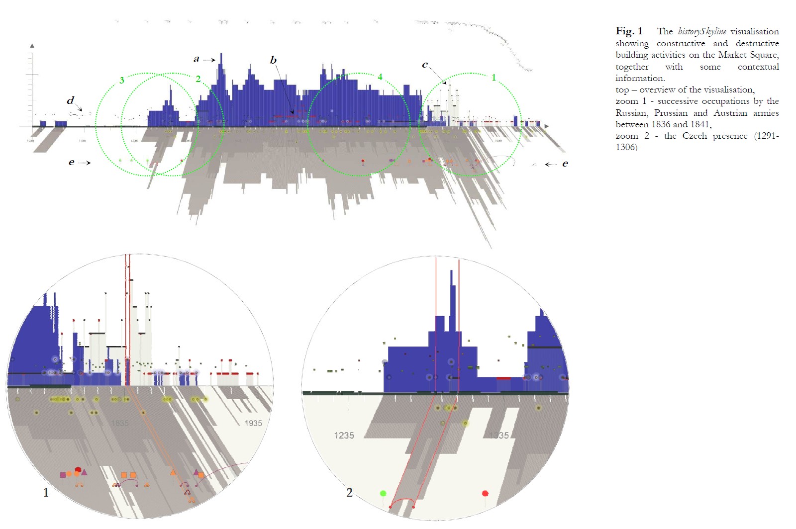
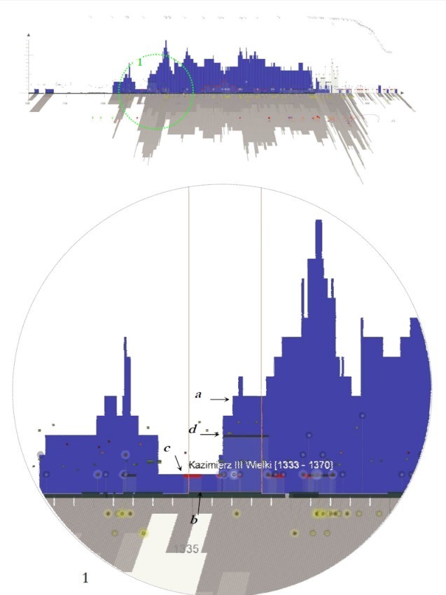
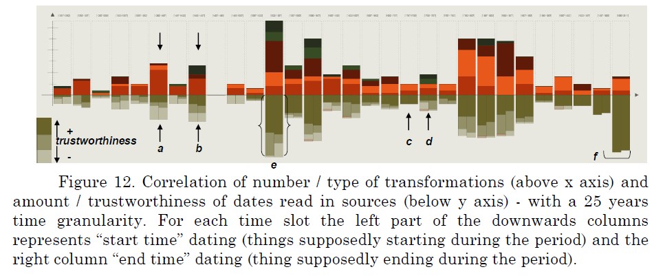
A visual metaphor aimed at aligning architectural events (changes, destruction ot extensions, etc.) and facts that may have impacted these events (in short, pieces of information about historical contexts). Vertical bars represent the amount of transformations across the whole market square, year by year, since 1035. Blue bars represent “positive” transformations (creation / modification), red lines represent episodic and recurrent changes (maintenance or equiv.), black lines represent destructive changes.
These indications are correlated with the number of documents available (grey “shadow”).
In addition, they are also correlated with a variety of contextual information such as wars, natural disasters, life of important people, new laws, etc.
The visualisation does not mention causality: it barely puts facts that occurred at the same period side by side.
applied to : Cracow's Main Square
J.Y. Blaise, I. Dudek
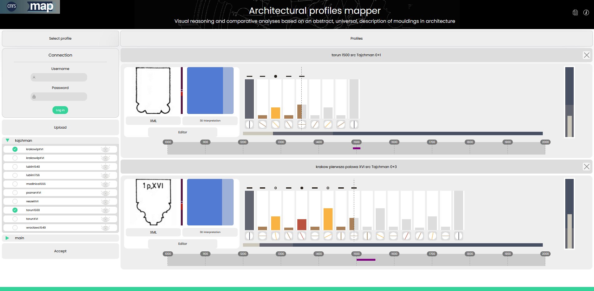
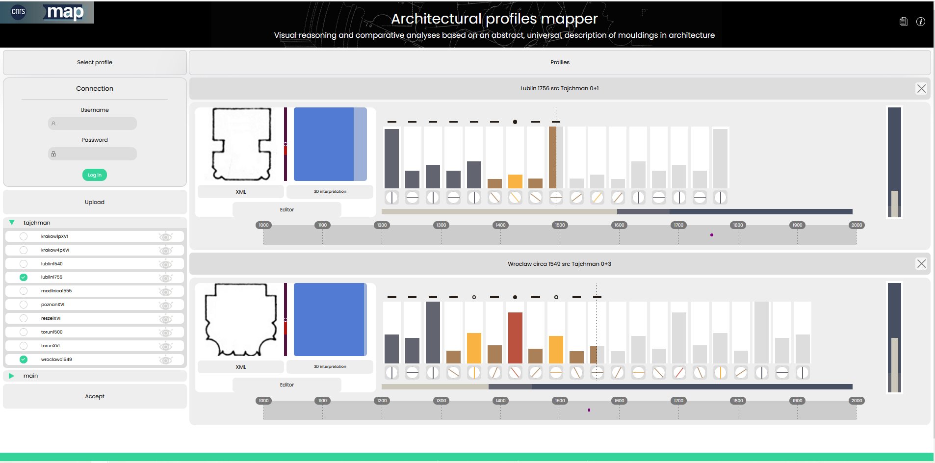
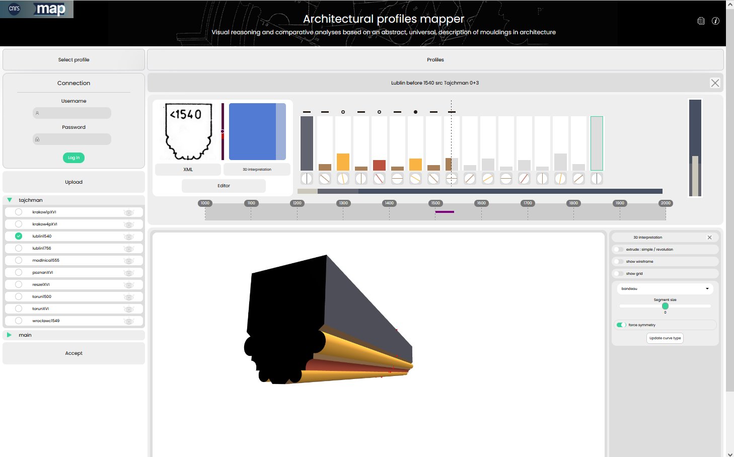
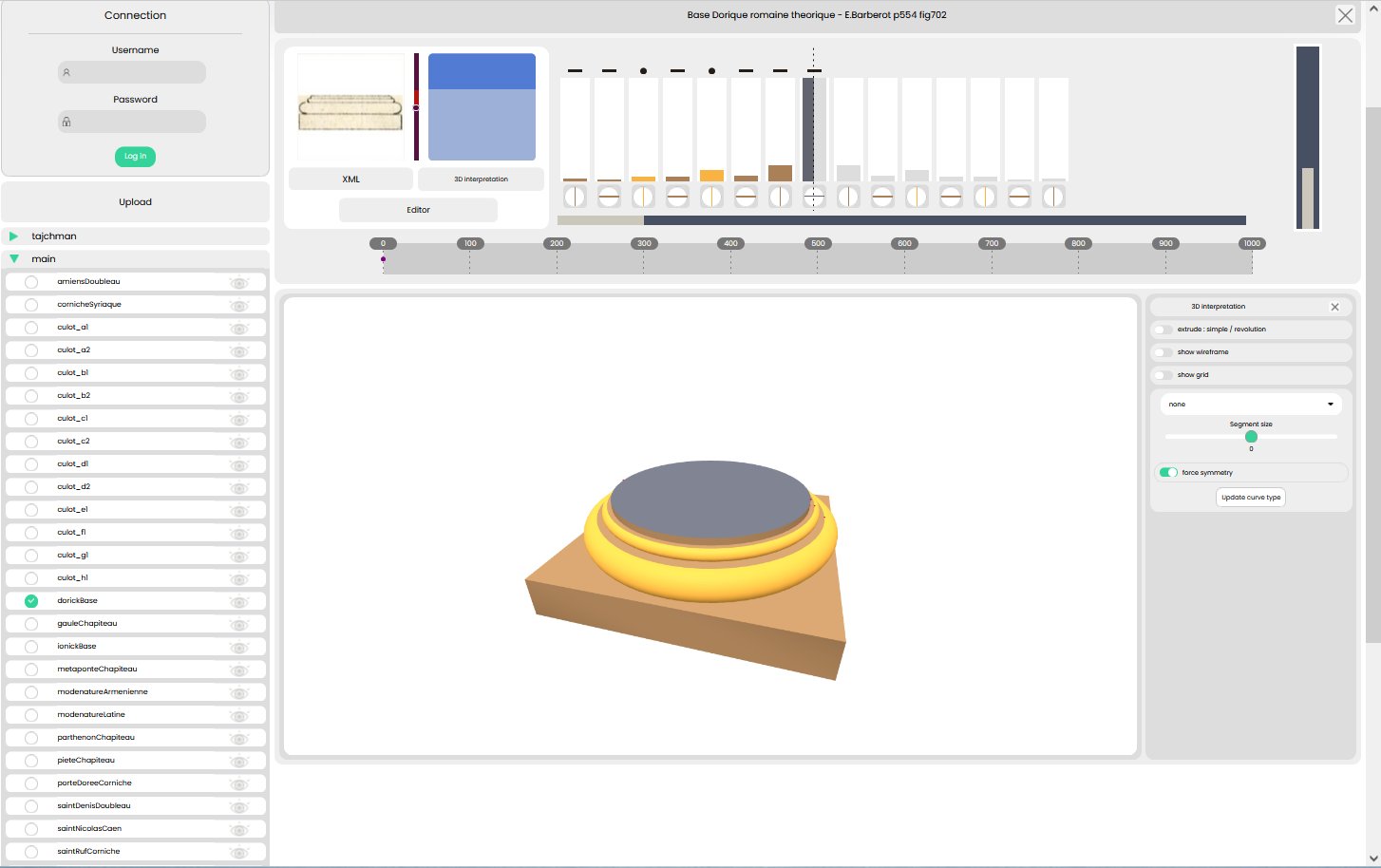
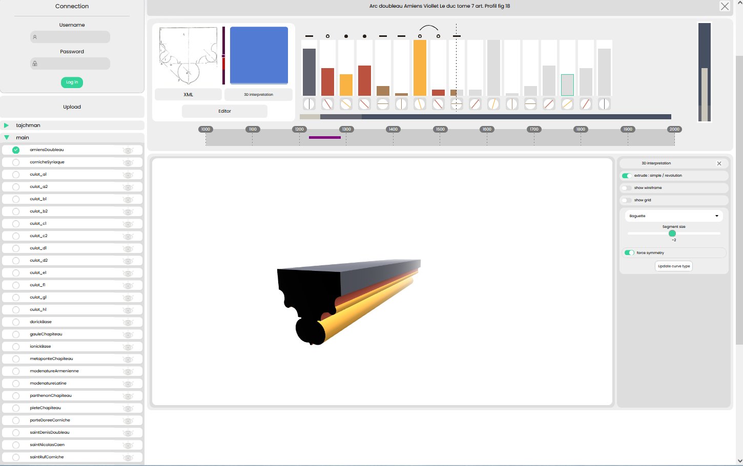
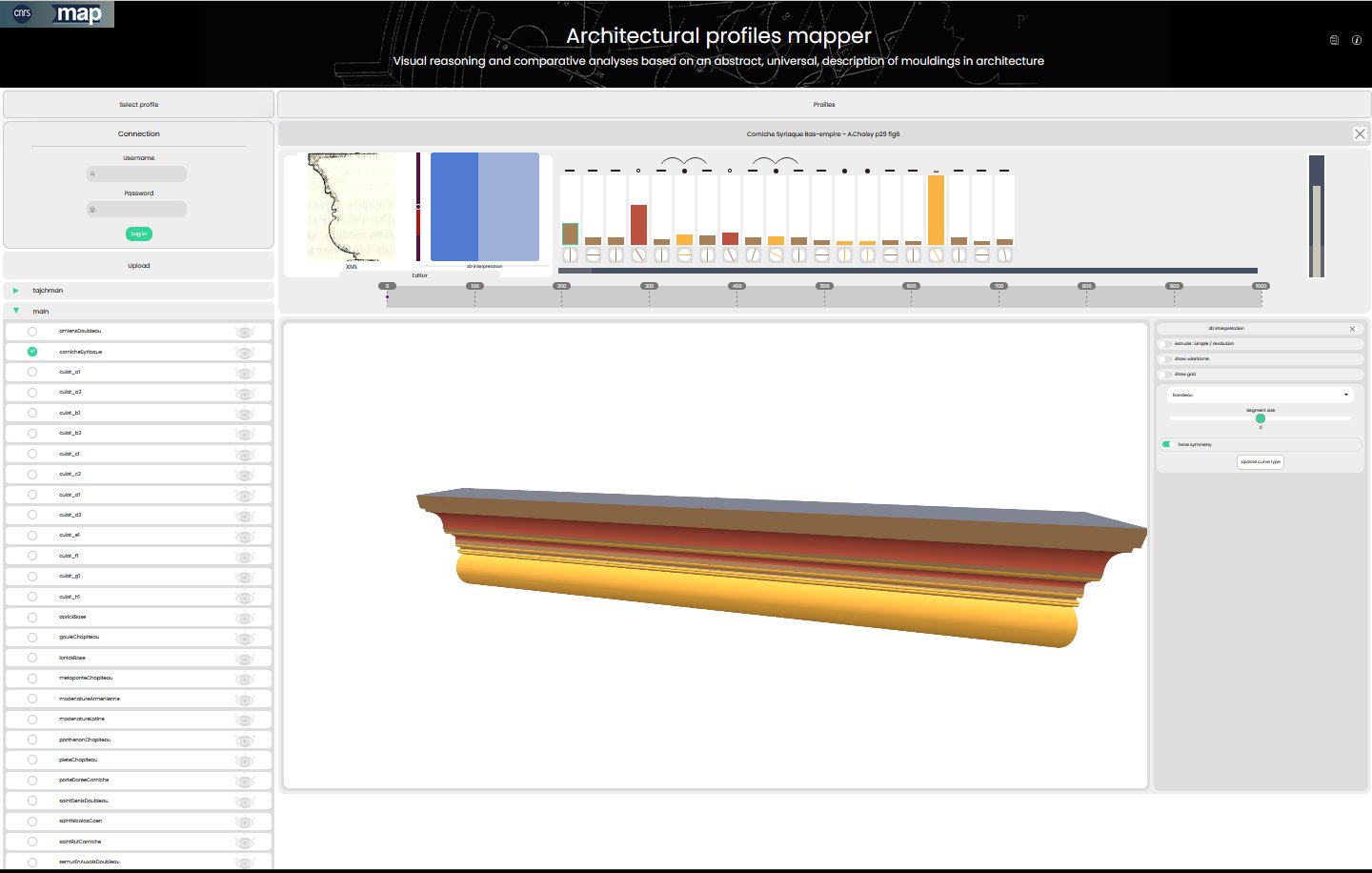
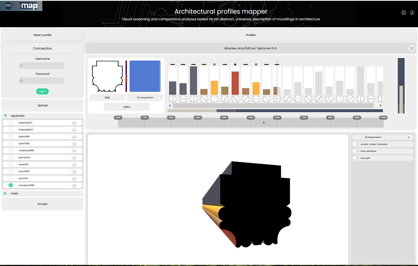
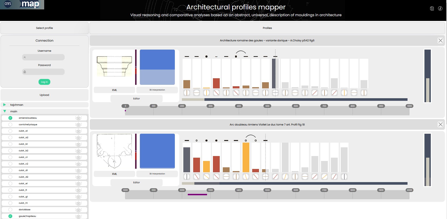
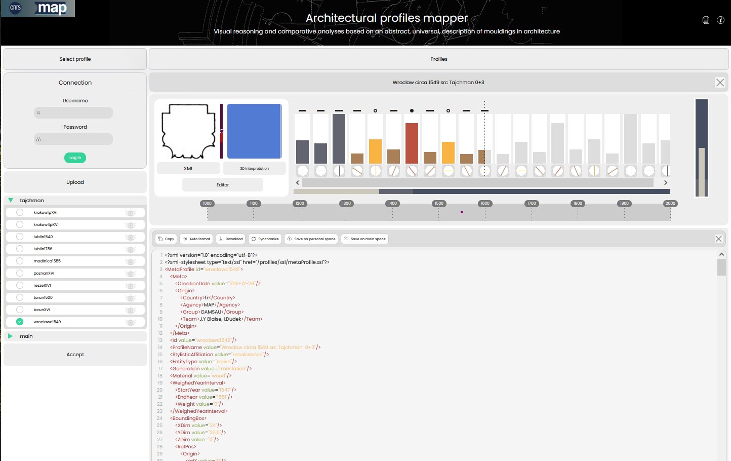
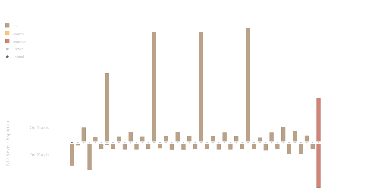
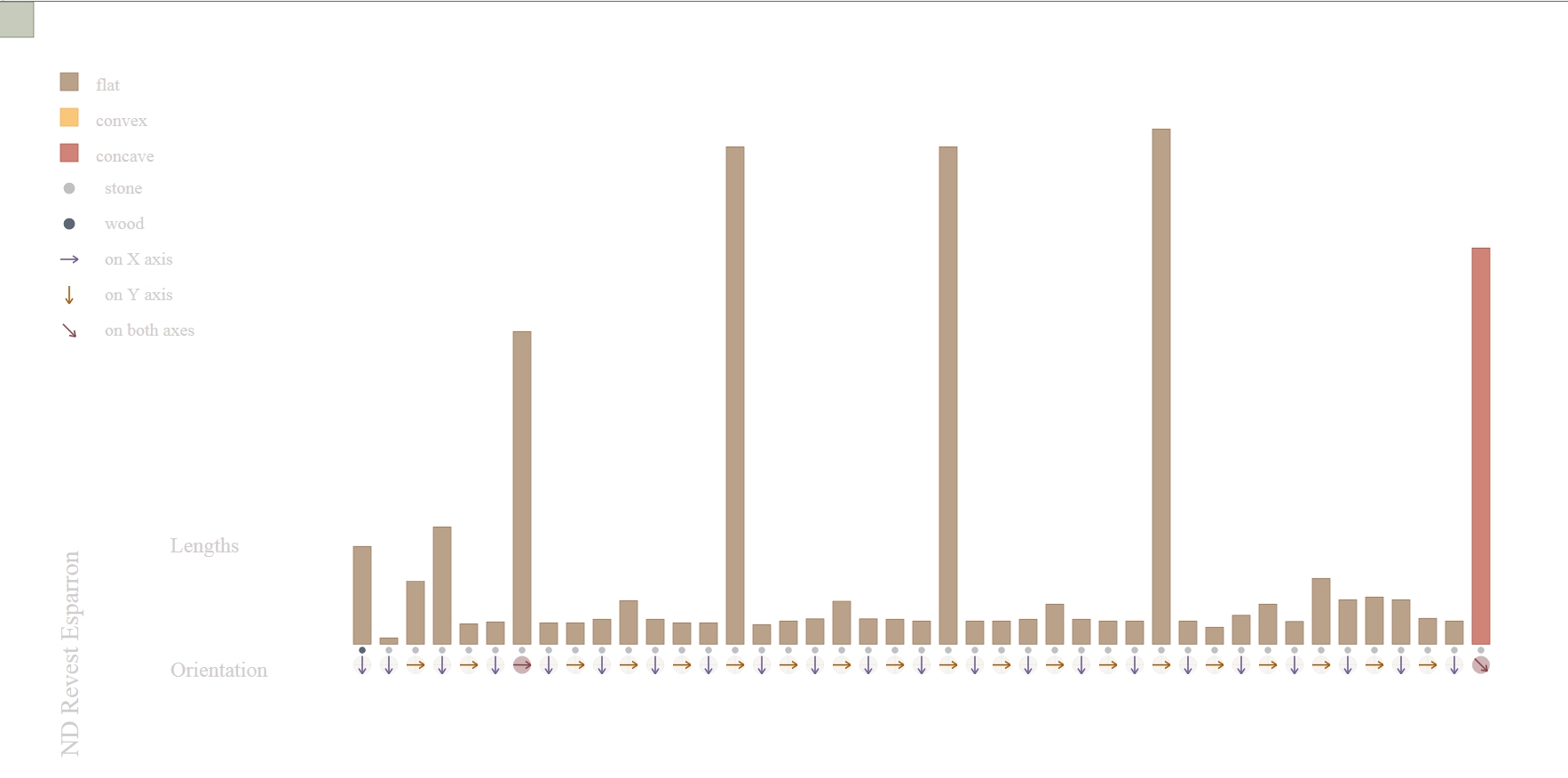
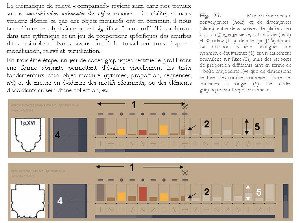
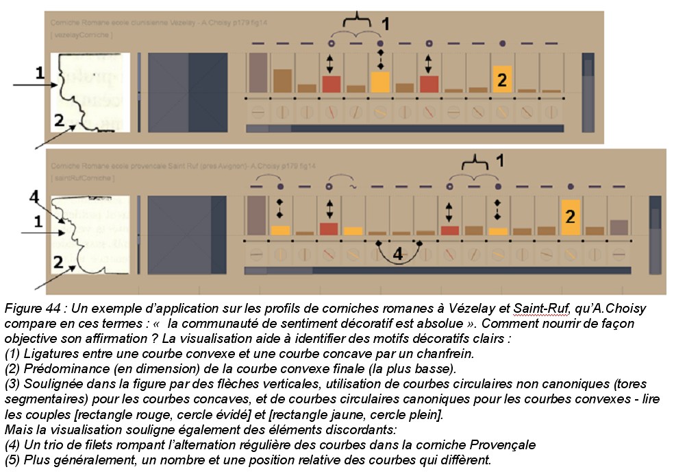
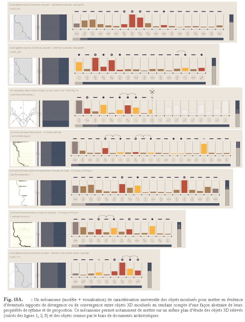
The methodological framework we introduced in this research aims at gaining a synthetic, abstract view of profiles, thereby facilitating the analysis of tendencies and discordances, and the comparison of profiles. We develop a concept that aggregates abstract features of a 3D moulded object, may the object be real (existing or having existed) or purely theoretical (from literature). The aim is to uncover patterns and exceptions in the design of mouldings (across historical periods, across territories, across stylistic affiliations, across families of 3D objects, and across sources) and ultimately gain insight on relations of mouldings to one another, and to the architectural theory.
The visualisation is composed of two information groups, global profile analysis and components and lengths analysis, corresponding to a move from a general analysis to a close view of segments.
We express all segments of a profile - whatever their real dimensions are - inside a predefined gauge, the height of which representing the profile’s longest segment. Graphically, a fixed-width rectangle represents each segment: its height corresponds to a ratio of the longest segment. What is perceived then are the relative importance of each segment inside the composition, not their actual size. Colours used for fixed-width rectangles help spotting alternations of concave (red), convex (yellow) and flat curves (brown).
applied to : various 3D objects, various localisations, various periods, various survey methods
published research used for teaching.
J.Y. Blaise, I. Dudek
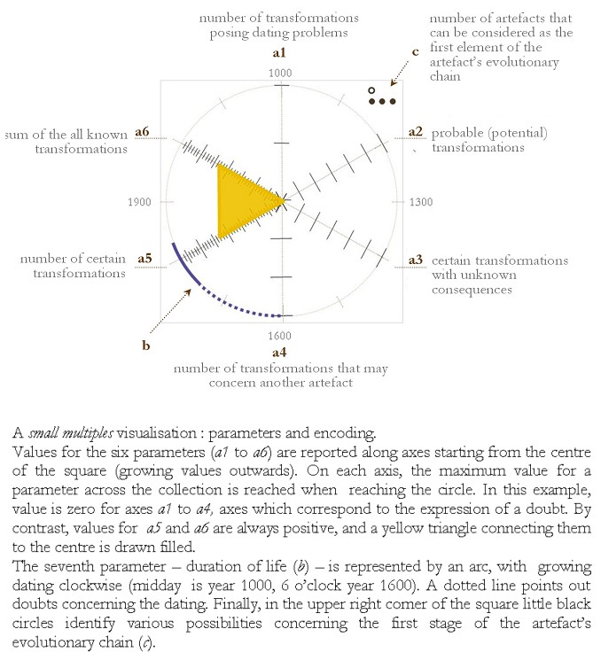
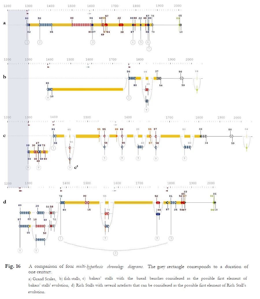
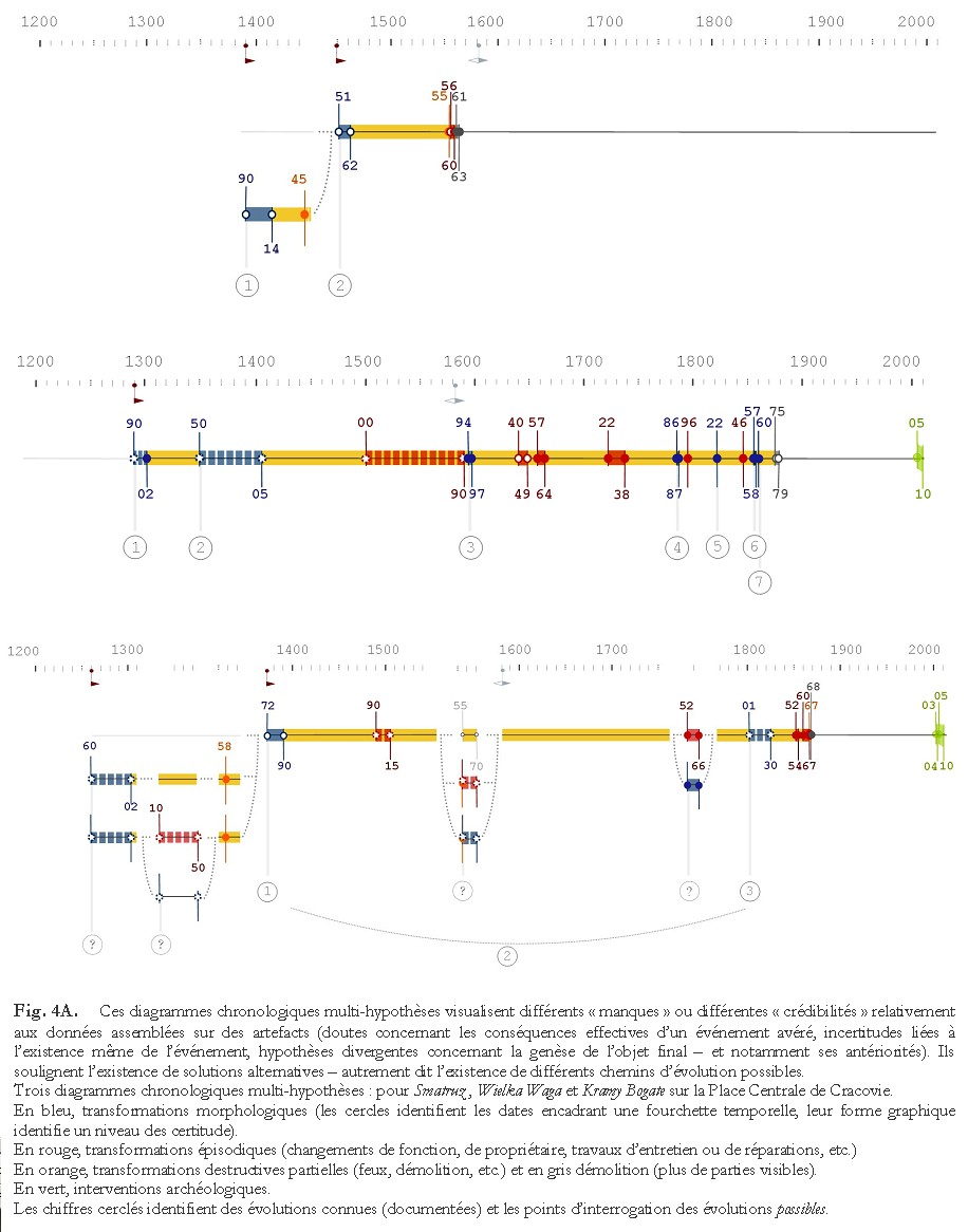
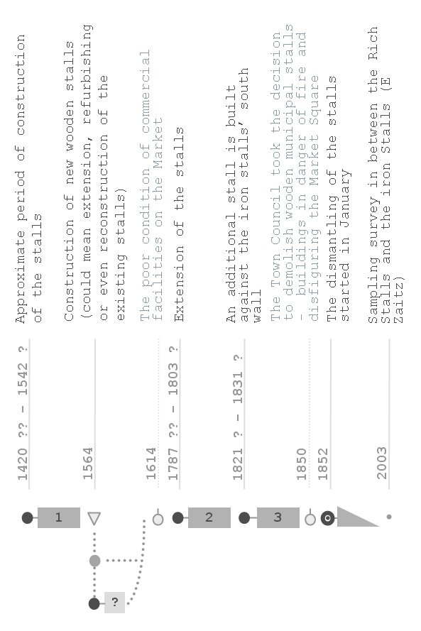
Multi-hypothesis chronology diagrams provide a quick, synthetic view on where alternative scenarios exist in time. They show doubts concerning the precision of dating and alternative paths, along with their potential consequences.
In multi-hypothesis chronology diagrams time is represented in real scale, and in discrete time: durations are therefore assessed, their relative lengths can be compared. These diagrams present alternative paths as they appear from the analysis of the data obtained from historical sources and of material traces: what they show is what we know, and consequently is most probably incomplete, and possibly deformed as a consequence of the source effect.
applied to : Cracow's Main Square
published research
J.Y. Blaise, I. Dudek
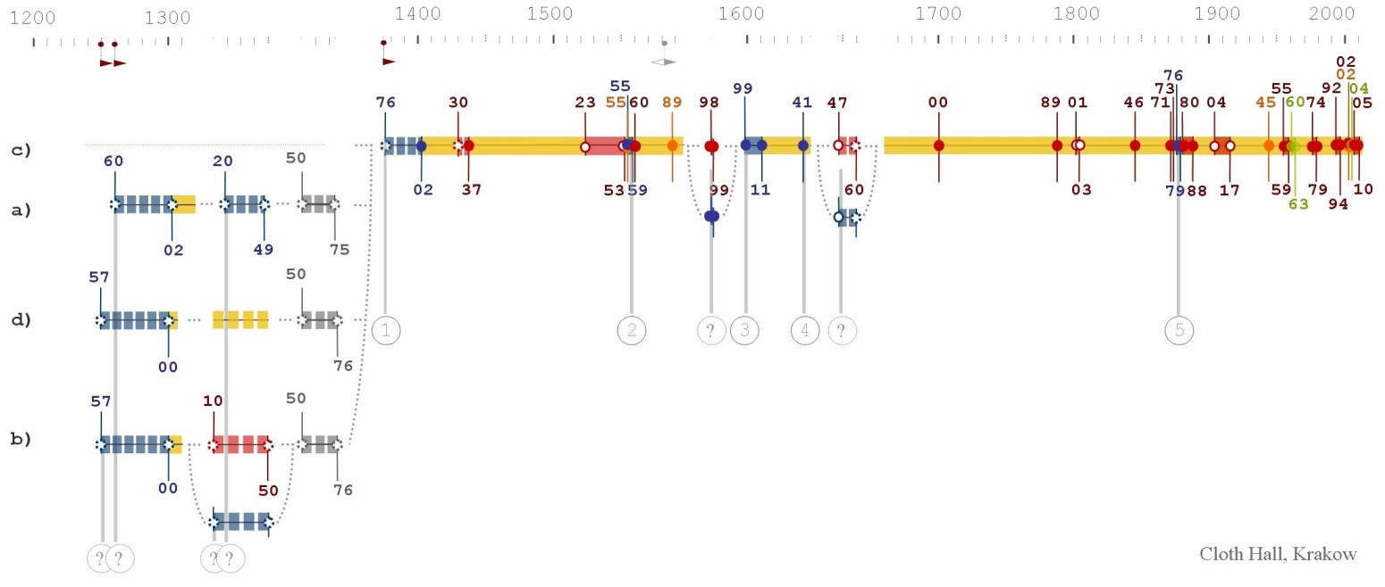
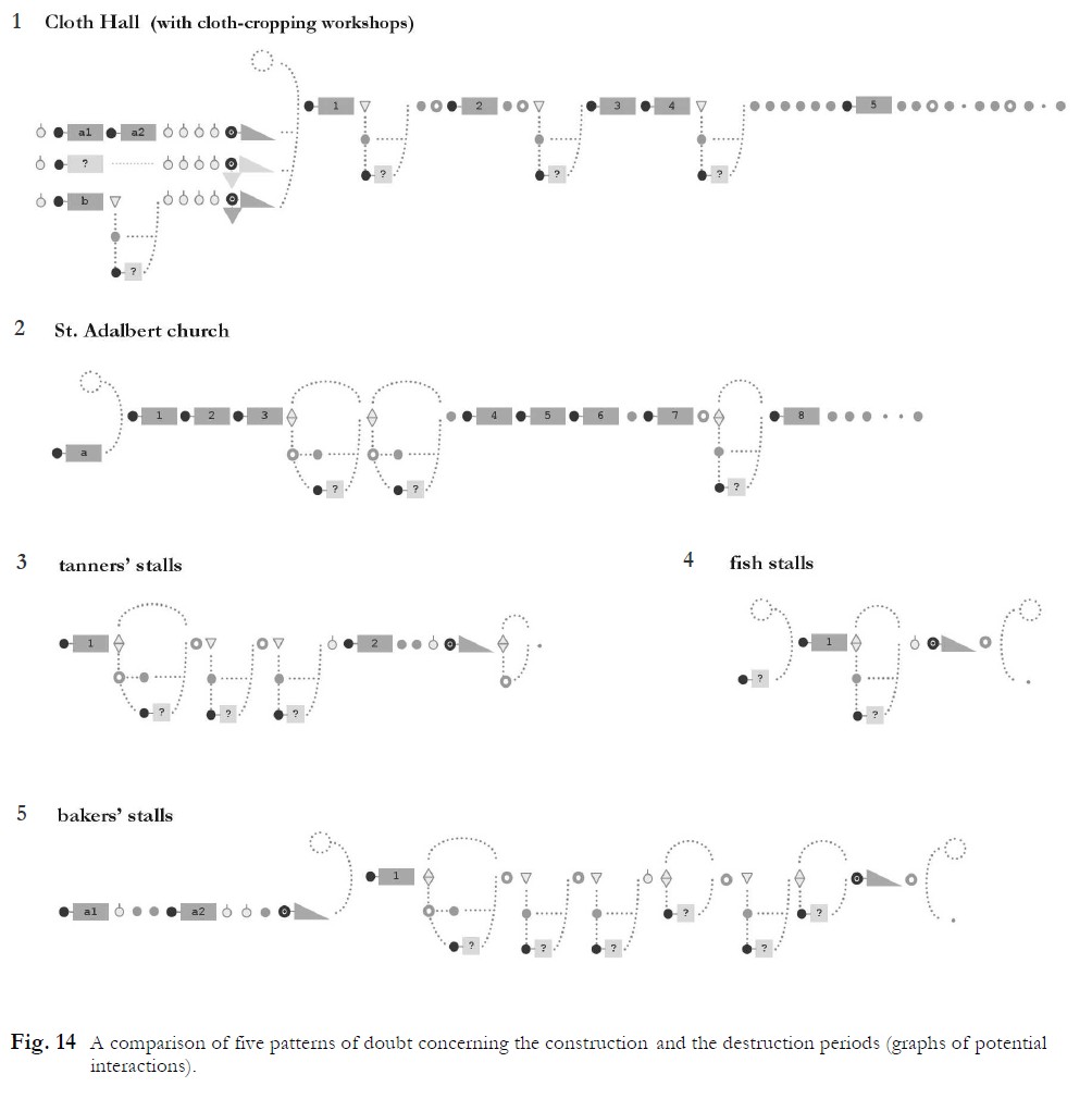
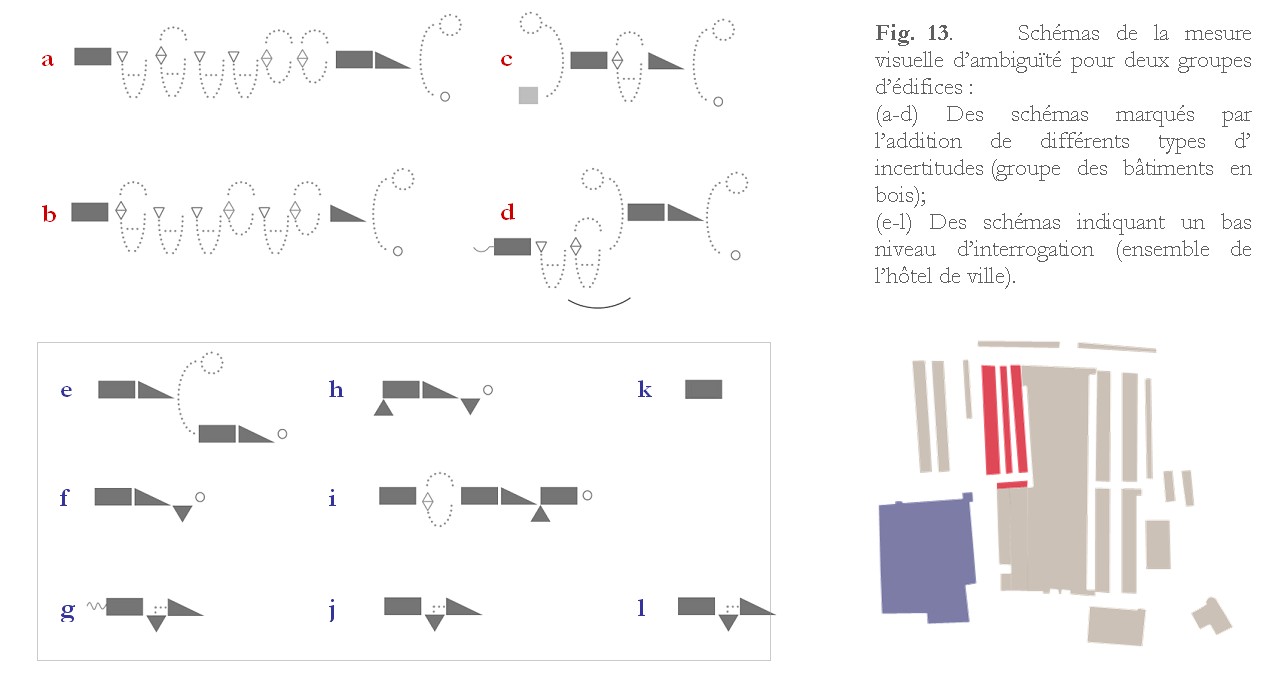
These diagrams allow a reading of transformations, states and contextual information in ordinal time, detailing the nature of alternatives and distinguishing clearly alternatives that are based on duly established facts from those that are based on circumstantial evidence. Graphs of potential interactions use the same classes of transformations as multi-hypothesis chronology diagrams. The chronology of events is retained, but the durations do not appear - only the order is assessed. The diagram emphasizes visually differences between definite, confirmed and potential transformations. As a result, these diagrams support other reasoning tasks: comparisons between objects (in terms of number and type of transformations and alternatives) or densities, order, frequencies and transformation patterns are easier to read in ordinal time since the actual length of the lifeline ceases to command the length of the visualisation.
applied to : Cracow's Main Square
published research
J.Y. Blaise, I. Dudek
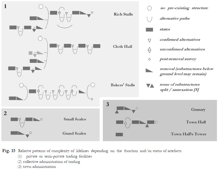
Visual measures of ambiguity allow a synthetic comparison of levels of complexity, underlining the amounts of alternatives and the density of doubts. They are created by simplifying graphs of potential interactions.
The main role of the visual measure of ambiguity is to foster comparative analyses. Juxtaposing visual measures of ambiguity for a group of objects with some features in common gives a broader picture, summing up the character of our current state of knowledge concerning this group.
applied to : Cracow's Main Square
published research
J.Y. Blaise, I. Dudek
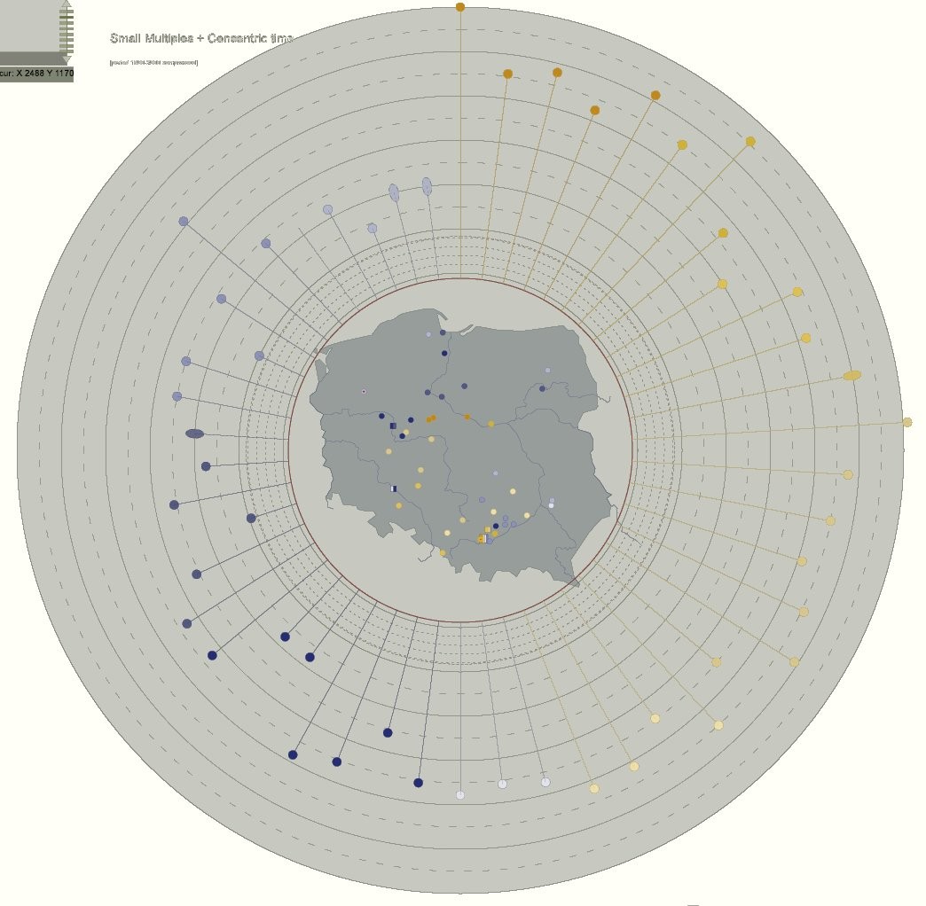
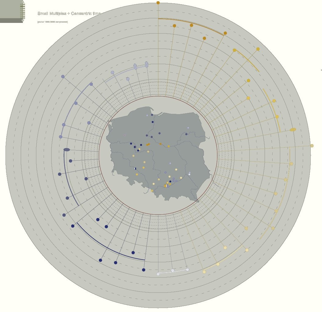
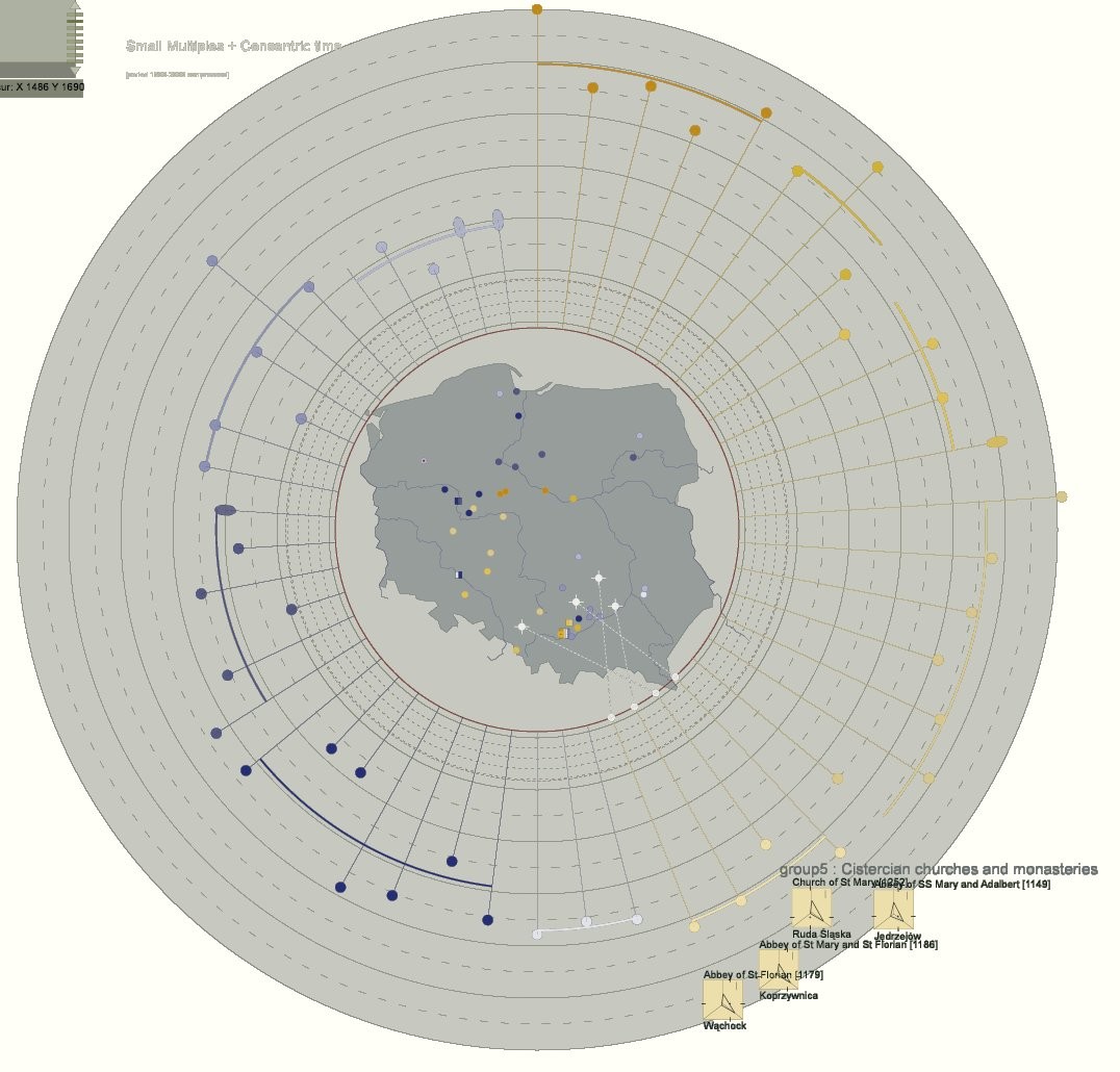
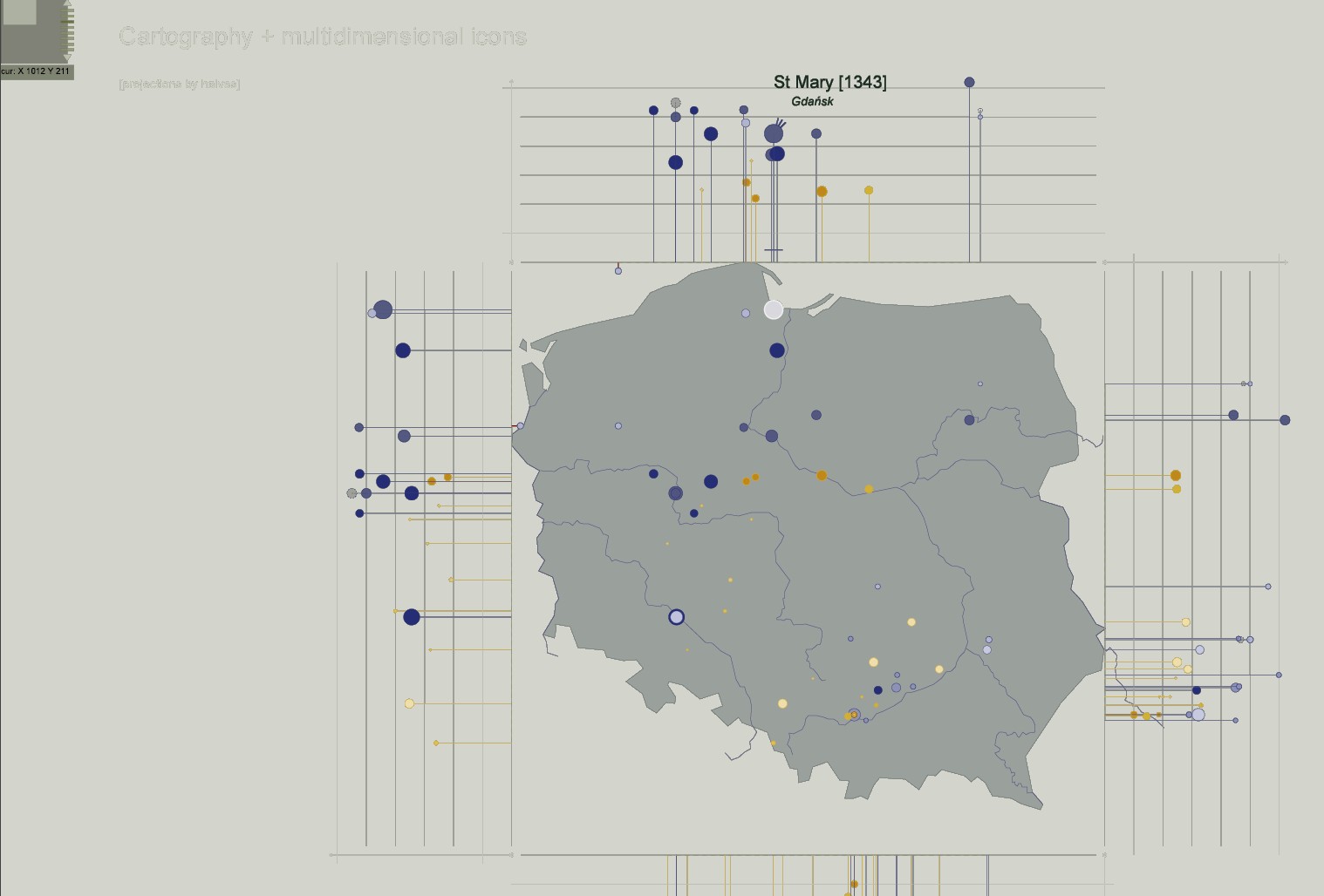
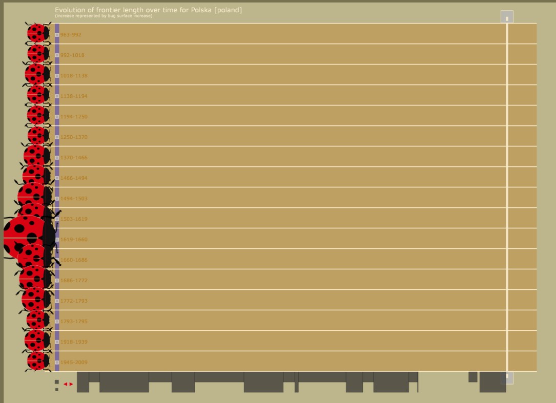
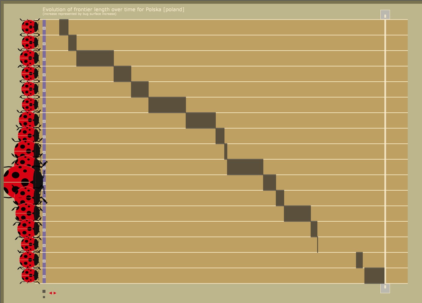
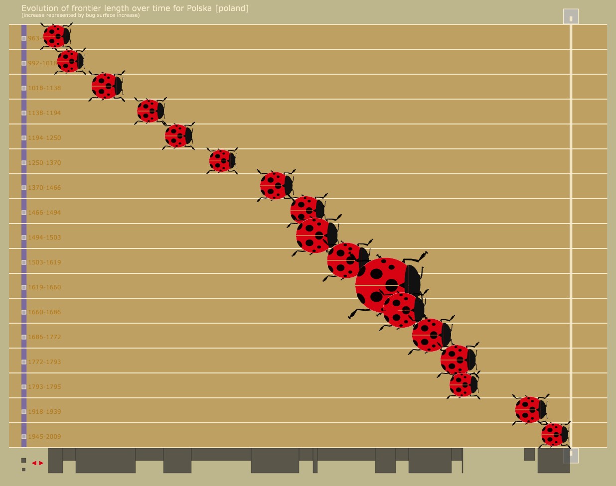
A visual tool dedicated to the analysis of Zbigniew Dmochowski's classification of the architecture in Poland - the aim is to analyse spatial and temporal patterns of diffusion. The visualisation combines a cartography and temporal features and patterns represented through concentric circles (the bigger the circle, the older the period).
applied to : 52 Roman and Gothic churches appearing in Zbigniew Dmochowski's classification.
published research
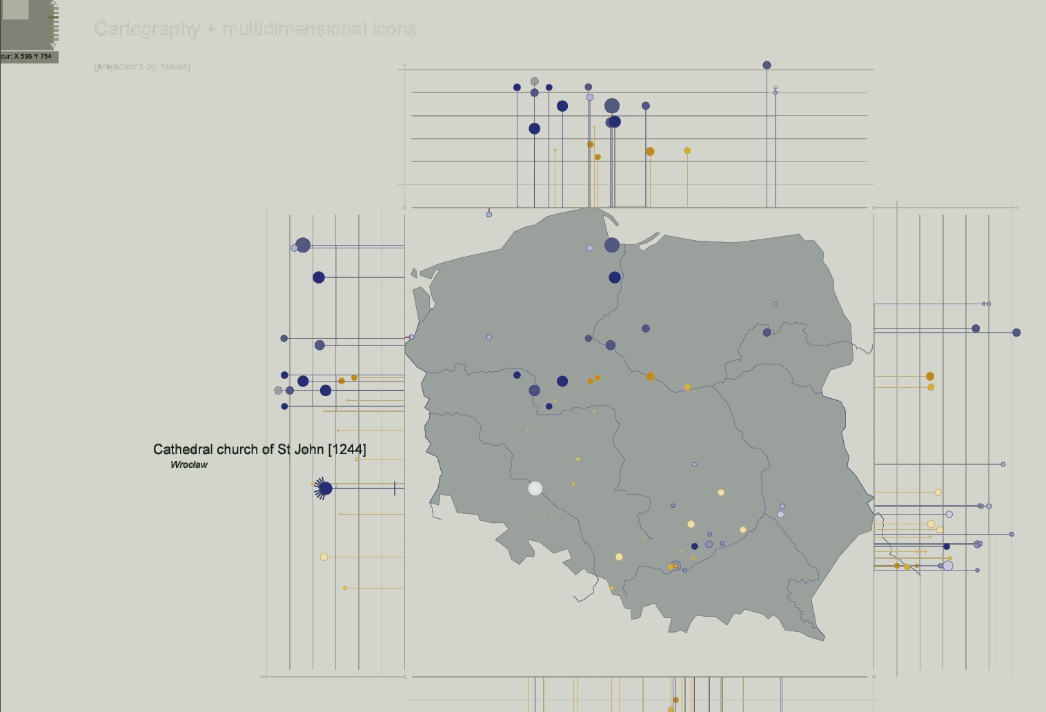
J.Y. Blaise, I. Dudek
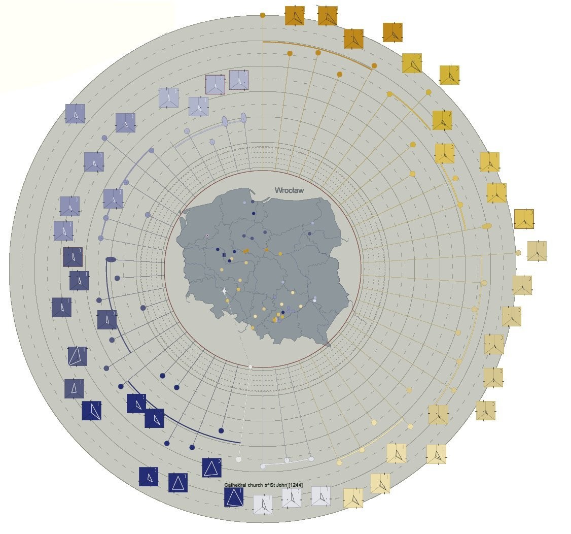
A visual tool dedicated to the analysis of Zbigniew Dmochowski's classification of the architecture in Poland - the aim is to analyse spatial and temporal patterns of diffusion. The visualisation combines a cartography and two multidimensional icons per object, one positioning it on the north/south axis, one positioning it on the east/west axis. The visualisation underlines geographical patterns (densities, predominance of a style in a sector, etc.) as well as temporal patterns (occurrences and proximities).
applied to : 52 Roman and Gothic churches appearing in Zbigniew Dmochowski's classification.
published research
J.Y. Blaise, I. Dudek
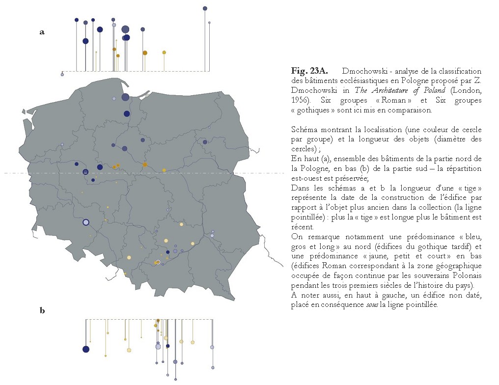
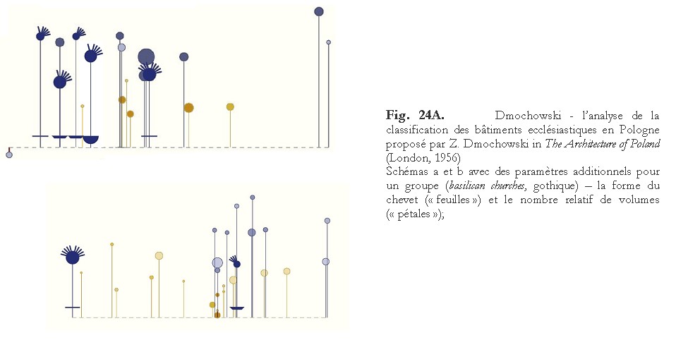
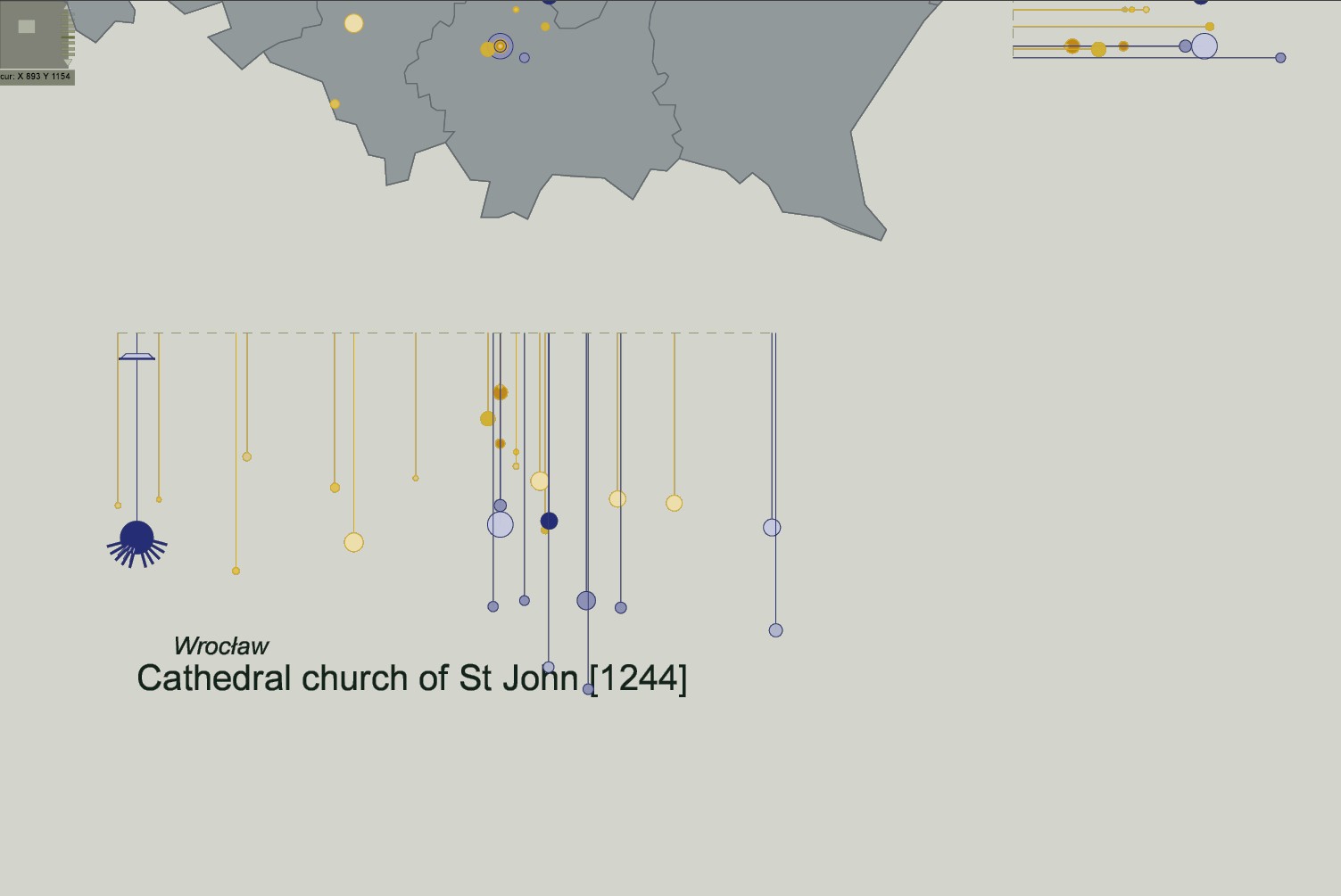
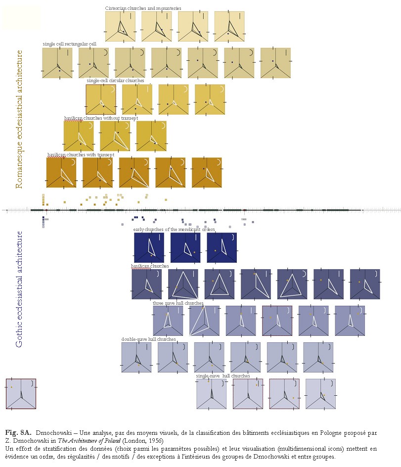
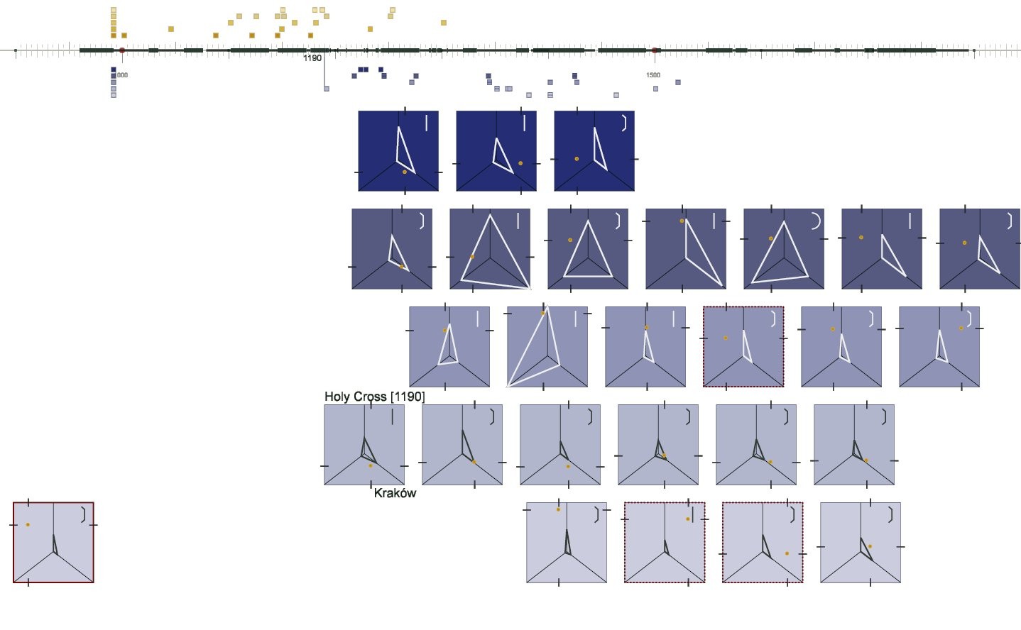
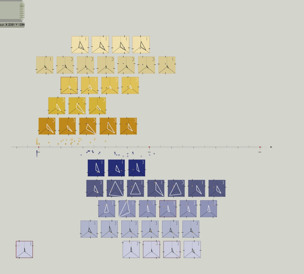
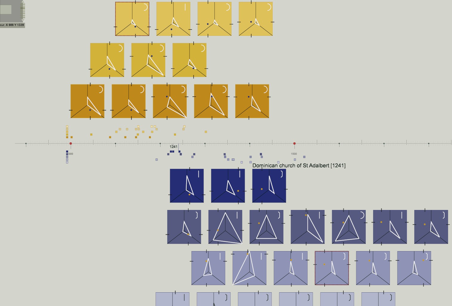
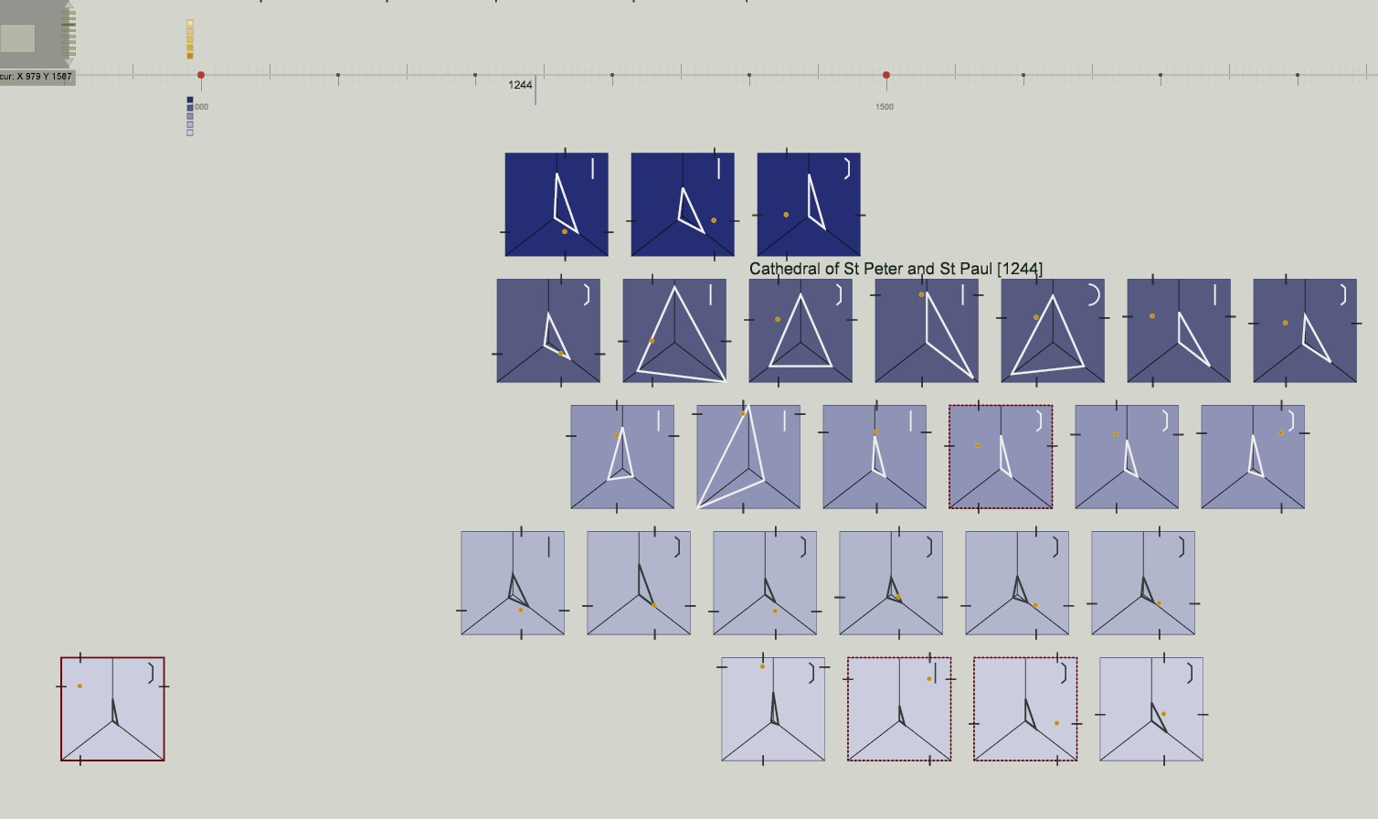
A visual tool dedicated to the analysis of Zbigniew Dmochowski's classification of the architecture in Poland - the aim is to analyse spatial and temporal patterns of diffusion. The visualisation summarises spatial features in a square-shaped multidimensional icon, and then distributes these square figures above (Romanesque) and below (Gothic) a timeline. The visualisation underlines the typological variability within Zbigniew Dmochowski's typological groupings.
applied to : 52 Roman and Gothic churches appearing in Zbigniew Dmochowski's classification.
published research
J.Y. Blaise, I. Dudek
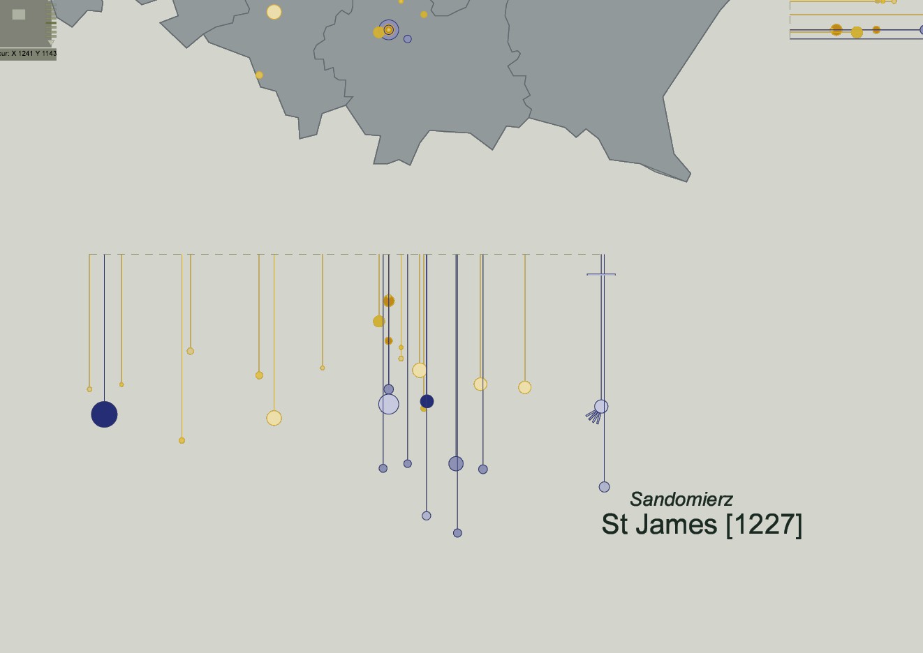
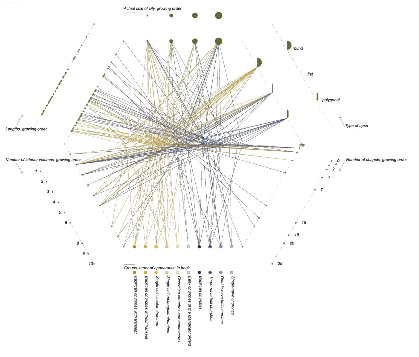
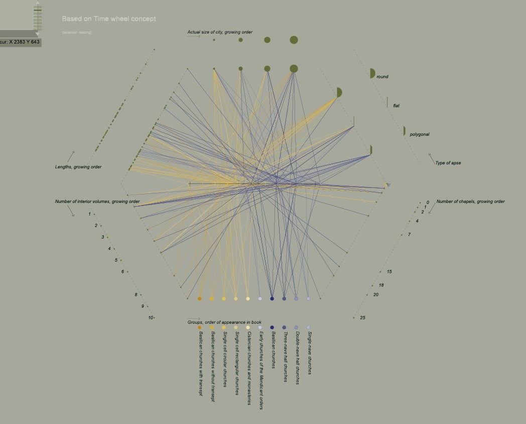
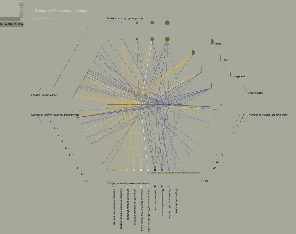
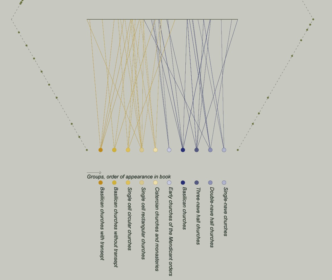
A visual tool dedicated to the analysis of Zbigniew Dmochowski's classification of the architecture in Poland - the aim is to analyse spatial and temporal patterns of diffusion. The visualisation reuses a concept from the infovis community called TimeWheel, first introduced by C.Tominski, J.Abello and H.Schumann, combining a classic horizontal timeline with segments distributed around the timeline in the shape of a polygon.
Each segment of the polygon represents the range of values of a given attribute: for instance a length, an age, a price, etc. This visualisation is used to analyse the value of a given variable, quantitative or qualitative (shape of pase, length, etc.) varies over the whole collection.
applied to : 52 Roman and Gothic churches appearing in Zbigniew Dmochowski's classification.
J.Y. Blaise, I. Dudek
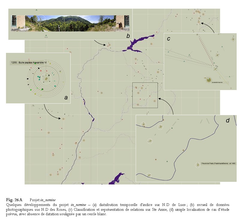
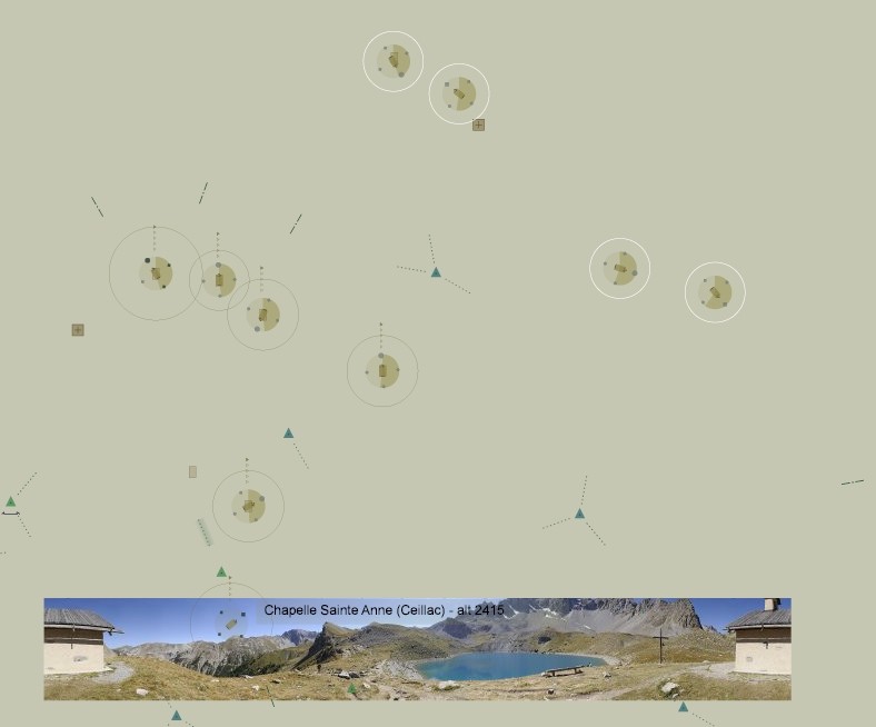
A dynamic SVG interactive cartography with zooming functions that act as successive filters inside the information set. In this experiment heterogeneous information sets are delivered: they bridge various scales (environmental features as well as architectural features for instance) and also combine temporal aspects, documentary aspects, or neighbourhood analysis.
applied to : remote, isolated chapels in Haute-Provence, France
I. Dudek, J.Y. Blaise
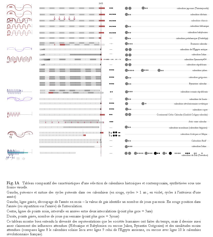
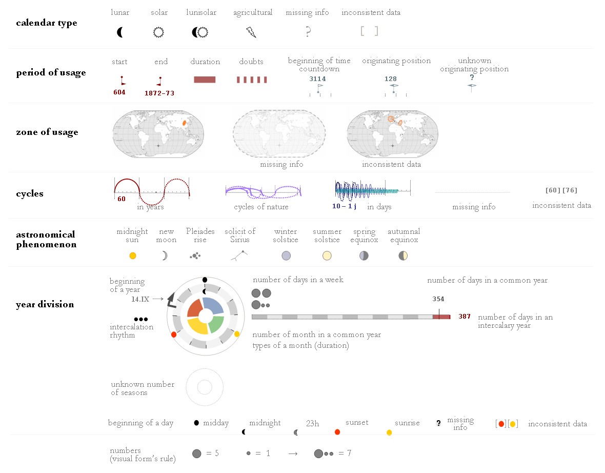
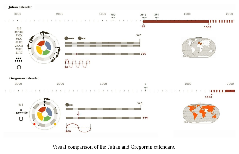
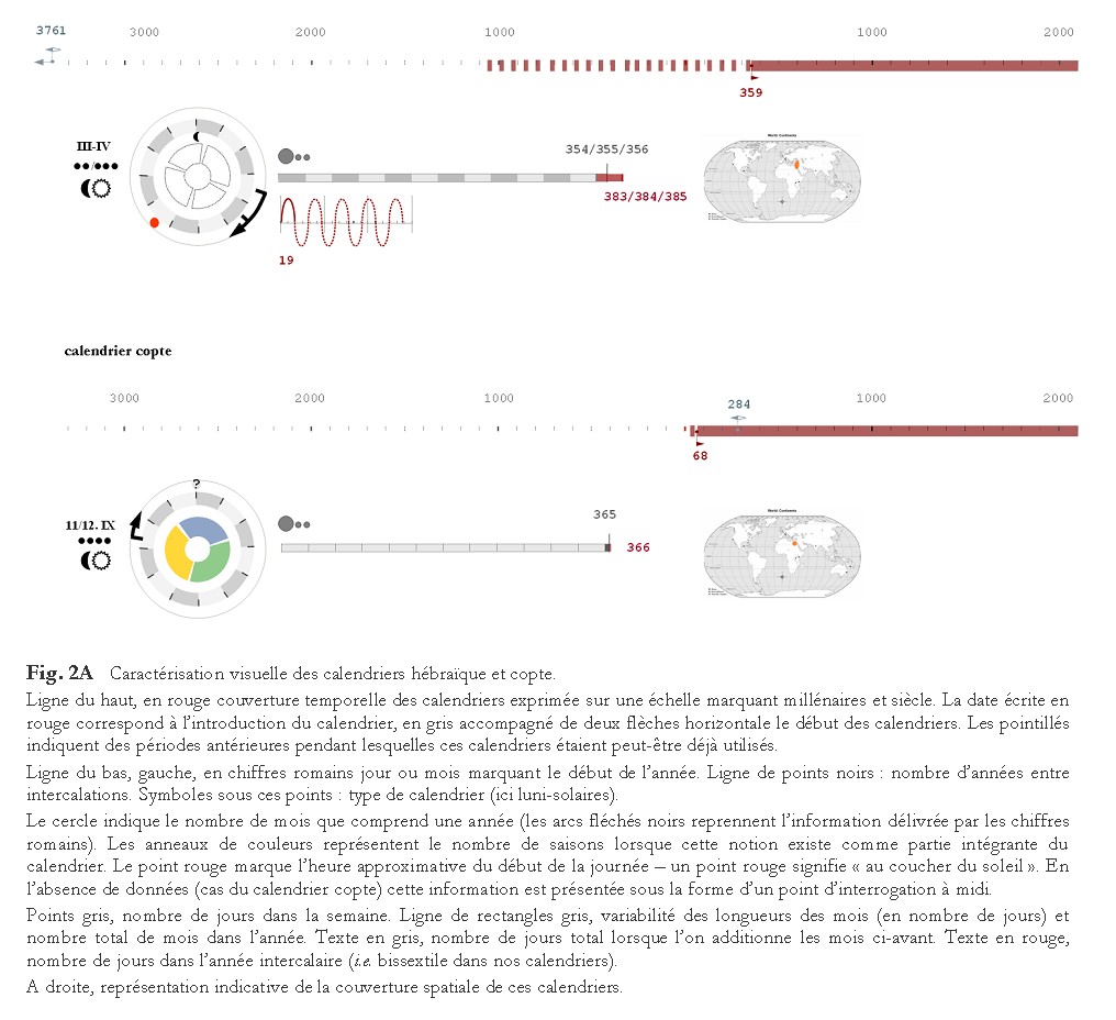
A collection of visualisations that summarize the characteristics of various historical calendars and allow for a clear-cut comparison of their features, underlining expected or unexpected relations in the way societies have understood and described time.
applied to : 27 calendars from ~2637 until today - Europe, Asia, South America, North America, Africa, Oceania
published research
J.Y. Blaise, I. Dudek
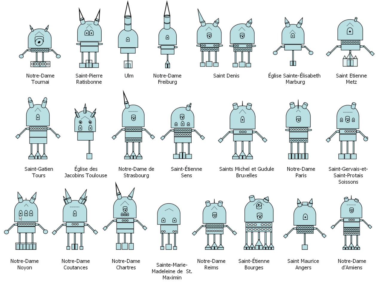
The visualisation summarises morphological features of major "Gothic" cathedrals in France, Belgium and Germany. Its aim is to facilitate comparisons across a collection of such edifices, promote the identitifcation of rules, patterns and exceptions, etc. It is mainly used for used for didactic purposes.
applied to : 55 Gothic cathedrals, founded during the 12th and 13th centuries in France, Belgium and Germany.
J.Y. Blaise, I. Dudek
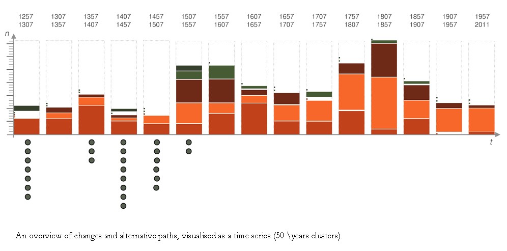
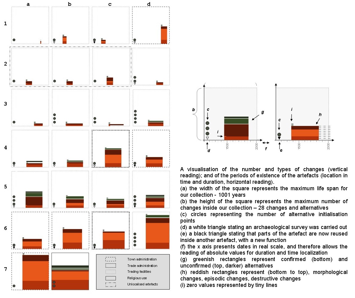
Two visual tools aimed at supporting the analysis of alternative scenarios of evolution of a collection of artefacts.
The first visualisation is basically a time series - on the x axis are distributed even periods of time (50 years) starting from the foundation of the city in 1257. On the y axis, we represent the overall amount of changes and alternatives for the whole collection at each period. Circles are added below the x axis that represent the overall amount of alternative initialisation points for each 50 years period.
Doubts concening the initialisation phase (construction), transformations that are known (documented), transformations that are questionable (not enough data, contradictory data) are explicitely differentiated.
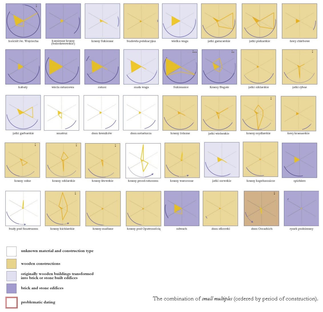
The second visualisation isinspired by the “small multiples” concept in which we report for each artefact, the life span and the number of changes and of alternatives. The size of each square unit represents maximum values for these two parameters inside the collection. Once a square unit has been computed for each element in the collection, various combinations can be tried out to grab an understanding of the collection and spot temporal, spatial or other patterns.
applied to : Cracow's Main Square
published research
J.Y. Blaise, I. Dudek
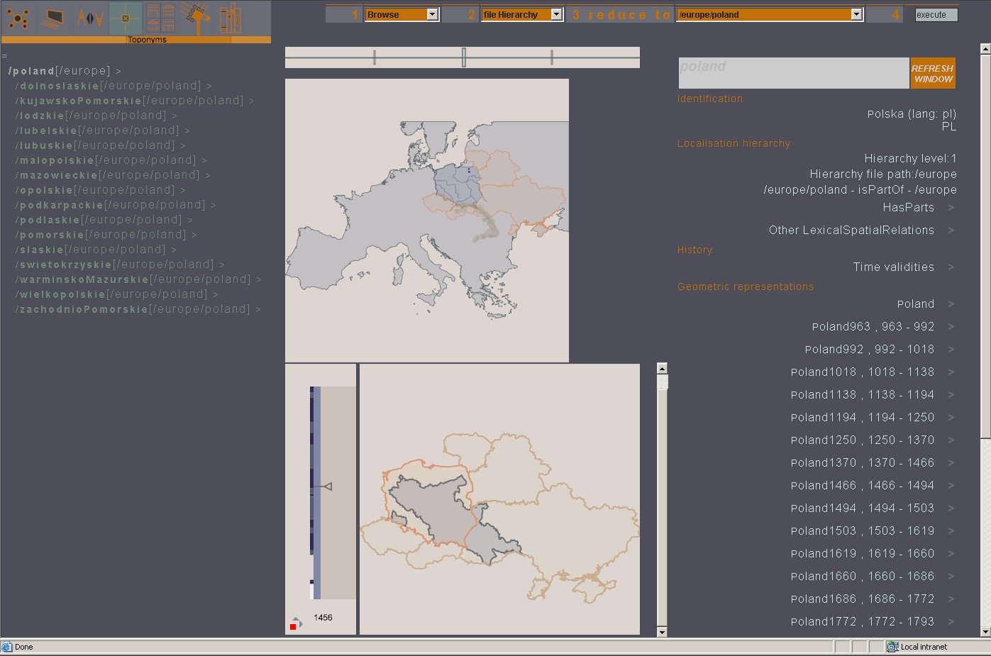
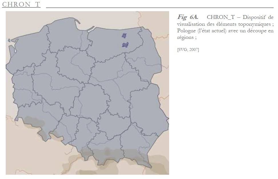
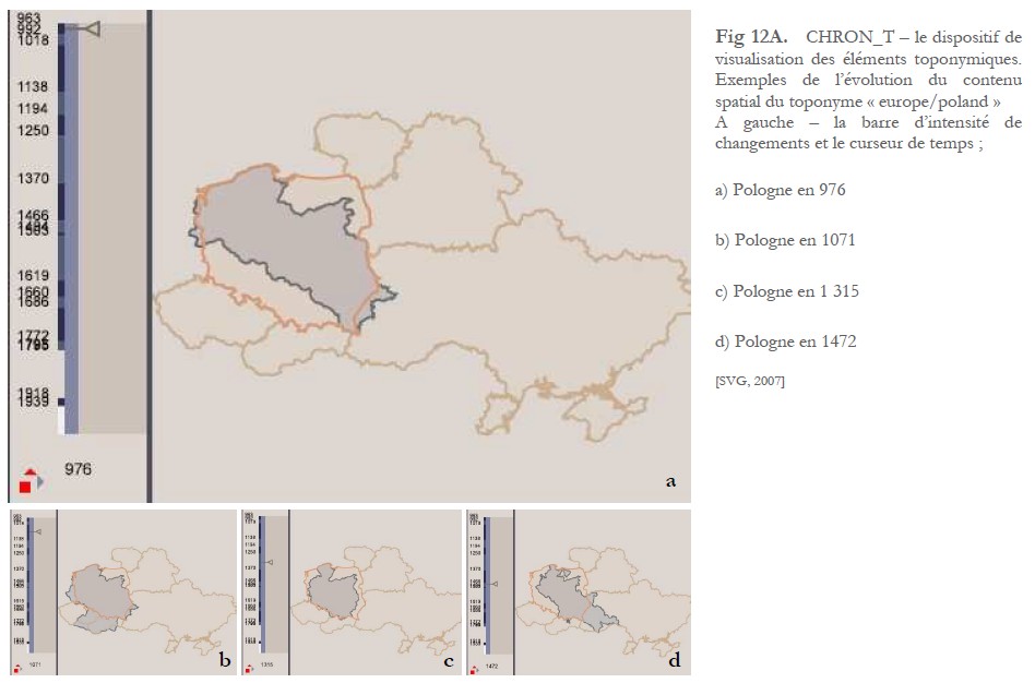
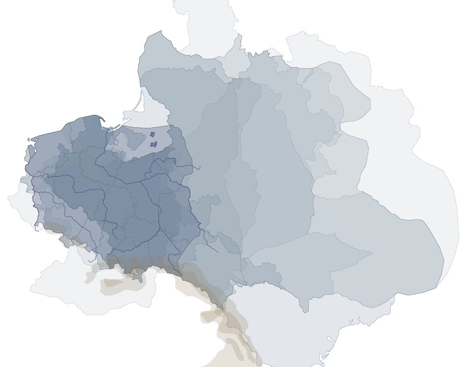
A visualisation of historical toponyms that combines a cartography (spatial coverage of the toponym) and a hierachical tree-like representation.
applied to : toponym/Europe, historical toponyms/Poland
J.Y. Blaise
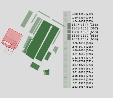
J.Y. Blaise, I. Dudek
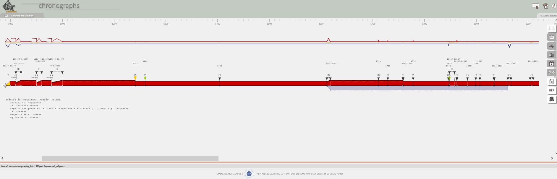
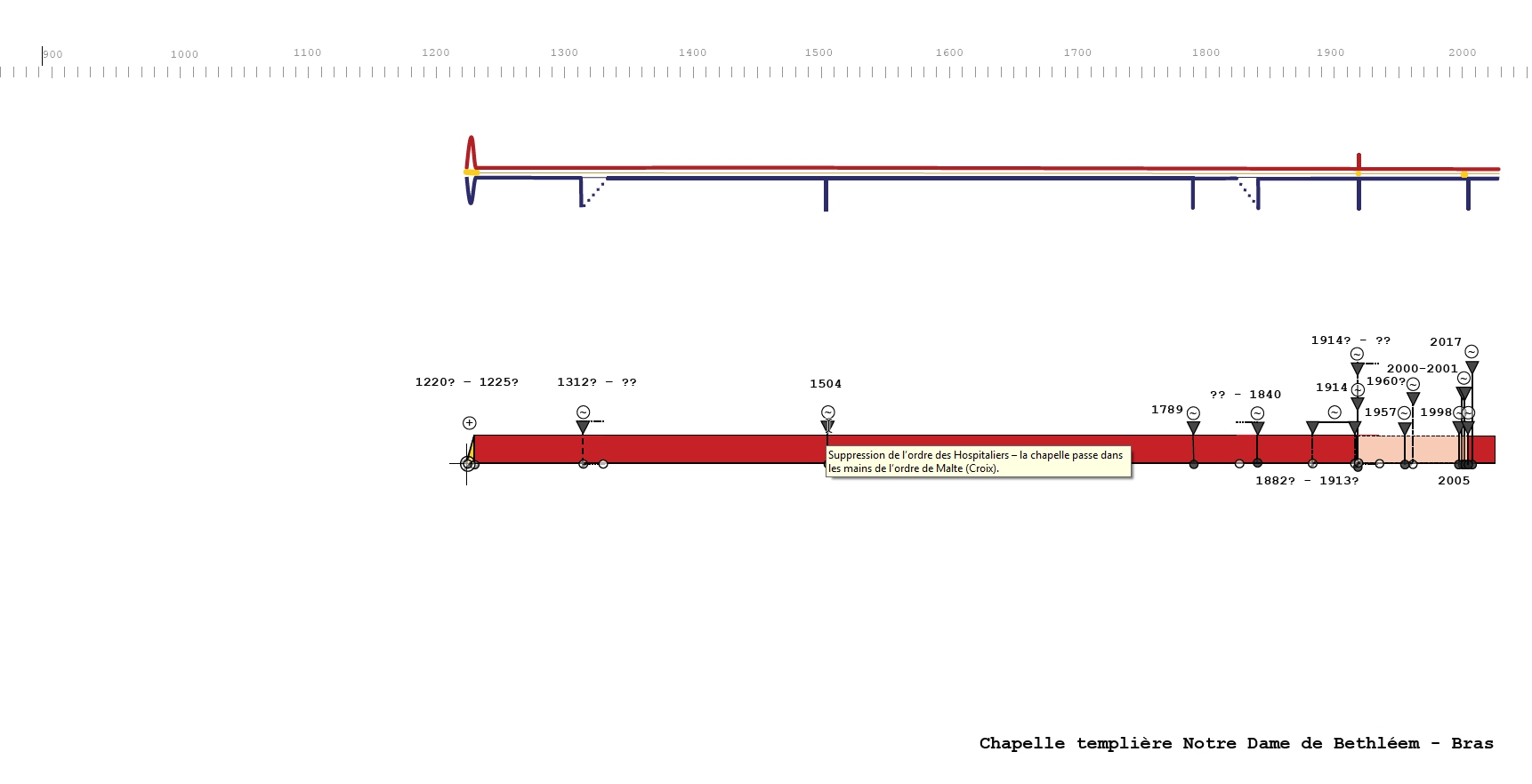
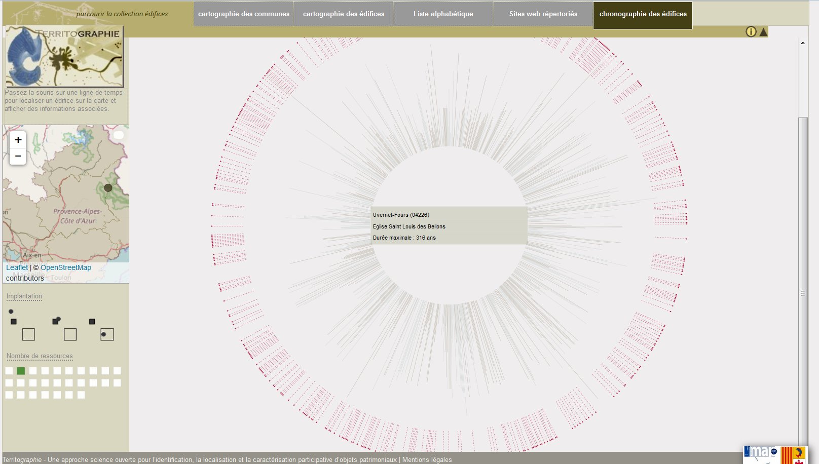
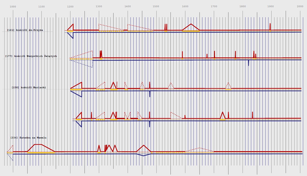
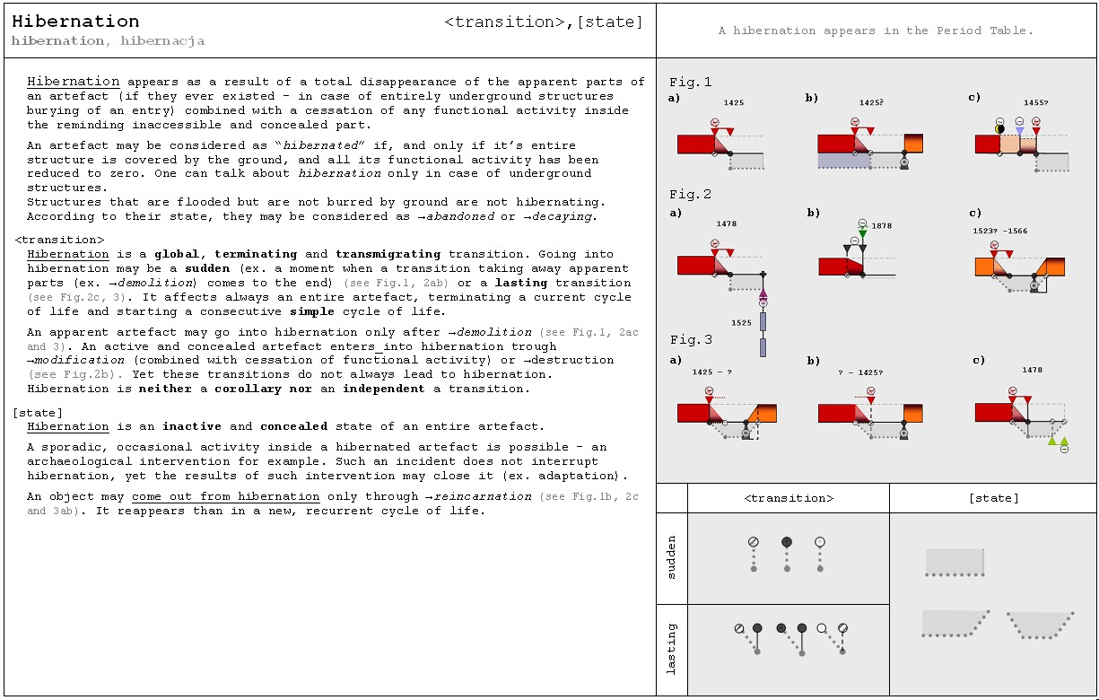
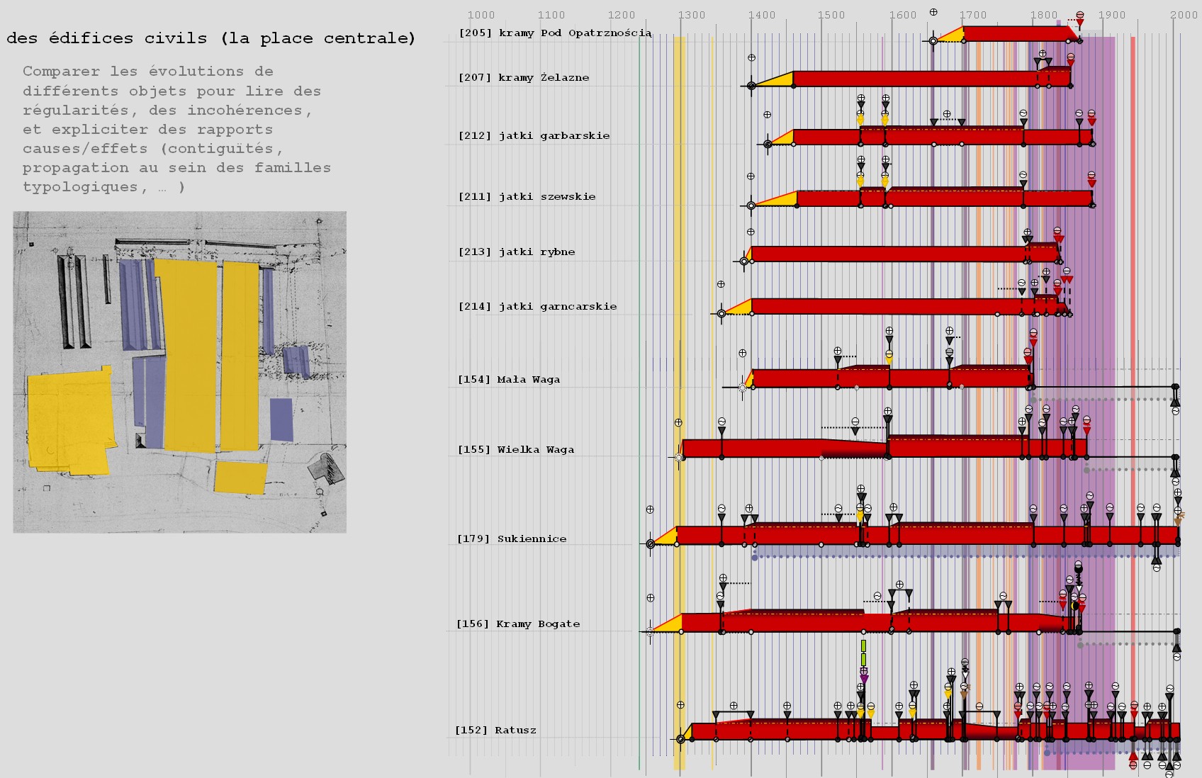
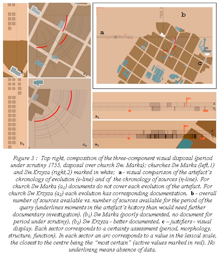
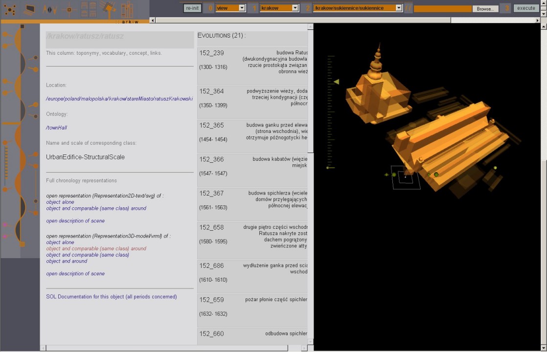
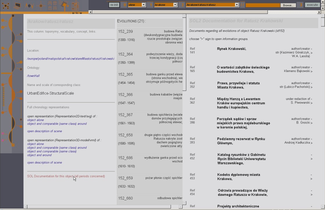
Chronographs are primarily designed in order to allow analysts to describe and visualise architectural changes.
Chronographs build on a description framework that focuses on the way artefacts get transformed, with a grid of notions giving the analysts the means to date, describe and order events/facts/elements of context that we consider meaningful in the understanding of the artefact’s transformations.
Chronographs is in fact the name given to a set of graphics, composed of three different visualizations:
Diachrograms present the evolution of an artefact along a time axis that positions transitions, states, and causality assessments along the time scale.
Variograms further detail the nature of the artefact’s transformation by Features visualisation that foster comparisons across features.
The "chronographs" solution has proven quite efficient in performing reasoning tasks - it does help assessing causal relations, and orders in time sequences, events and consequences in a robust manner.
applied to : Cracow's historical centre
published research
J.Y. Blaise
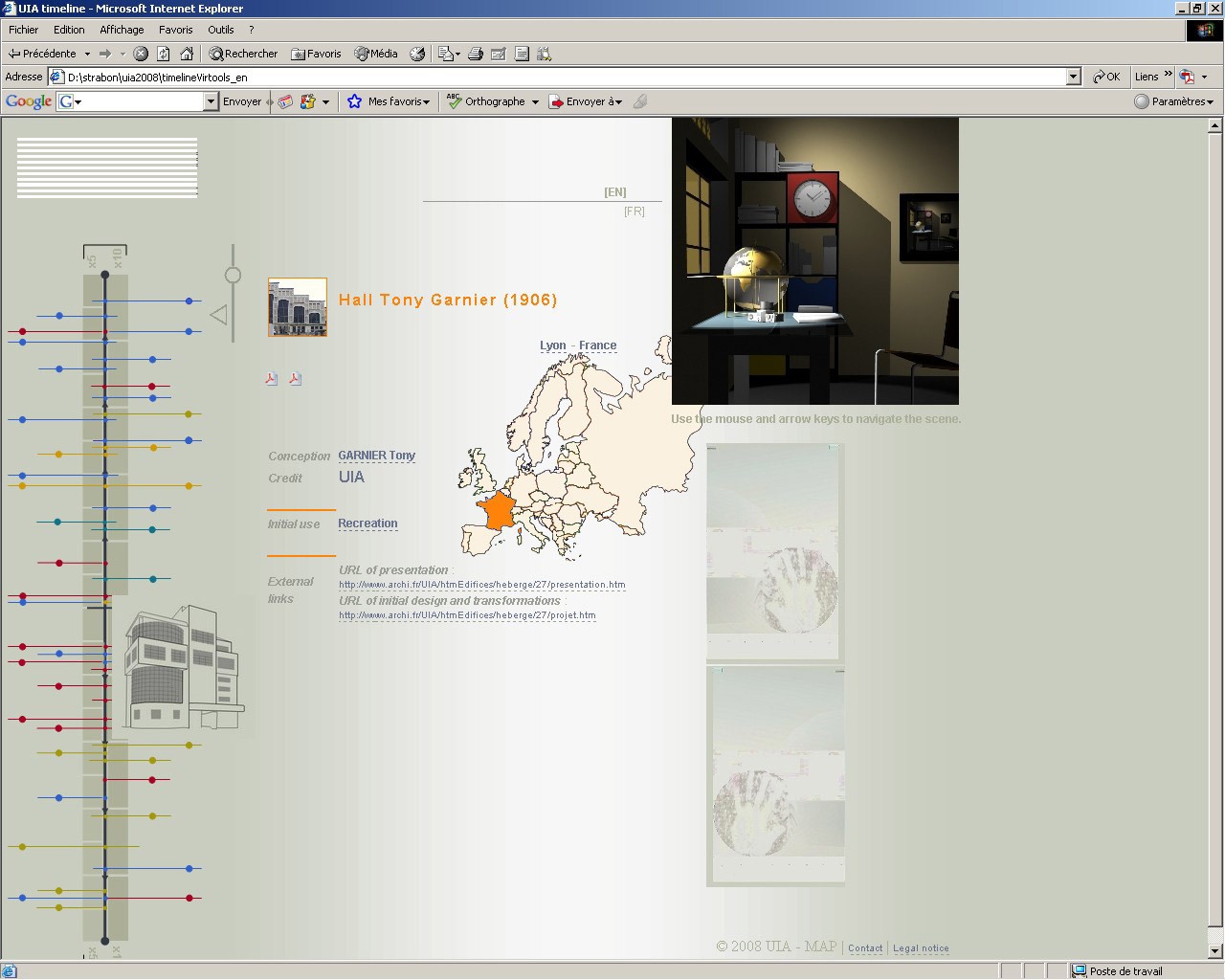
Interfacing of the UIA XXth century architectural heritage web repository, an open and collaborative collection of 20th century architecture worldwide, available on the internet.
The system’s interface allows various browse and search modalities (space, time, image, etc.) – implementing a basic mantra : “there is more than one road to the information”.
It includes visualisations of temporal and spatial patterns on a selected number of key edifices, and a 3D visual metaphor based on Vermeer's "Geographer", both used as menus.
J.Y. Blaise, I. Dudek, T. Driscu
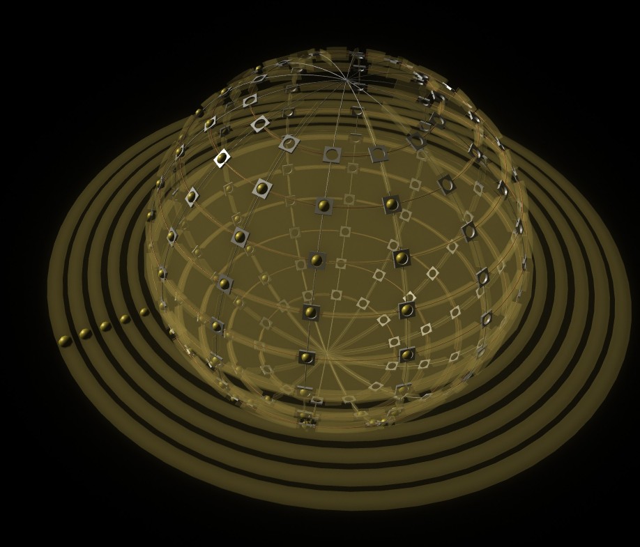
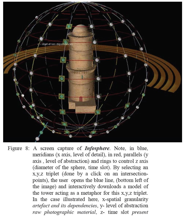
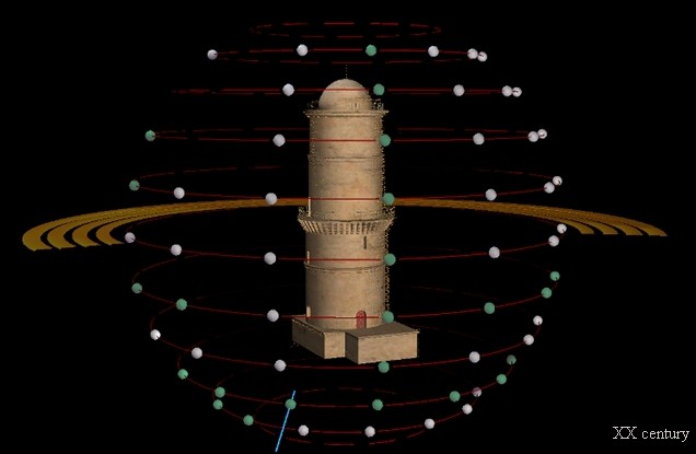
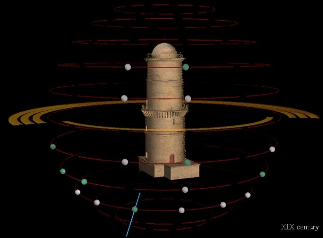
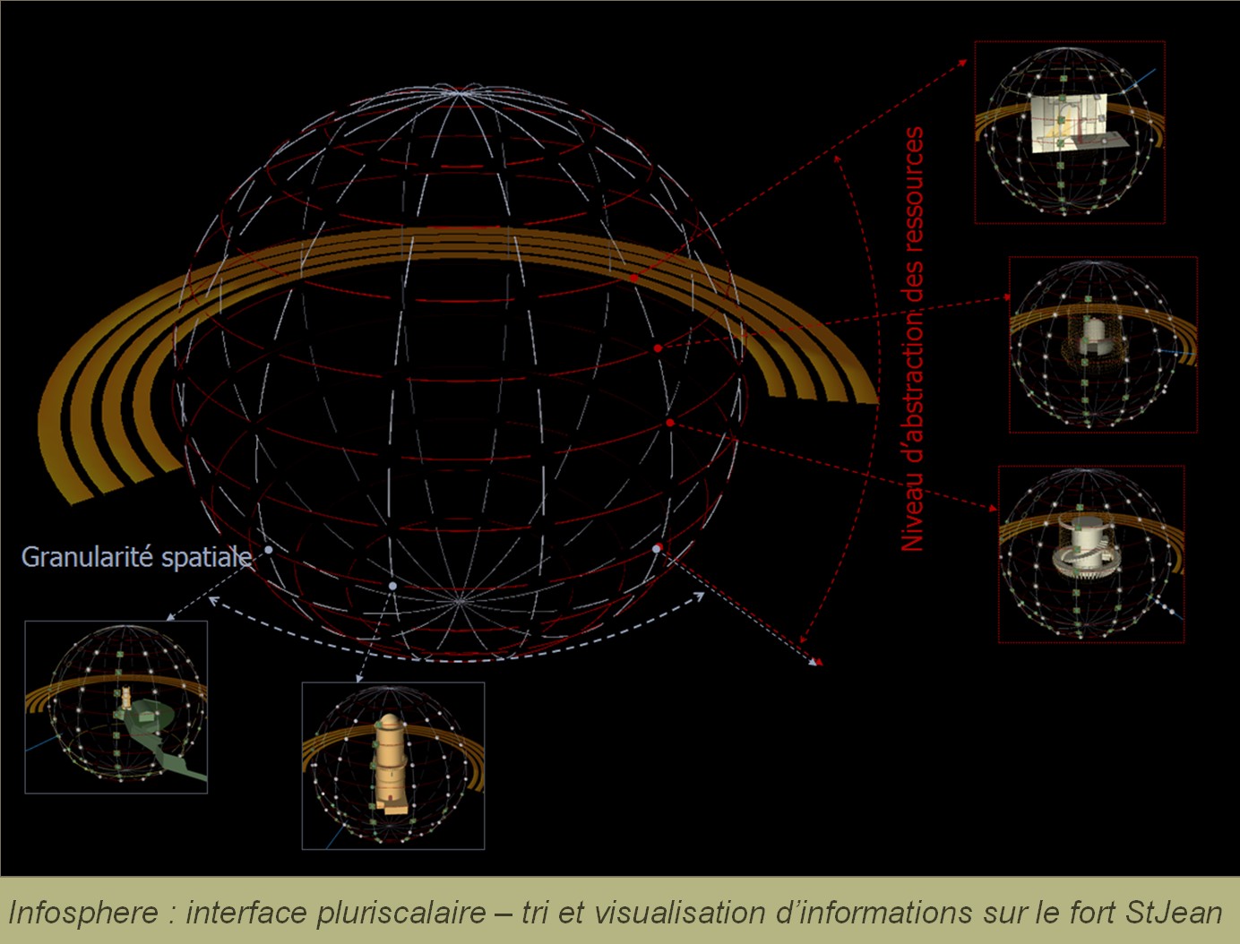
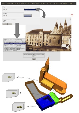
Infosphere is an experimental 3D visual interface through which documents about an artefact under scrutiny are visualised and retrieved. The disposal bases on the hypothesis that for each document in a data set a corresponding element of the artefact under scrutiny can be found (edifice as a whole, parts, details, etc.).
Infosphere is designed as a tool helping to sort out, visualise and retrieve documents concerning an artefact, according to three parameters: granularity of the architectural analysis, level of abstraction of the documents, and time slot concerned.
Documents are positioned inside a 3D metaphoric display by an [x,y,z] triplet (materialised in the 3D interface by the intersection of parallels and meridians of a sphere); where [x] corresponds to a breaking down of a site into sub-elements (spatial granularity, more or less equivalent to level of detail), [y] corresponds to the level of abstraction of the documents itself (from realistic representations to diagrammatic analyses), and where [z] corresponds to a given time slot.
The display is composed of two visual metaphors. The artefact itself is represented as a 3D metaphoric model positioned at the centre of the scene. A sphere based on a second metaphor (parallels/meridians of a globe) encircles the first artefact’s model.
applied to : Signal light tower, Marseilles
published research
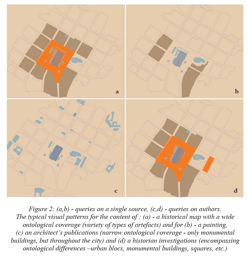
J.Y. Blaise, I. Dudek
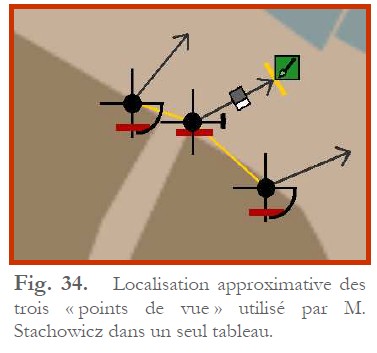
This visualisation builds on a framework of codes, formalisms and parameters that can be used to estimate the positions of the observer (x,y,z) and of its target point inside historical visual sources such as paintings, drawings, panaoramas, etc.
Visual sources can then be more or less positioned on the cartography, highlighting preferences, densities and behaviours for instance.
applied to : Cracow's historical centre
published research
J.Y. Blaise, I. Dudek
This visualisation builds on an interactive SVG cartography through which artefacts are positioned, and give access to documentary sources.
The cartography includes a visual encoding of the reliability of the information extracted from documents, letting analysts to weigh and compare levels of knowledge and understanding across the collection of artefacts.
Documents available for each artefact are analysed in terms of type and in terms of time distribution so as to assess visuallly a sort-of density of historical evidences.
applied to : Cracow's historical centre
published research
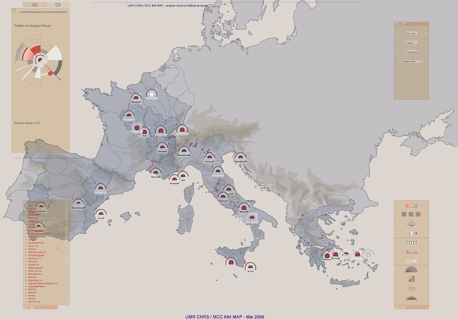
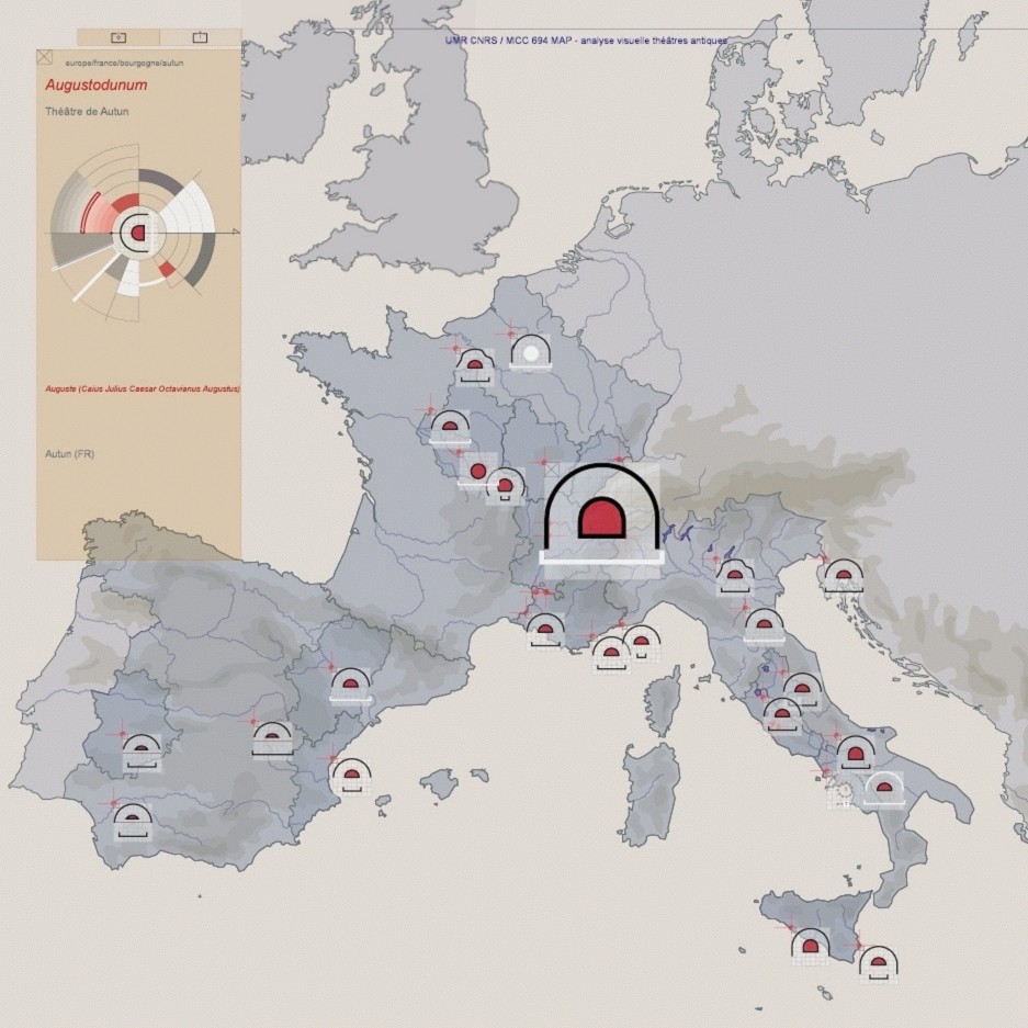
J.Y. Blaise, I. Dudek, F. De Domenico
A set of visual tools, including spatial distribution representation, that provide the following services:
Help gaining insight on each object and on the data set as a whole by fostering one-to-one or several-to-several comparisons (of features),
Help characterising each object by providing a univocal “visual signature” not of the object itself but of the information behind the object.
The development includes three levels:
A formal analysis of the architectural typology in order to define the parameters we need to compare, and the visual sign in charge of conveying comparisons. Result of this first step is a univocal graphic symbolisation of the typology’s architectural composition.
A set of visual signs, calculated dynamically for each object in the data set, and displayed inside an interactive SVG map, support for the spatial distribution of objects.
• A set of interactive tools, that let the user query the data set on comparisons. (For instance, comparing a feature of the typology such as dates of construction) or on a given object (visual signature, including information all the features of the typology for the given object).
applied to : A collection of 36 antique theatres, distributed across four North-Mediterranean countries
published research
J.Y. Blaise, I. Dudek
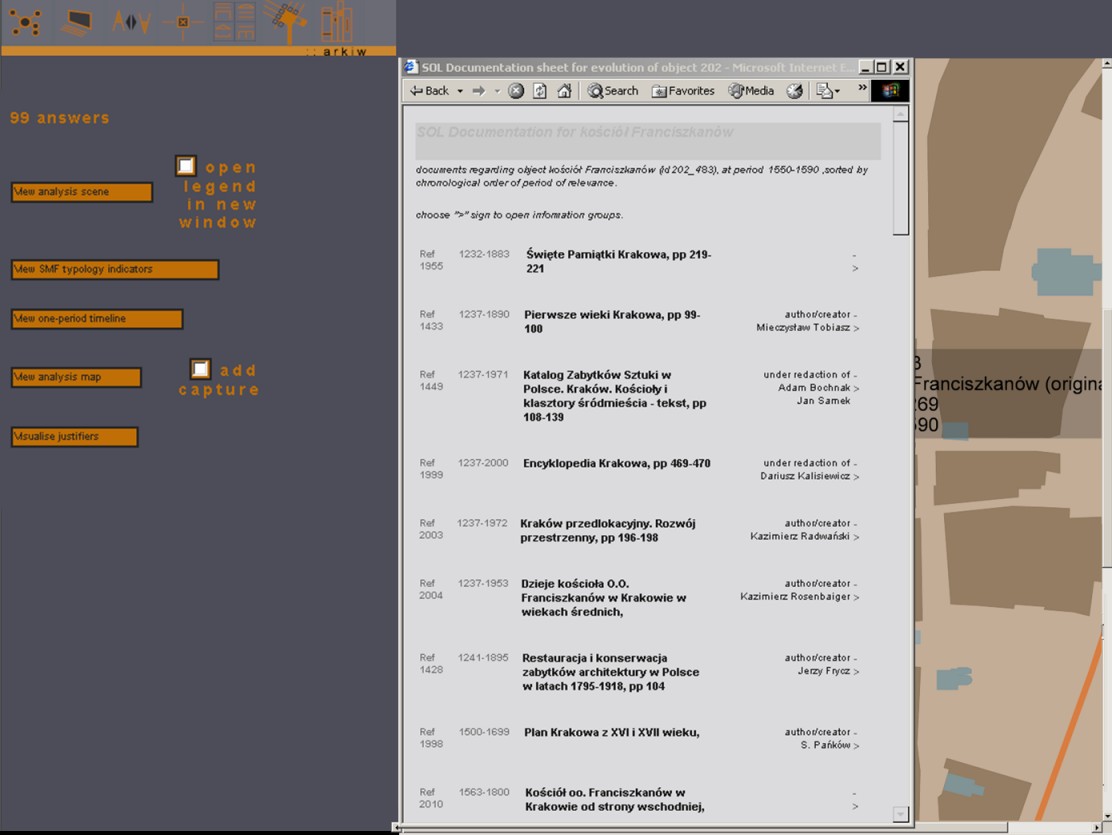
This visualisation builds on an interactive SVG cartography through which artefacts are positioned, and give access to documentary sources.
The cartography is then used to visualise the architectural content of a given source, of a group of sources, of the works of an author, etc. : all corresponding artefacts are highlighted.
applied to : Cracow's historical centre
published research
J.Y. Blaise, I. Dudek
MIR is an information integration formalism dedicated at visualising successive steps in a knowledge acquisition process about an architectural object (specific data - documentation, archaeological findings, analogies, etc. - and generic knowledge).
It is targeted at the field of the architectural heritage where the order of appearance of the data and information cannot be foreseen: the acquisition process is irregular and remains open.
MIR's "knowledge acquisition spirals" are used both for browsing and visualisation purposes
applied to : Cracow's historical centre
published research
J.Y. Blaise, I. Dudek
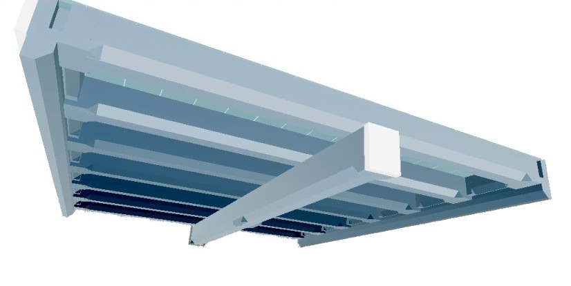
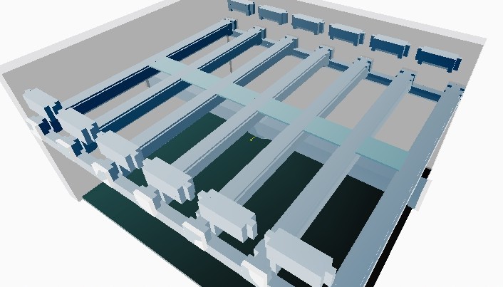
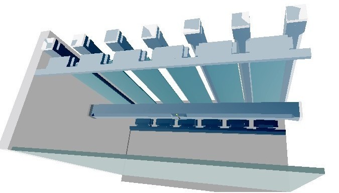
Didactic VRML animations shwowing the structure and assembly of wooden ceilings
applied to : a collection of wooden ceilings in Poland
J.Y. Blaise, I. Dudek
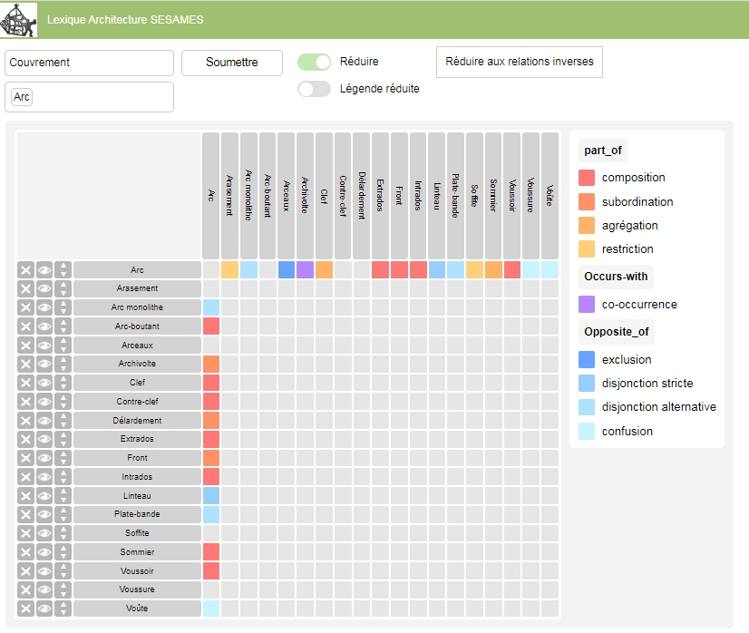
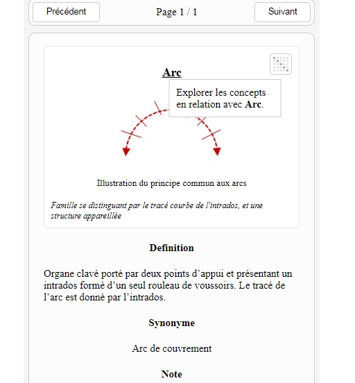
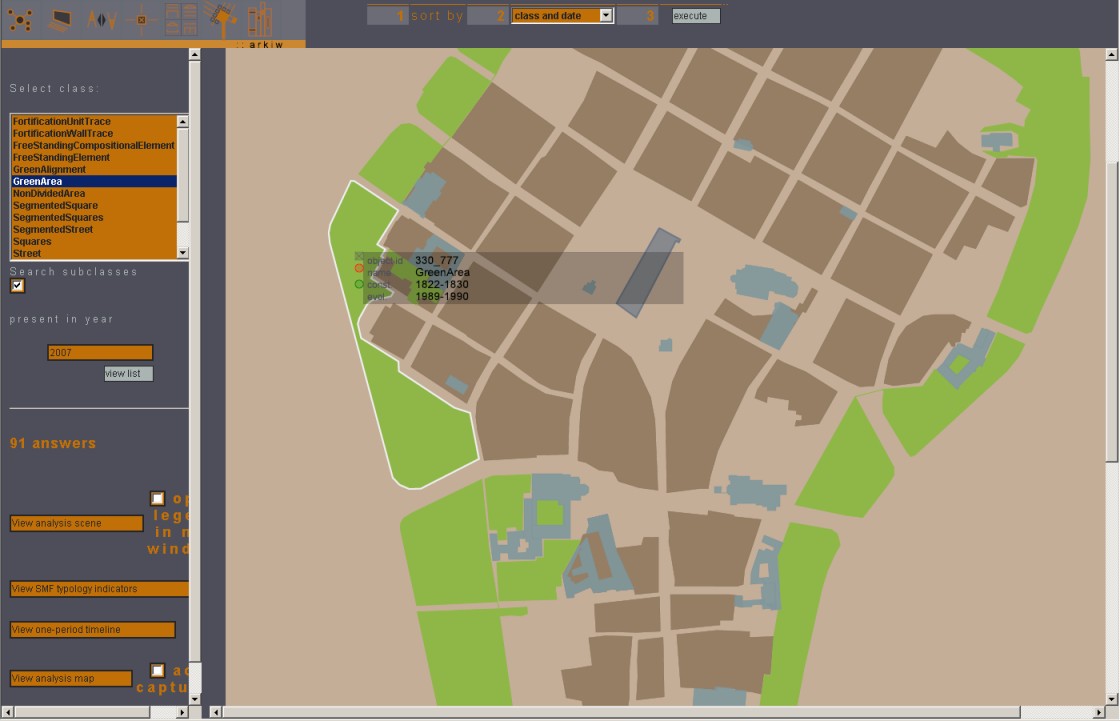
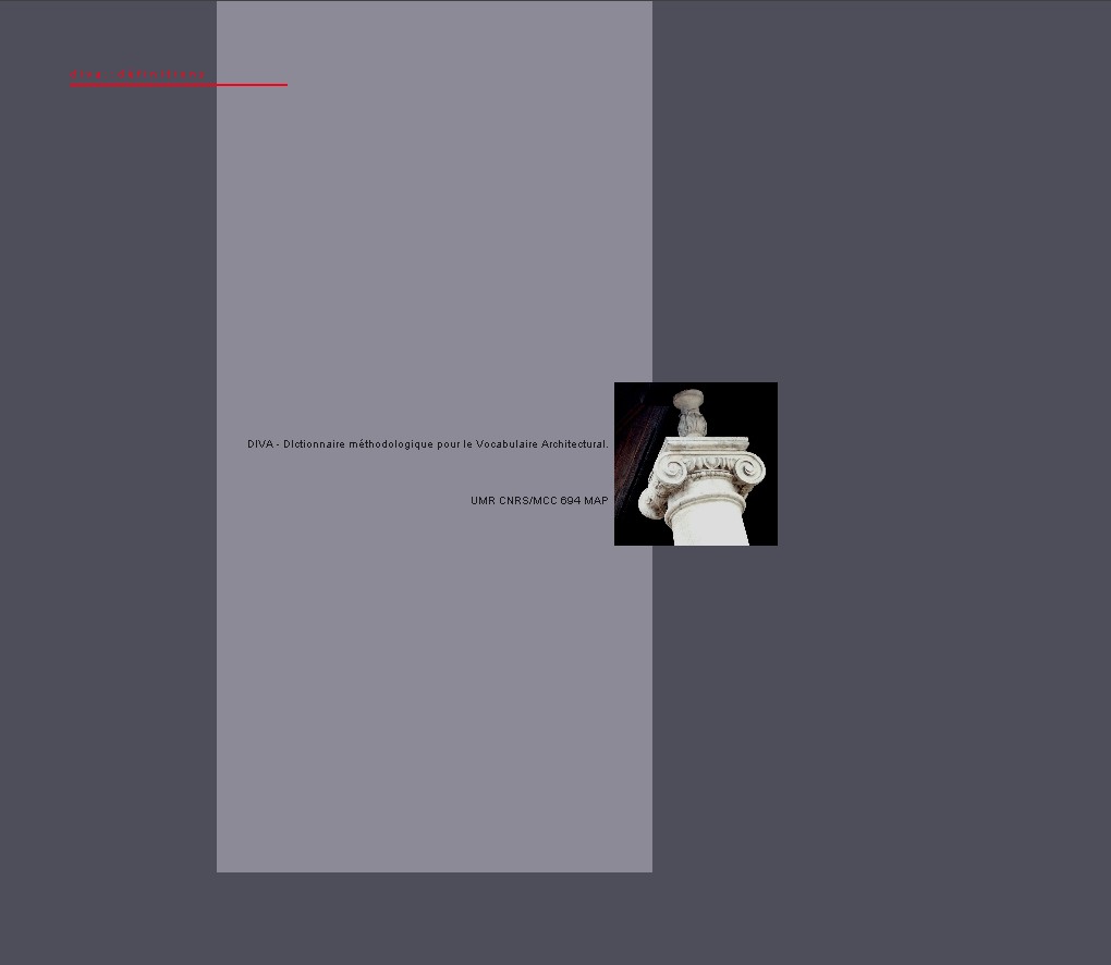
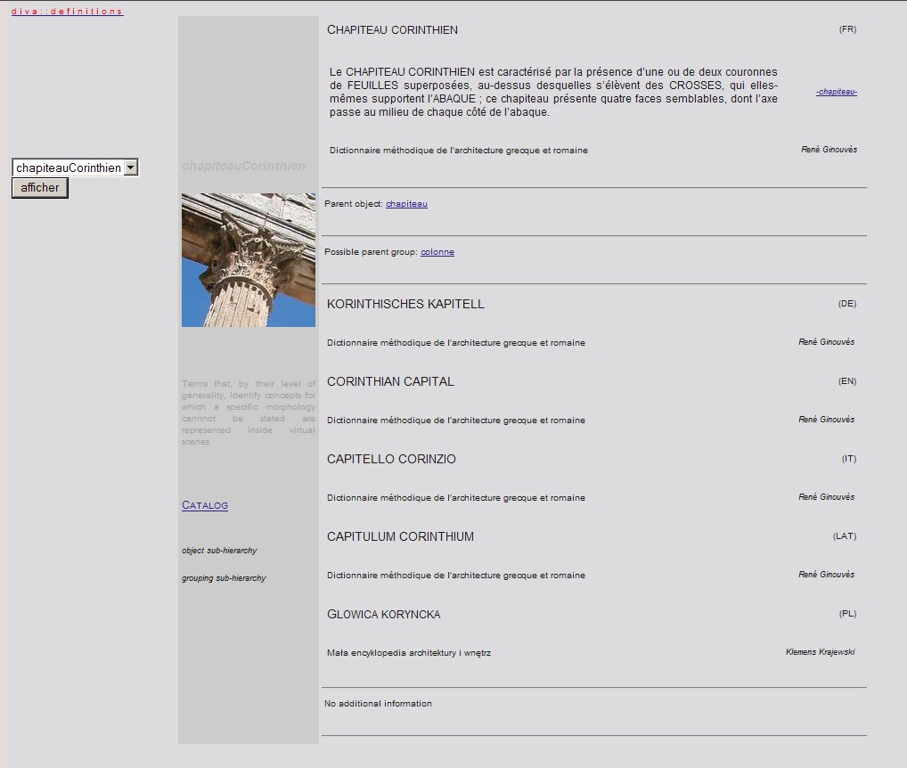
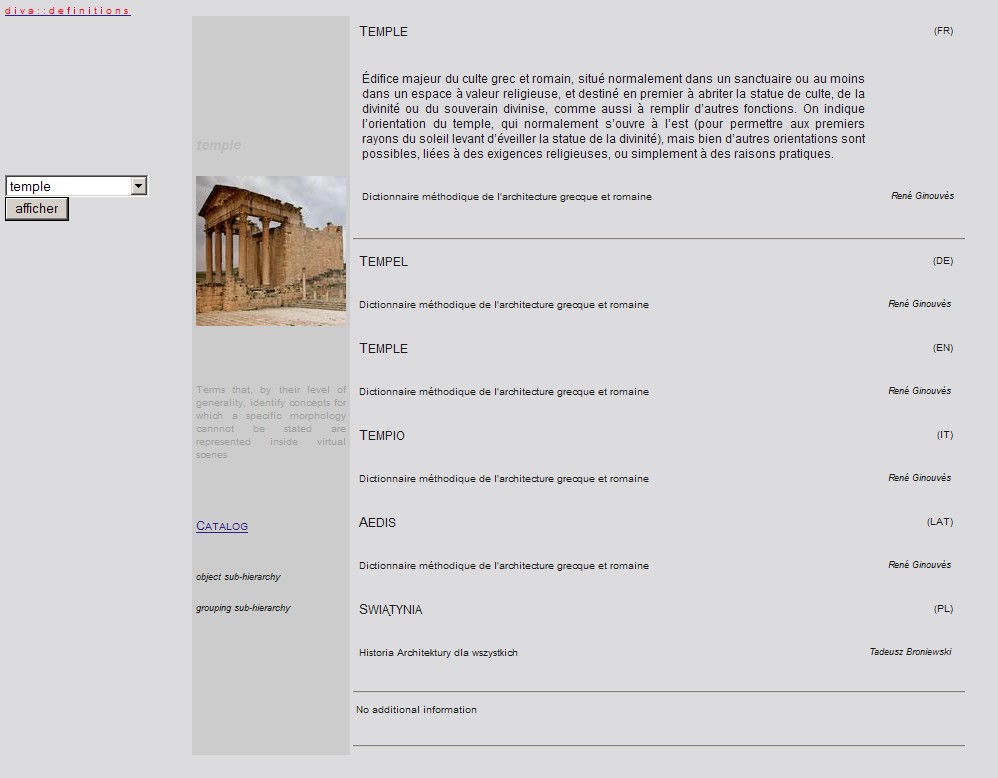
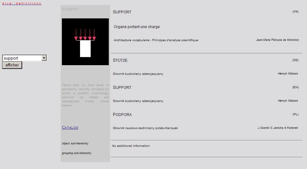
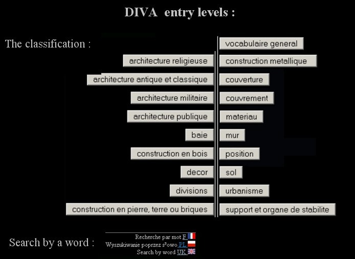
An information system dedicated to the vocabulary of architecture (DIVA database, XML collection of instances, web interfacing)
applied to : vocabulary of historic architecture
published research
J.Y. Blaise, I. Dudek
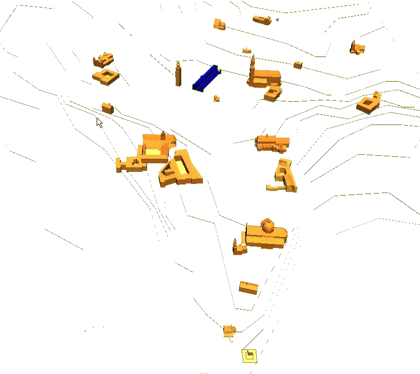
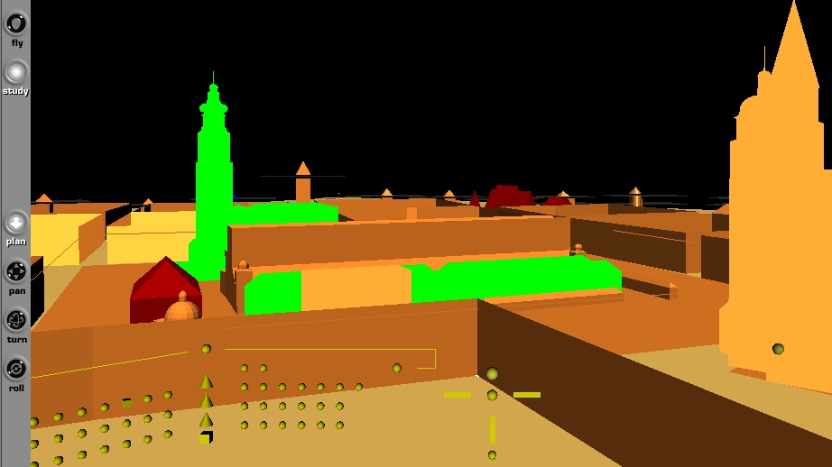
A VRML interface allowing users to browse inside heterogeneous data sets about the ancient Roman city of Dougga, and including an animated tour. 3D Models are given various visual aspects depending on the data available.
applied to : the ancient Dougga (Tunisia)
J.Y. Blaise, I. Dudek
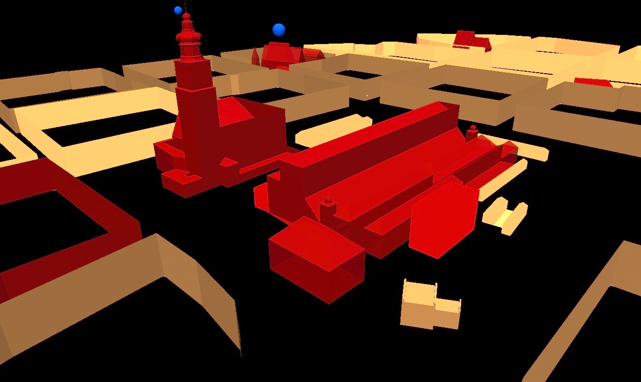
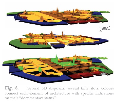
A 2D SVG and/or 3D VRML visualisation, produced on the fly for any user-chosen date. It combines interfacing capacities and a visual encoding of a variety or parameters:
- typology,
- synchronicity indicator (of the user
- chosen data with the 3D model of edifices),
- documentary status.
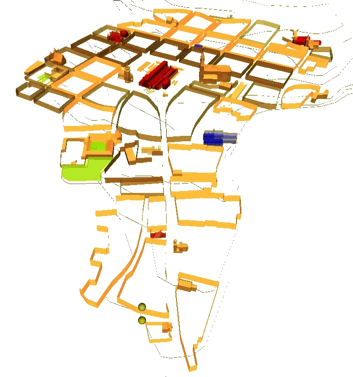
The 3D VRML visualisation builds on a catalogue parametric entities dedicated to the architecture of Cracow, and includes an interactive time slider.
applied to : Cracow's historic centre
published research
J.Y. Blaise, I. Dudek
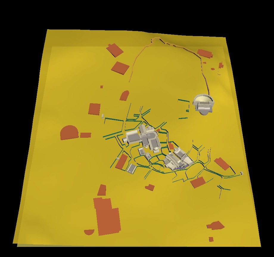
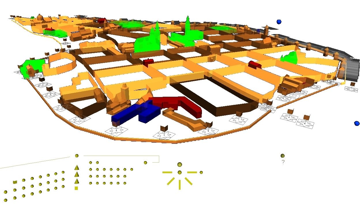
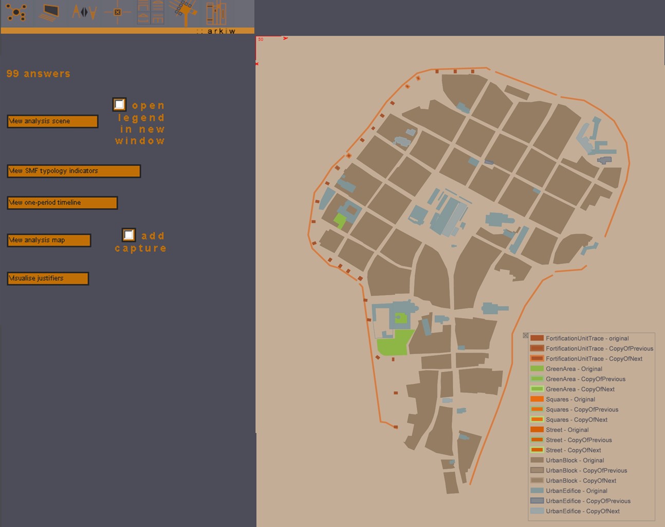
A 3D VRML visualisation allowing users to check inside a 3D scene the availability of historic sources for each urban or architectural object represented in the scene.
Sources are classified by type, users inteact with the scene in order to highlight "all objects for which sources of a given type are known to exist".
Alternatively, users can interact directly with each object in order to retrieve a summary of the sources available object per object.
applied to : Cracow's historic centre
published research
J.Y. Blaise, I. Dudek
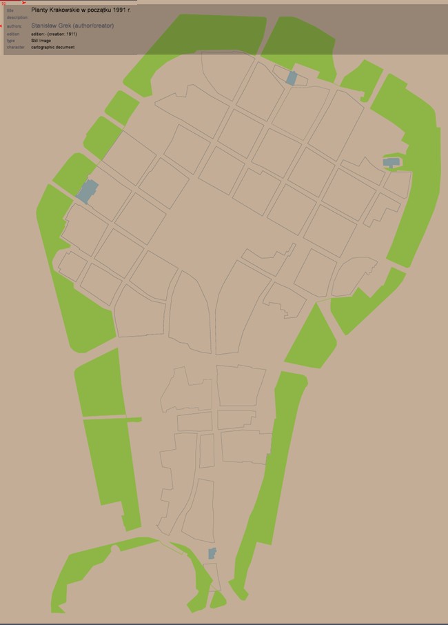
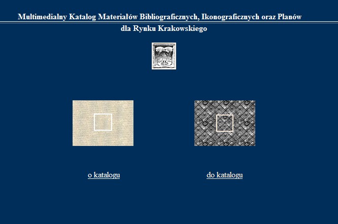
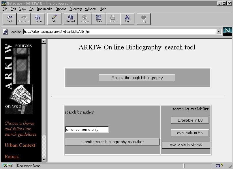
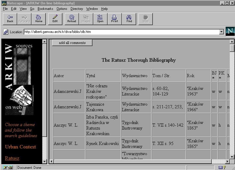
A web interface giving access to a comprehensive set of bibliographic, iconographic and cartographic database on the city of Cracow.
The interfaces includes early web-compatible 2D+text interactions.
applied to : City of Cracow
published research
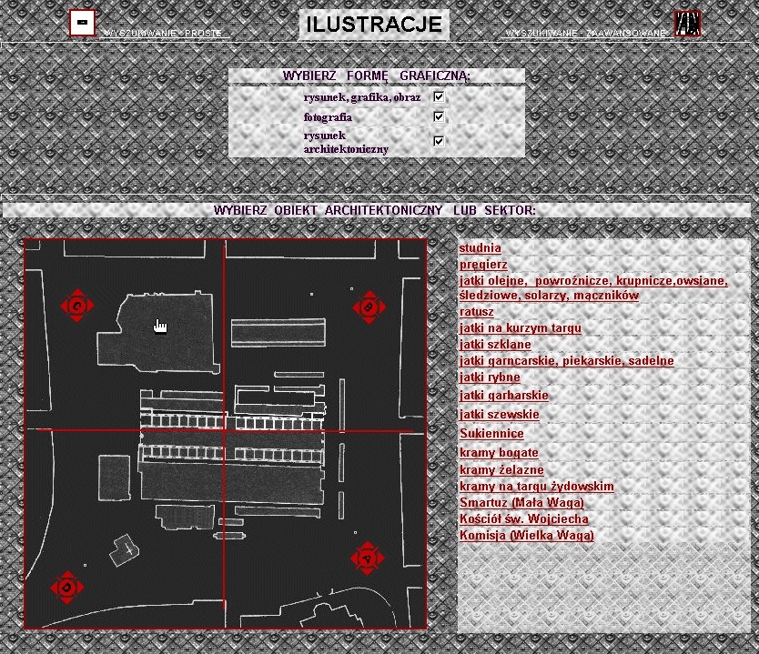
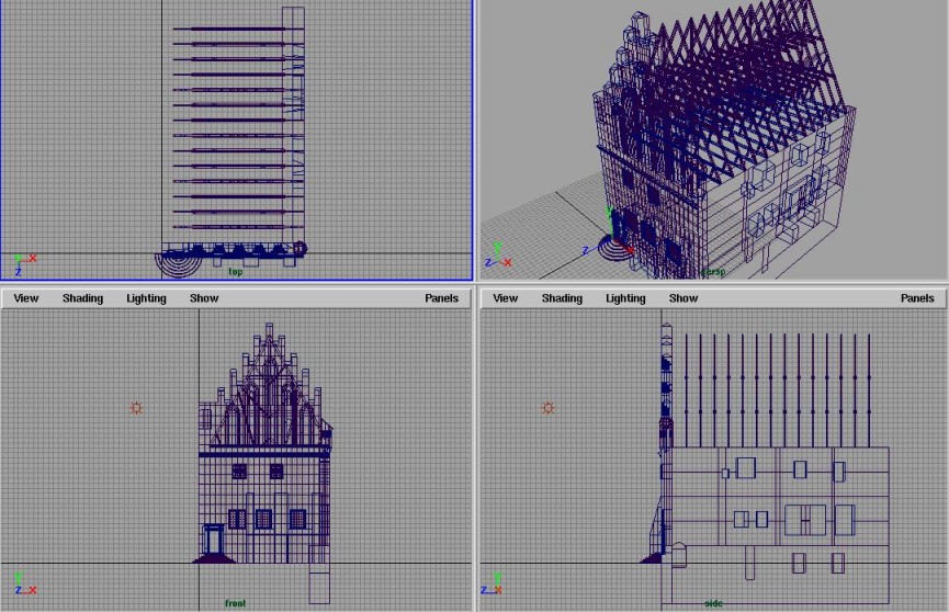
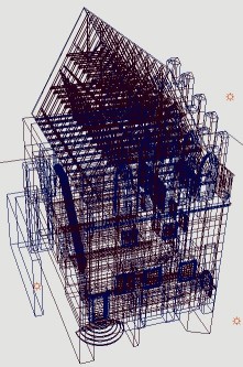
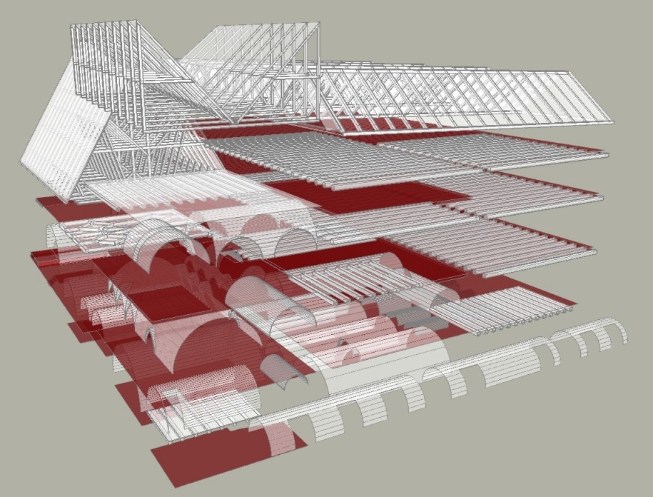
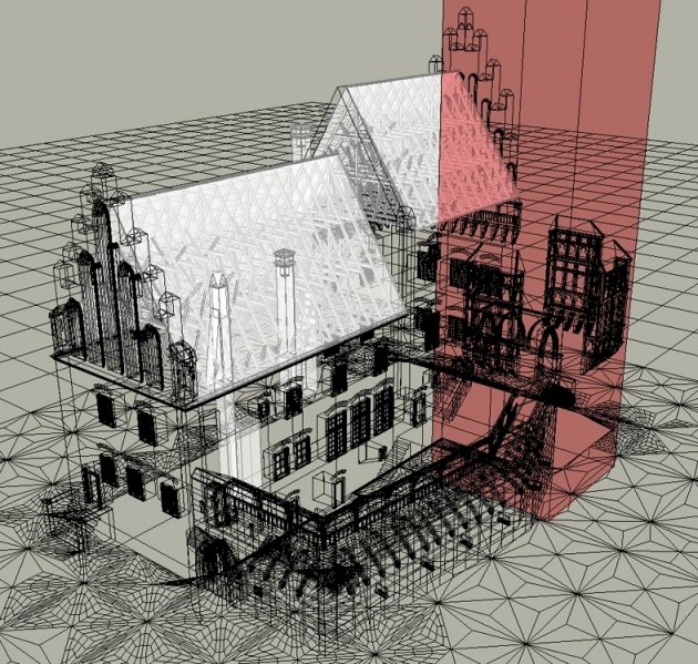
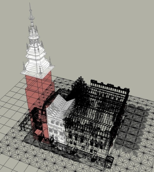
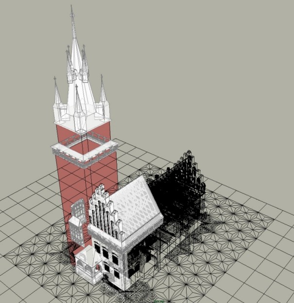
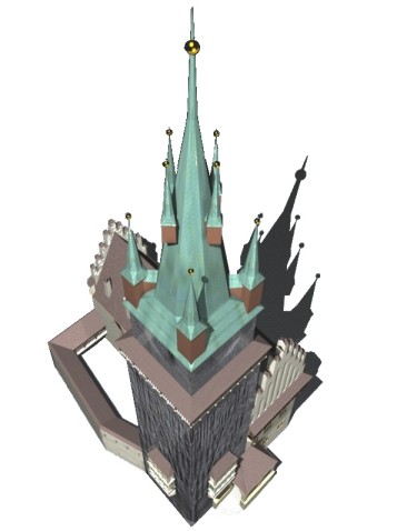
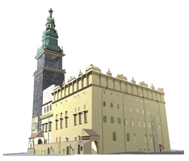
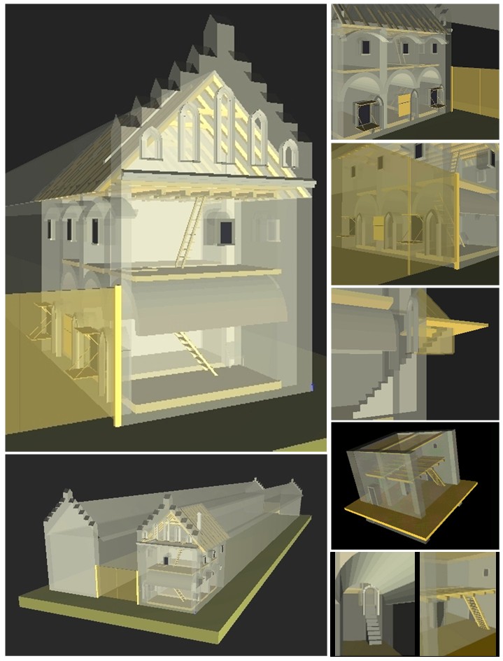
Ch. Radi, J.Y .Blaise, I. Dudek
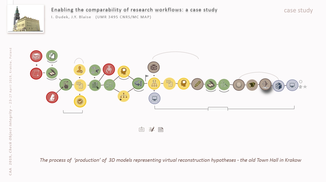
The making of 3D virtual reconstructions of Cracow's old Town Hall helped underling a number of methodological challenges in such situations:
- graphic semiology
- organisation of the 3D Model
- analytical models
- rendering techniques and misuses
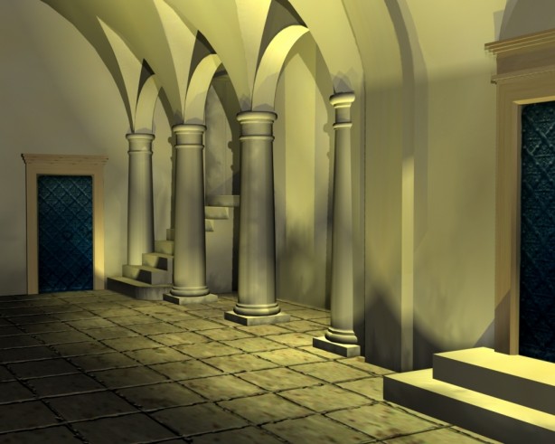
applied to: Cracow's old Town Hall
J.Y. Blaise, I. Dudek
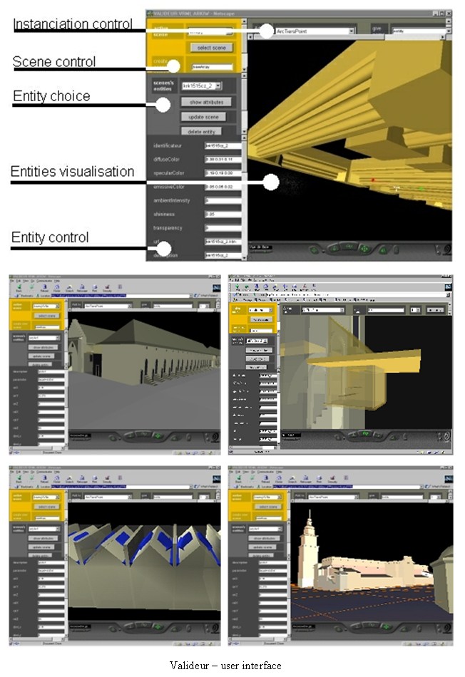
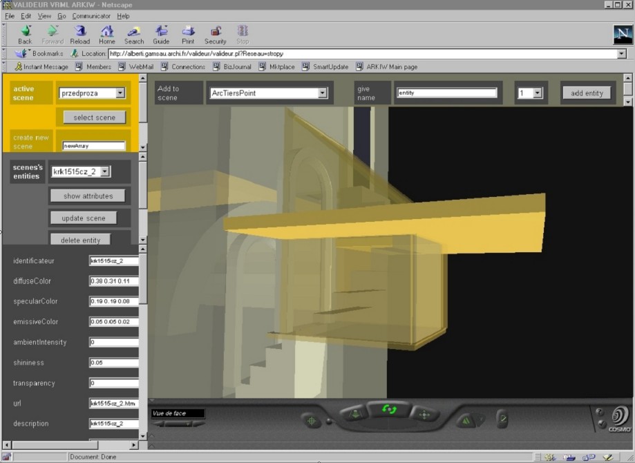
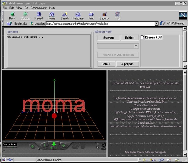
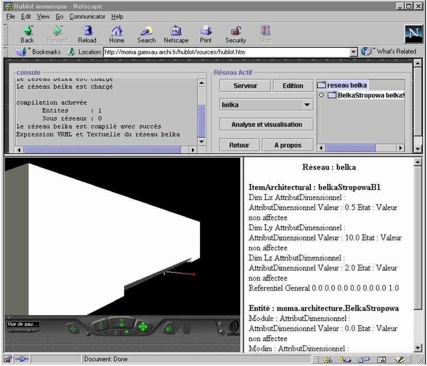
A web tool used as a 3D (parametric) VRML modeller: users define geometric parameters through HTML forms, and retrieve a VRML scene produced on the fly. Specific alphanumeric codes allow the definition and combination of complex architectural shapes.
applied to : Cracow's urban fabric, architectural objects, wooden ceilings.
J.Y. Blaise, I. Dudek
J.Y. Blaise, I. Dudek
An early web implementation of a technical dictionary on historic architecture.
applied to : vocabulary of historic architecture
(published research)
J.Y. Blaise, P. Drap
Contribution to a Java implementation of a 3D VRML modeller.
(published research)
J.Y. Blaise
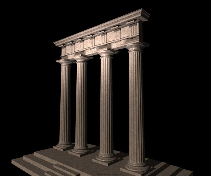
A structured catalogue of parametric POV architectural objects.
applied to : various architectural objects
published research